
7AM DAISY SKIN BOOSTER
7AM DAISY SKIN BOOSTER
Client: 7AM DAISY
Design Company: BLANKO DESIGN STUDIO
Creative Direction: Hanxi Li
Design: Hanxi Li
Country: China
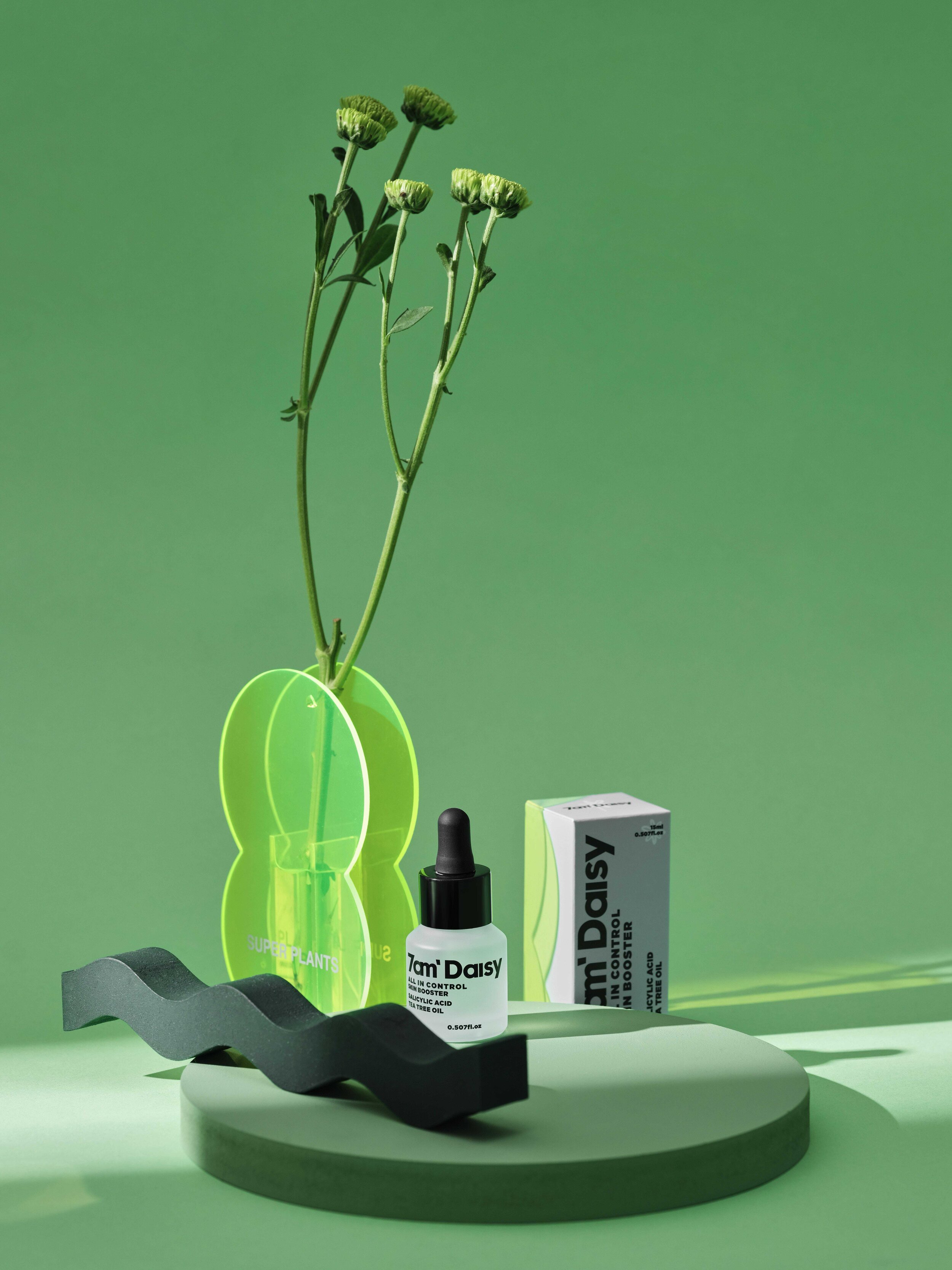
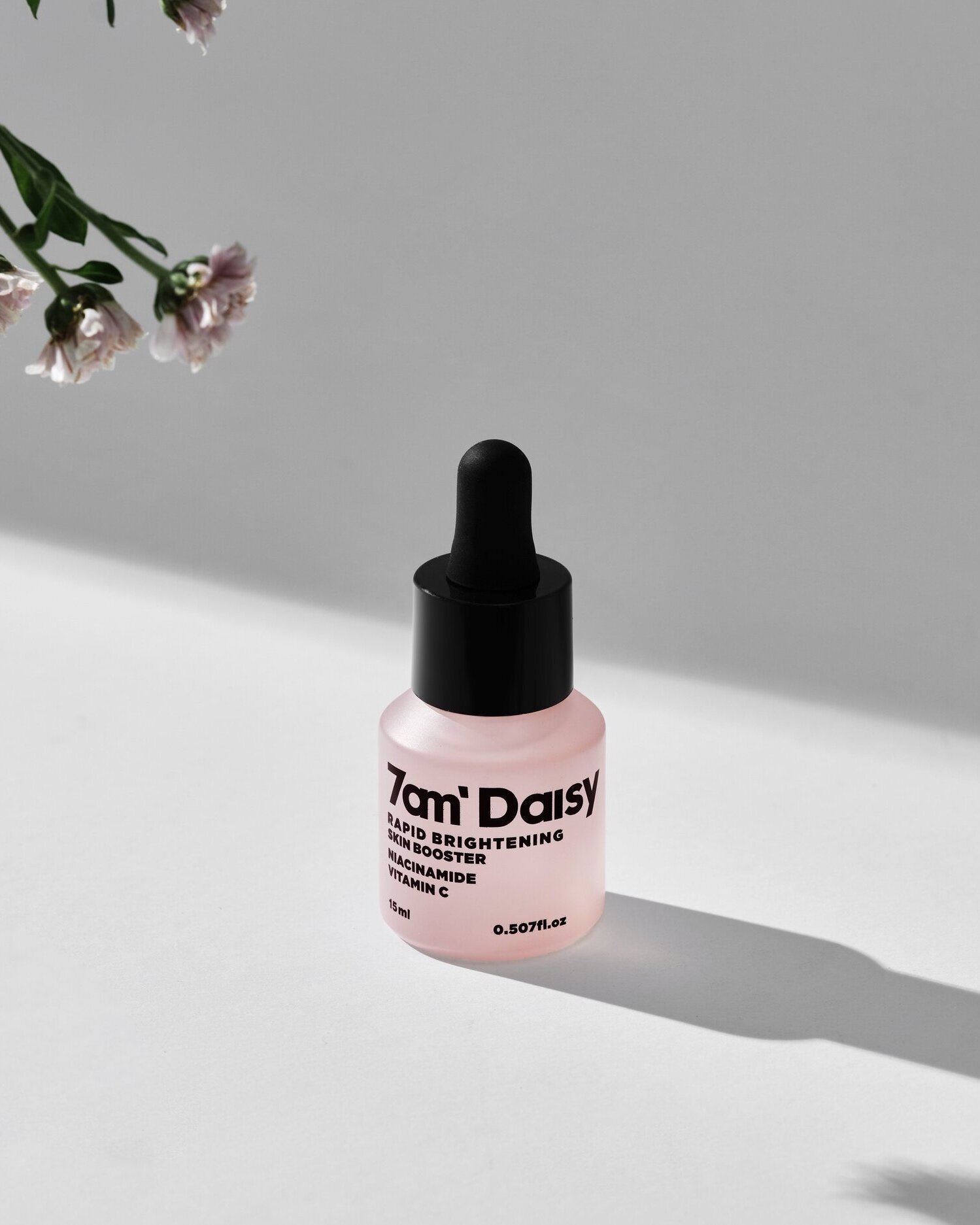
Design logo, brand, and packaging for 7AM DAISY youthful and professional essences series in early 2020.
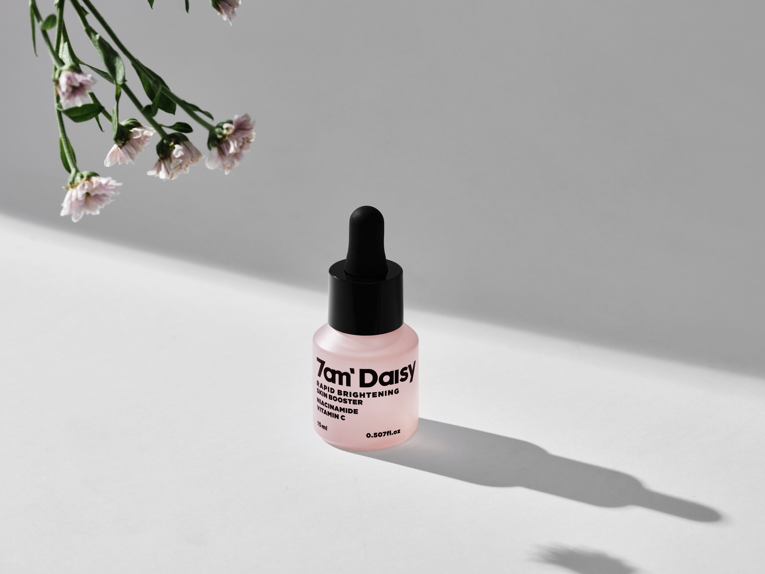
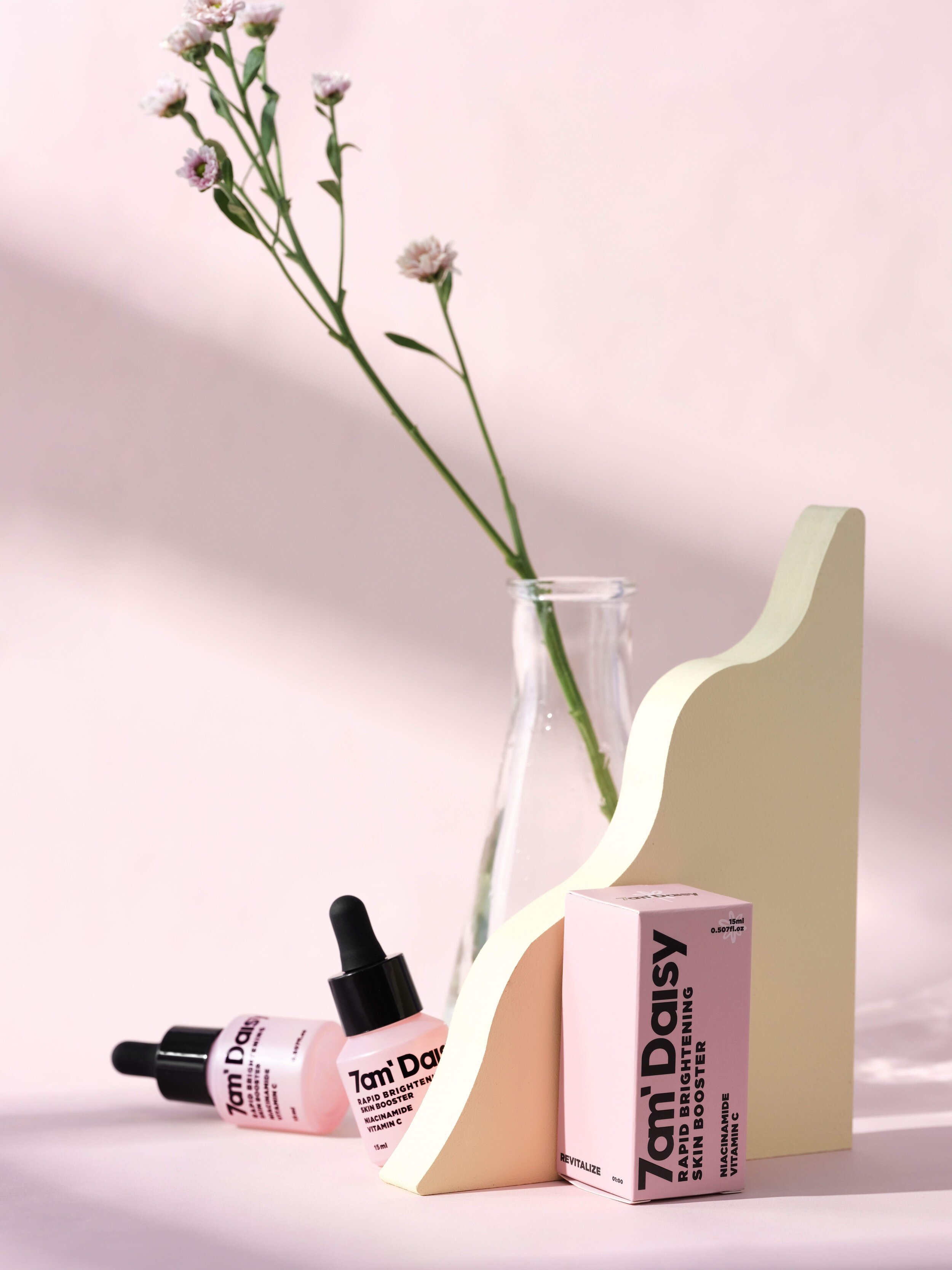
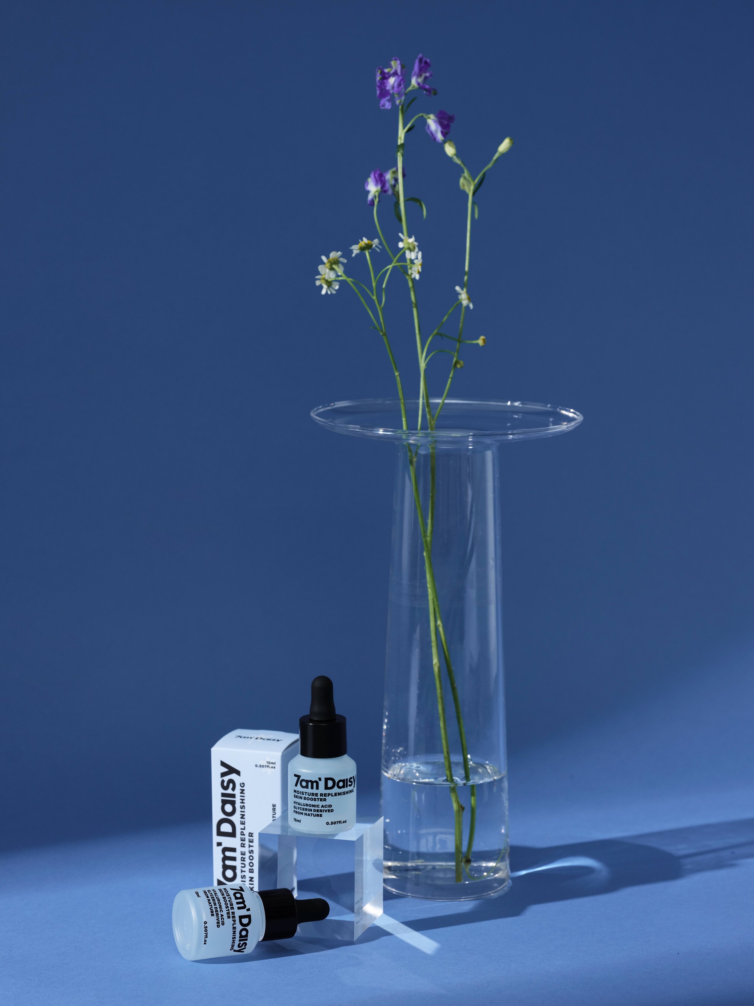
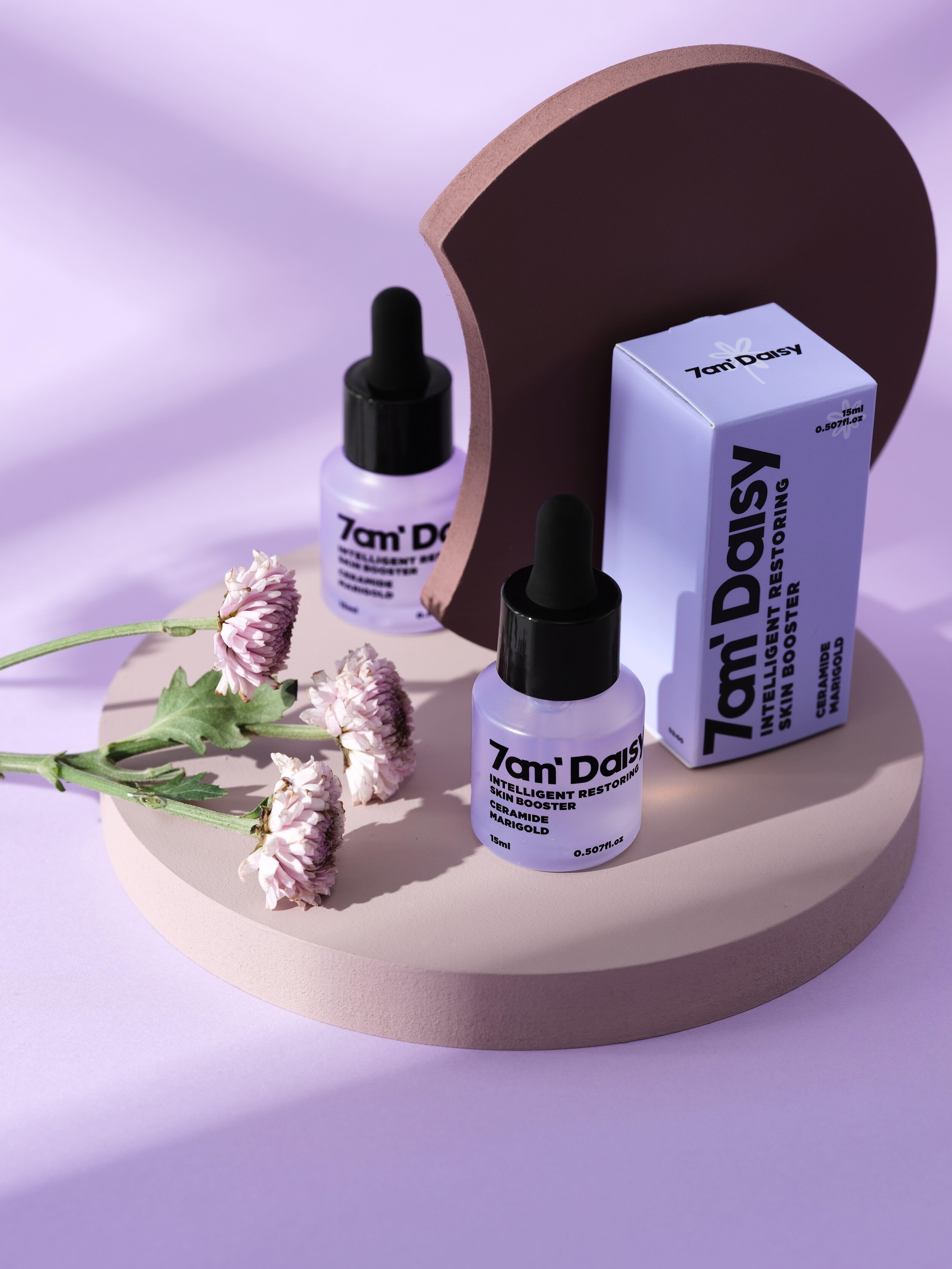
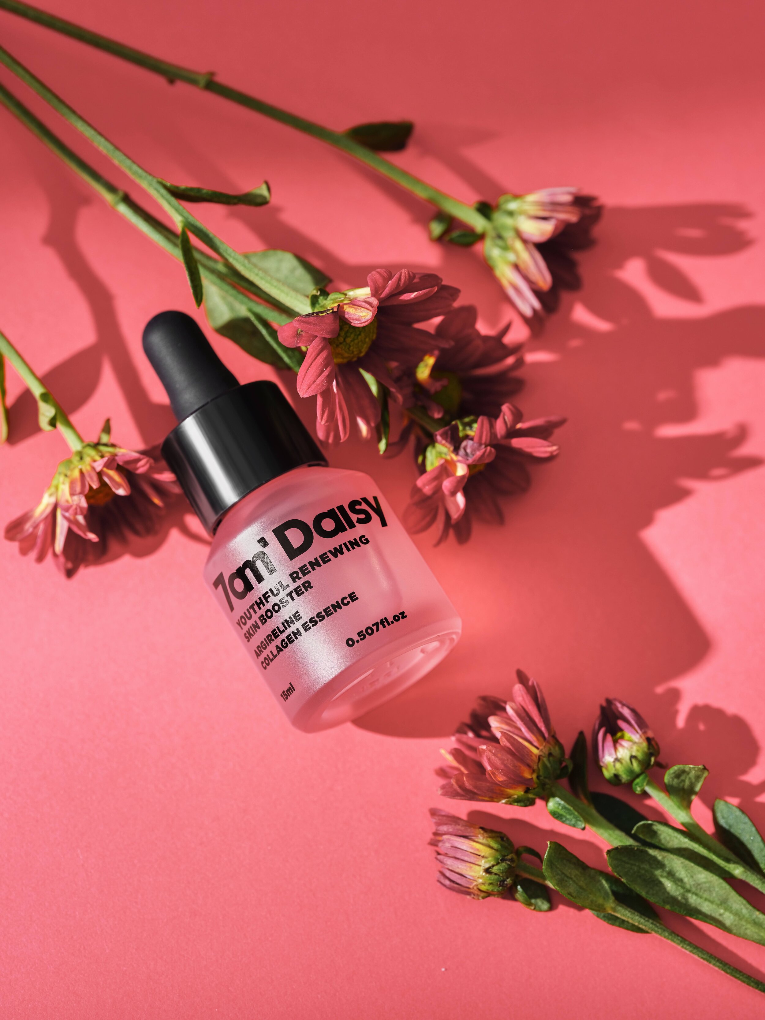
7AM DAISY is inspired by the magic of those fluids and Daisy flower that closes at night and opens during the day as a symbol of freshness and purity, and is designed to give you that healthy, dewy, naturally glowing “morning skin” throughout the day!
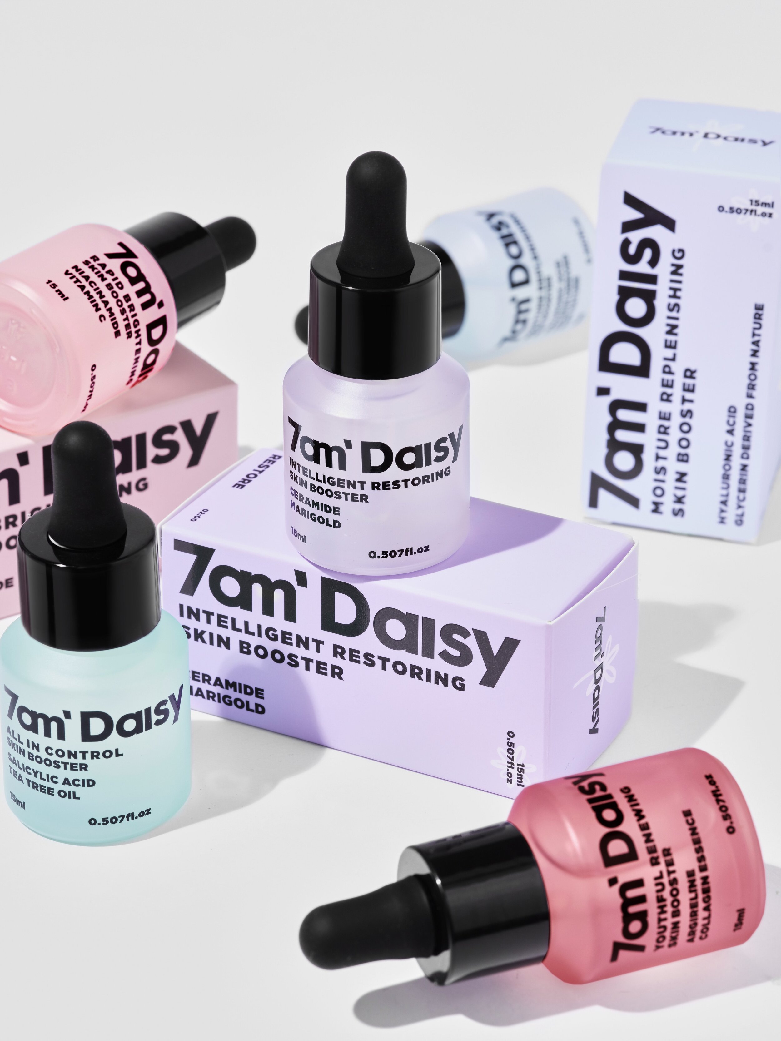
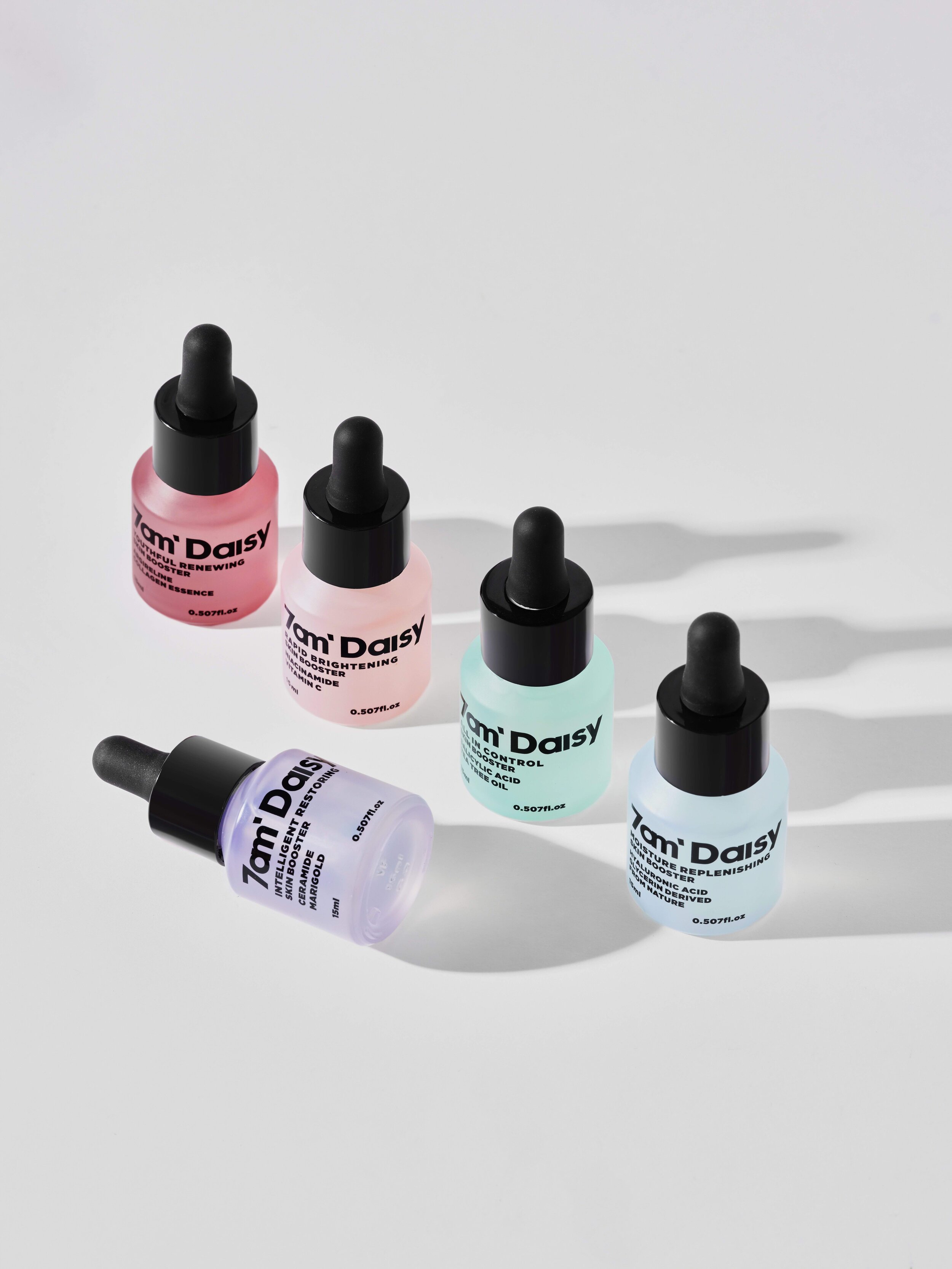
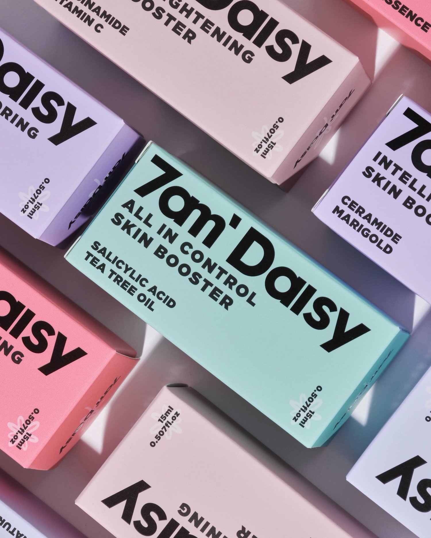
The product design used 5 colors to represent 5 different function: BLUE-REPLENISH, RED-RENEW, PINK-REVITALIZE, PURPLE-RESTORE, GREEN-RESCUE. The collision of color- block such as daisy blossom. The packaging design formed the differentiation between traditional skincare. A daisy logo mark half-seen on the packaging perfect matching brand concept. The colors of packaging speaks a strong visual impact, constant and coherent alteration generates beauty. More international visual language, more youthful attitudes of skincare.
The product already launch in Southeast Asian countries such as Singapore, Malaysia, Thailand. Awarded 4.9 score on makeup Internet platform such as SHOPEE. 7AM DAISY has been a new Internet celebrity on INSTAGRAM.
Unique design concept:
Attempting to re-examine the skincare industry's design style of using componential icons in a regular way to inject vitality into the skincare industry.
The packaging captures the habits of professional skincare users, highlights the componential elements, and shapes the new generation of skincare brands through the reorganization of information levels and bright colors. On the other hand, bring the energy from makeup into skincare.


