THE CARBONATION

THE CARBONATION
Client: The Carbonation
Design Company: .Oddity Studio
Direction: Alice Mourou
Account Manager: Kirill Runkov Motion Graphic: Nikita Schchukin Design: Alan Wa Lun
Country: Hong Kong
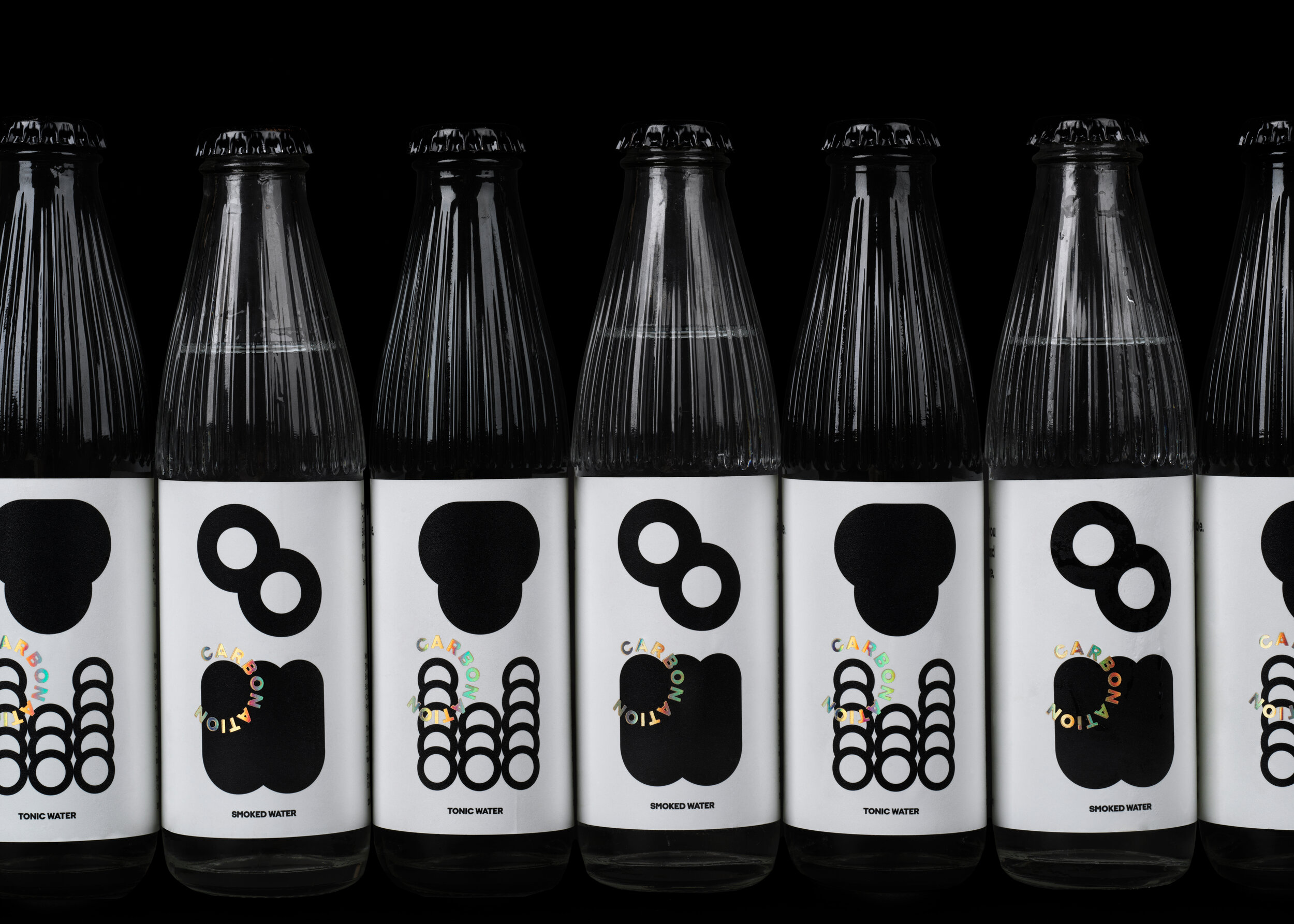
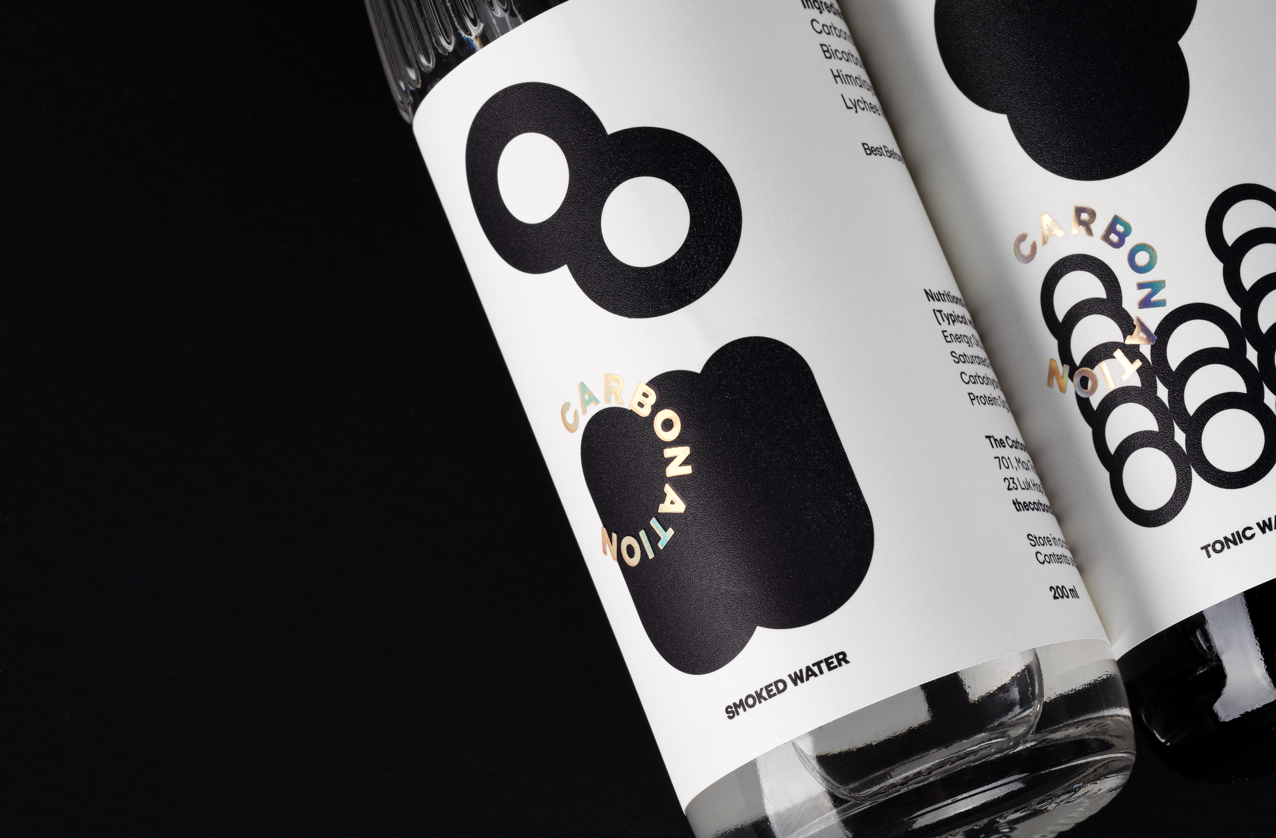
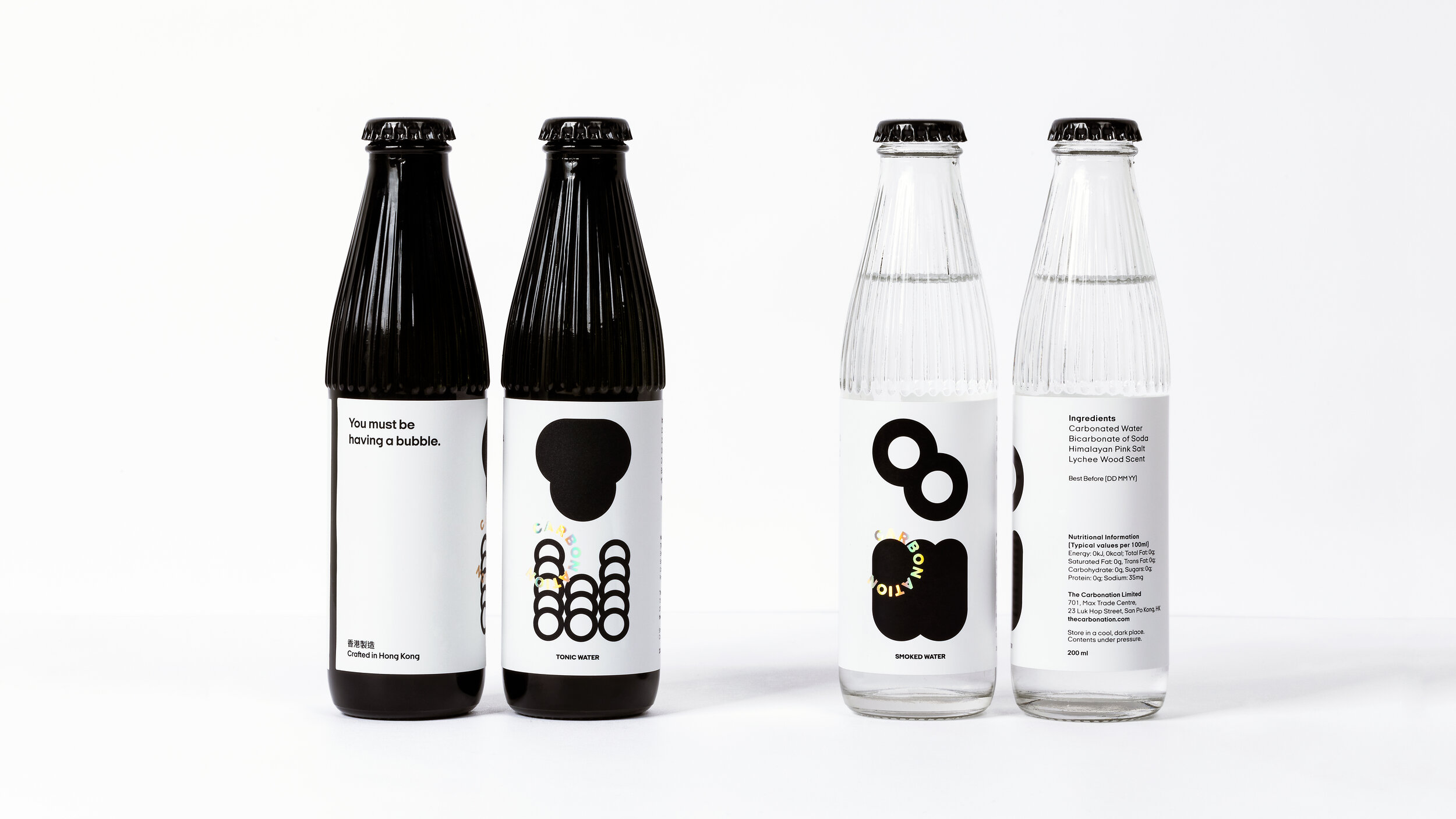
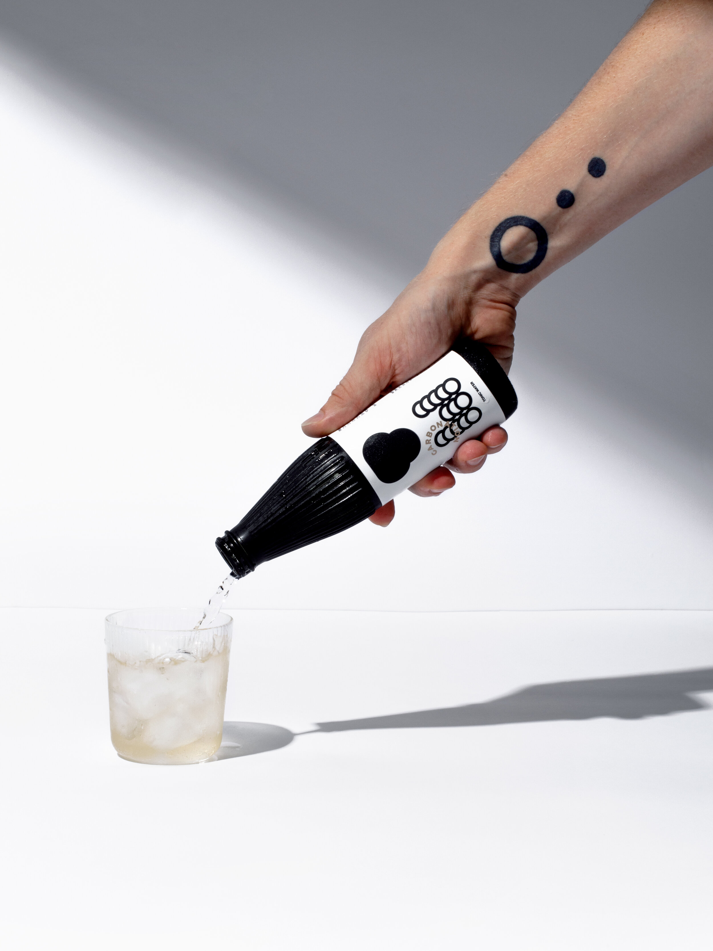
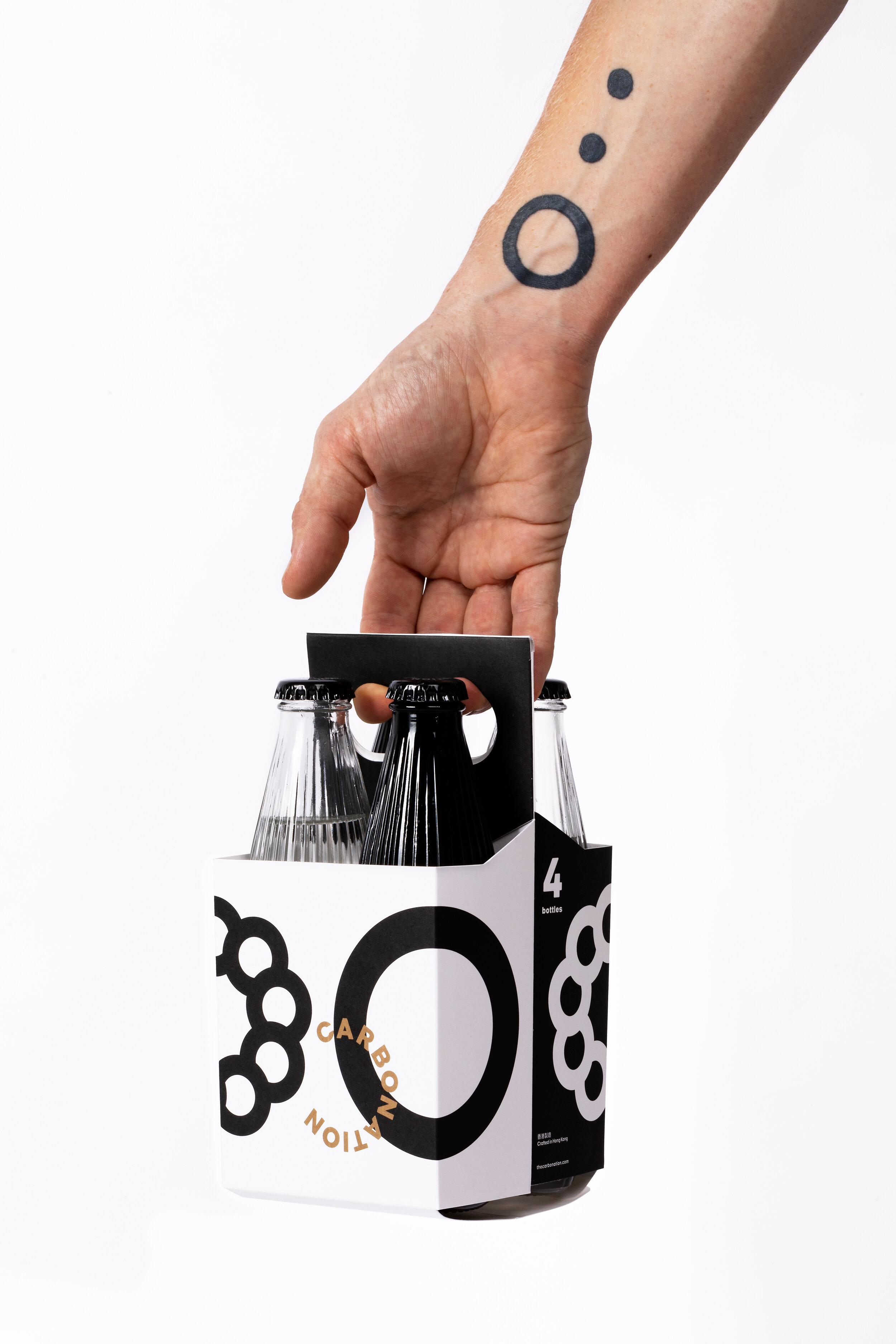
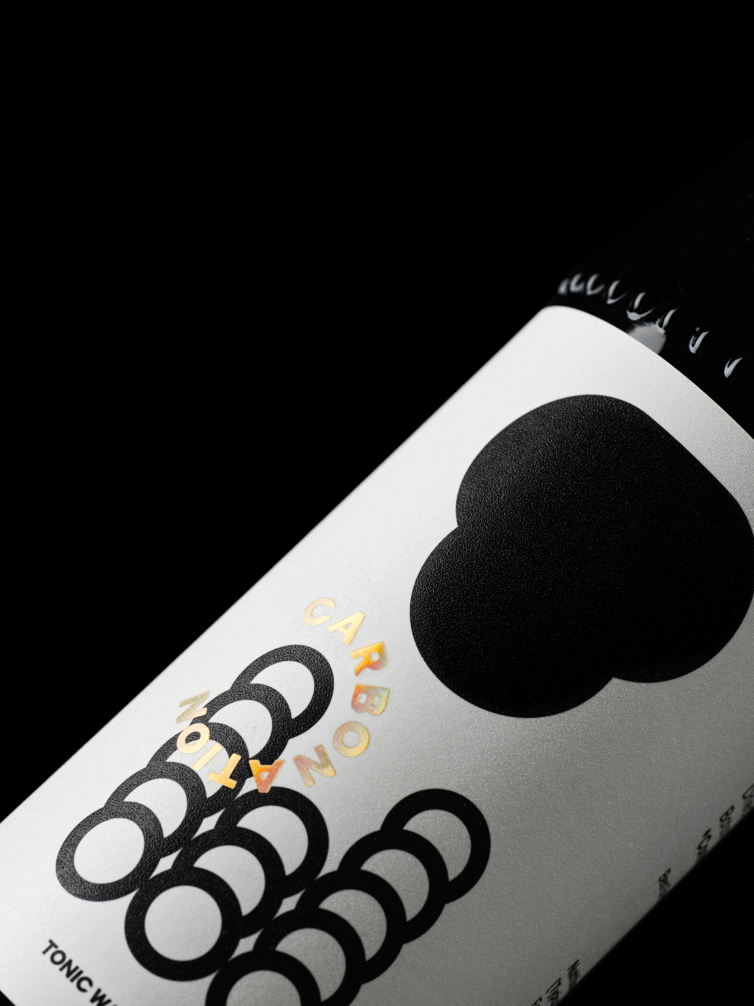
Bubble language
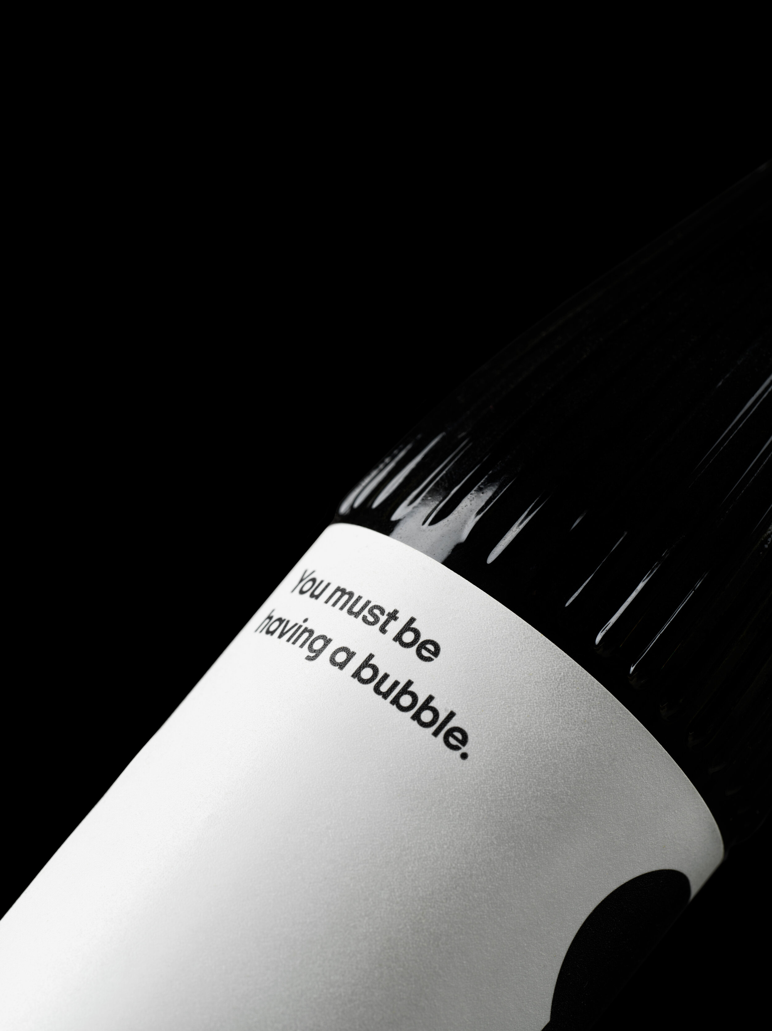
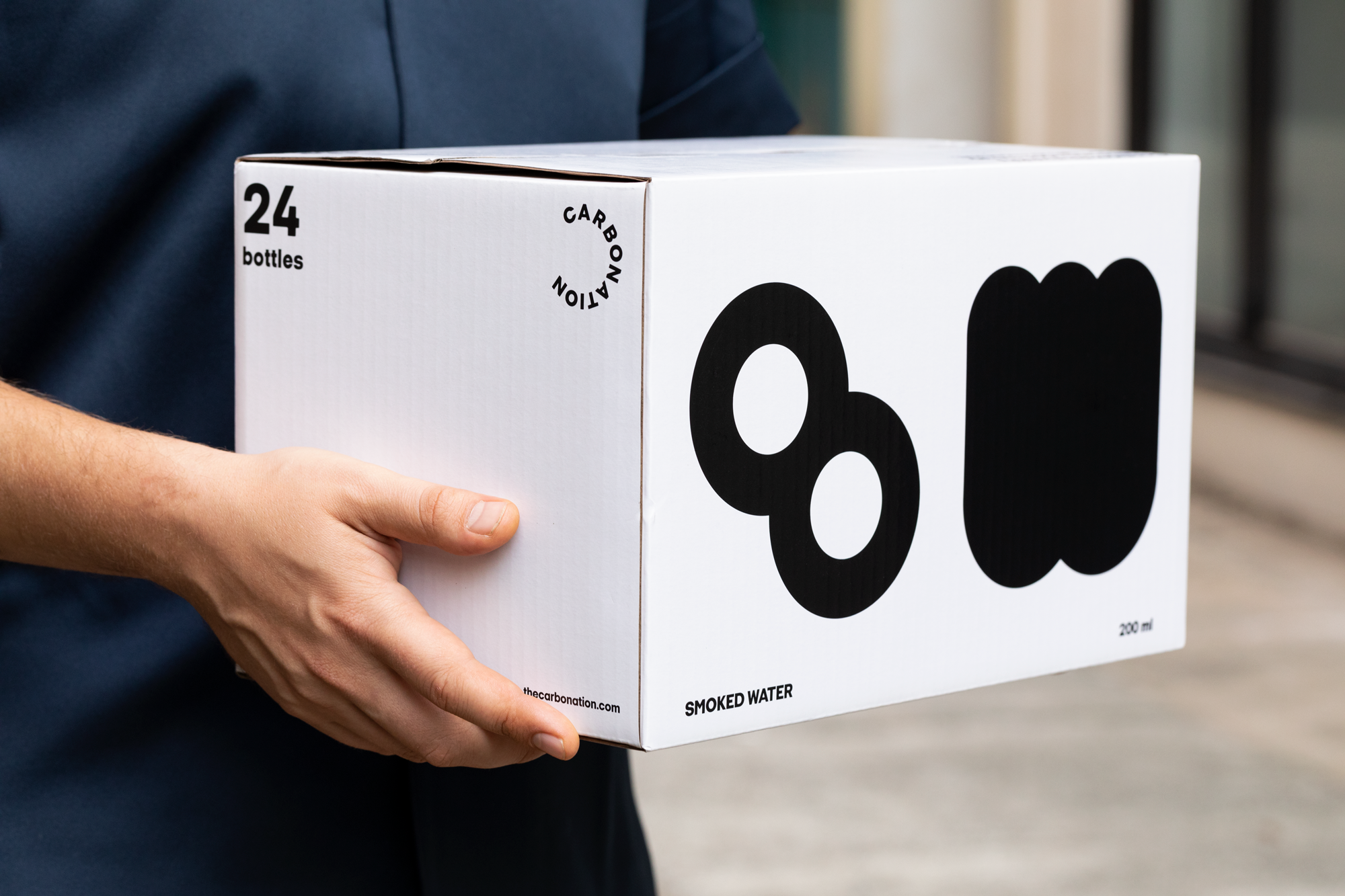
Carbonation is an independent brand of fizzy cocktail mixers from Hong Kong. We have developed it’s full brand identity with a strong focus on packaging: labels, boxes, sleeves and bottles. Visual language of the identity is based on basic bubble shape that forms a whimsical secret alphabet to convey brand’s message of concealed local aesthetic and exclusivity.
It is playful and eye catchy, yet mature and smart. Even the logo easily becomes part of artistic interplay as it follows round shape.
Bubble shape is also used for crafty die cuts that form another graphical layer to complement visual system. It serves as a centrepiece element for applications as bottle opener, business cards, coasters.