AHUA Handmade Soap
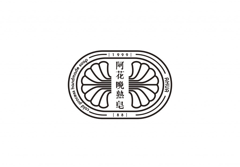
AHUA Hand Made Soap
Client: AHUA
Design company: 2TIGERS Design Studio
Art Director: Kuan
Designer: Kuan, Pai
Photography: Pai
Country: Taiwan
Cold process handmade soap is from the west, while AHUA is from Taiwan. AHUA is an attitude, a character, it represents the spirit of purity yet full of passion. Inspired by the founder's grandmother (Ama), the brand was founded to pass on her wisdom of respect to the nature. In addition, to tribute to all the strong female figures in Taiwan.
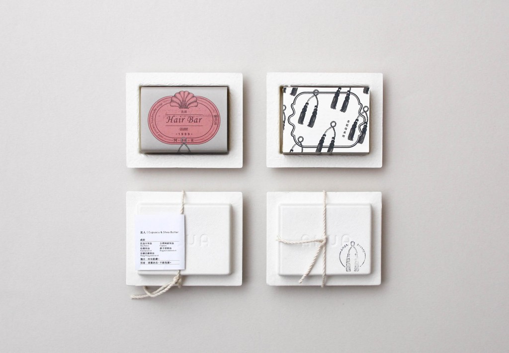
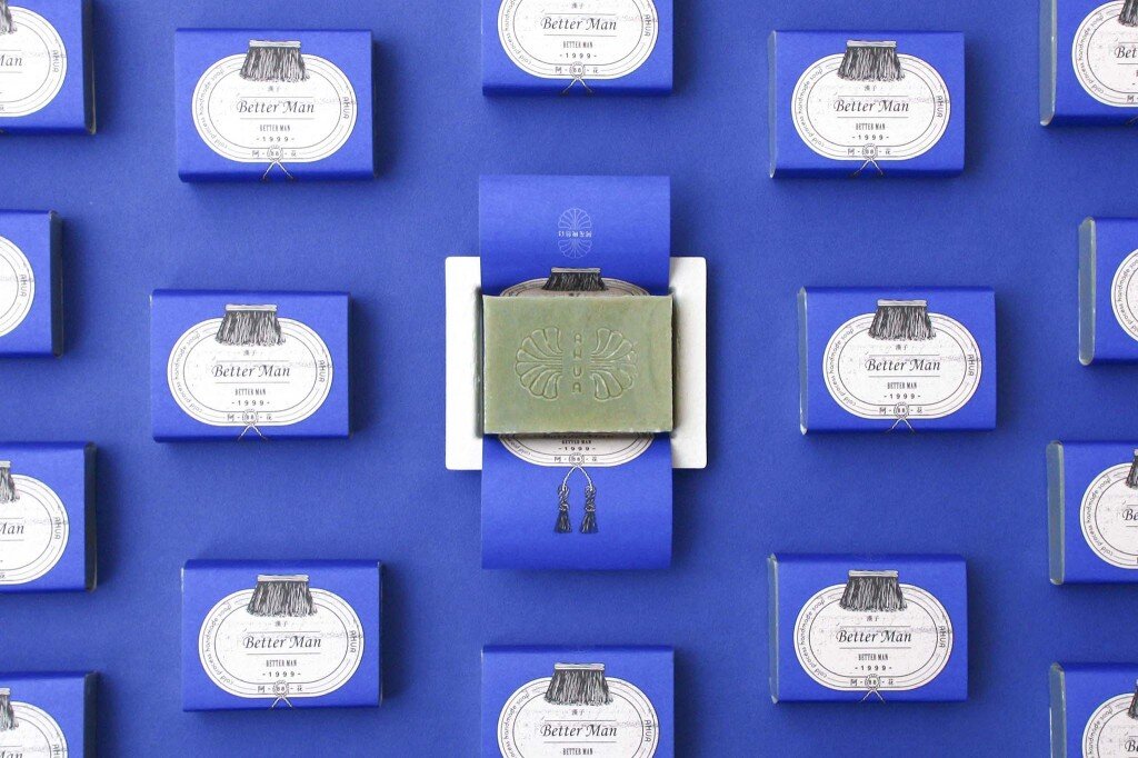
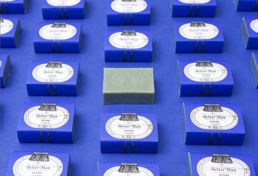
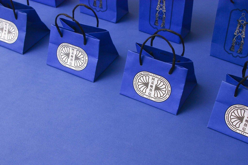
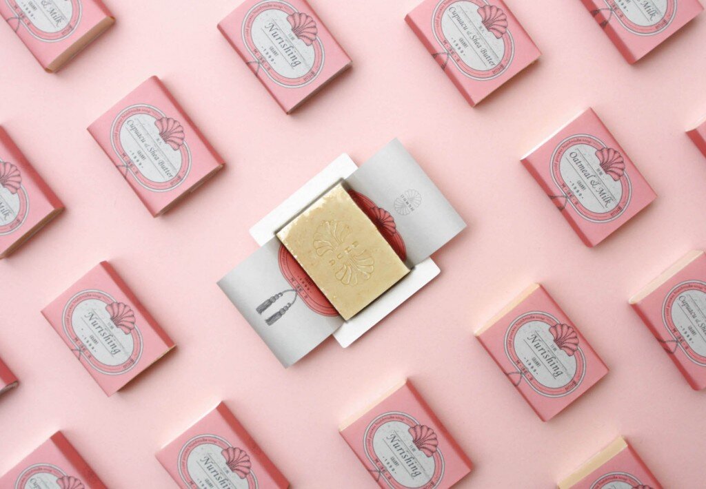
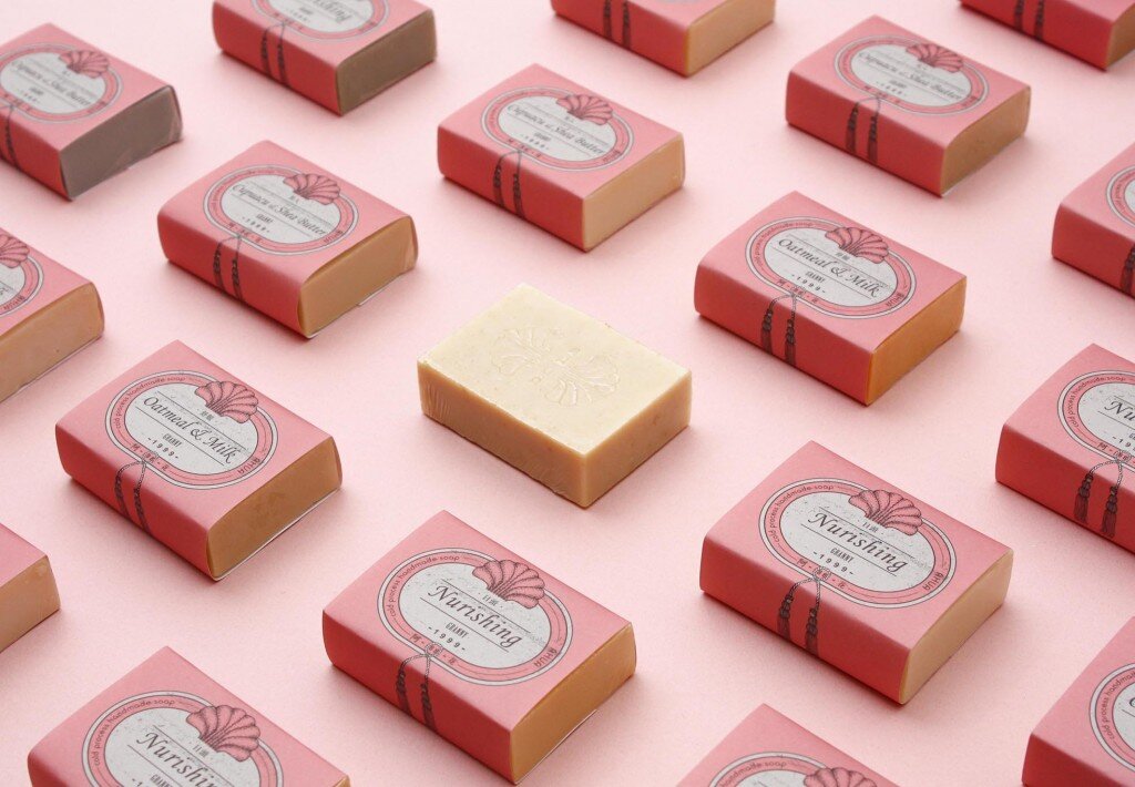
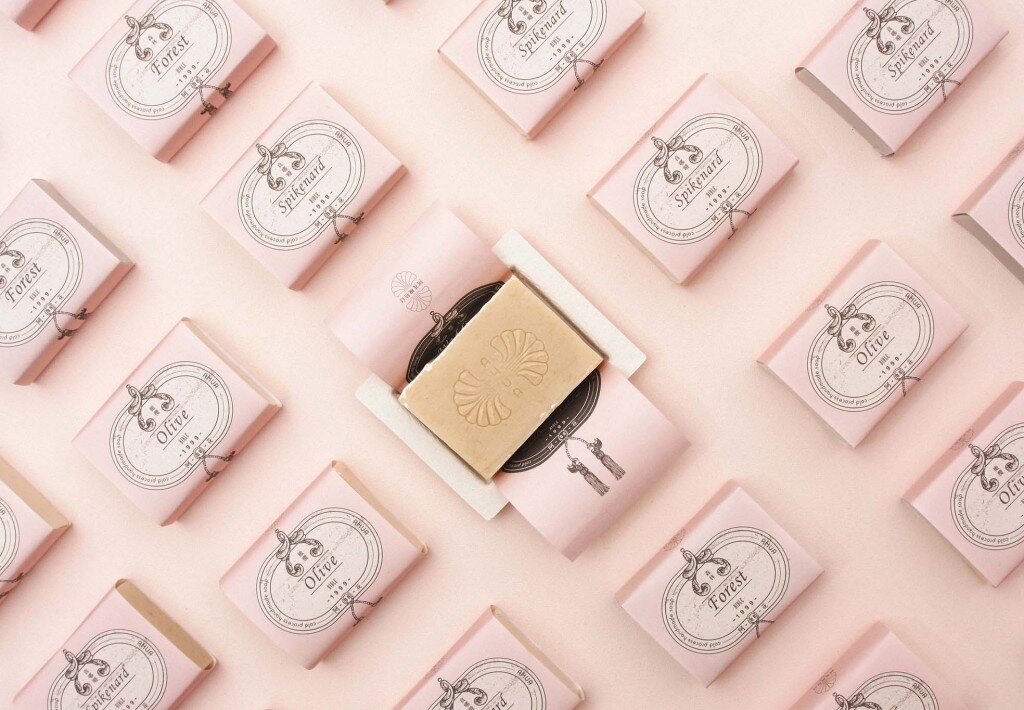
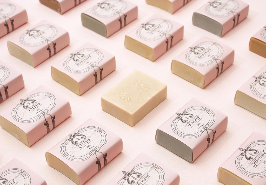
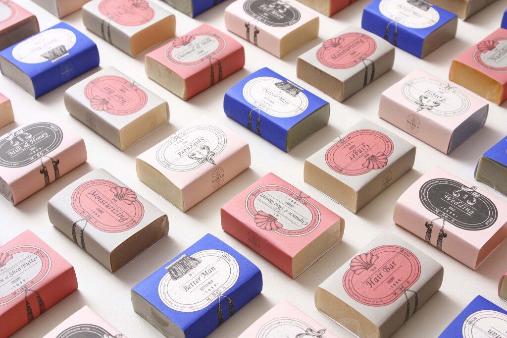
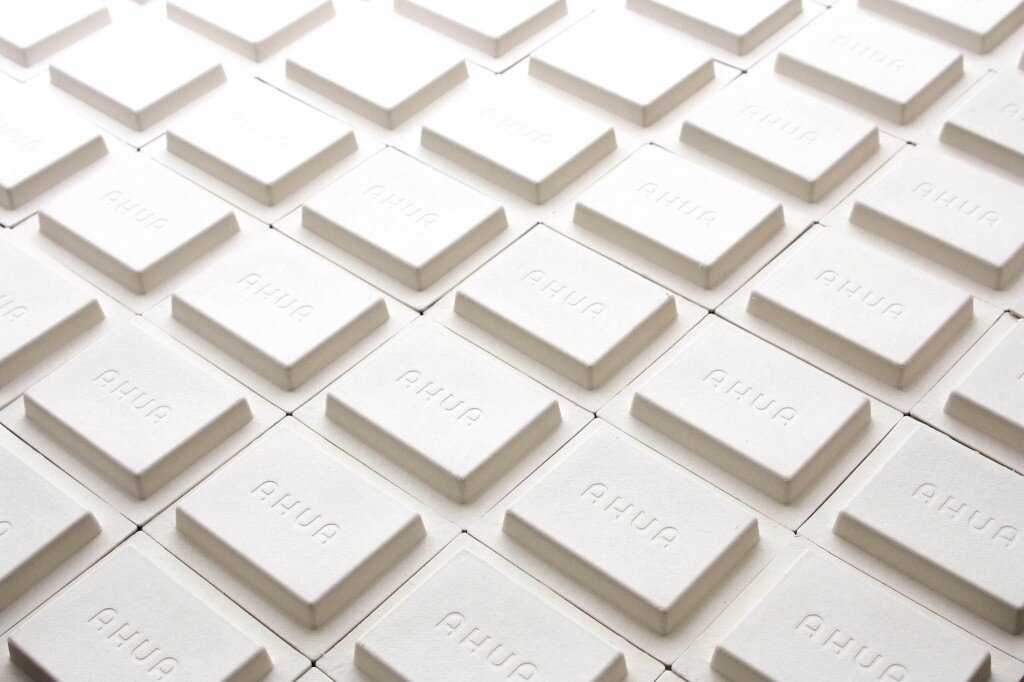
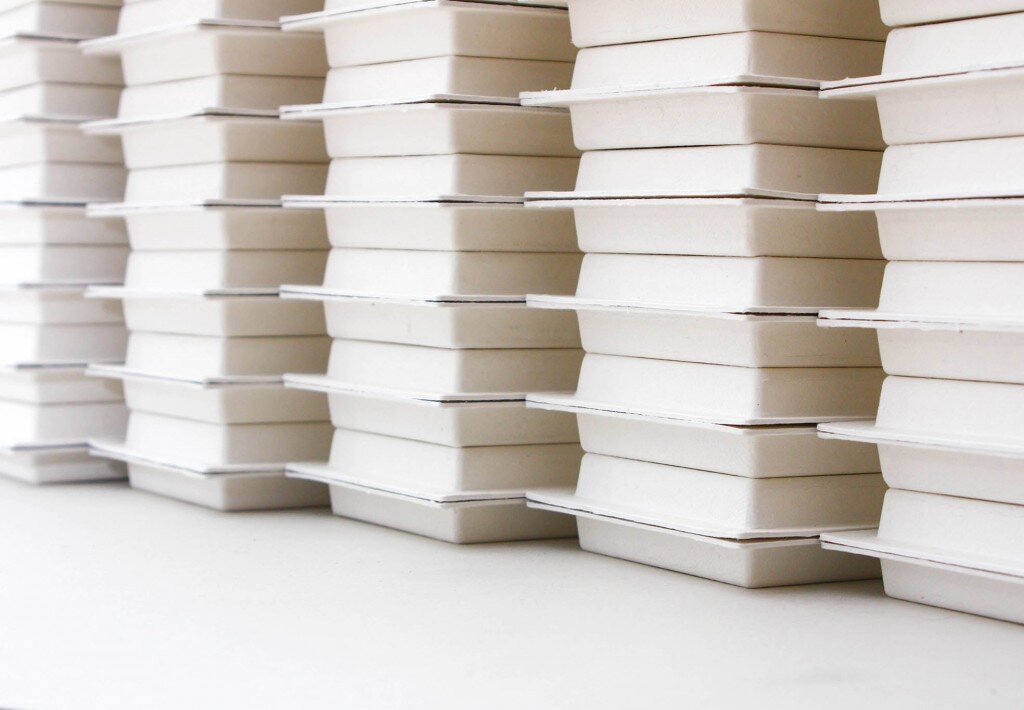
The packaging adapted the European style as the main focus of the design, with details of the local touch, that is, the shape of the soap from the early days as the frame of the logo, paired with the cockscomb flowers which previously represented Taiwan. In the series, the sharp blue color is specially used to reflect the fearless and strong personality of Ama. Paper pulp was chosen as the packaging material to match with this handmade soap with natural materials.
BRAND:
'Hua' means flowers in Chinese, the brand name AHUA was inspired by the grandmother (Ama) who liked to handpick different kinds of herbs and flowers she saw on the road, and to convert them like a magician into various utilities such as repellent oils and medicines. Ama also grew many plants in her garden in which the cockscomb flowers were the most eye-catching. Ama loved and respected the nature, and believed that simplicity is not easy but natural is the best. She never asked for more but her next generations to live healthily, just like how other Taiwanese females' efforts to the families day by day. "Natural is the best", to pass on Ama's motto, AHUA has been using the most natural ingredients to their cold processed handmade soap since 1999.
SERIES:
Granny - brick red with grandma tassels
Bible - pink with angel tassels
Better man - blue with brush
Digital Communication services, including website design, search engine optimization, social media, and content creation for nonprofit organizations, consultants, and creative entrepreneurs.