DEODEOKMONG - DEODEOK JERKY
DEODEOKMONG - DEODEOK JERKY
Client: DEODEOKMONG
Design Company: FRONT KIT
Creative Direction: Min Ah Hong
Art Direction / Design: Yun Woo Shin
Naming / Storytelling: Min Gi Hong
Design: Jung In Lee, Hyeok Kim, Ga Bin Kim
Photography: Yun Woo Shin, Ga Bin Kim
Country: South Korea
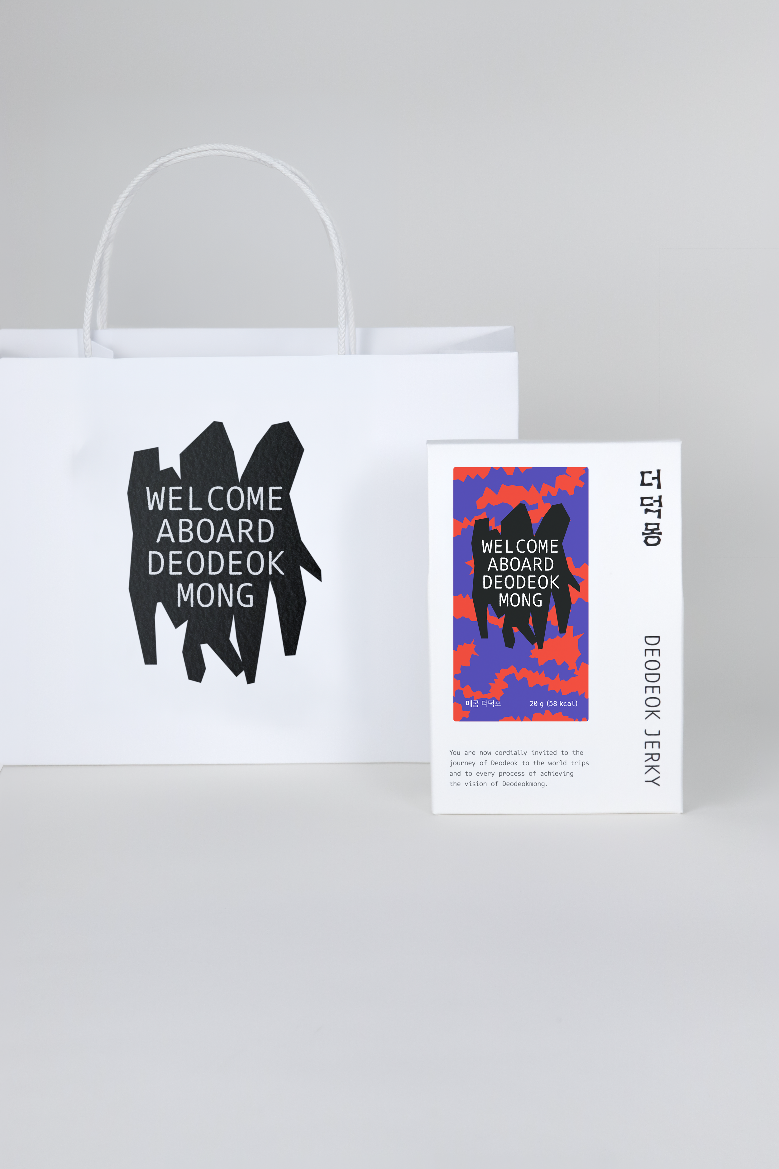
DEODEOKMONG is a food brand that explores new possibilities for deodeok, a valued root vegetable in Korean cuisine. The brand name combines “deodeok” with “mong” (夢), meaning “dream,” embodying the brand’s vision of reimagining deodeok in new ways.
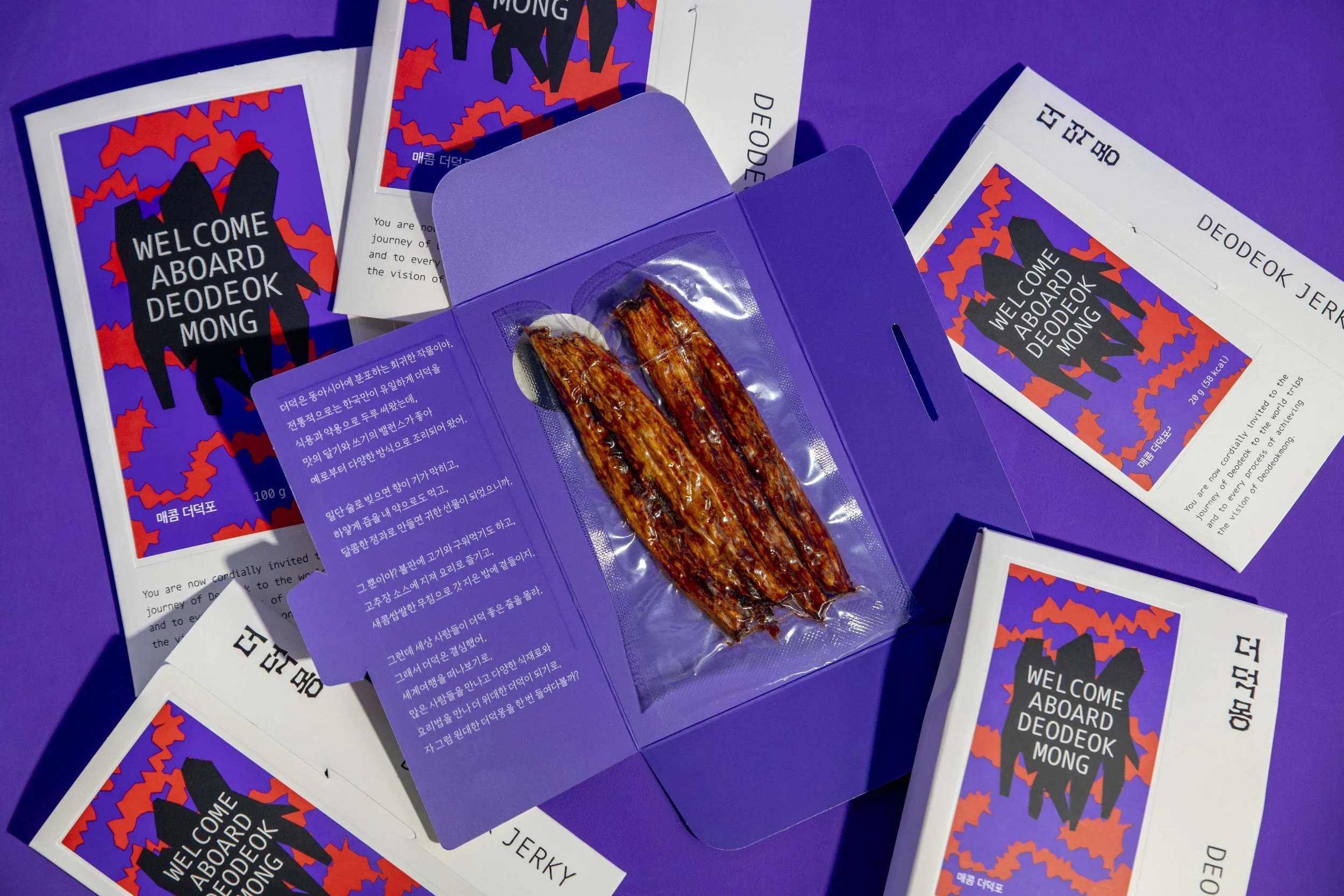
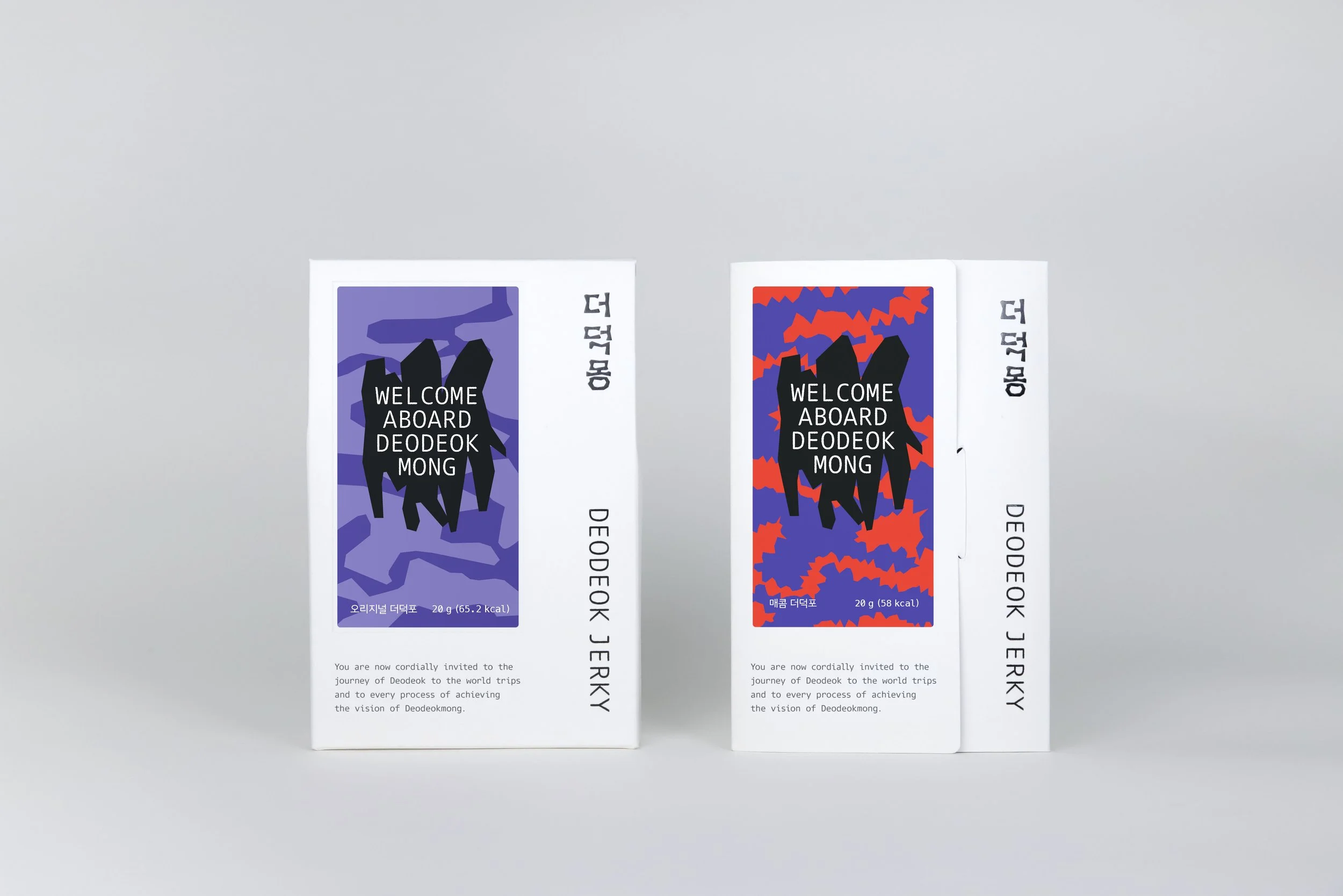
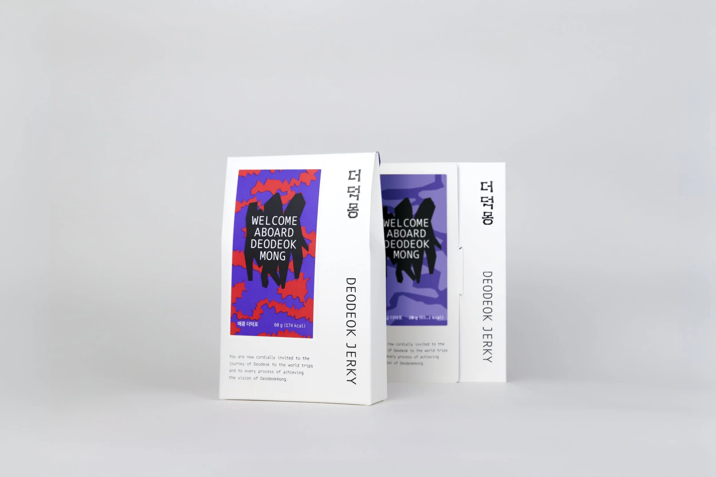
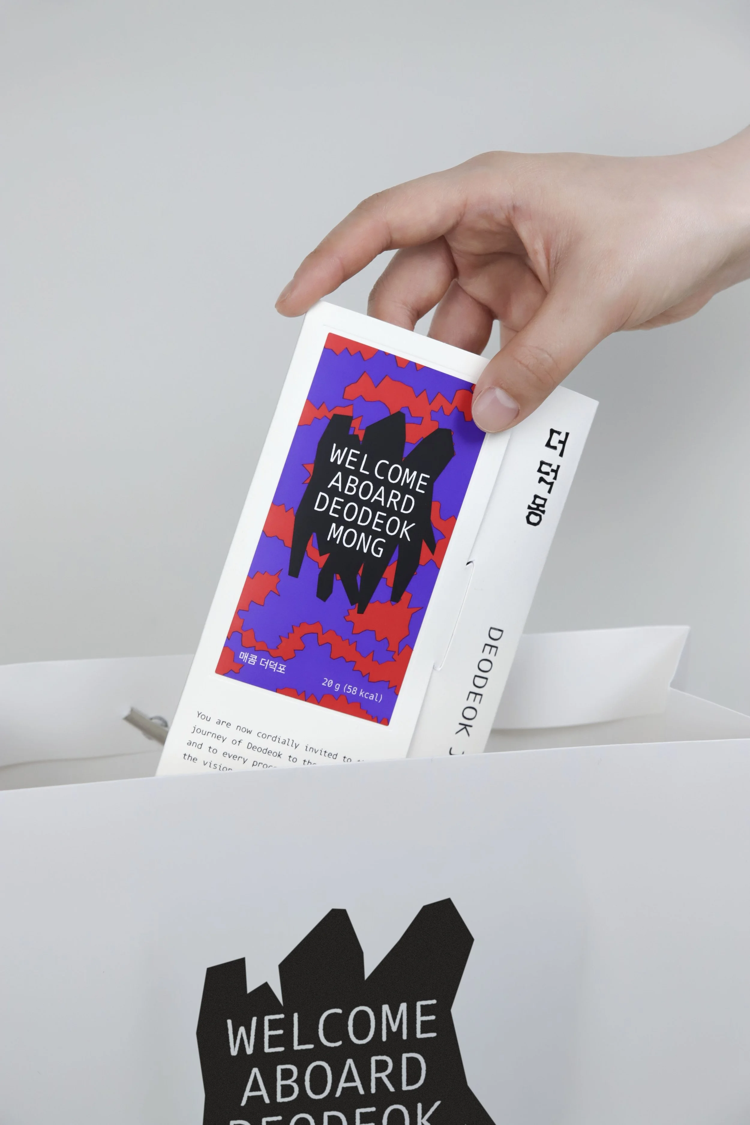
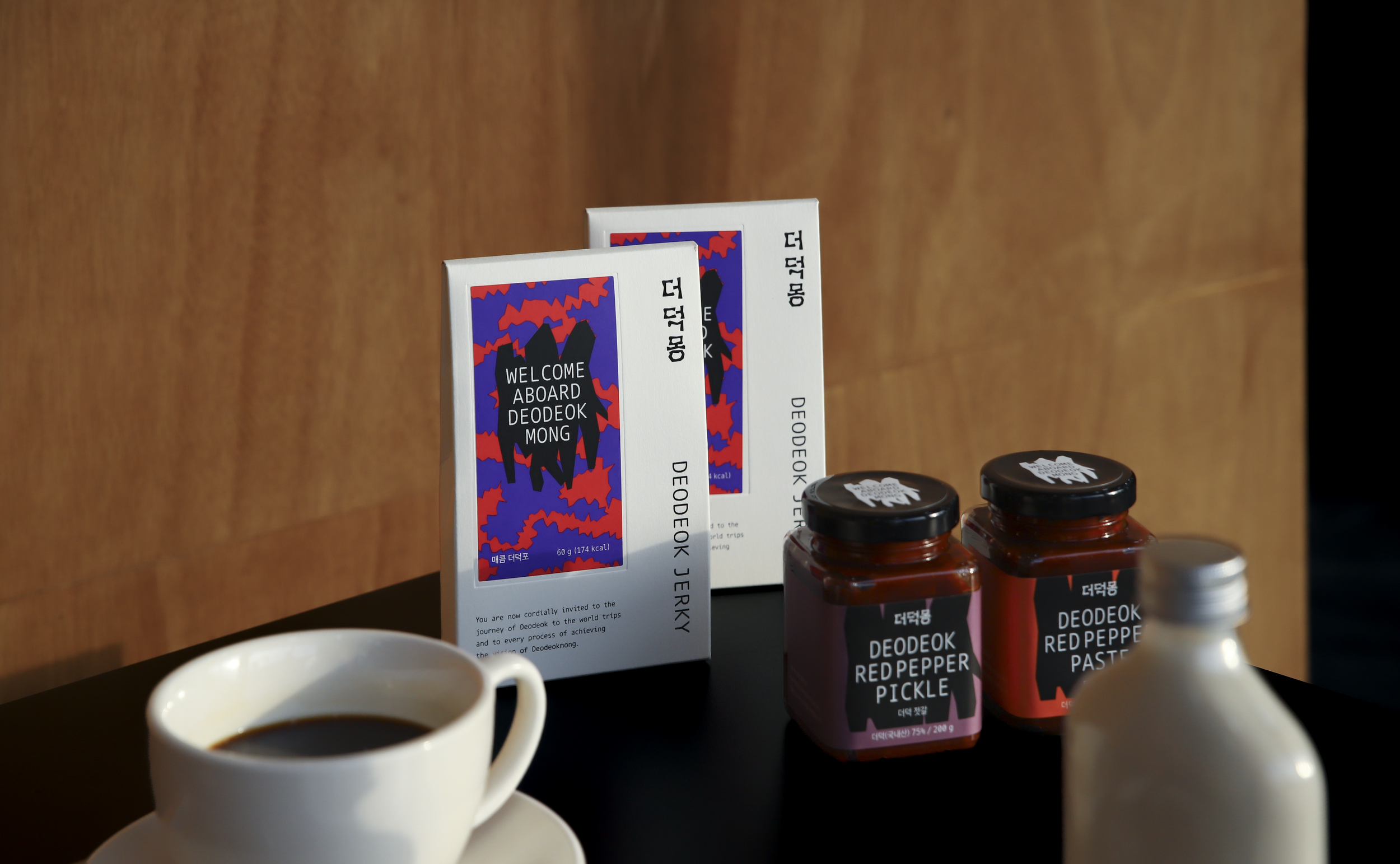
The brand identity begins with the distinctive shape of deodeok. The bold logo is derived from the silhouette of bundled deodeok roots, and this form is extended into a key visual motif throughout the brand identity and packaging.
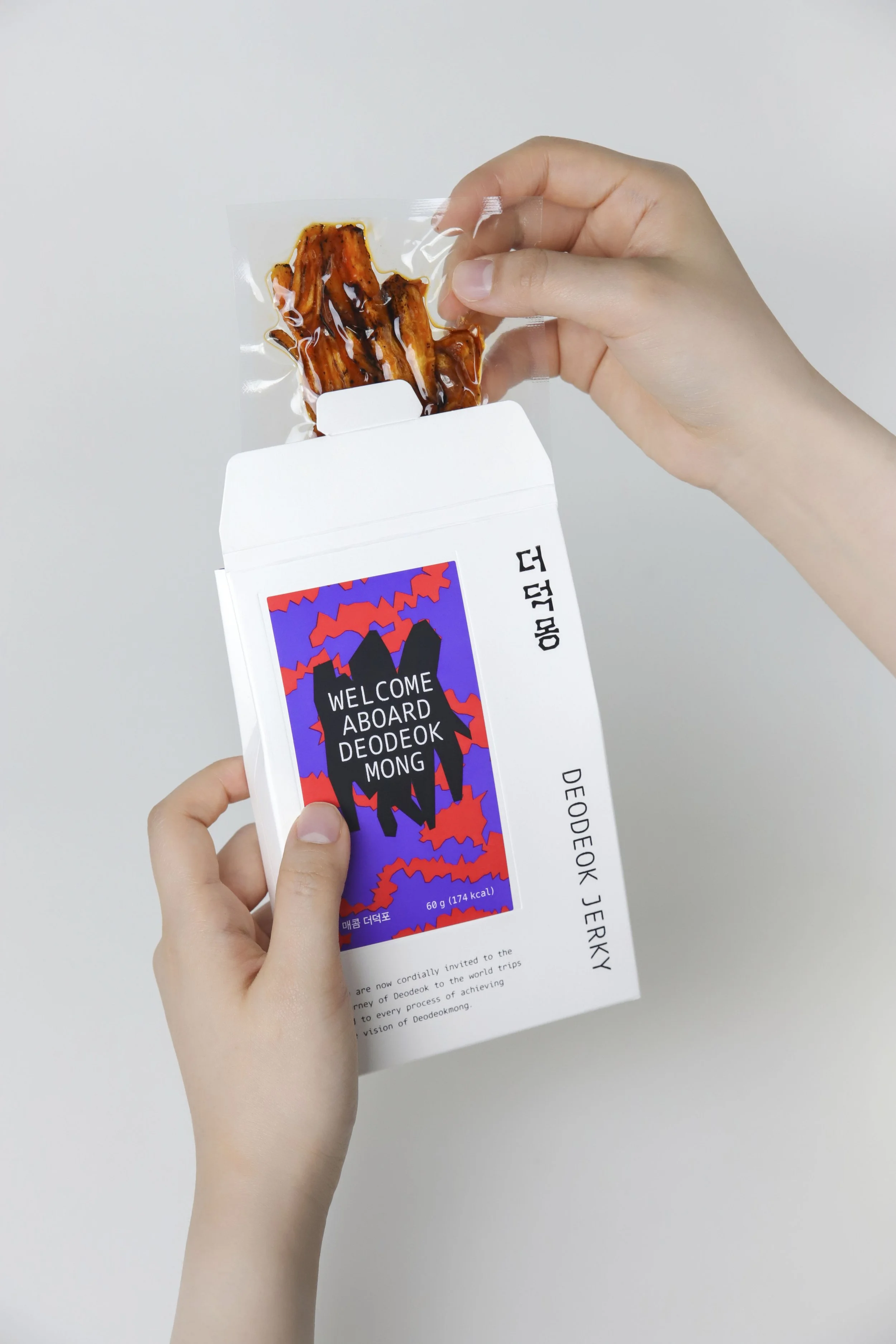
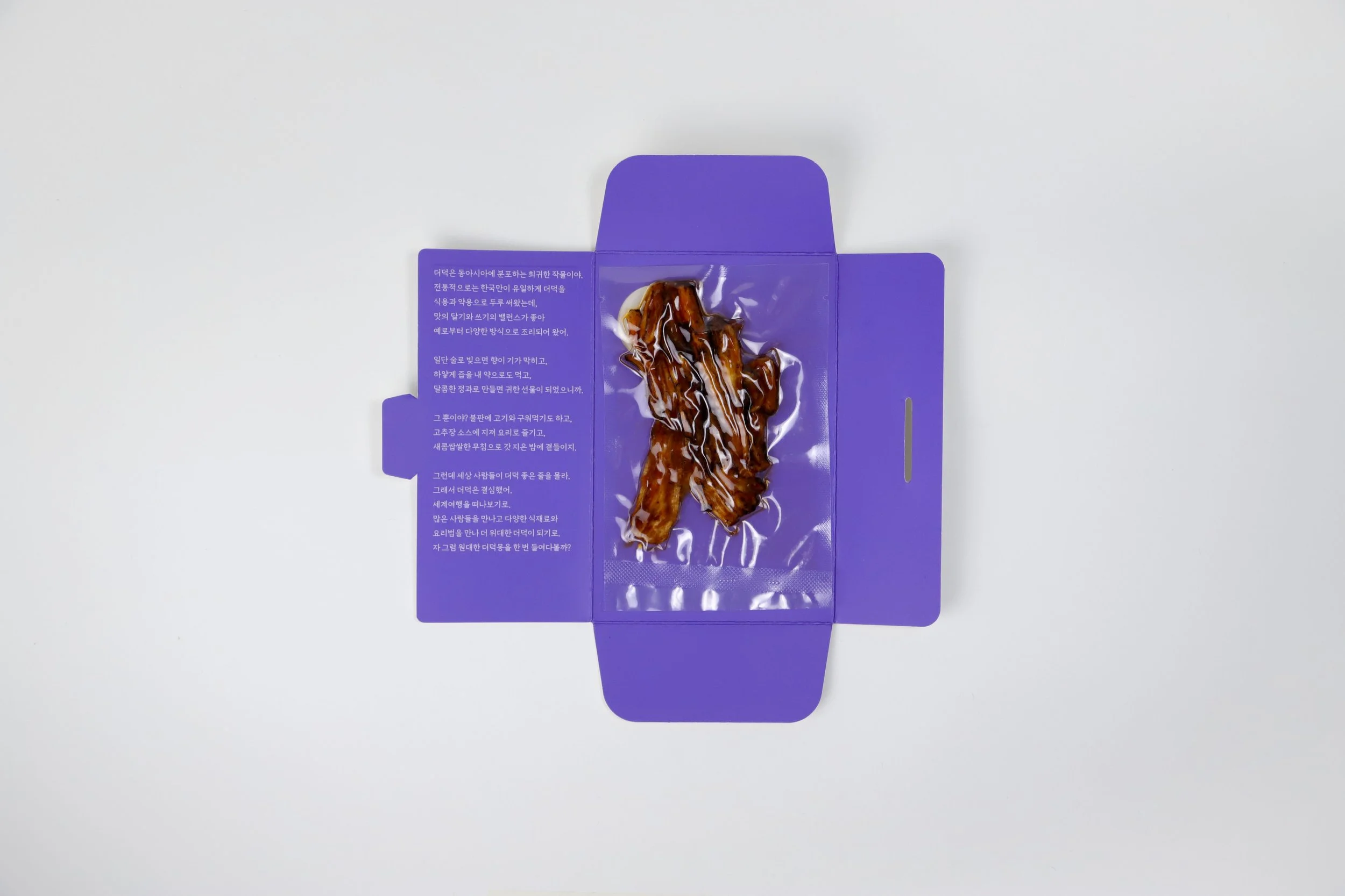
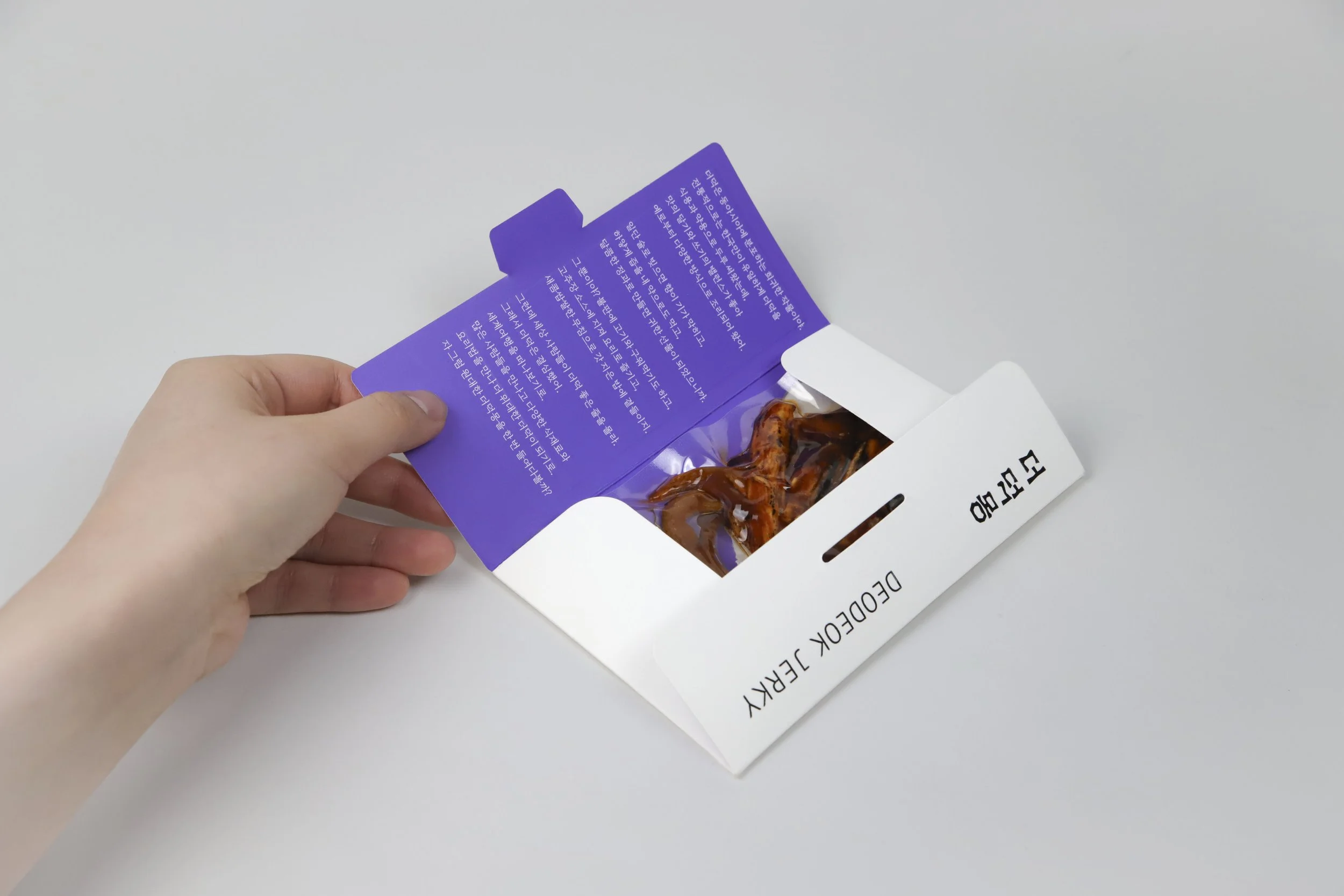
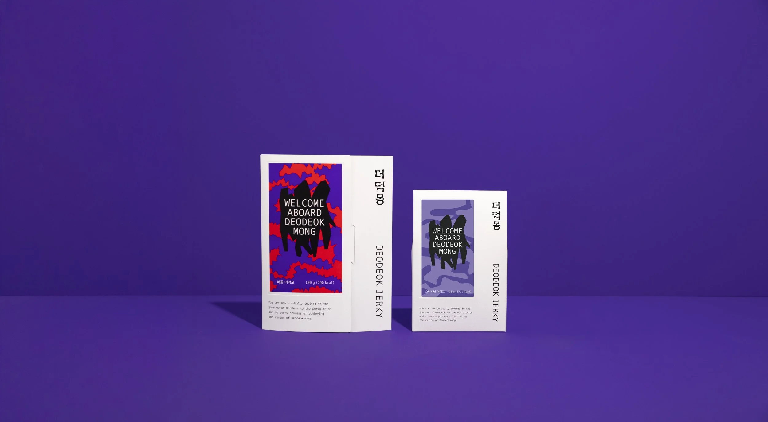
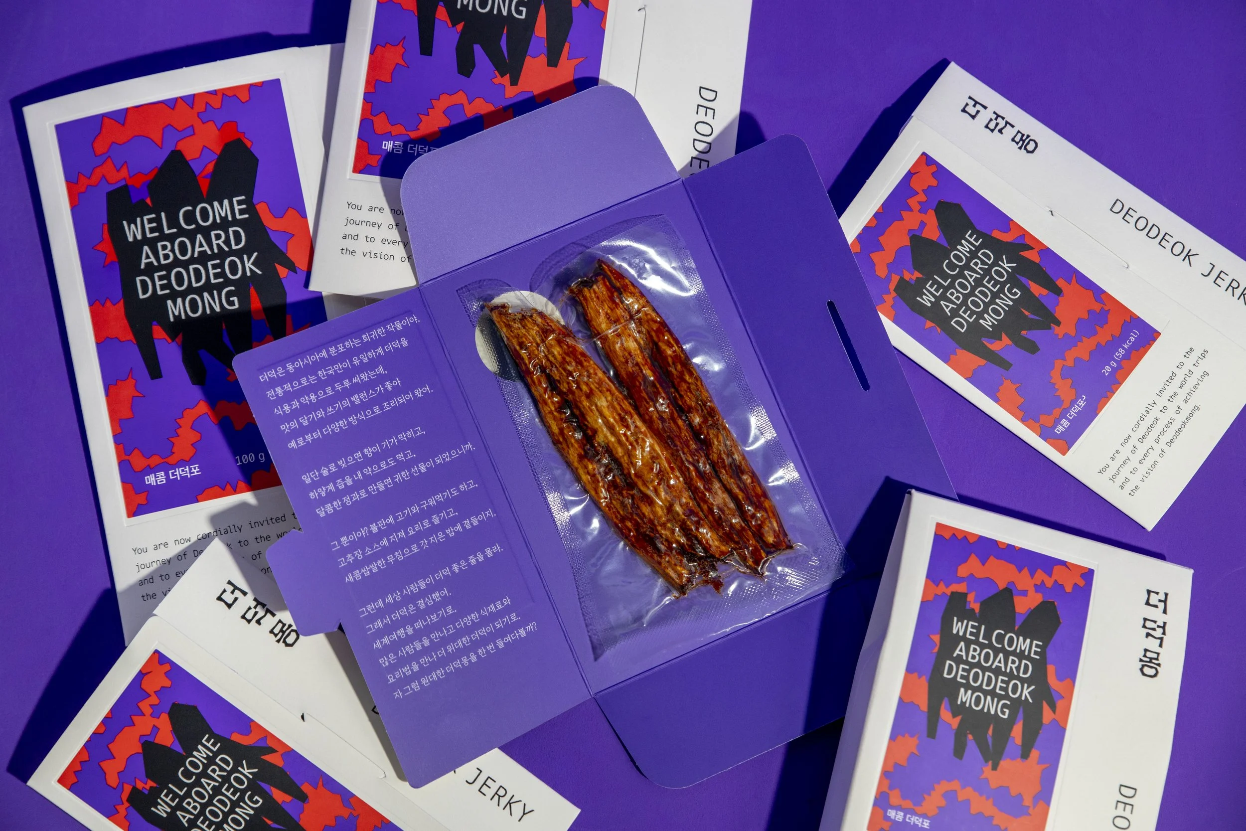
The packaging for DEODEOK JERKY presents a modern and playful interpretation of deodeok. The key visuals for each product translate the flavor and characteristics of each sauce into graphic elements, giving each variety its own personality while maintaining a consistent brand identity.
Through the combination of an iconic logo, flavor-inspired graphics, and bold visual language, the design moves beyond the conventional image of deodeok. Reflecting DEODEOKMONG’s core philosophy, the packaging expands the possibilities of deodeok as a contemporary food product while preserving the identity of the ingredient at the heart of the brand.
DEODEOKMONG was selected as a 2025 Korea Tourism Souvenir and received the Minister of Culture, Sports and Tourism Award.