Morishima

Morishima
Client: MORISHIMA SAKE BREWERY
Design: TRUNK
Creative Direction/Art Direction/Design: Ryotaro Sasame
Project Management: Satomi Sukagewa
Copy Writing: Sayaka Hirashima
Photography: Tsutsumi Yano, Wataru Onuma
Country: Japan
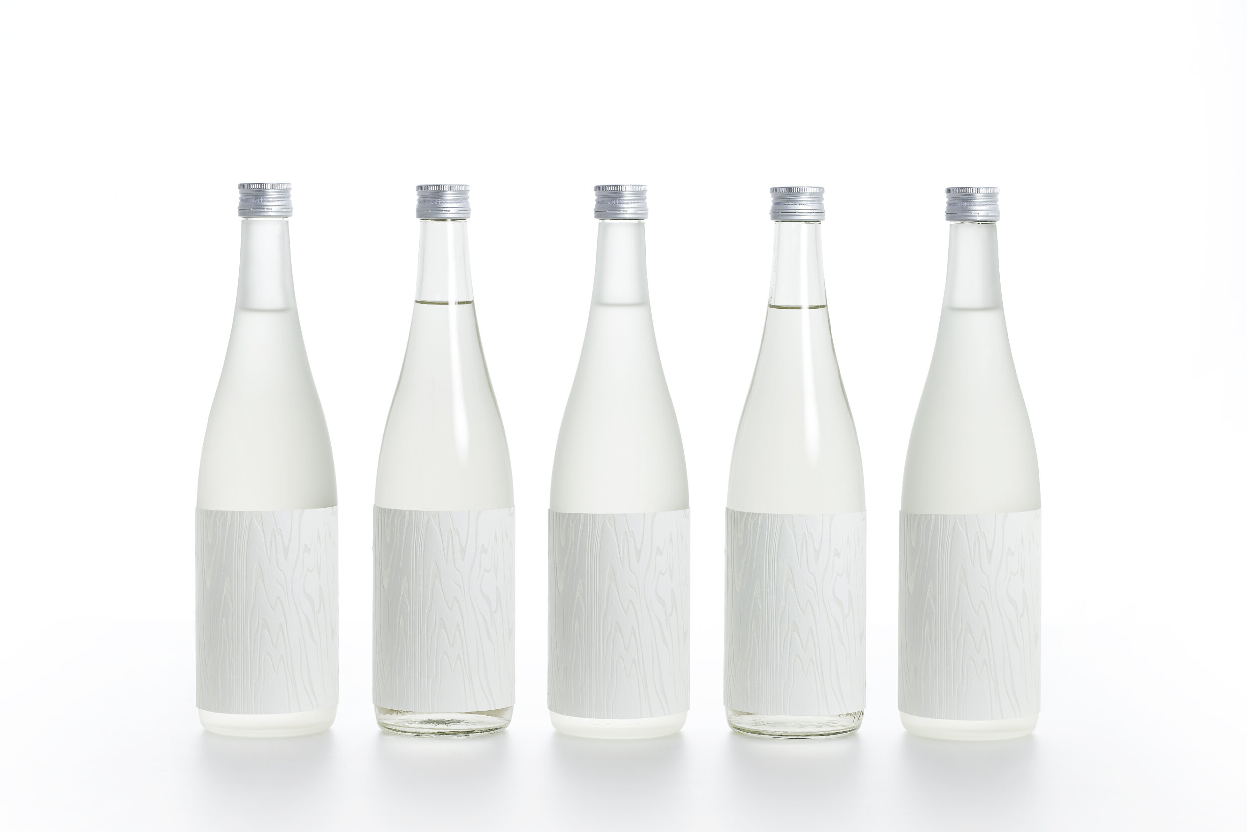
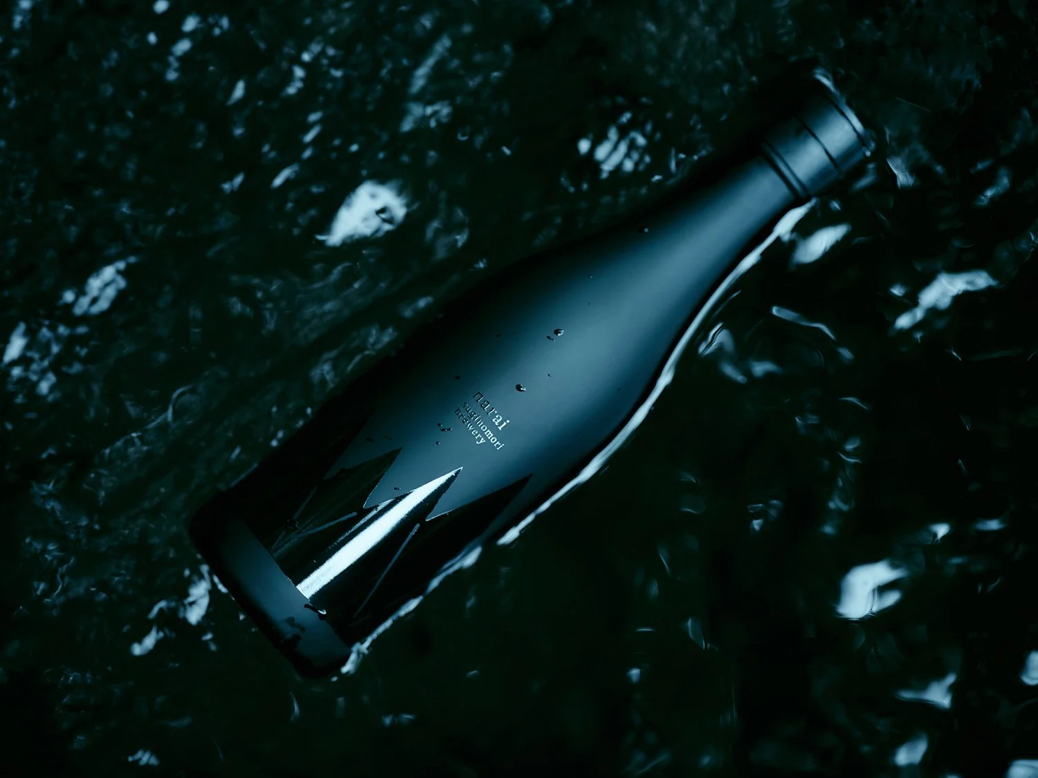
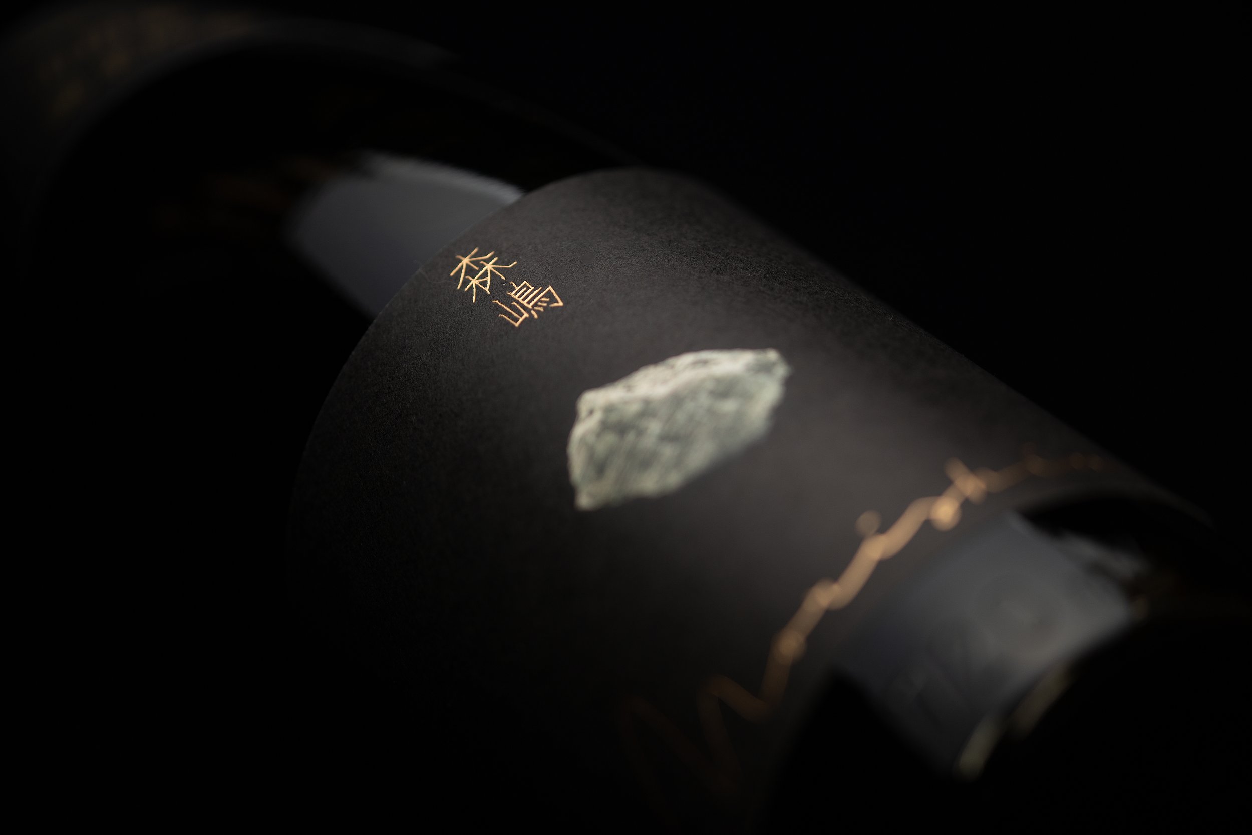
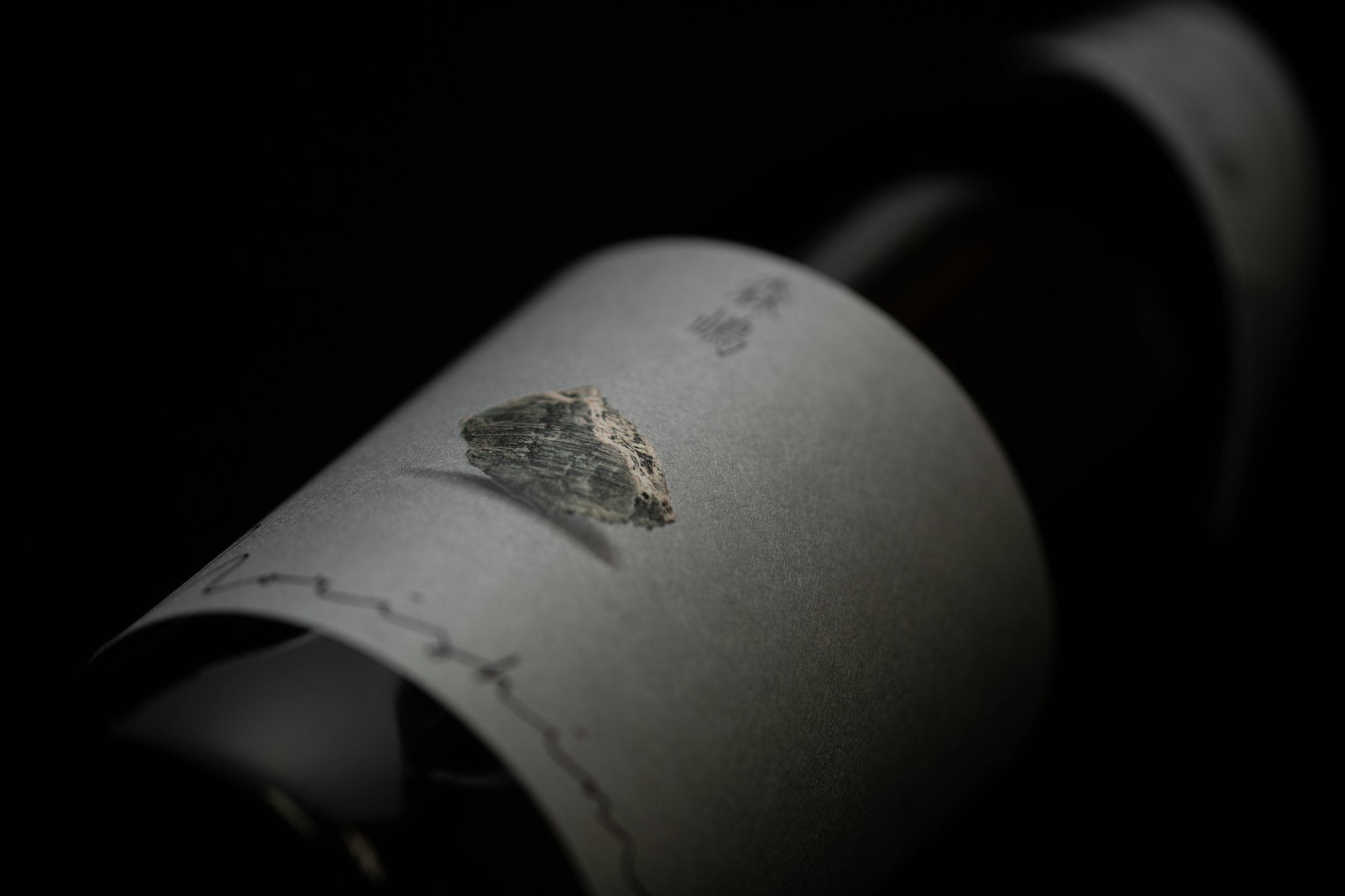
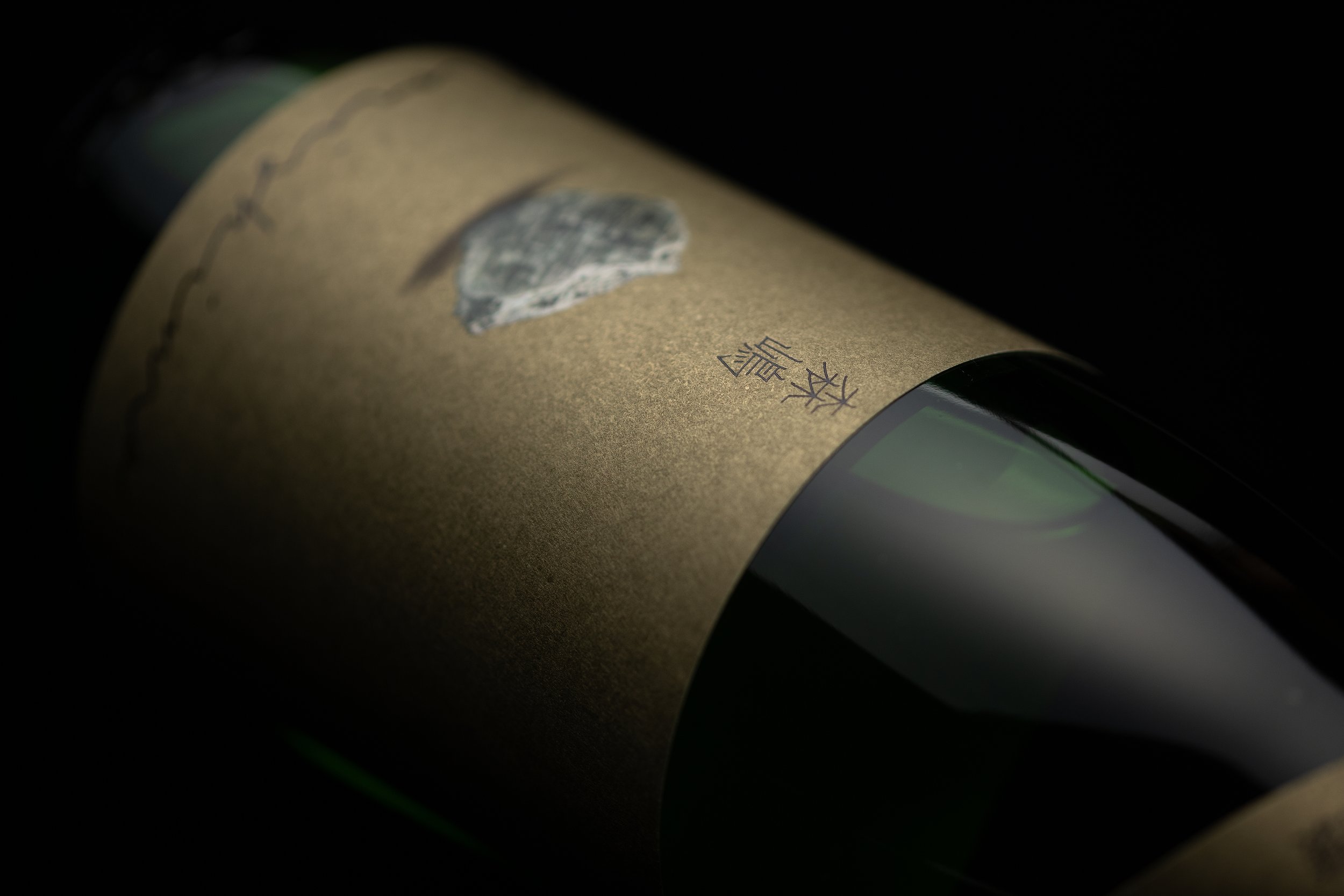
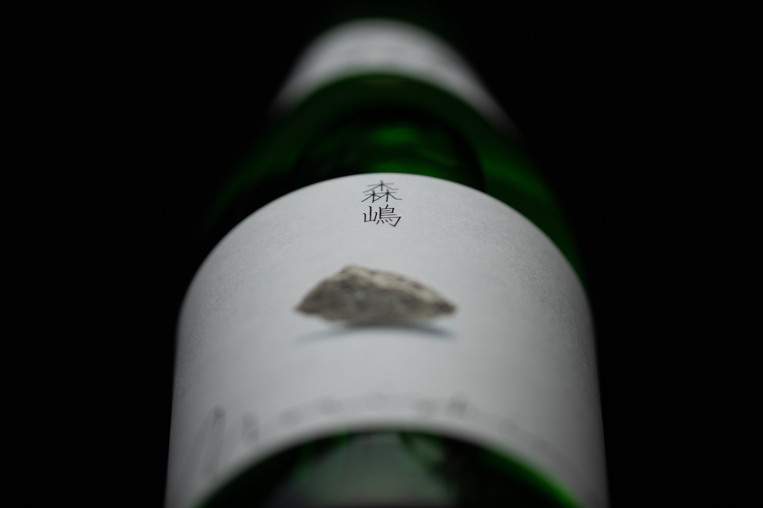
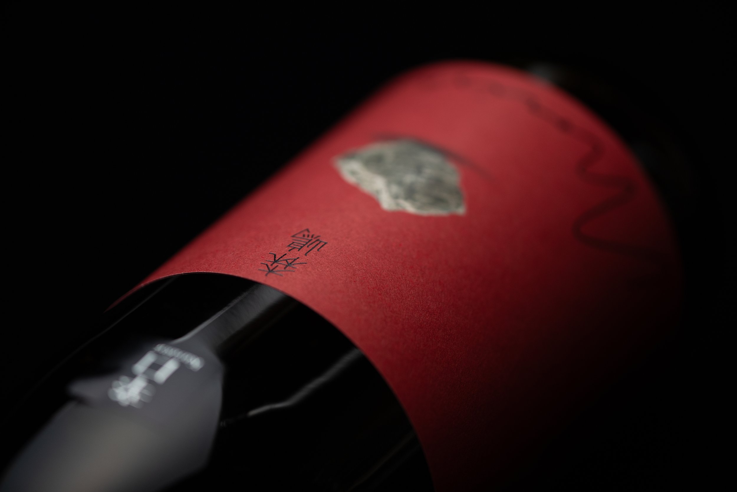
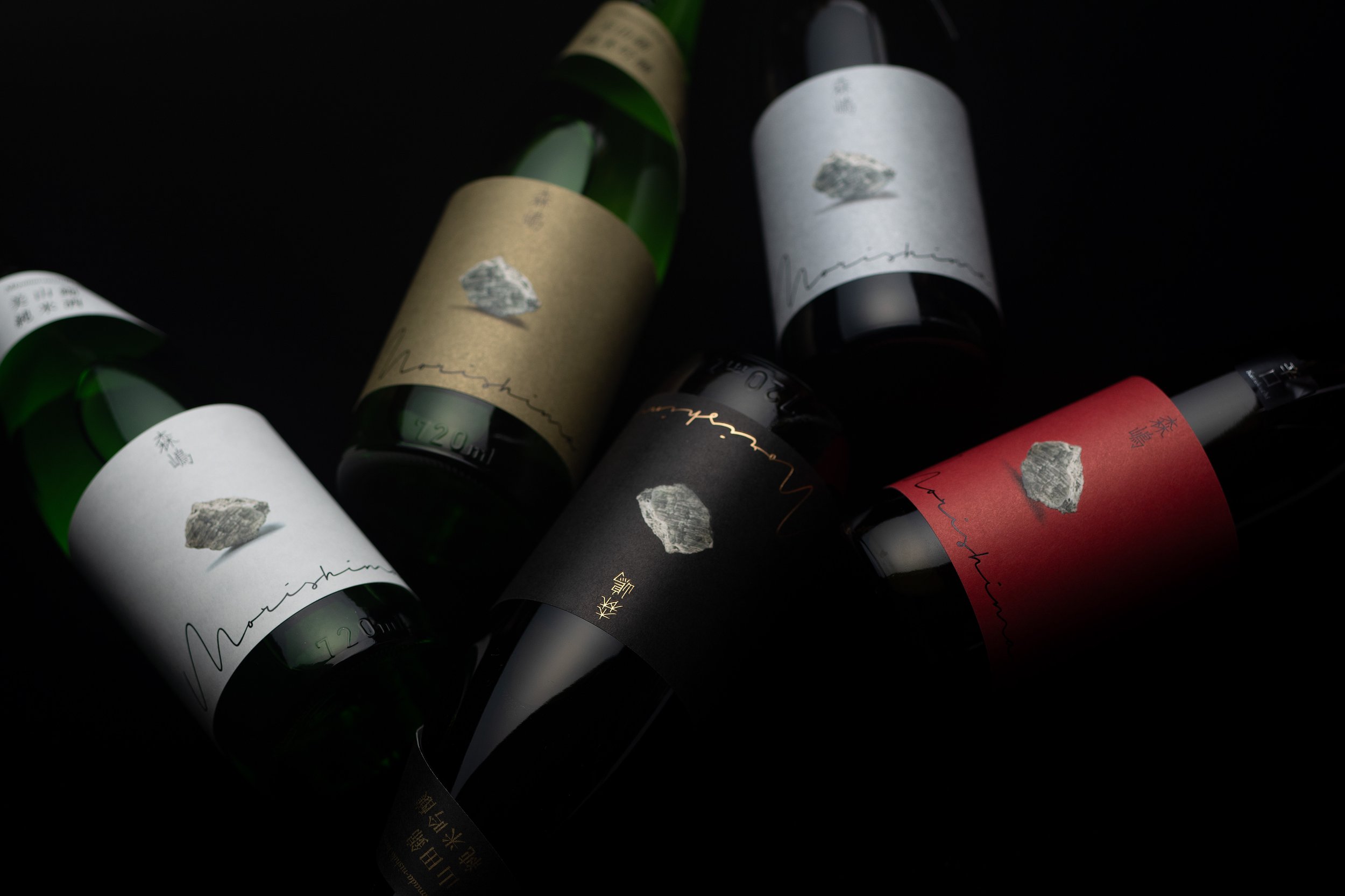
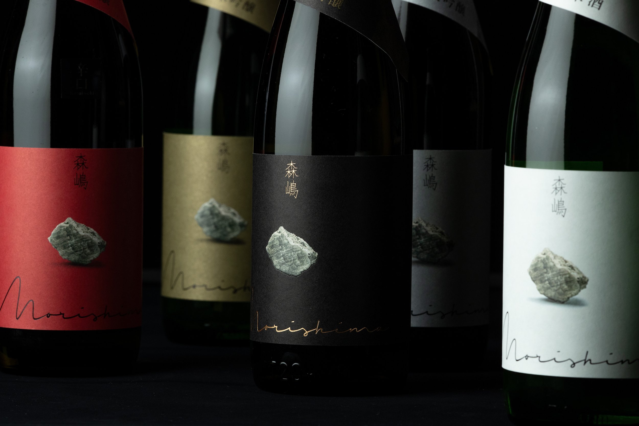
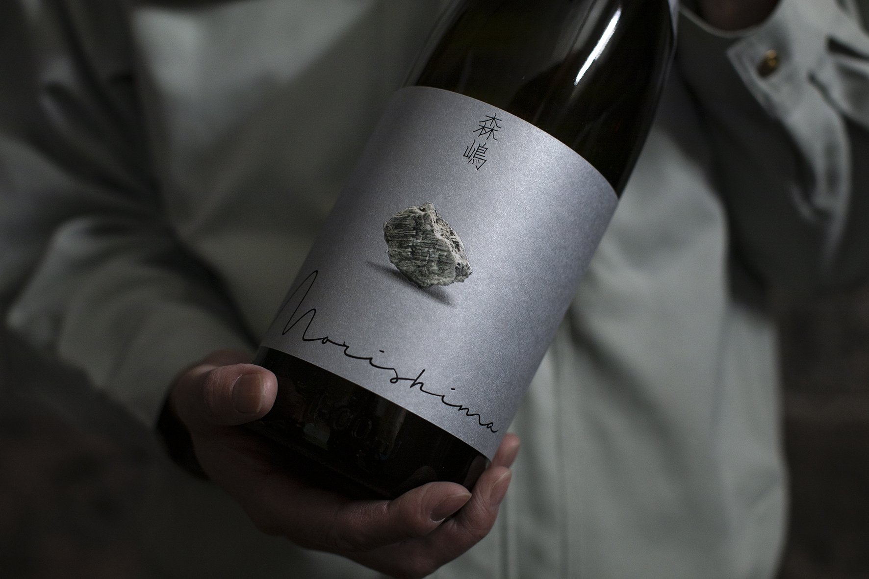
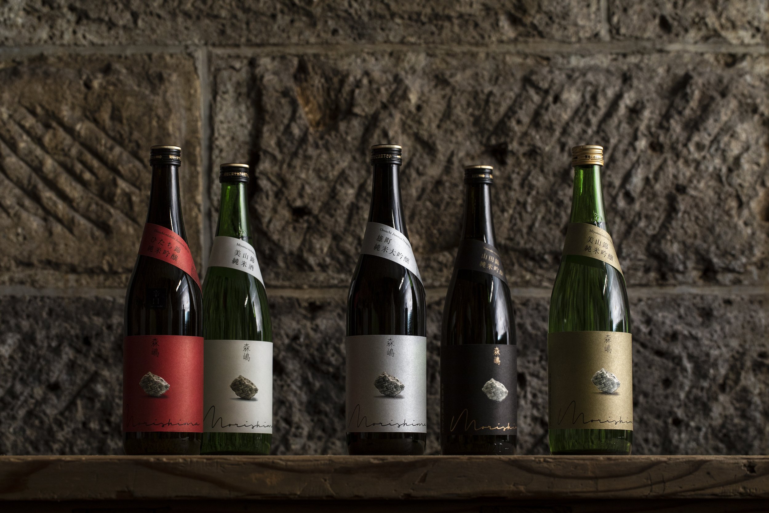
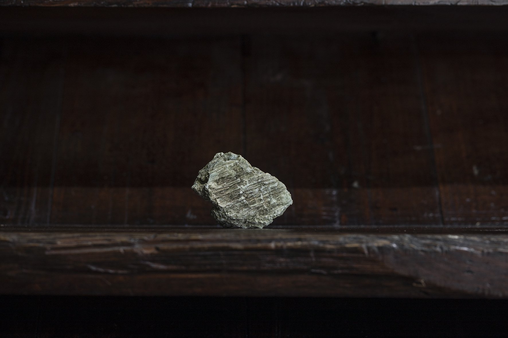
The sake brand "Morishima" is a new product branding project by Morishima Sake Brewery Co., Ltd. in Hitachi City, Ibaraki Prefecture, which suffered tremendously in the 2011 Great East Japan Earthquake, with the aim of reviving the brewery. The design, which uses a piece of stone from the Oya stone brewery that was broken by the great earthquake as the symbolic icon, symbolizes the indomitable spirit of the brewery that will not be defeated by any difficulties.
The brand tagline is 一石投じる一杯を。"A cup of sake that creates a stir in the world." A small sake brewery in Ibaraki Prefecture, a minor sake-producing region in Japan, has spent 10 years to create a new sake that will appeal to the world. The design also represents a challenge to the sake lovers in Japan and around the world to deliver the sake with a sense of "creating a stir" into the world.
The design is minimalistic and well-honed, expressing the taste of Morishima, which is brewed with the philosophy of wabi-sabi, the Japanese sense of beauty.
Since its launch in 2019, "Morishima" has been ranked No. 1 in sales in Ibaraki Prefecture and within the top 40 in Japan, This year, Morishima 25+, a high-end line with an eye on the global market, will be released in 2023, and continues to create a stir in the world of Japanese sake.