PHAROS COFFEE
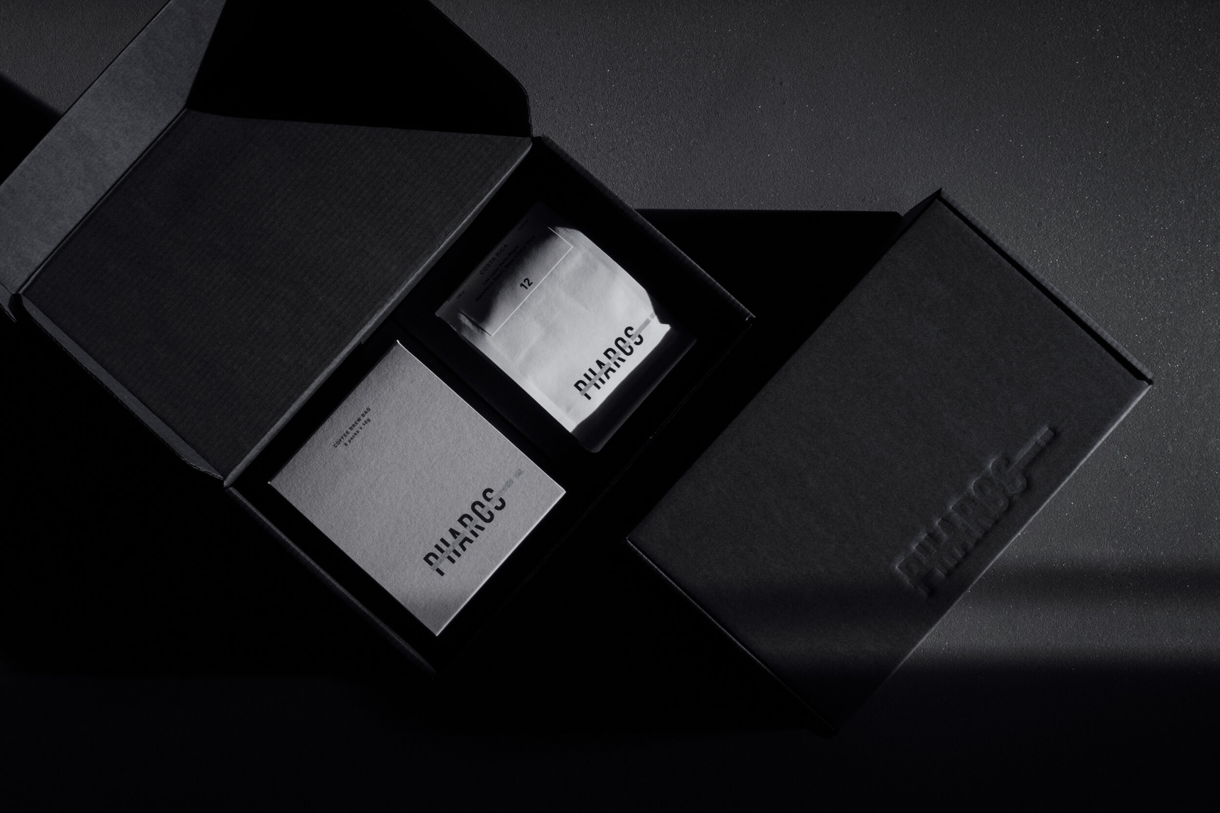
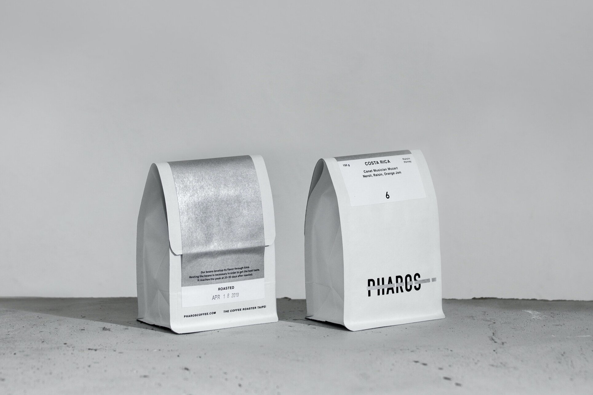
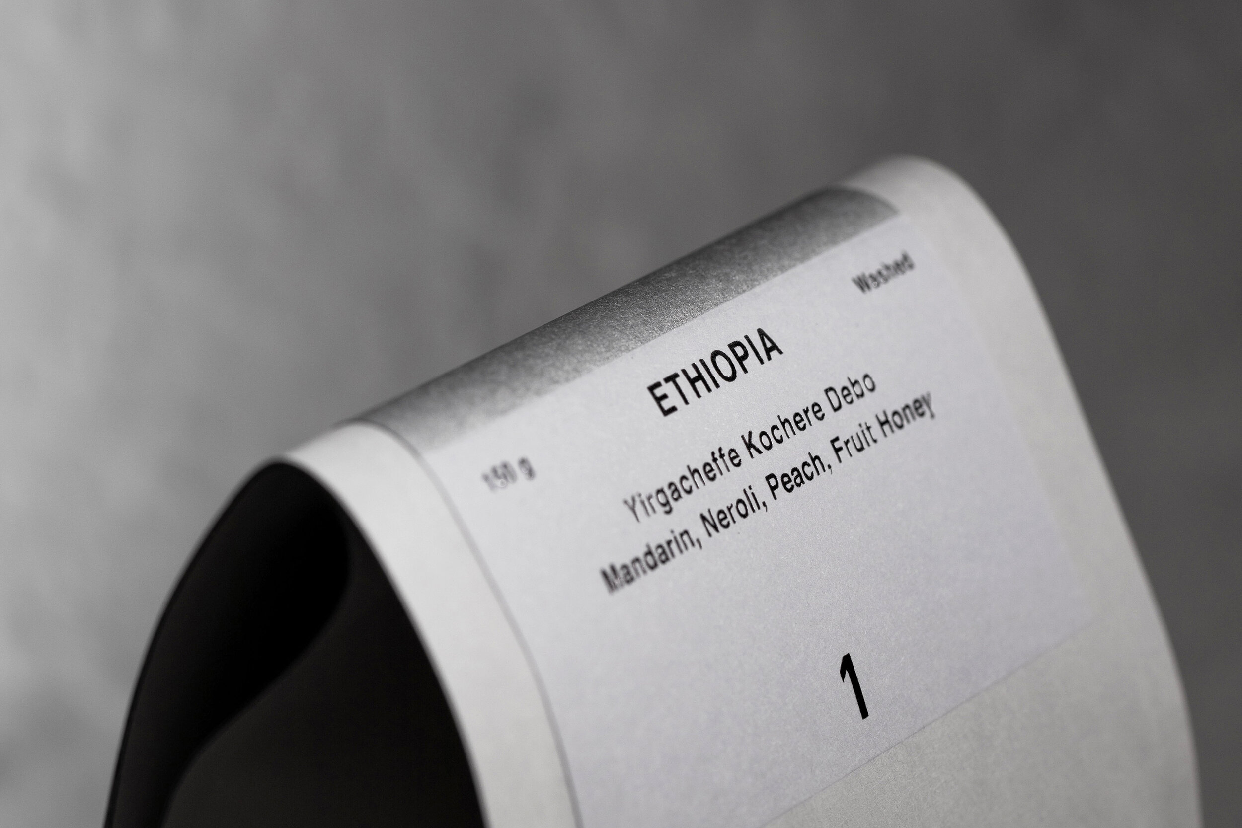

PHAROS COFFEE
Client: Pharos Coffee
Design Company: HOUTH
Creative Direction: Haung Chi Teng
Art Direction: Ho Wan Chun
Photograph: Huang Chi Teng
Country: Taiwan
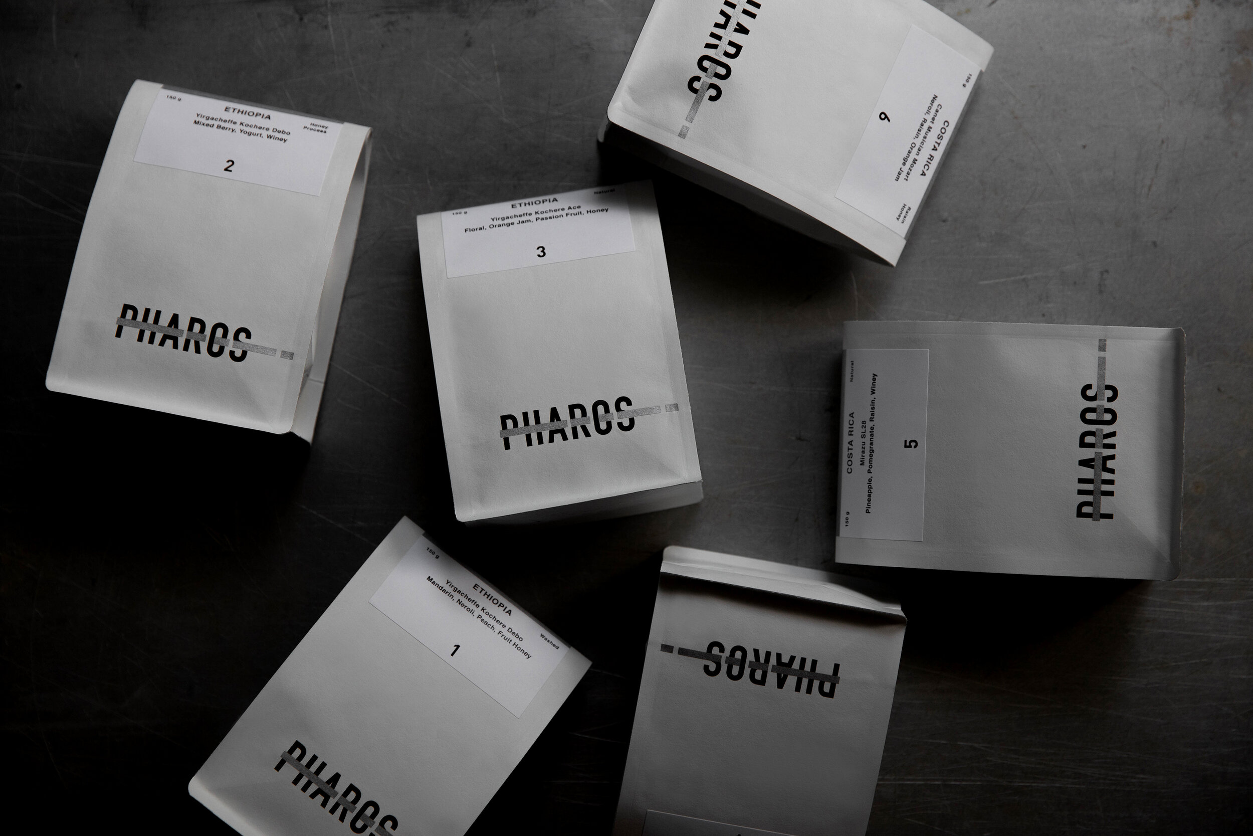
Pharos is a an independent coffee roaster based in Taipei specializing in light roasts. It's a flavor research lab with a unique perspective on roasting, continuously present new coffee beans from different area with modern process methods.
Keep growing product lines is always a challenge for product packaging design. Instead of color system or image series to categorize the coffee beans, we use number system, a system that allow consumer to build cognition through only taste itself without being affected by color and image. And discussing flavor through numbers become much easy than the names of area and process methods.
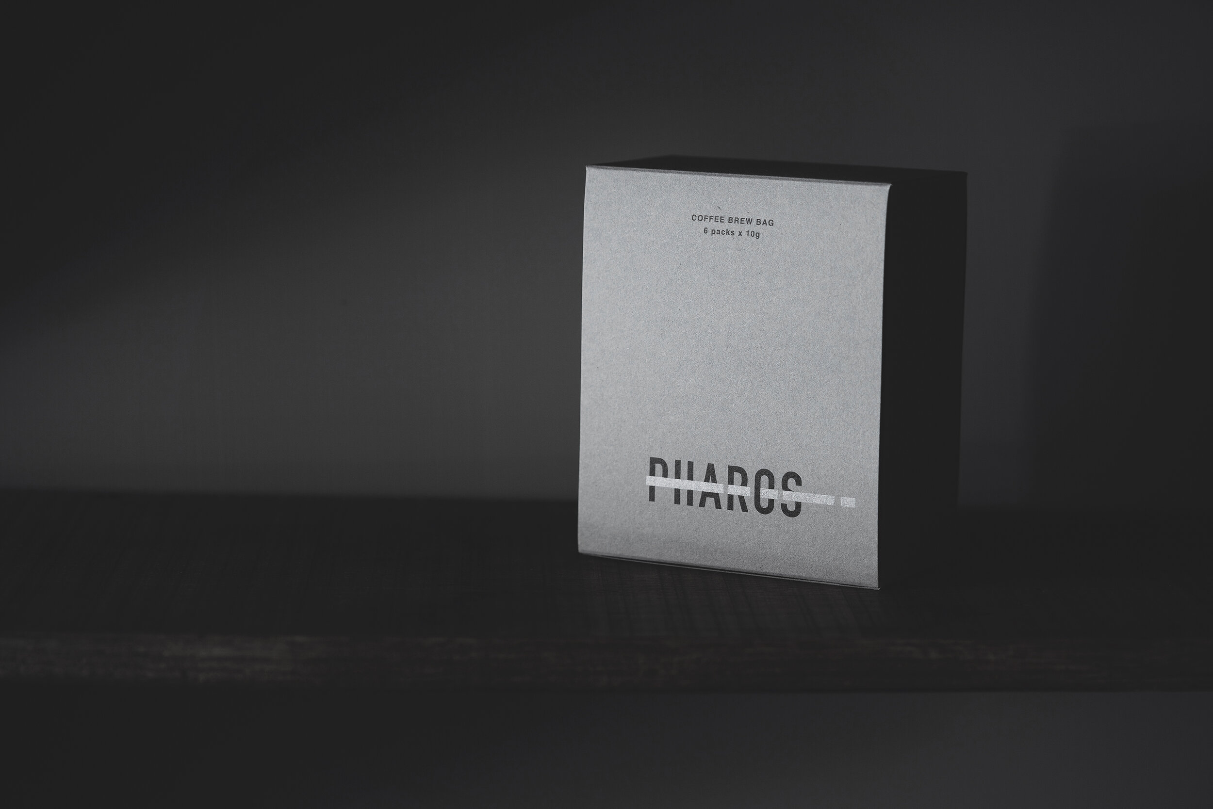
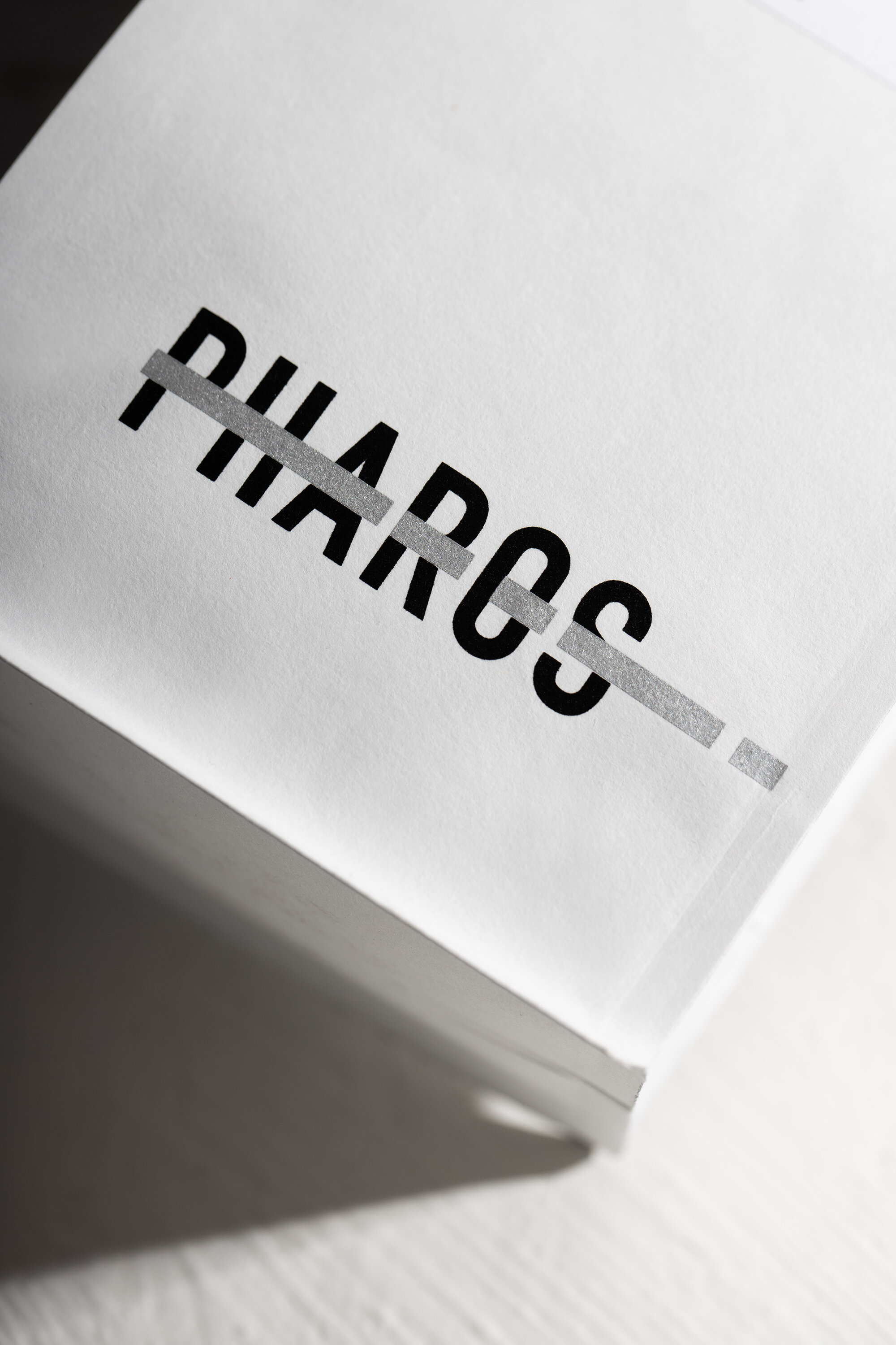
Pharos, means lighthouse, to guide the path of flavor adventure. Instead of using figurative element of lighthouse, we emphasize the light with a touch of silver running through the logo.