SISI

SISI
Client: SISI
Design Company: Saeka Shoda
Produce: Minoru Sako
Art Direction/Design: Saeka Shoda
Country: Japan
As society matures, I feel that the desire to "lead a rich and healthy life that is uniquely one's own" is expanding, shifting from a desire for the (physical) possession of things to a desire for the (mental) fulfillment of one's heart.
It is precisely because we live in such an era that we believe in our own value and power, and that the values that make us feel we are important are universal.
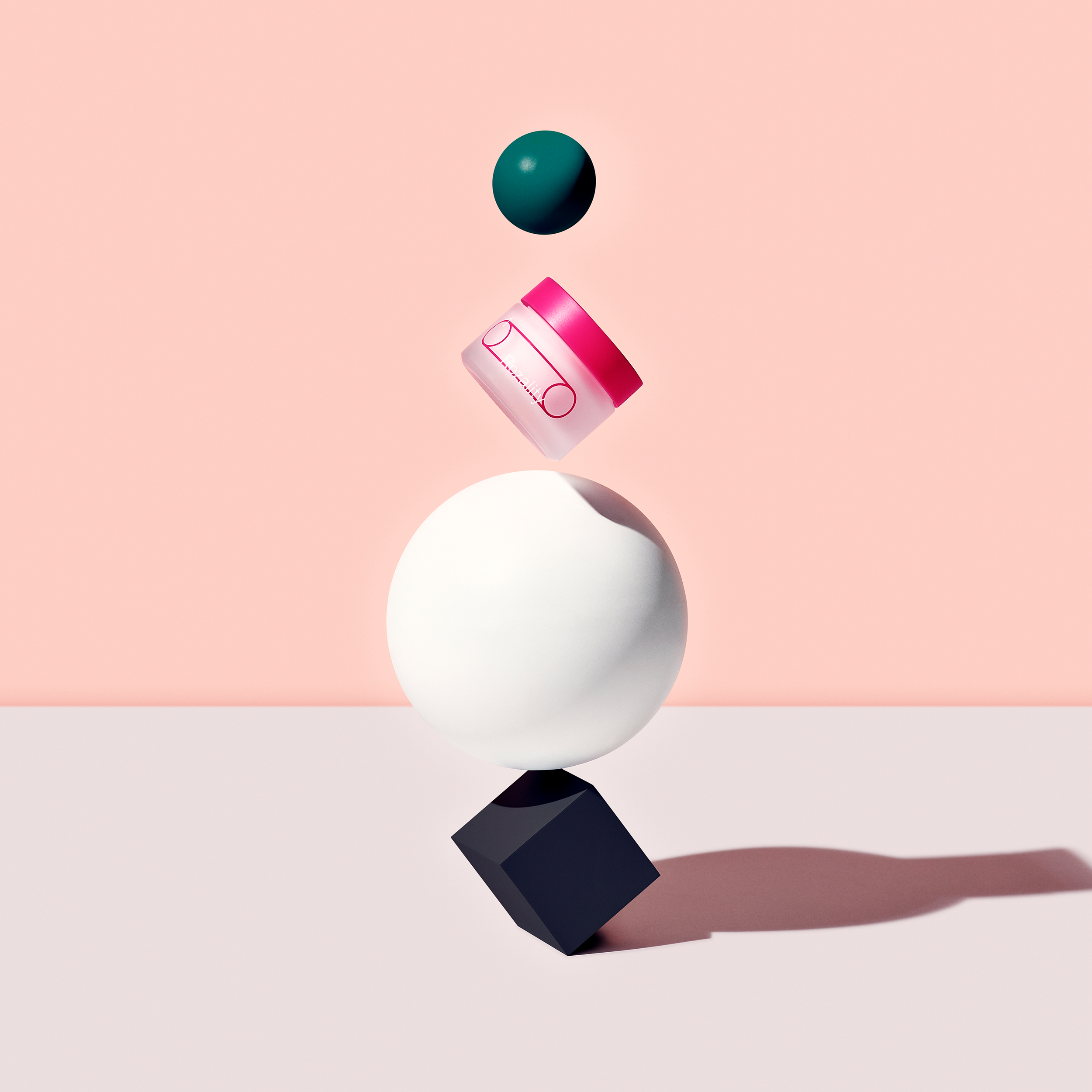
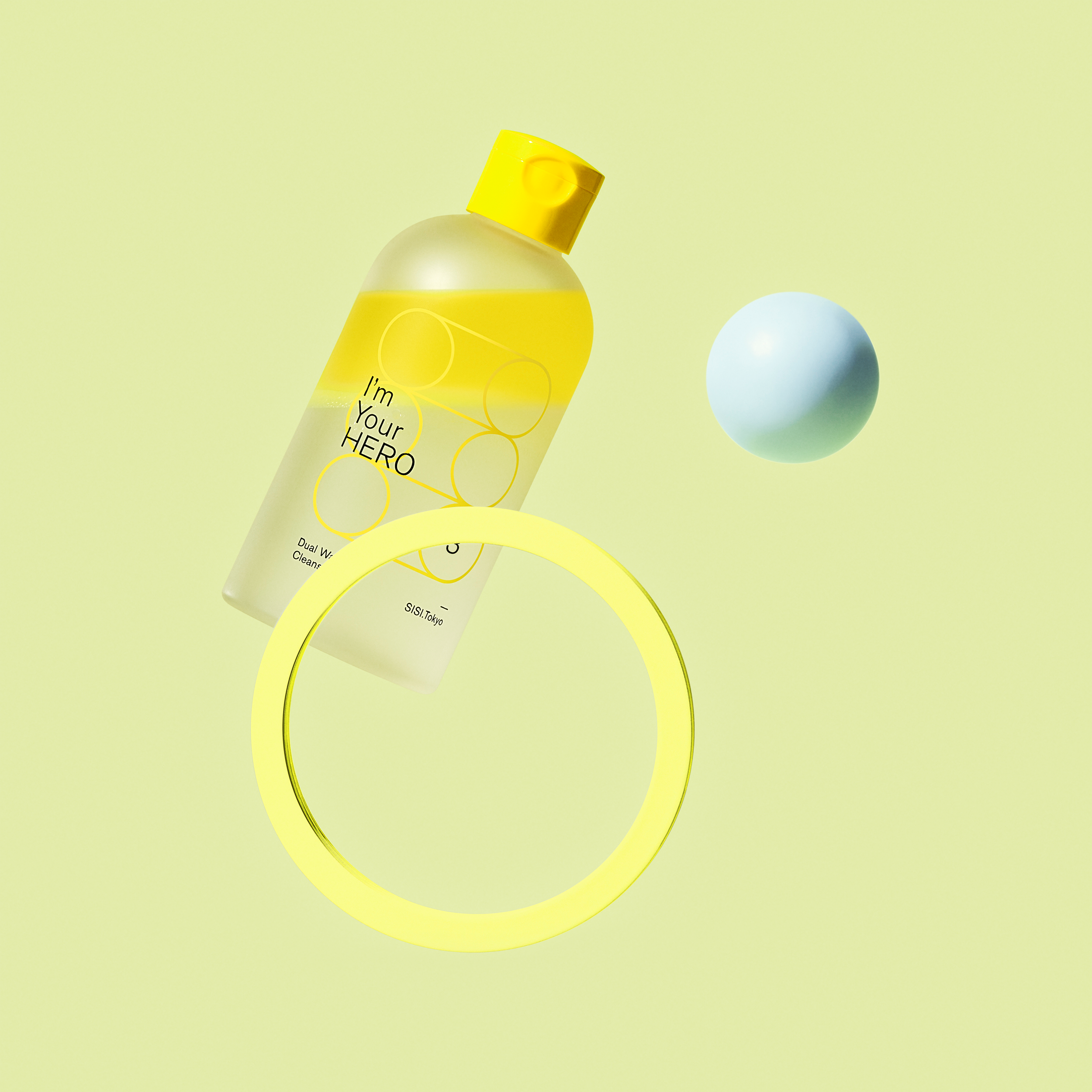
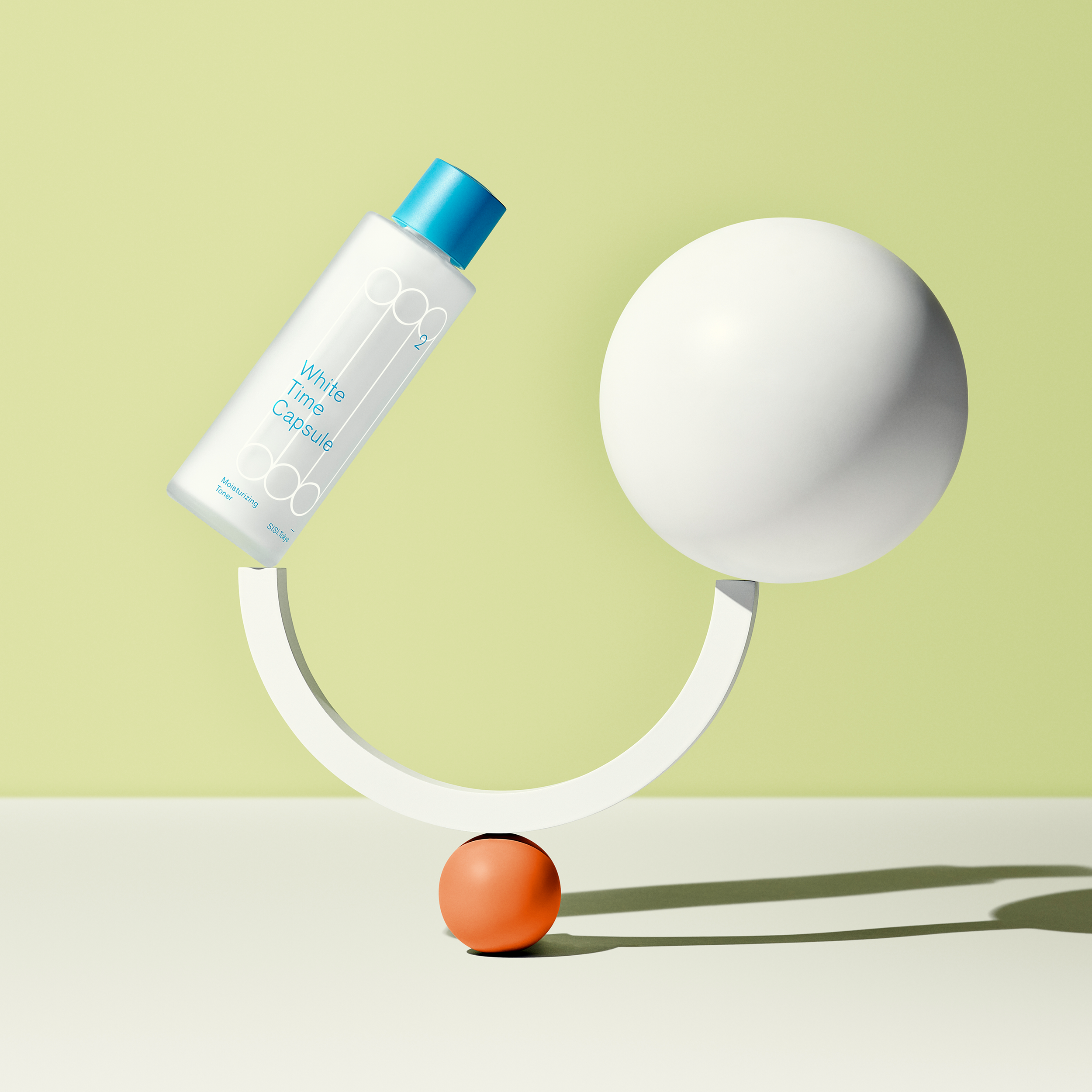
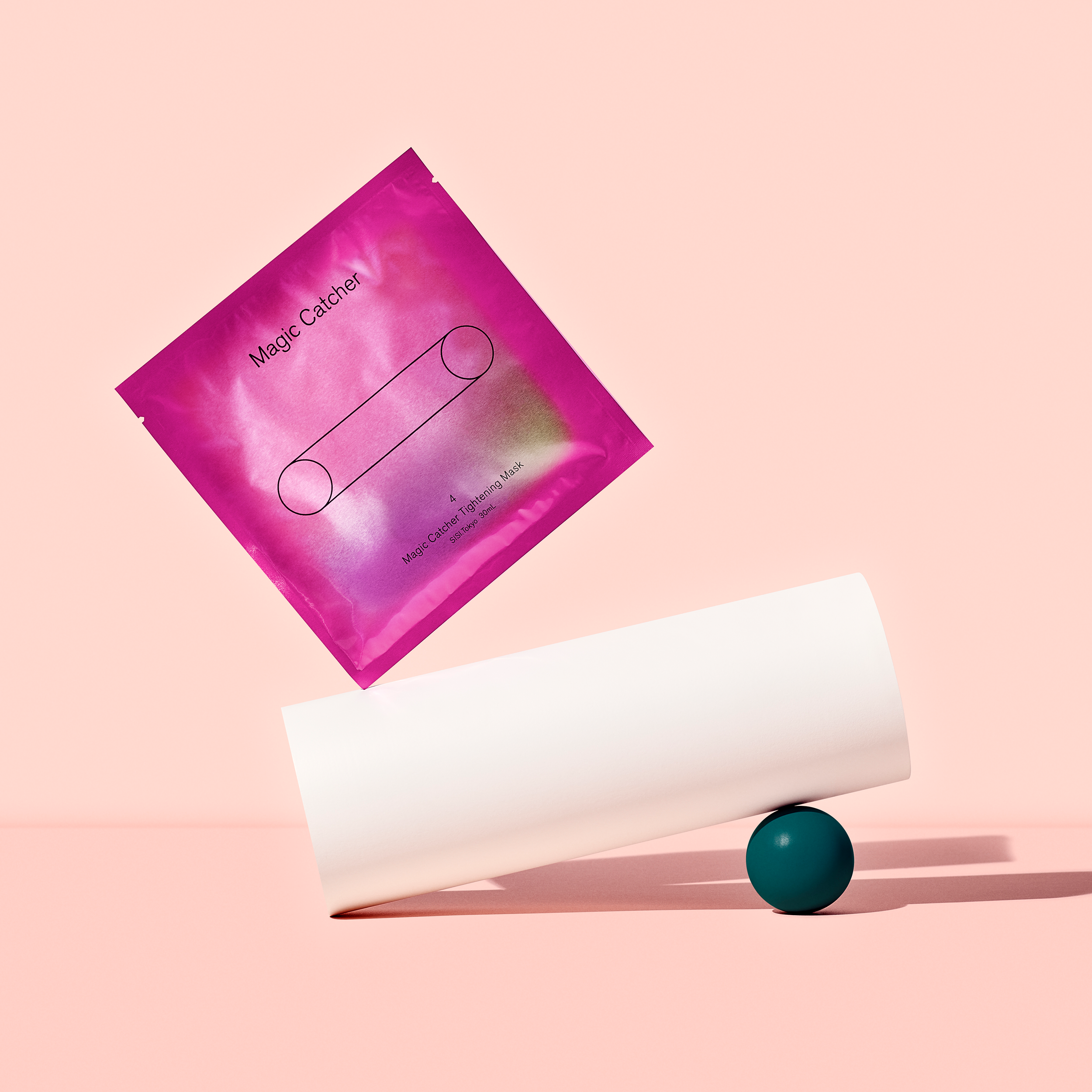
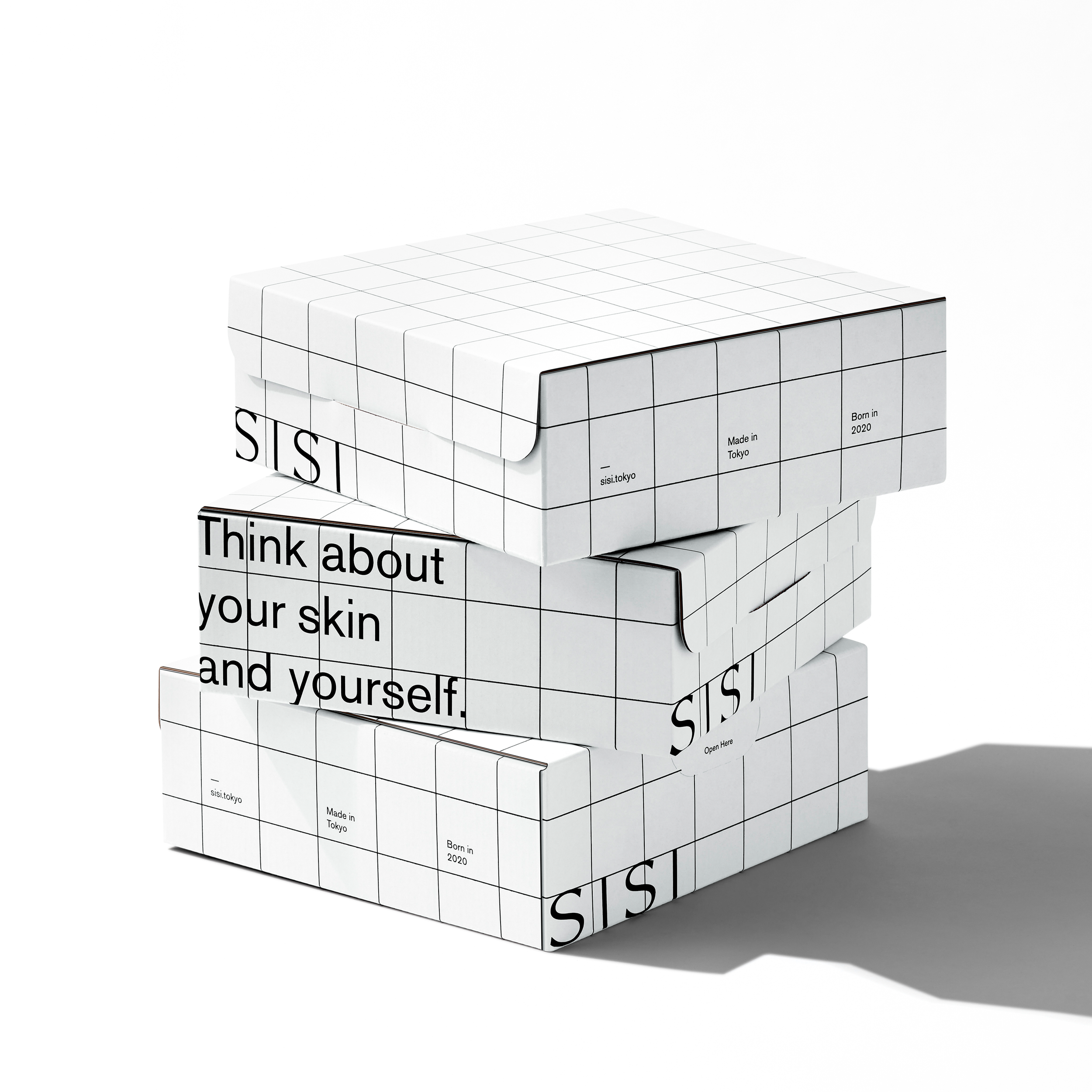
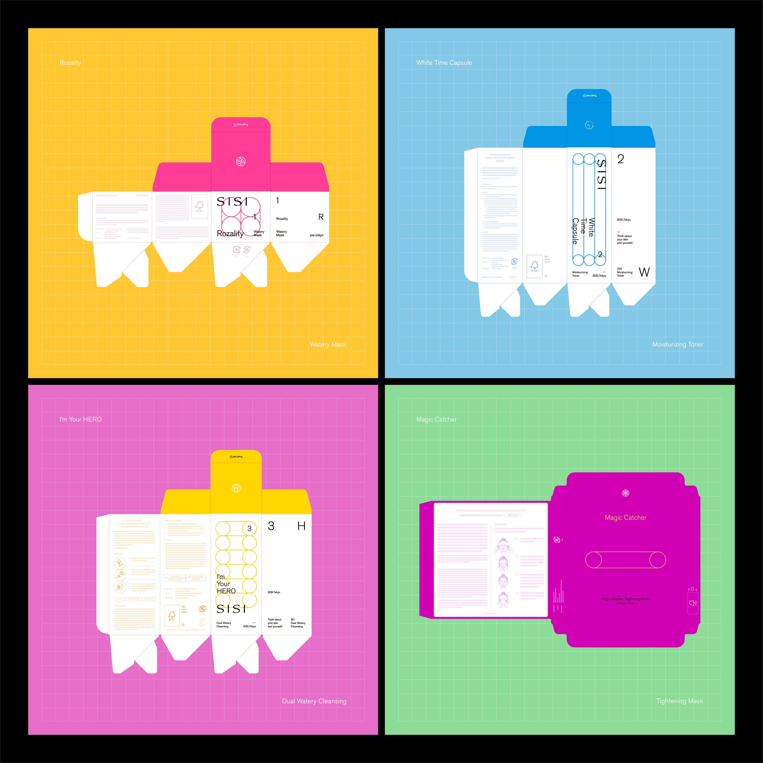
Therefore, SISI has developed products that confront the skin and oneself, incorporating the message of "thinking of oneself and valuing oneself" into the brand name and design of SISI = “私思” (meaning "I think of myself、I care about myself ”). SISI also proactively utilizes environmentally friendly ingredients, containers, and materials with "clean beauty" as one of its keywords.
We want to help make people’s lives brighter, happier, and more vibrant with sustainable products. We use colorful tones for our brand because we want to add color to people's lives, rather than just being eco-friendly and simple. The brand logo mark, which stretches, shrinks, and proliferates depending on where it is used, is an image of lively modern people who are flexible and changeable while maintaining their core.