conte



conte
Client: ICHIBISHI KINZOKU CO., LTD
Design Company: Frame.inc
Creative Direction: Ryuta Ishikawa
Art Direction / Design: Ayumi Hasegawa
Country: Japan
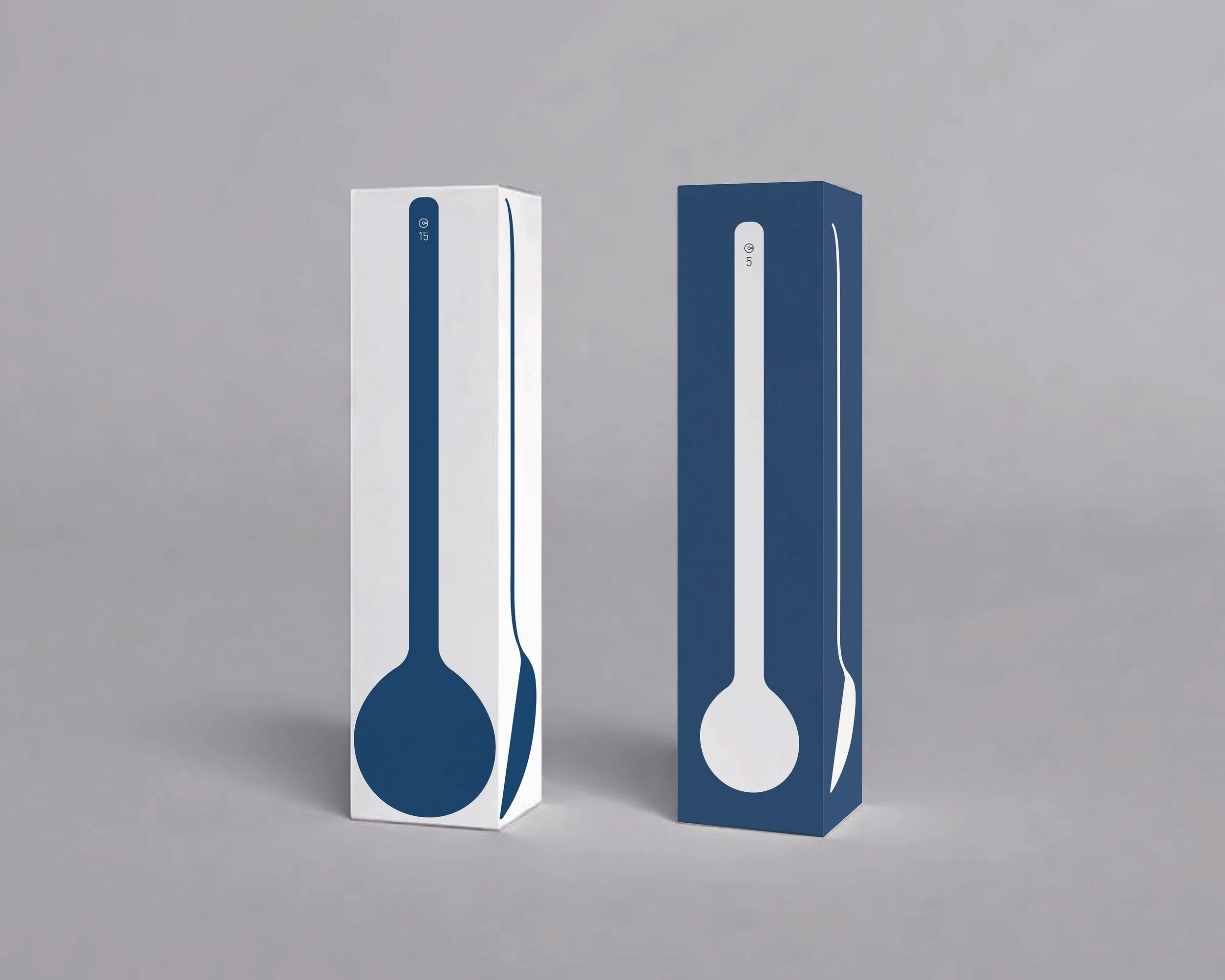
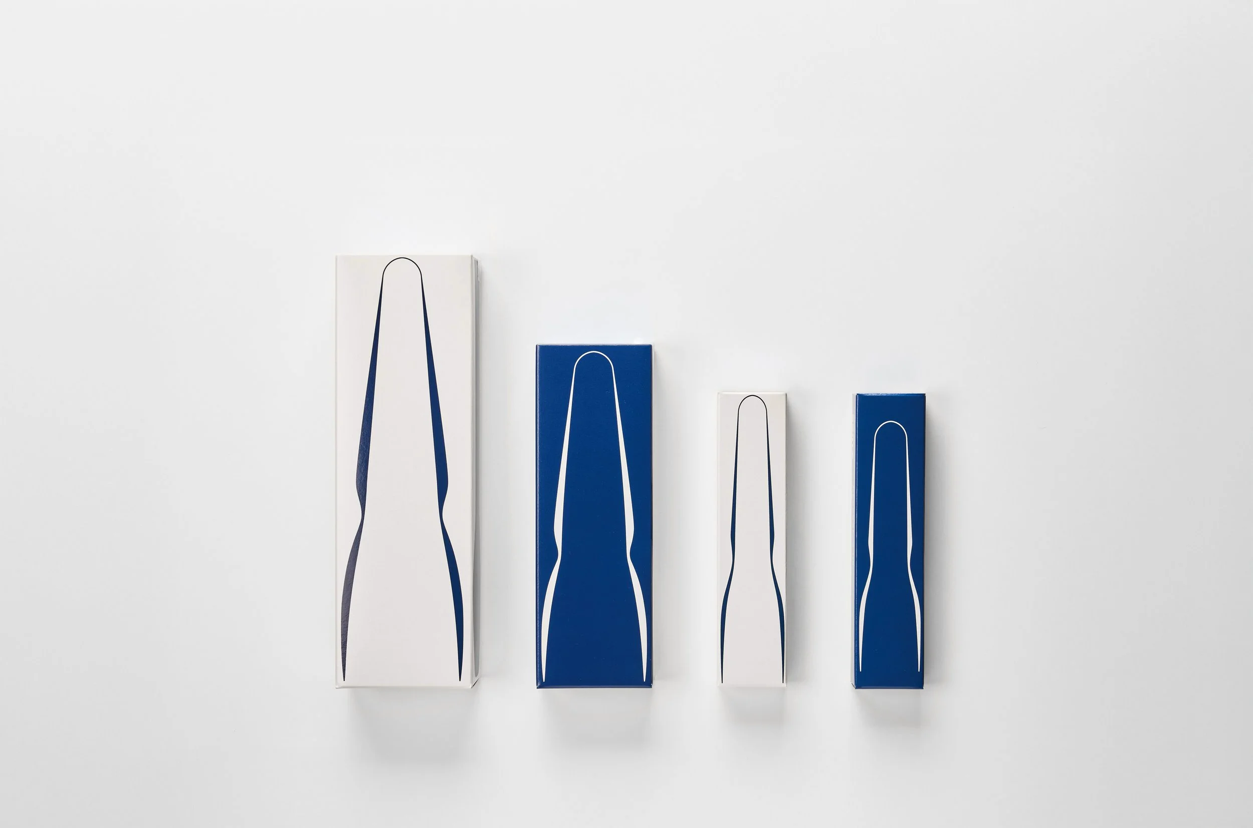
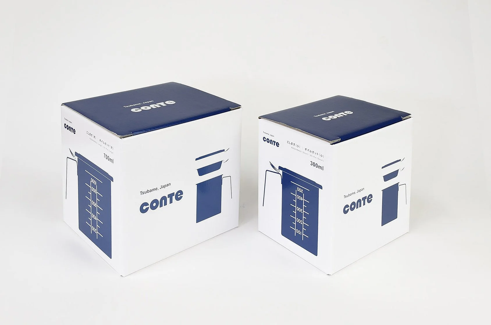
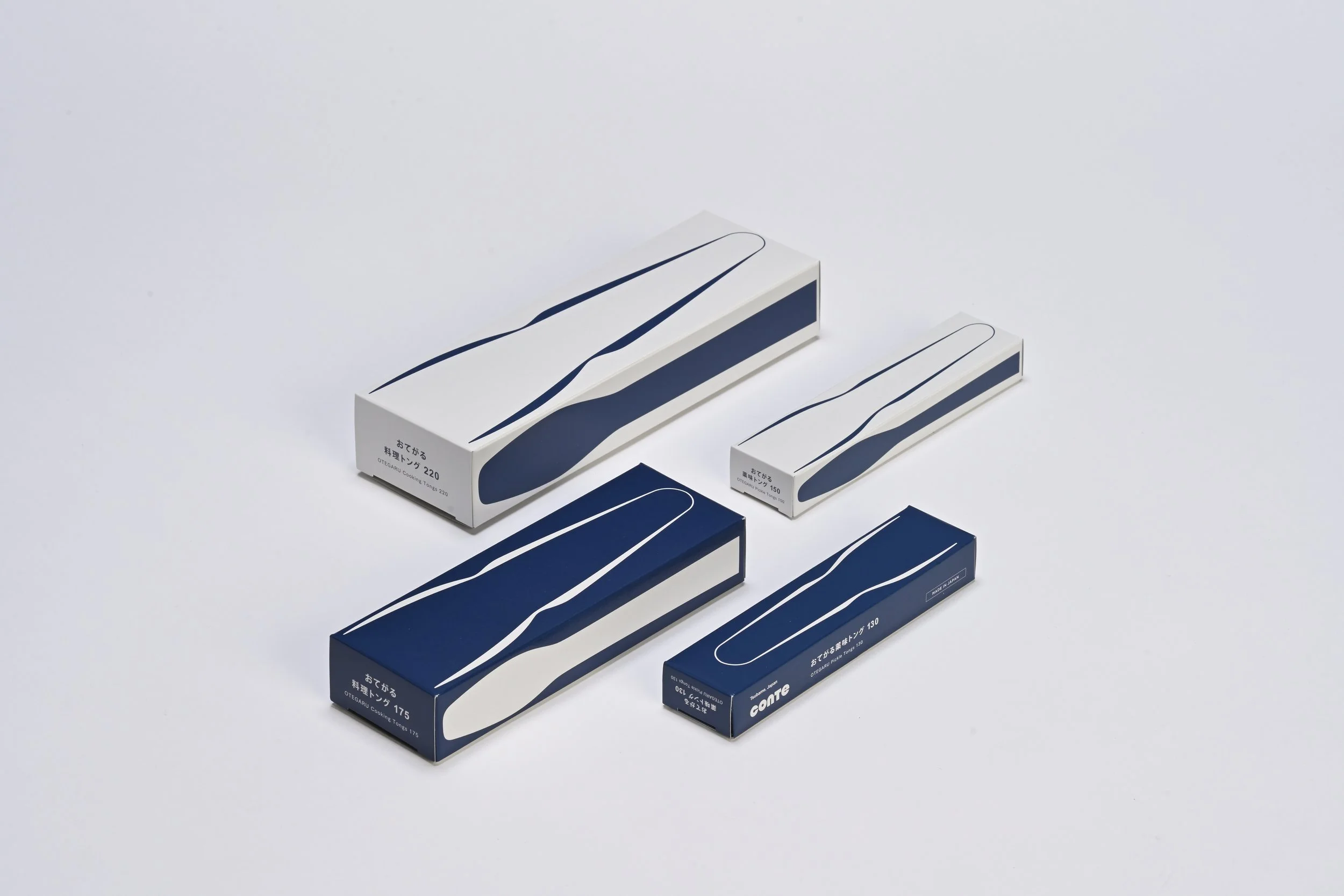
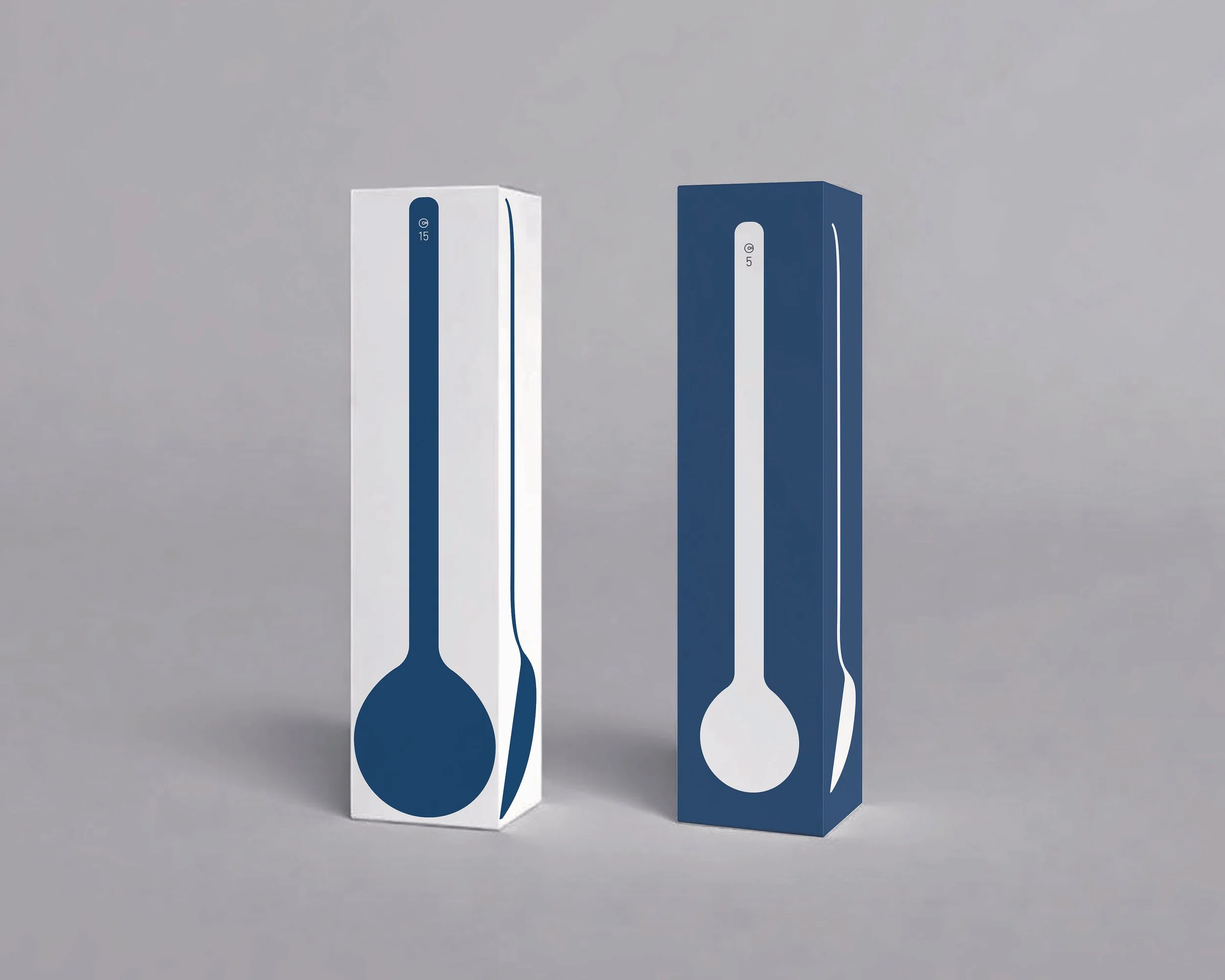
Using only conte’s signature navy and white, the packaging creates a unified visual language across the entire series by boldly transforming the silhouettes of the tools themselves into graphic elements. Rather than adding decorative elements, the differences in each product’s shape and size are used as information.
For items such as tongs and measuring spoons, larger sizes are represented in white and smaller sizes in navy, allowing customers to distinguish between them intuitively on the shelf without having to read the product name.
The packaging is also designed to adapt to different retail environments. A header can be removed from inside the box, allowing the product to be displayed either standing or hanging. Specifications on the back of each box and the instruction manuals are presented in both Japanese and English, ensuring that the same information can be communicated in domestic and international markets.
By translating the functionality of the products themselves into the functionality of the packaging, the series was designed as a consistent system encompassing display, identification, and communication.