
TOERI

TOERI
Client: MODERATO inc.
Design Company: Bangal Dawson
Creative Direction: Tatsuya Ishikawa
Art Direction: Ayumi Tsuchida
Design: Miyuki Kamo / Nana Tabata
Photography: Bangal Dawson
Country: Japan
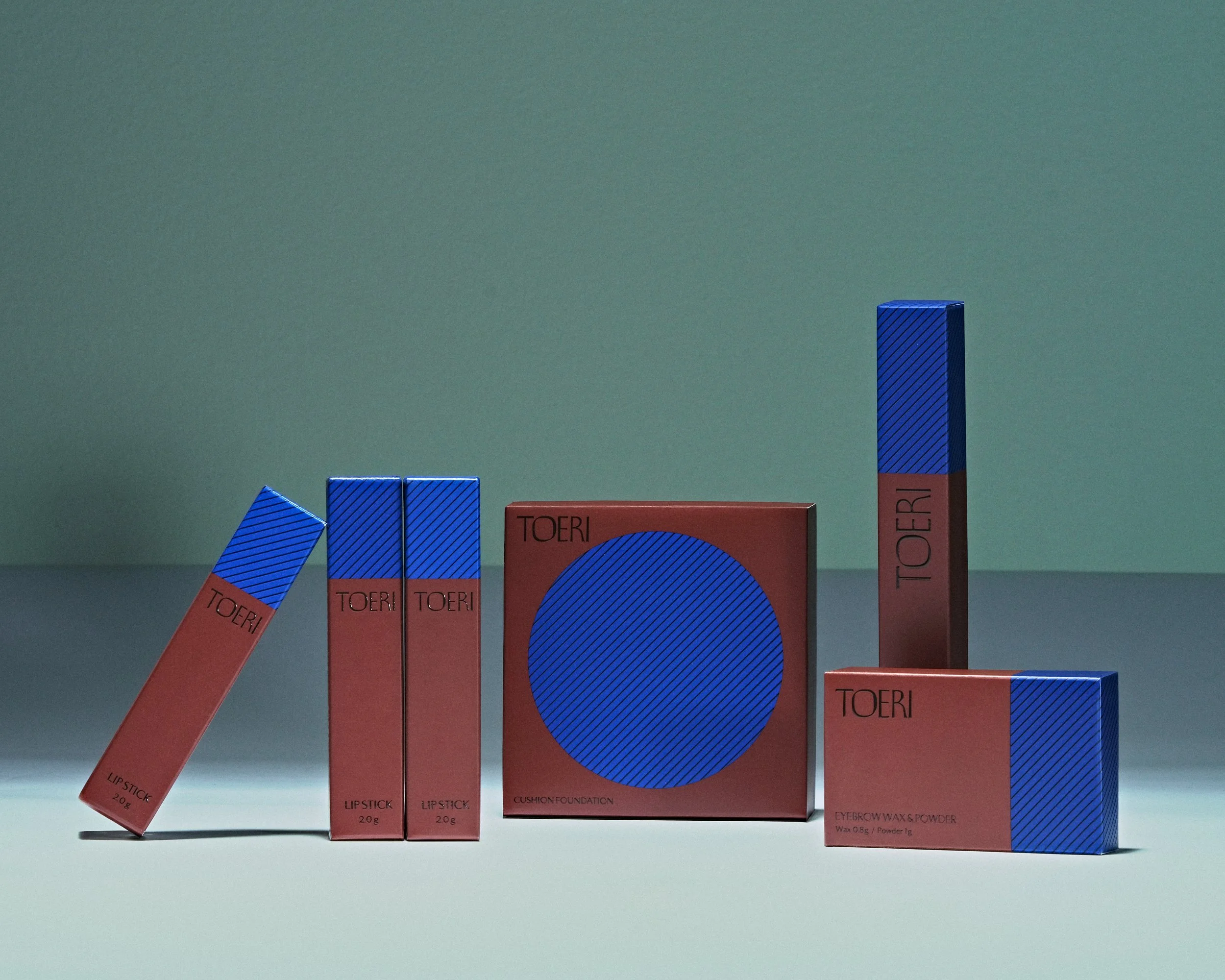
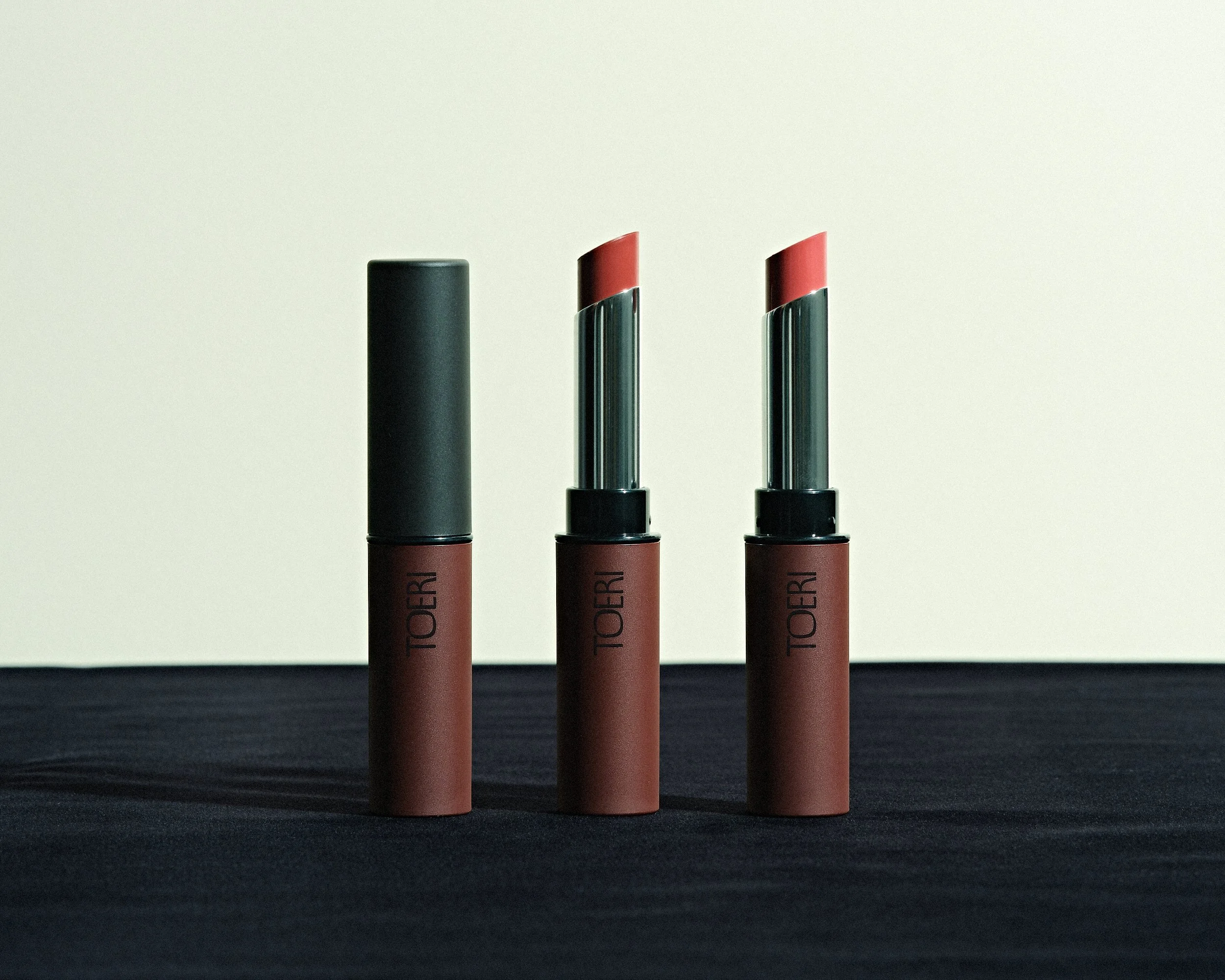
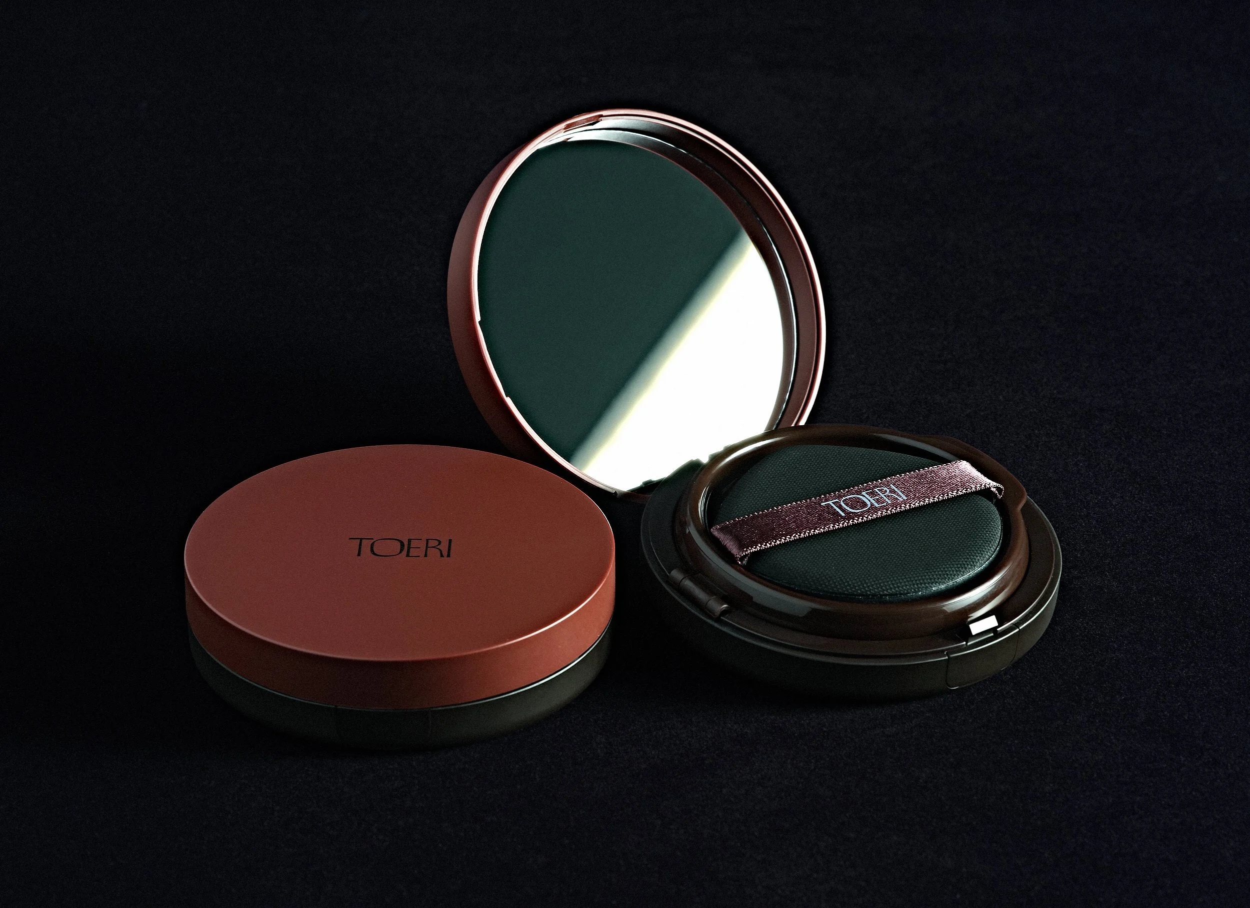
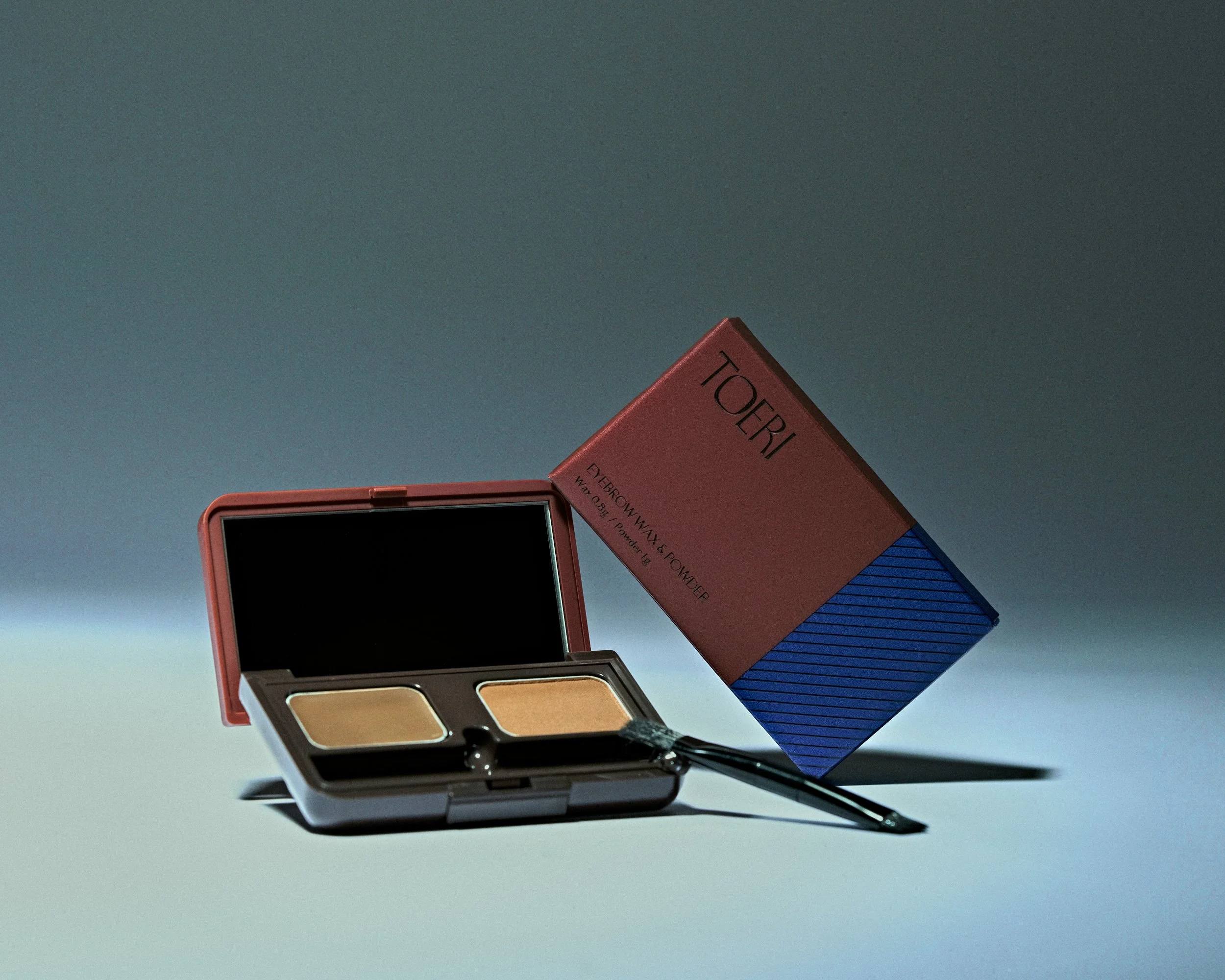
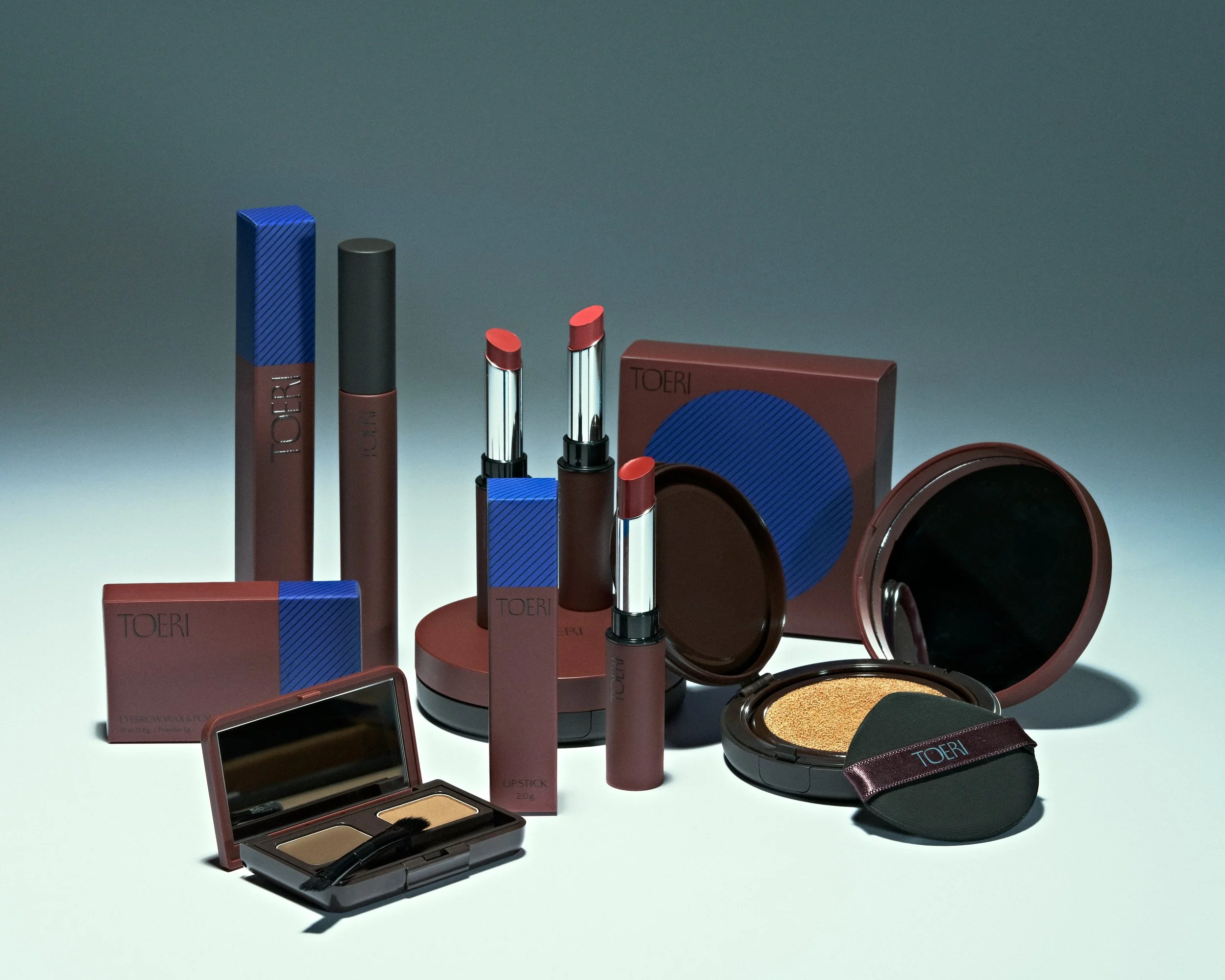
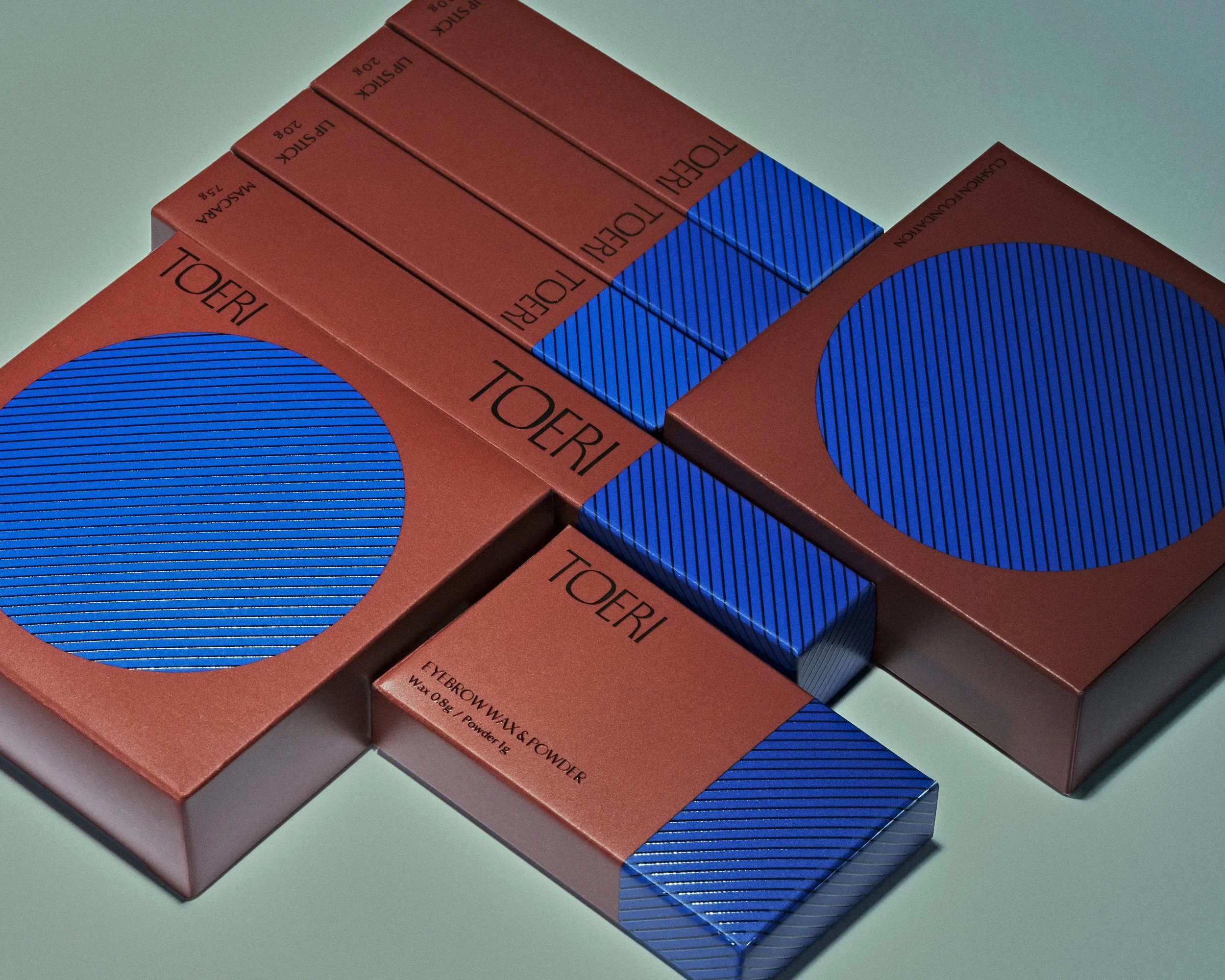
TOERI is a beauty brand that enhances the natural beauty. Its name is derived from the traditional Japanese phrase “Oubaitouri” (桜梅桃李), which celebrates the innate individuality of each blossom—cherry, plum, peach, and apricot.
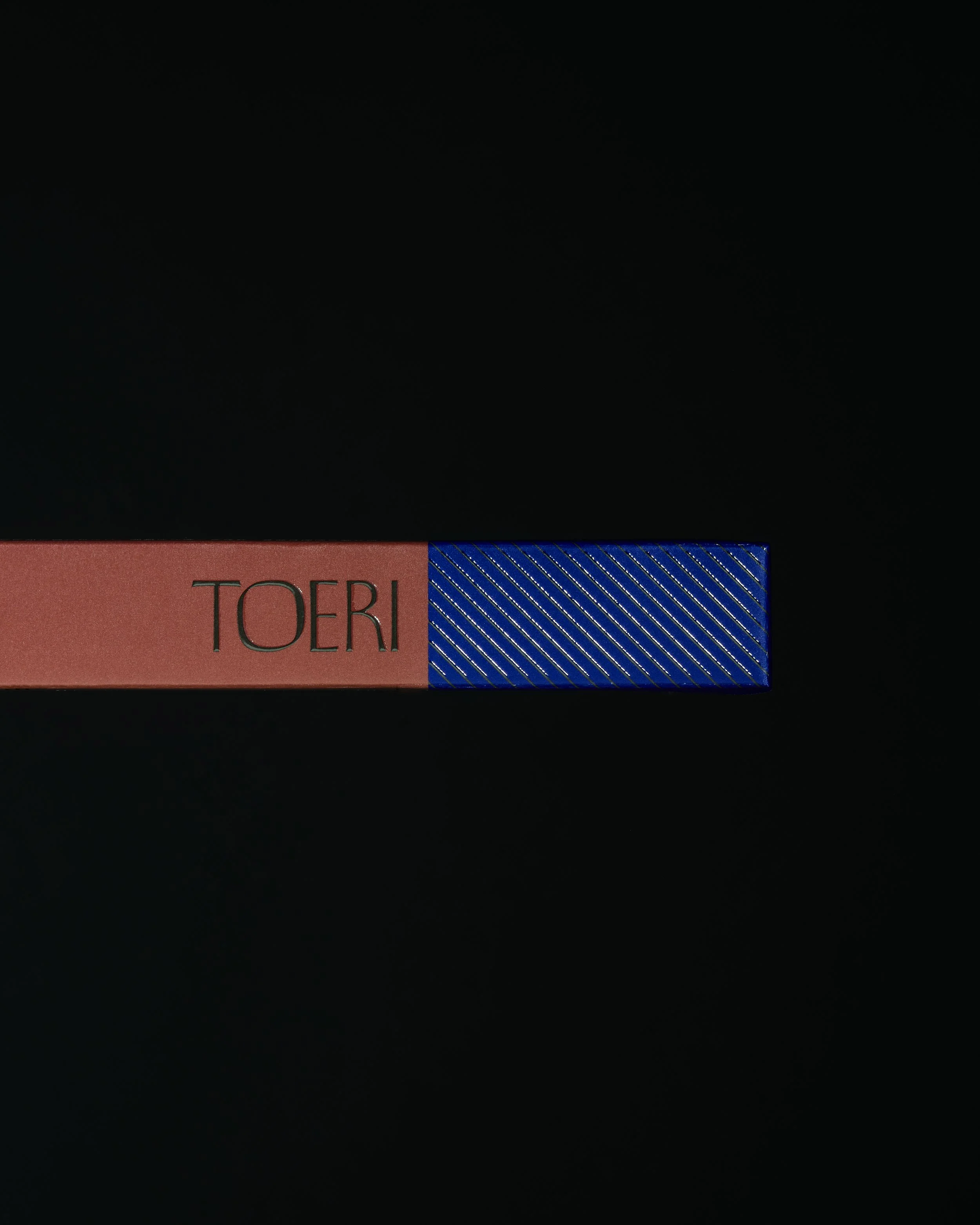
Uncommon in the cosmetics industry, the brand adopts a distinctive deep blue as its key color. From logo and packaging design to website, visual development, and social media, we built a cohesive brand identity that embodies TOERI’s unique concept.
TOPAWARDS ASIA


