DASHI-PRESSO

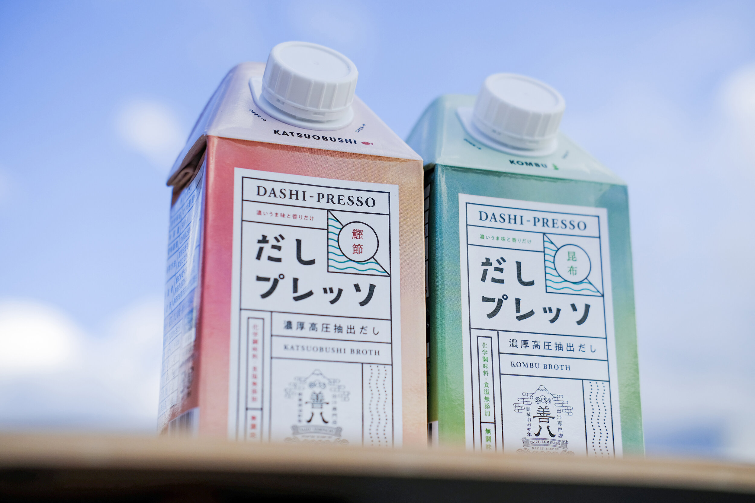
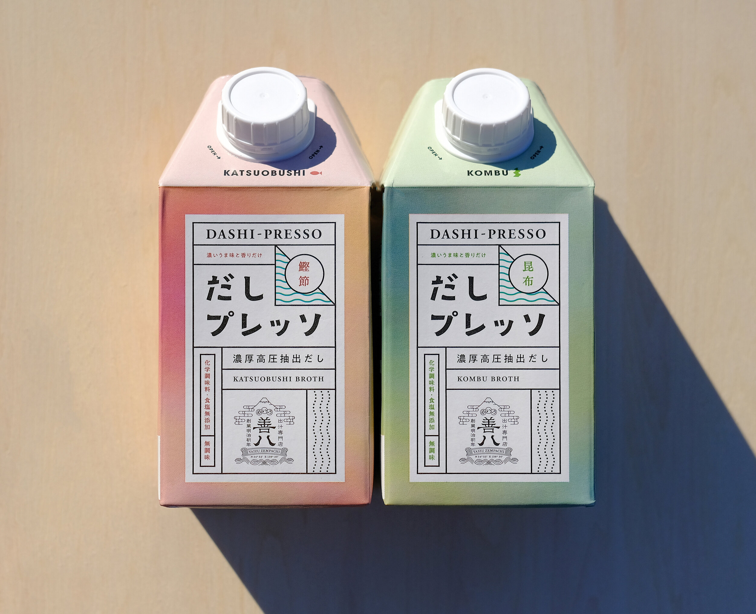
DASHI-PRESSO
Client: YAIZU ZEMPACHI
Design Company: Crown Clown Inc. / TWOPLATOON Inc.
Art Direction&Design: Suguru Matsuzaki
Design: Hitomi Sano, Shota Asano
Country: Japan
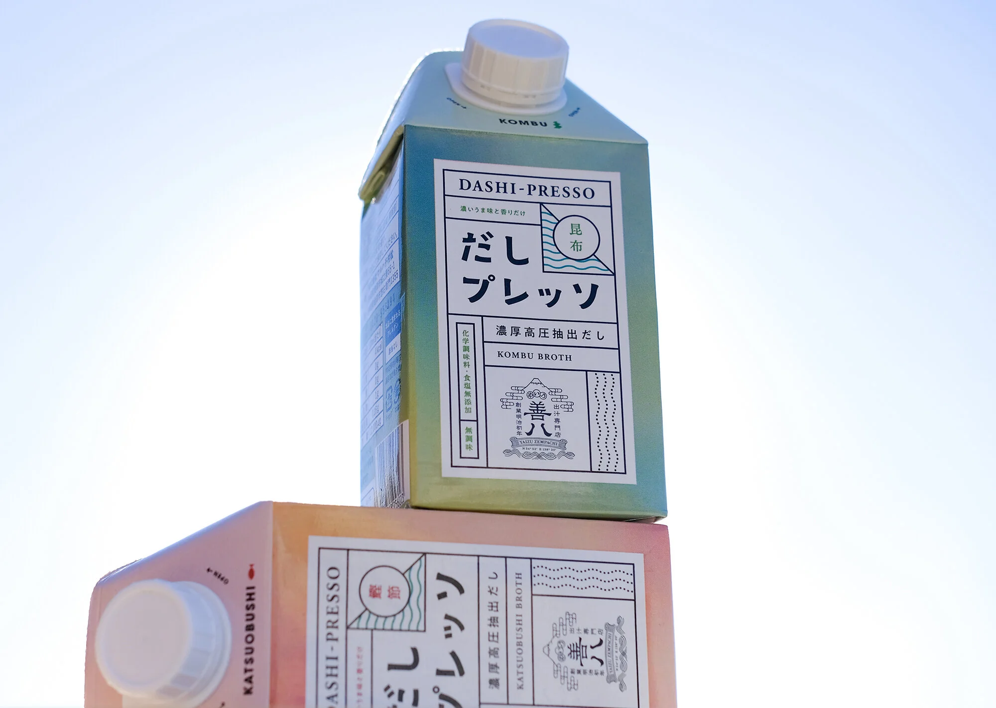
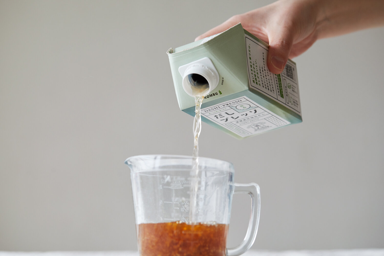
"Dashi-presso" as its name suggests, is an unseasoned thick dashi that is extracted from pieces of katsuobushi (dried bonito) and kombu (kelp) with a high-pressure extraction technique. One of the appeals of this product is its easiness in pouring the dashi out of the pack, and the ability to enjoy an authentic taste of dashi. In order for the innovative characteristic of the product to be recognized instinctively, we used an uplifting mood for the packaging, which is not very common amongst dashi products, and made it so that users will want to have it in their kitchen.
The logo type of "Dashi-presso" is made with intent to satisfy both Japanese and overseas users. With use of grids and separations, we made sure that the authentic, traditional taste of Yaizu Zempachi can co-exist with the new look. The wave-like graphic represents the richness of the ocean of Yaizu in Shizuoka Prefecture, and the transparent color represents the additive-free, clear characteristic of dashi. The natural gradation used for the packaging is a visualization of emotion and excitement that comes from tasting "Dashi-presso".
Since it is a product of new production techniques with many potential usages, we see the package as an important communication tool that should efficiently convey the product characteristics through its design.