Eutopia Organics Shampoo & Conditioner
Eutopia Organics Shampoo & Conditioner
Client: Eutopia Organics Pty Ltd
Design Company: Beeswork Design & Production (Brand Identity), Milk Design (Product)
Design: Cheng Siu Tung Winston, Lee Chi Wing
Country: Hong Kong
STORY:
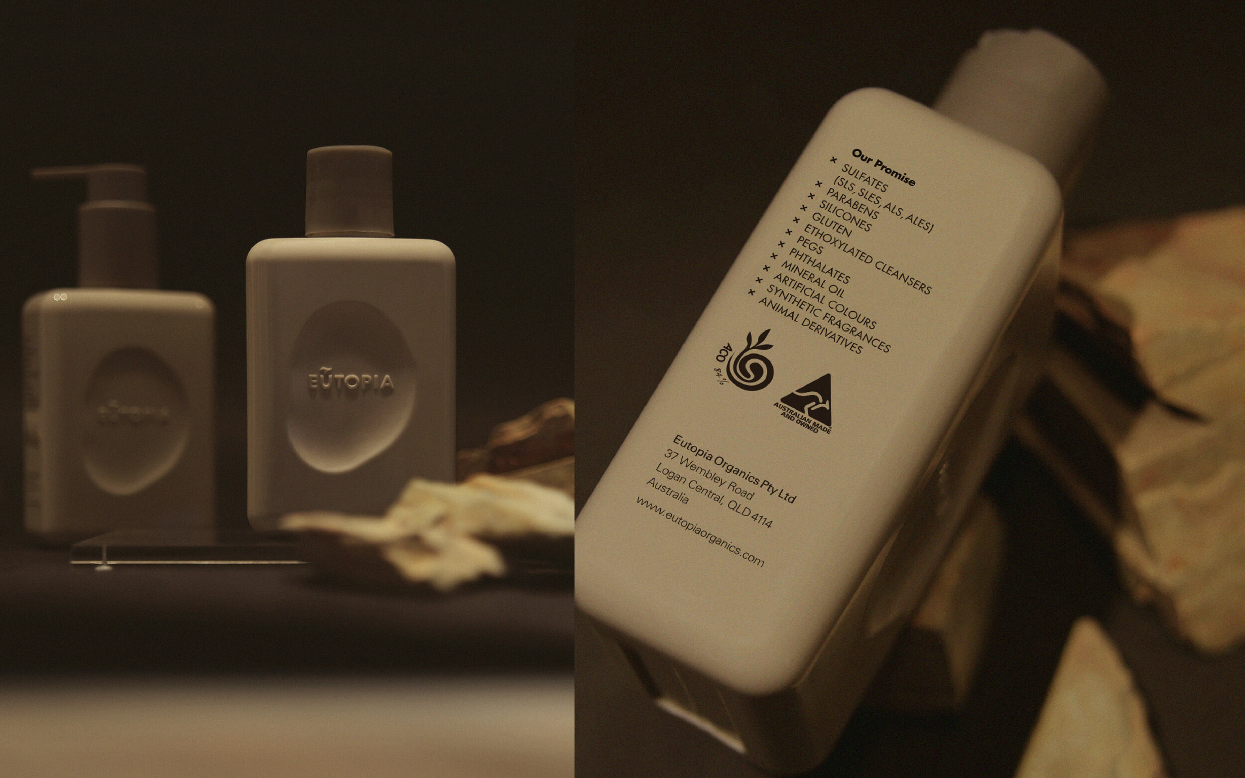
Australia is rich in natural resources and often produces many different organic products. Our client’s products are ACO (Australia Certified Organics) certified, a testament to their use of high quality organic ingredients as well as their stringent monitoring in their production process. The first step we took for this project was to come up with a name for the brand. Focusing on our client’s “high-quality organic products,” we associated it with the Garden of Eden – a thriving, untouched paradise where everything was good – as it embodied the qualities that our client’s products possessed.
Upon having a chat with our client, we found that though they were quite satisfied with the initial direction, they wanted to avoid affiliating their products with religion. After understanding their needs, we began brainstorming around the idea of “a beautiful and ideal world” and came up with two more concepts: Tao Yuanming’s “The Peach Blossom Spring” and Thomas Moore’s “Utopia.” We chose the latter as the body care products were from Australia, a Western country, and found it more fitting to position them with a concept that also had Western roots. After further research in the Greek concept of “Eutopia” (a good place), we took the word and combined it with “Organics” (to signify nature) and finalized our client’s brand name as “Eutopia Organics.”
CONCEPT:
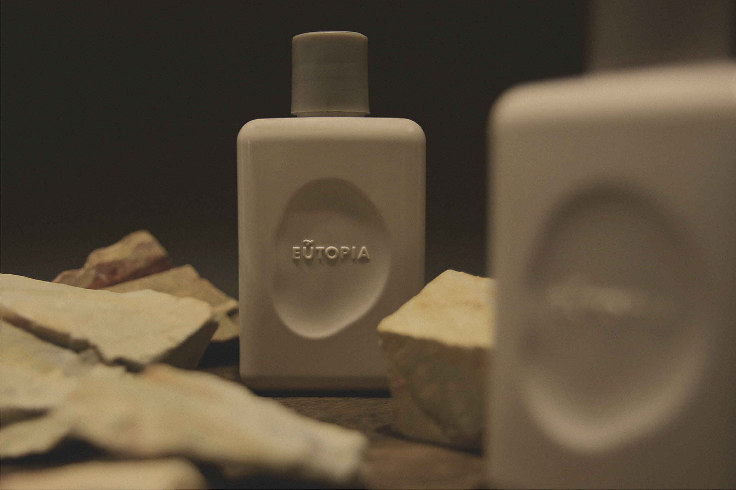
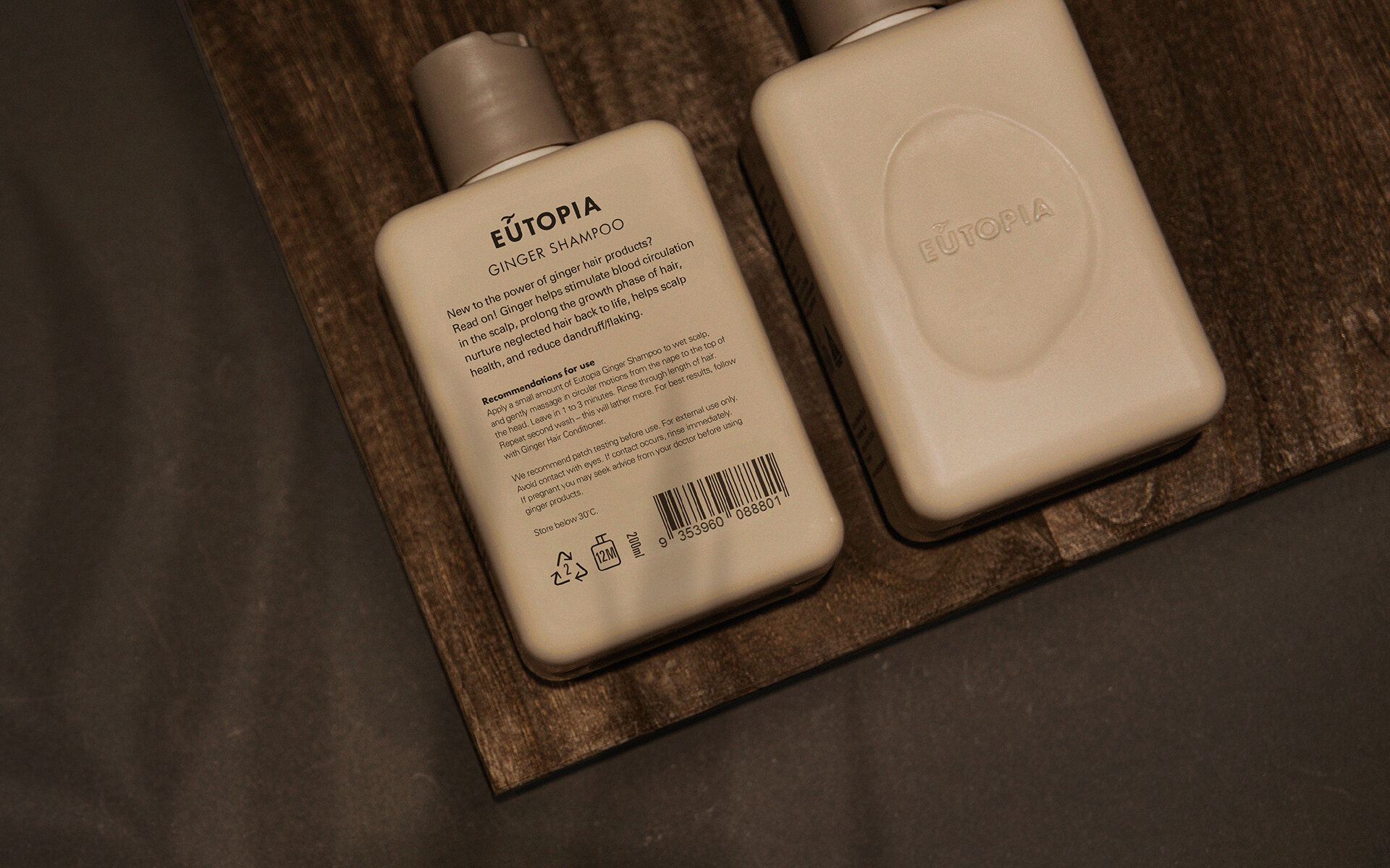
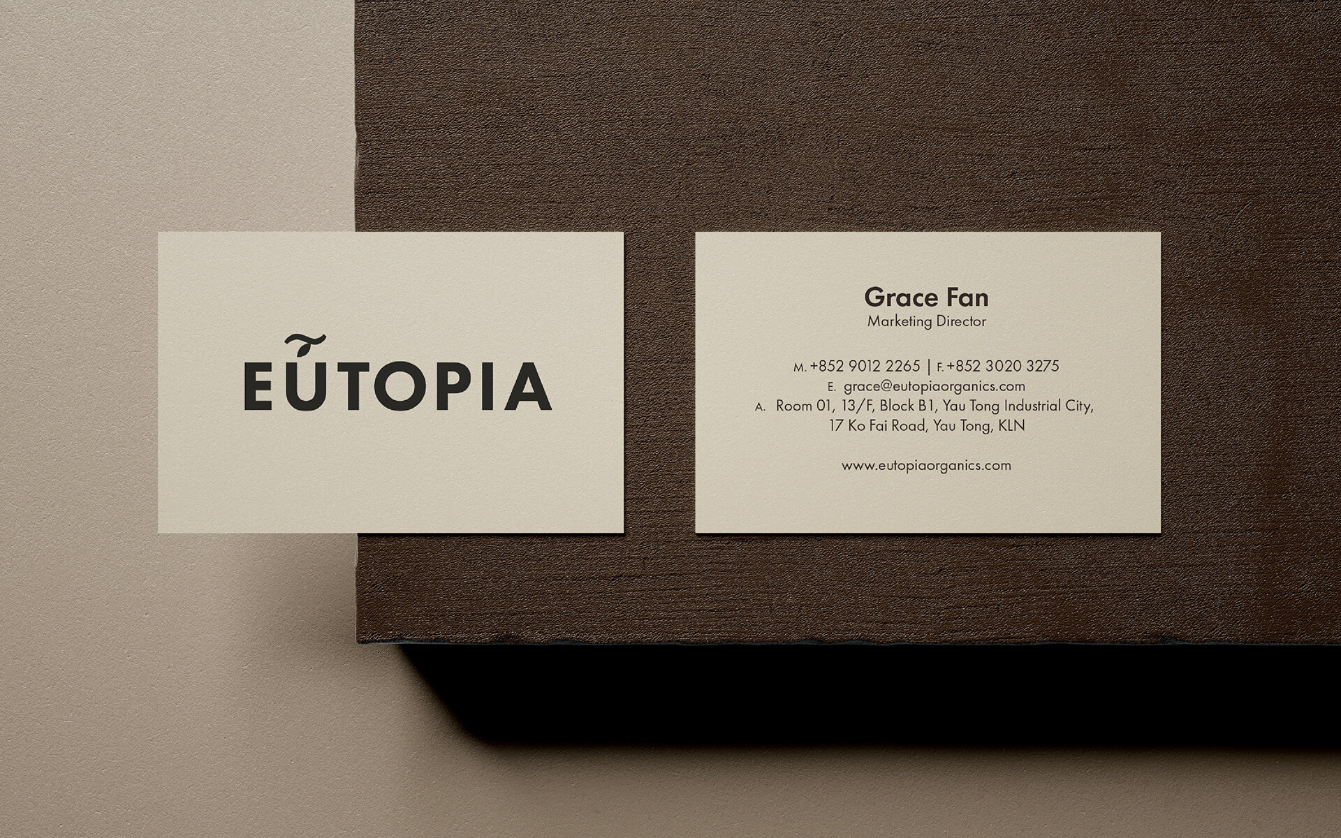
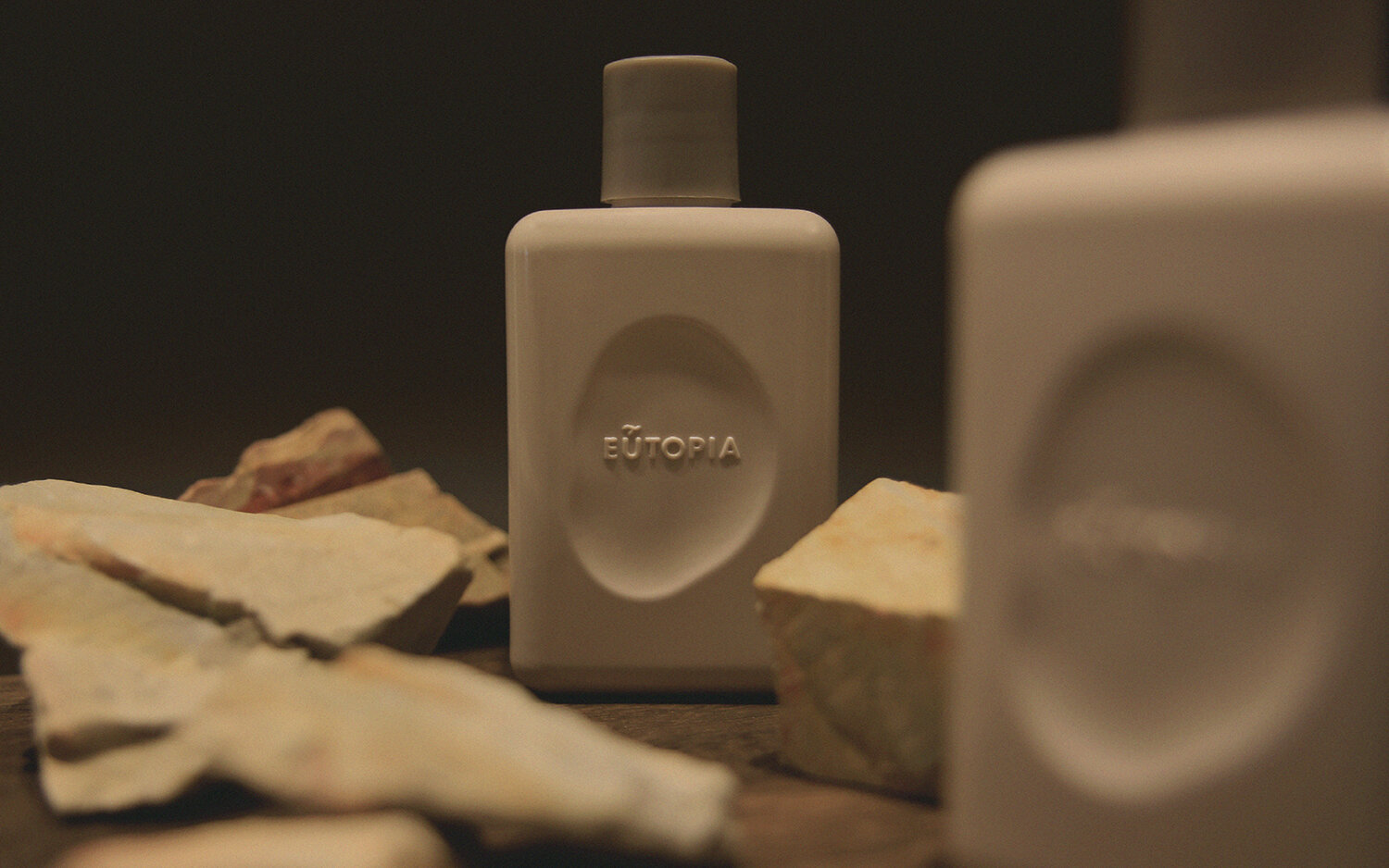
After deciding on the brand name, we moved onto designing the logo. In the original Greek, there is an accent above the “U” in eutopia. Starting with this symbol, we adapted it into a simple illustration of a branch with a hanging leaf to draw attention to Eutopia Organic’s deep connection to nature.
The familiar shape of the logo makes it easily recognizable and we chose Futura and Univers as the brand’s basic font type for their future packaging and printed materials. We set the slogan for Eutopia Organics as “Not just organics” to convey that the body care brand was not just another organic brand, but one that encapsulated an entire attitude towards life.