BELLEESSE AESTHETIC MEDICINE

BELLEESSE AESTHETIC MEDICINE
Client:BELLEESSE
Design Company: HOLYCOW DESIGN,TAIWAN
Creative Direction: Shiouwen Wang
Art Direction: Jhihsiang Han
Design: Yurong Chen
Copy Writing: Yichieh chou
Country:TAIWAN
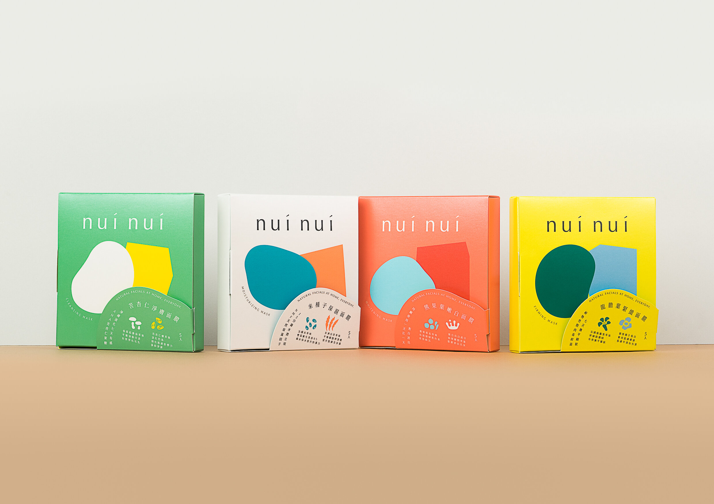
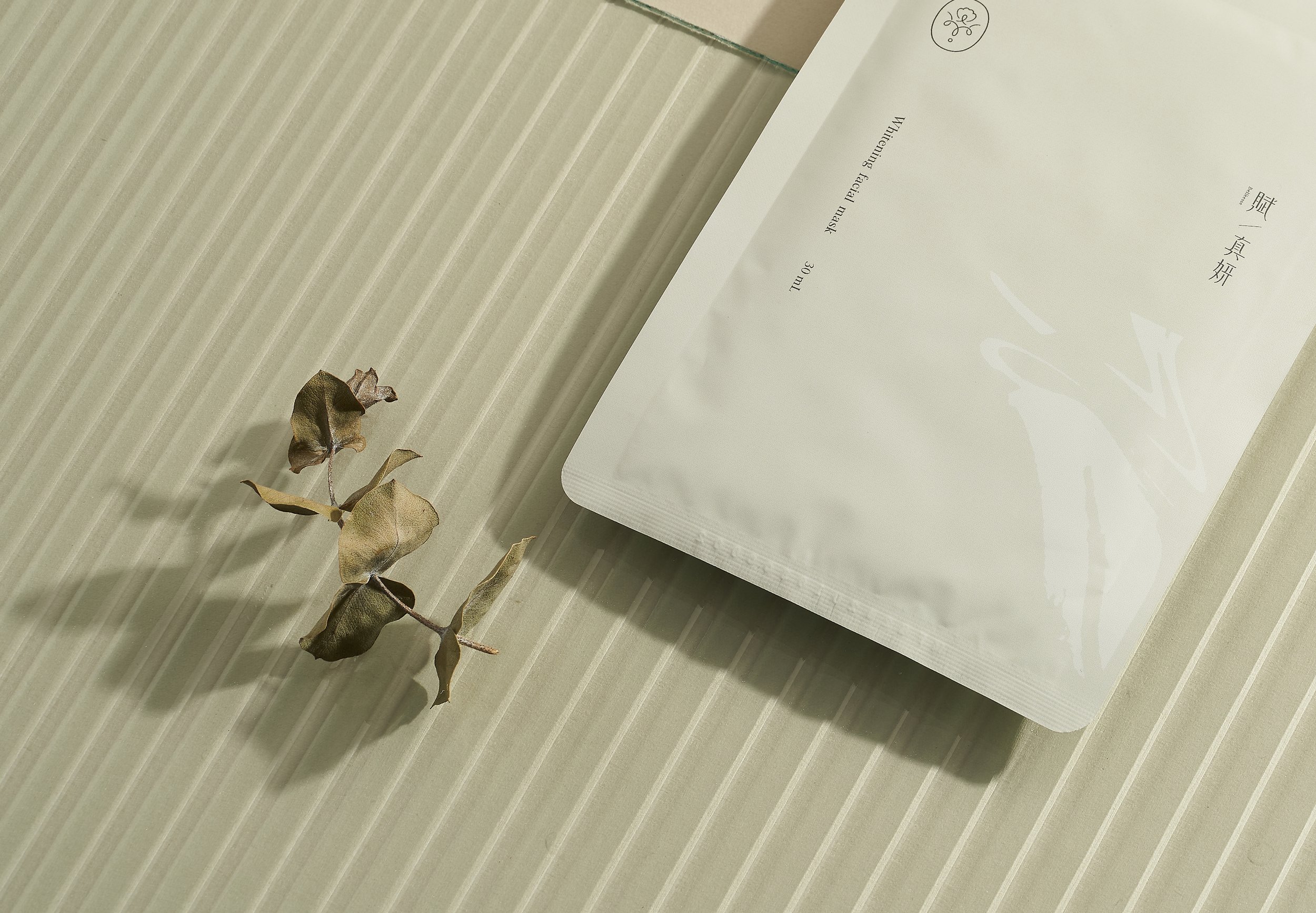
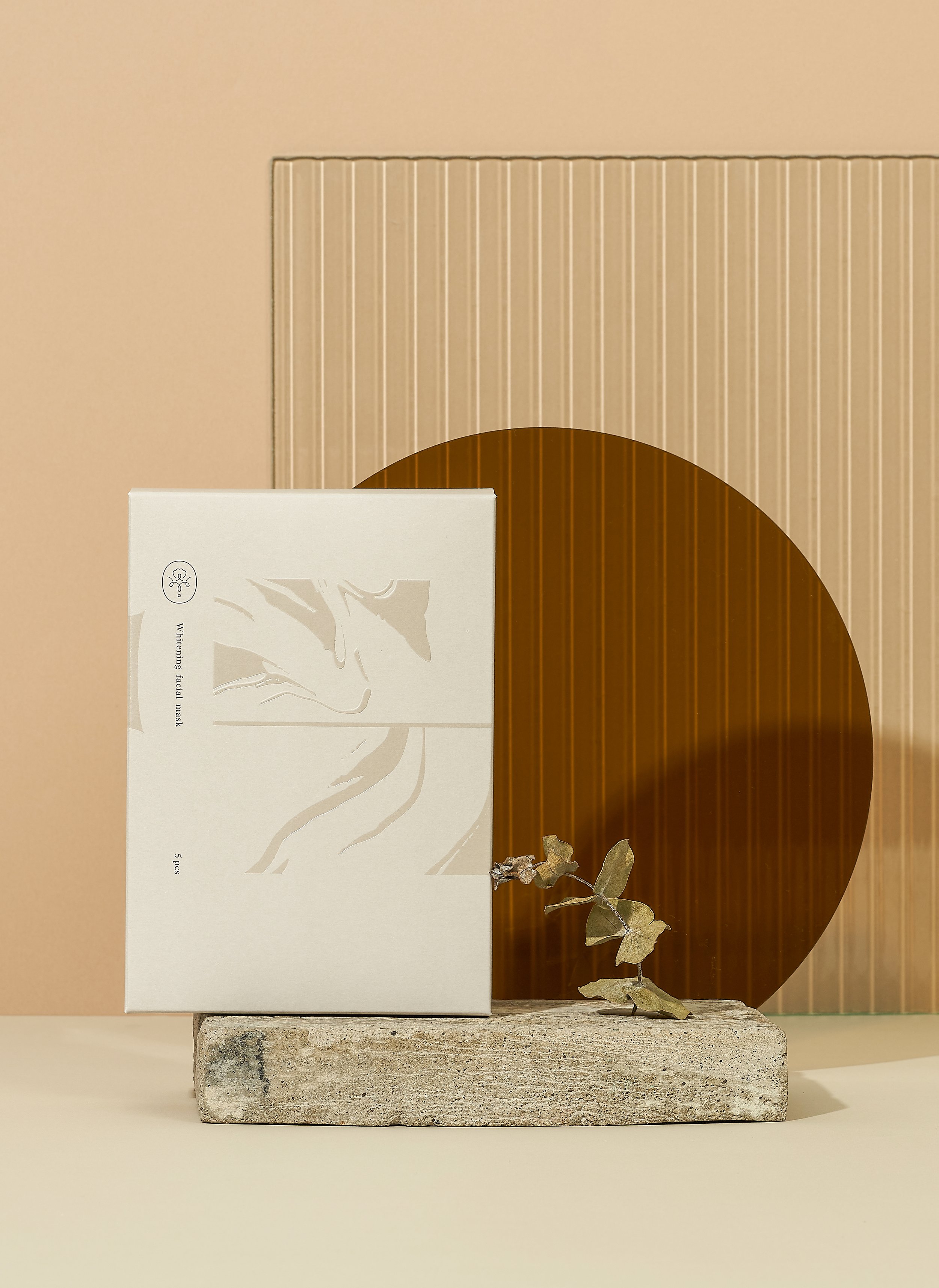
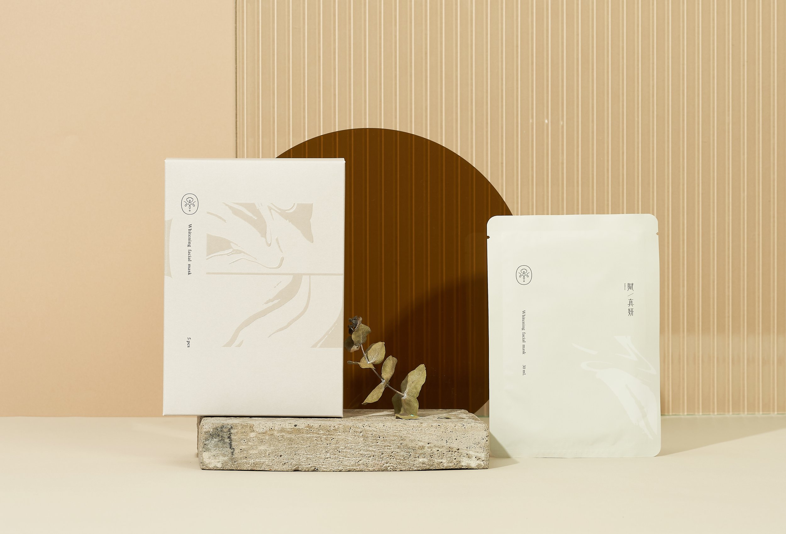
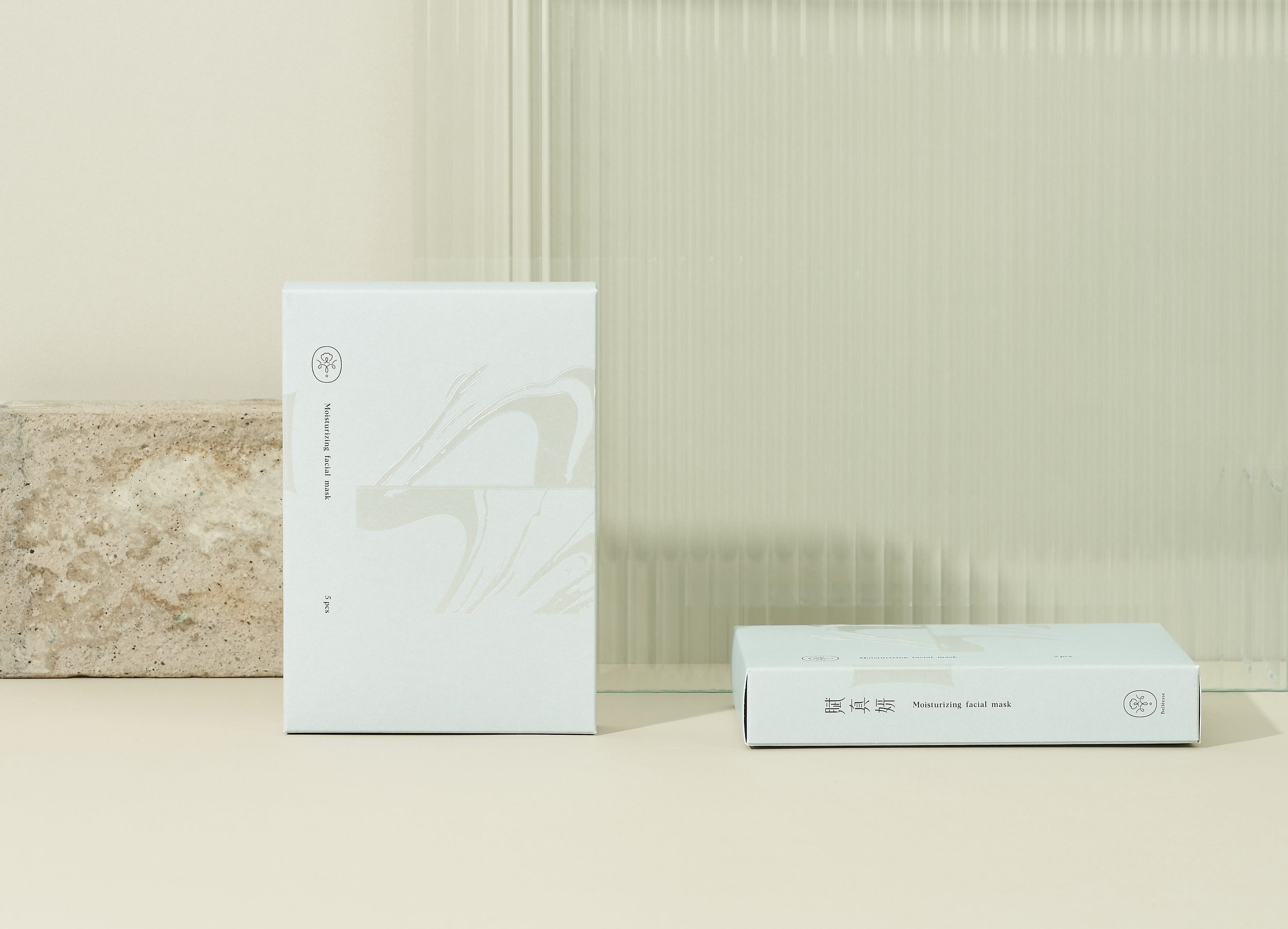
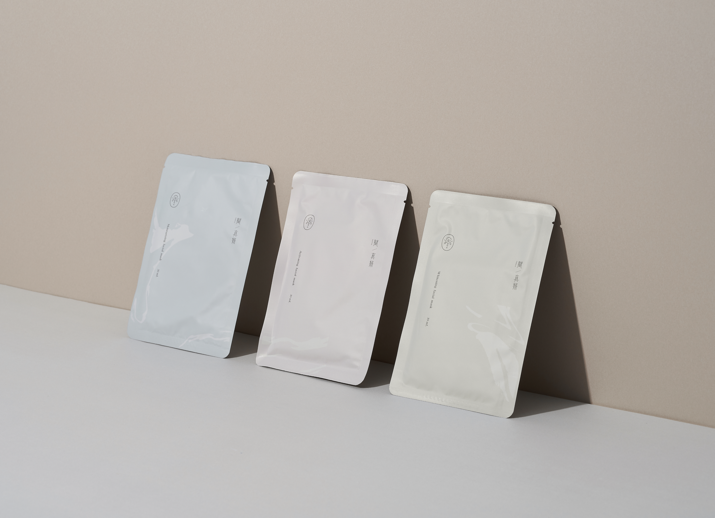
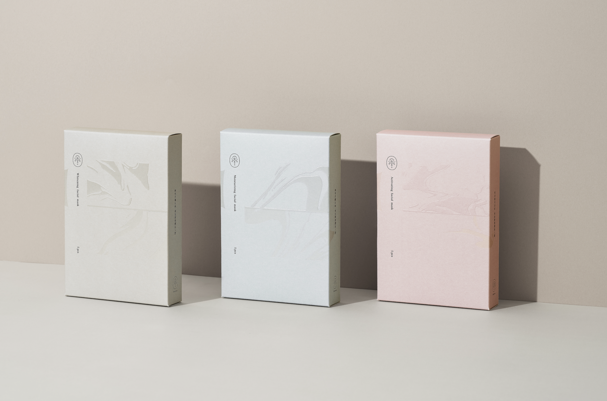
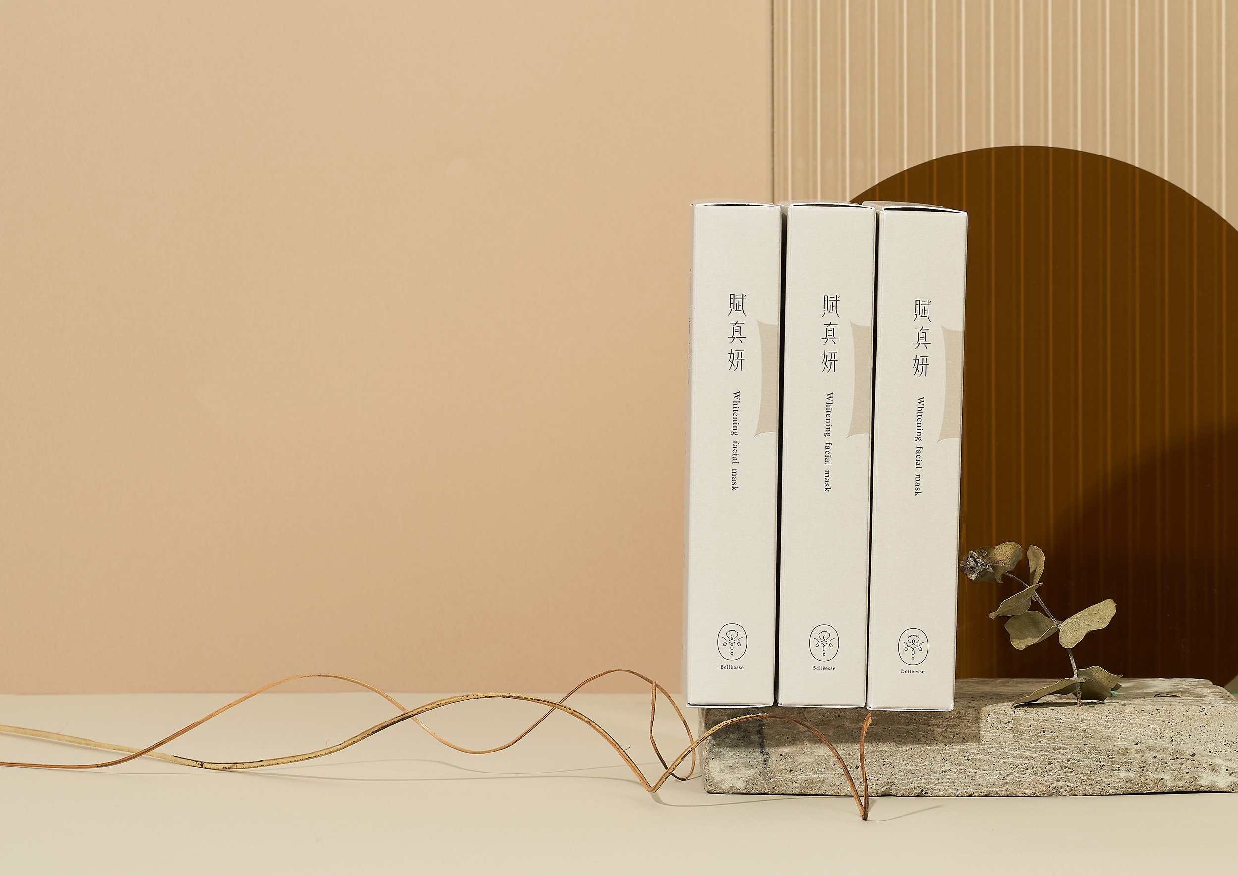
Each letter in the Chinese name of the brand, “賦真妍”, is endowed with meaning. “賦” means to bestow vitality to the body’s cells; “真” means a true, authentic, and pure aesthetic experience; “妍” means to personally experience that transformation. This is our pursuit of beauty.
The name of the brand “Belléesse” is a combination of the French words “Belle”, which means “beautiful”, and “Déesse”, which means “goddess”. Thus, implied in the brand name, Belléesse’s commitment is to help each and every person to become the beautiful goddess they aspire to be.
In contrast to most aesthetic clinics run by doctors in the industry, the Belléesse team is founded by “seasoned consumers” in the area of medical aesthetics. Thus, they can better understand the customers’ desire and pursuit of detail when it comes to personal beauty.
In addition to the professional medical team, the brand aims to create a genuine customer experience, so that when they come to Belléesse, they feel at home. The hope is that in the journey to beauty, customers will feel at ease and relaxed.
The team members have gone through each of the services thoroughly to ensure the highest quality. Furthermore, the high-grade medical equipment is complemented with the professional medical team. Carefully listening and understanding the customer’s need, the brand is confident that it can truly deliver on the ideal beauty each customer desires.
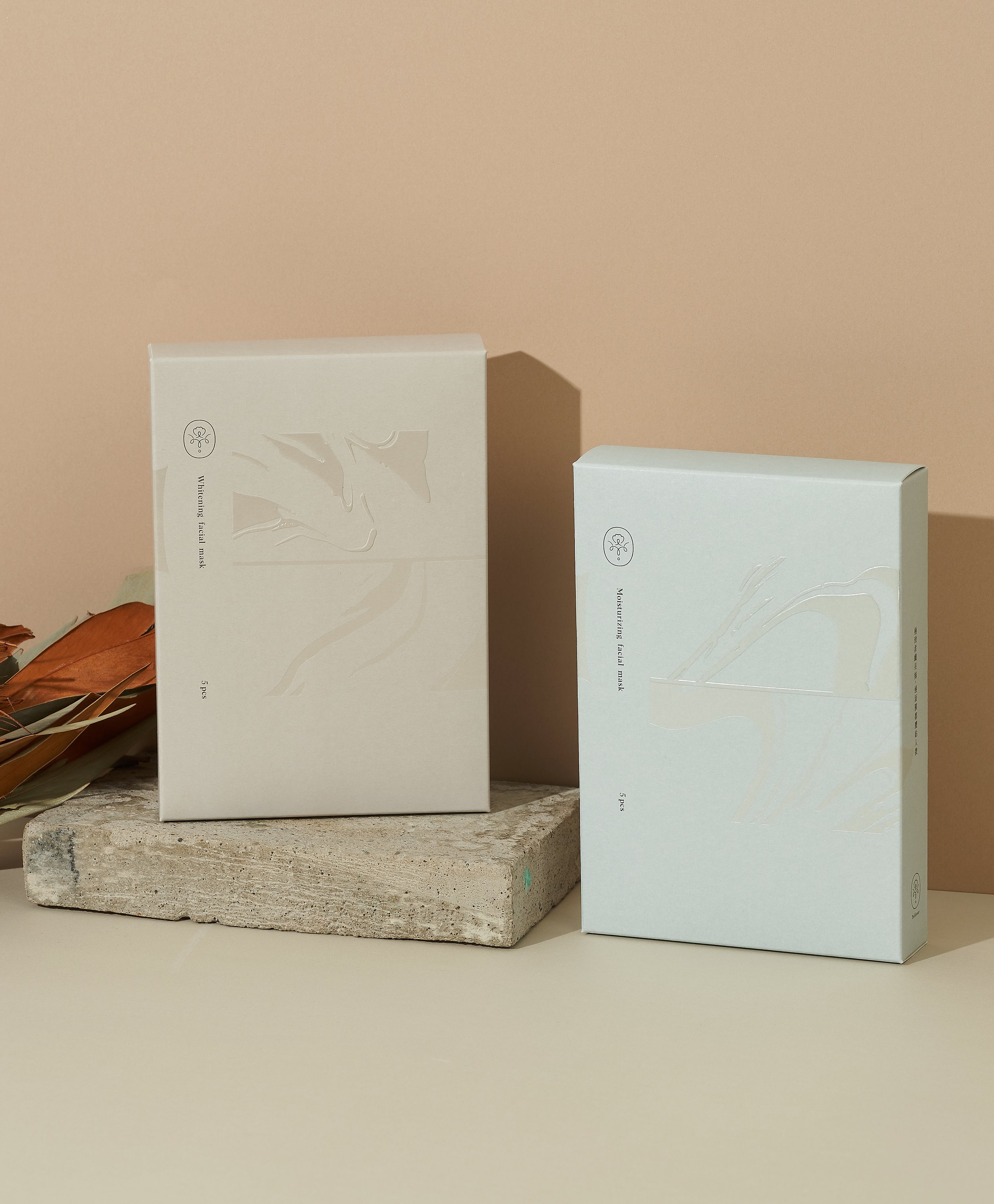
In terms of the font design, the thin and tall design draw out a feeling of elegance and sweetness, with each stroke and contour line to convey the details within, thus complementing the overall design with a sense of professionalism.
The logo’s design reflects the brands finesse and professionalism. With a stamp-like template, the stamen within faces up, representing new life. On both sides, the letter “B” from the brand name is cleverly designed as receptacles holding the flower petals. The water droplet at the bottom represents how the brand provides the body with the most authentic feeling.