kasiko shell

kasiko shell
Client: Brandlogistics Co., Ltd.
Art Director: Tsuyoshi Fukuda
Naming: Yoshihiro Iwanaga
Designer: Hitomi Sago
Country: Japan
Find out more through: http://www.kasiko.jp and their Facebook
"A form to send a heartfelt message.
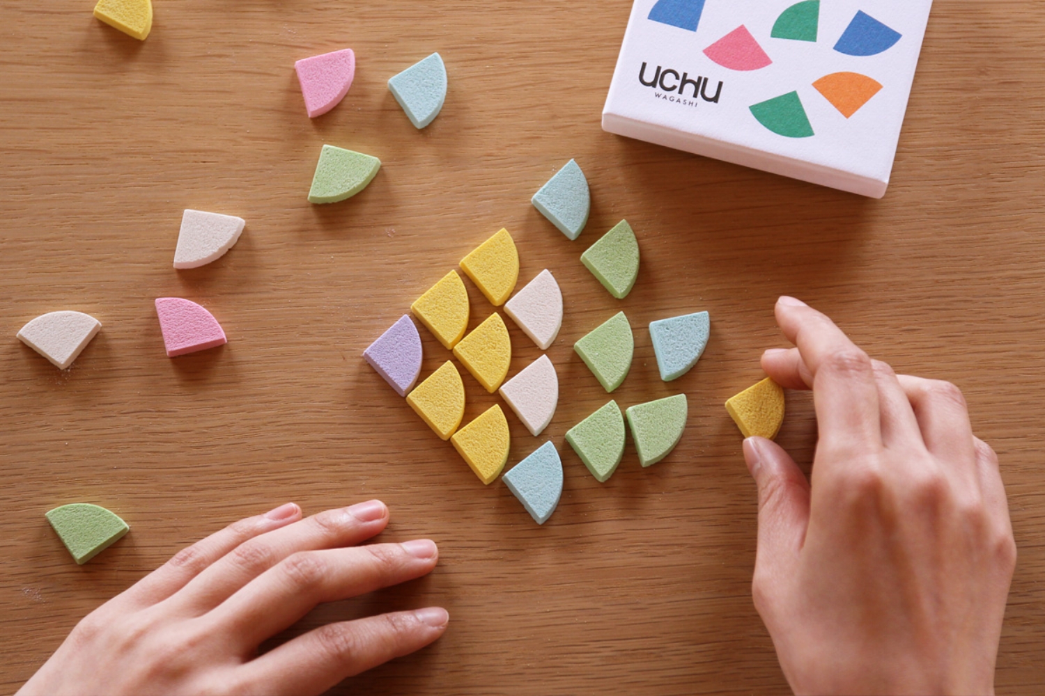
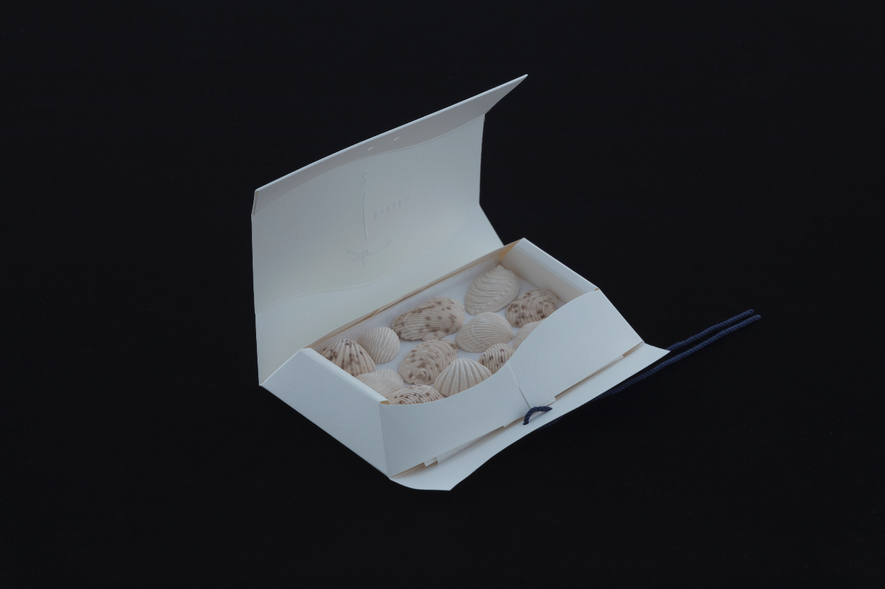
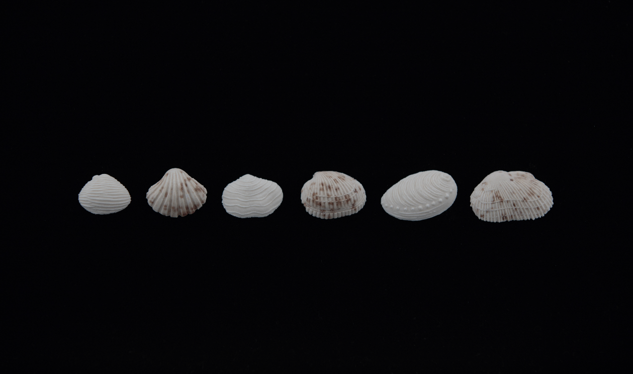
“kasiko” is a small sweet that can take the role of a greeting to accompany messages that you want to tell someone.
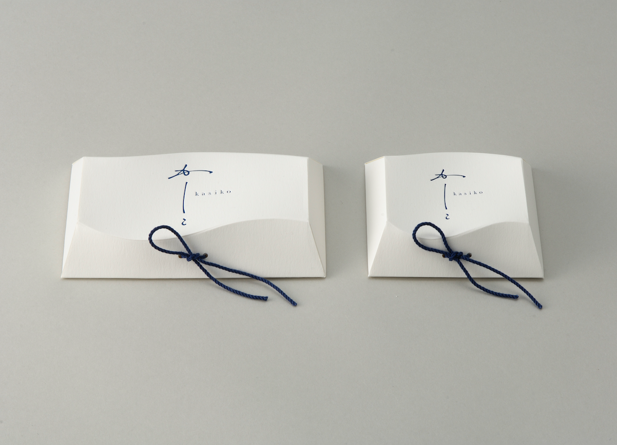
The word, "kasiko" is the complimentary close of a Japanese letter.
Our logo mark is designed using the Japanese "SHO" — calligraphy to express both Japanese tradition and modernity.
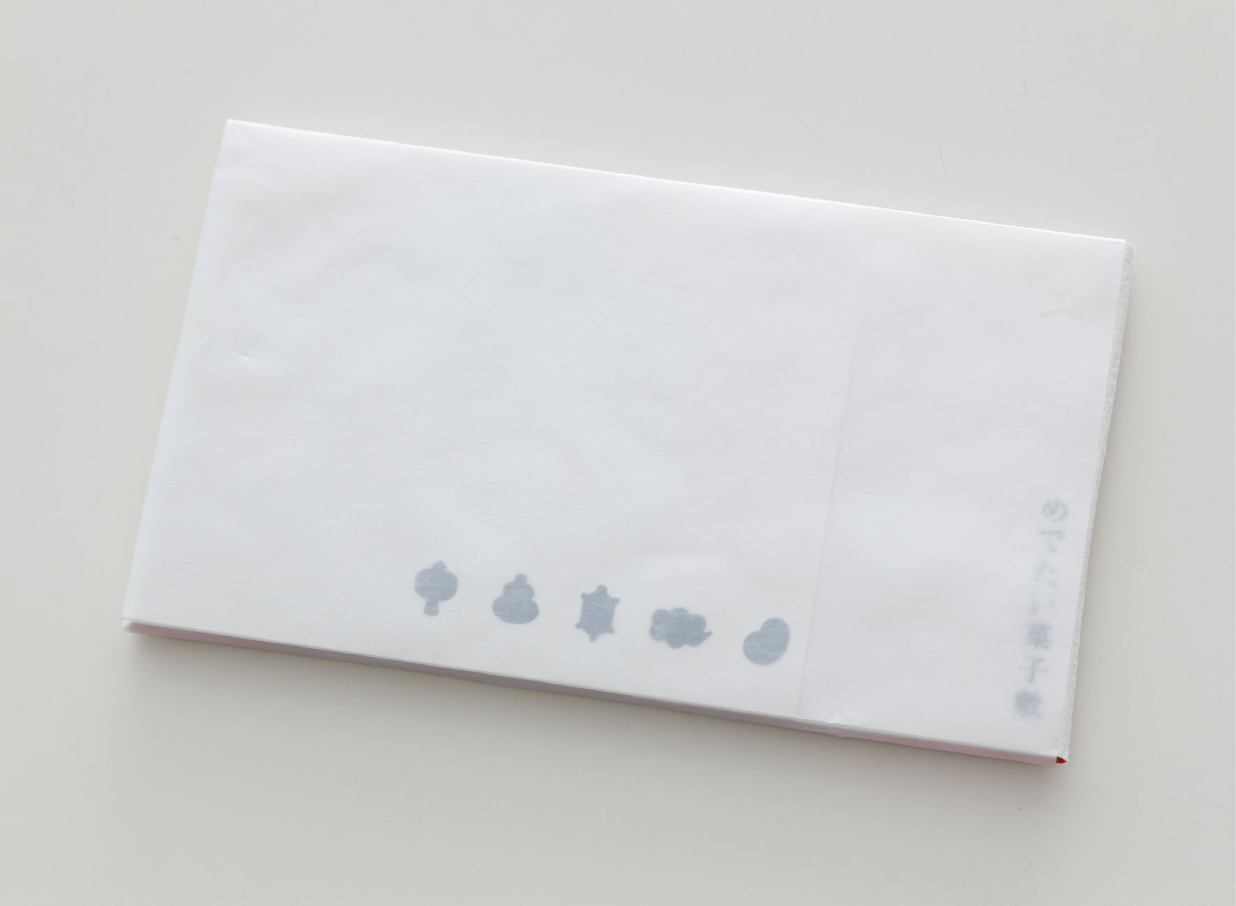
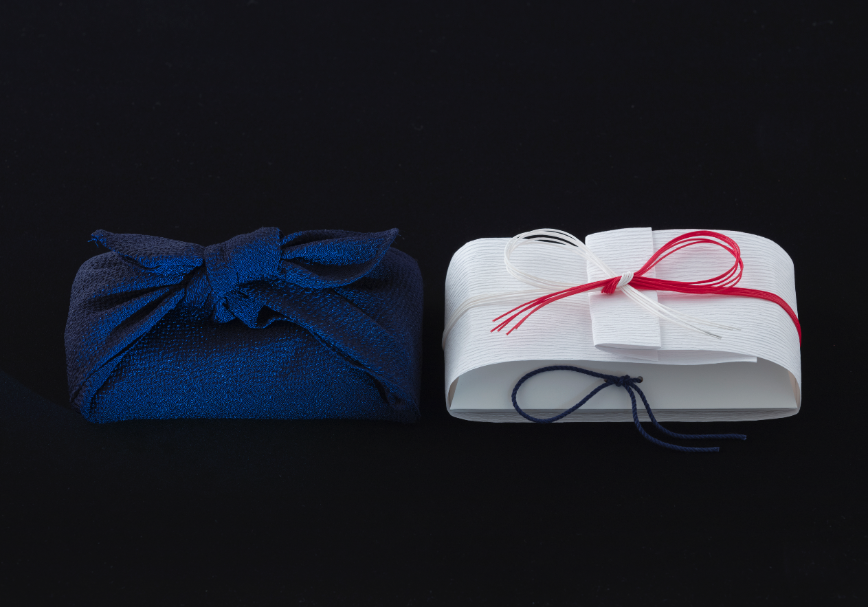
Our package is designed with a gentle form of a wave to wrap the delicate shell “HIGASHI” (dry confectionary).
Following the Japanese custom of using “MIZUHIKI” (a pair of paper string) to tie around a wrapped gift, we have tied our package with a string to finish it.
For the colors of our logo mark and package, we used the white of “WASANBONTO” (our main ingredient, a traditional Japanese sugar) and the navy blue of waves.
Through a simple and fine design, we hope to convey the high-quality Japanese “WAGASHI” culture to the customers."
Digital Communication services, including website design, search engine optimization, social media, and content creation for nonprofit organizations, consultants, and creative entrepreneurs.