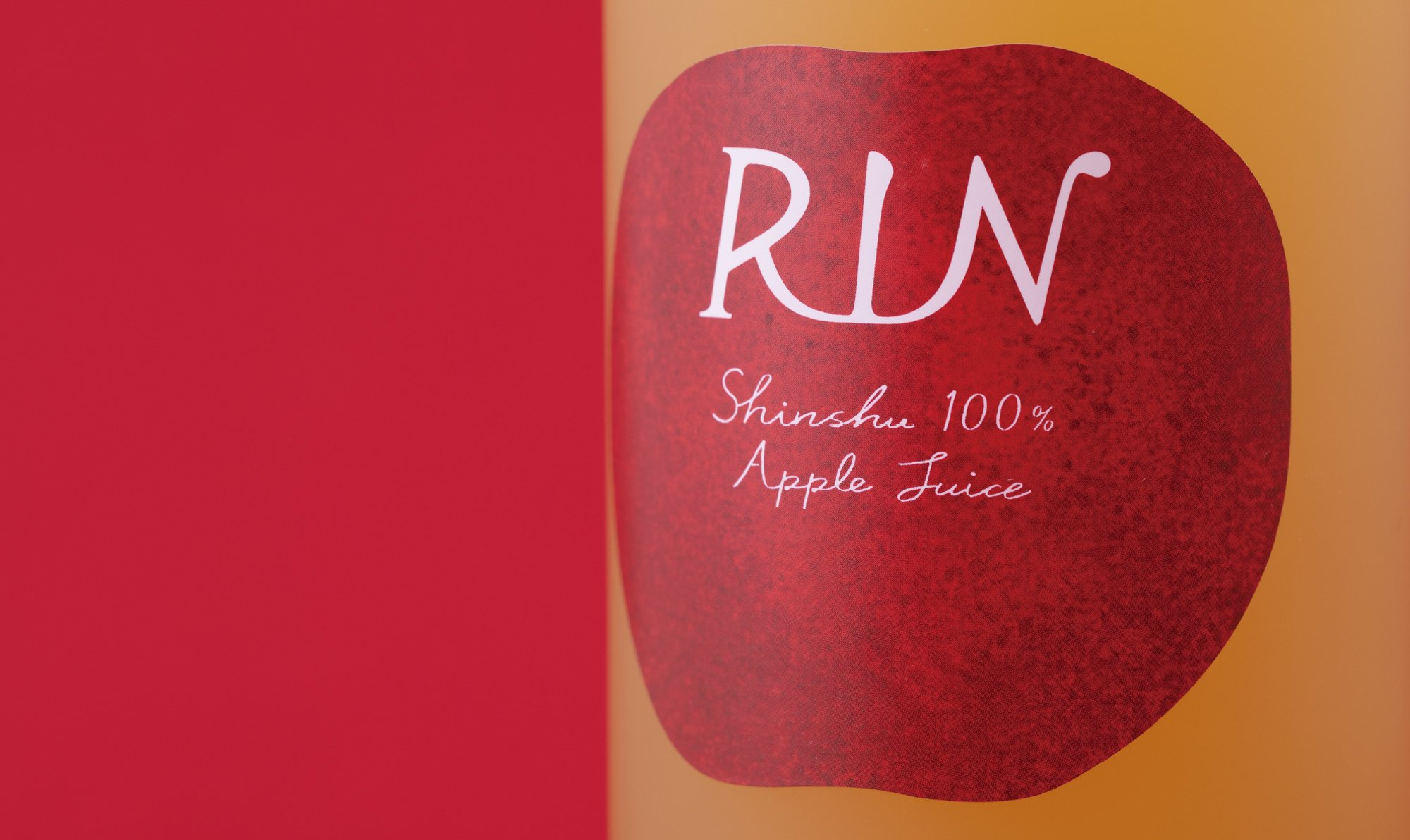
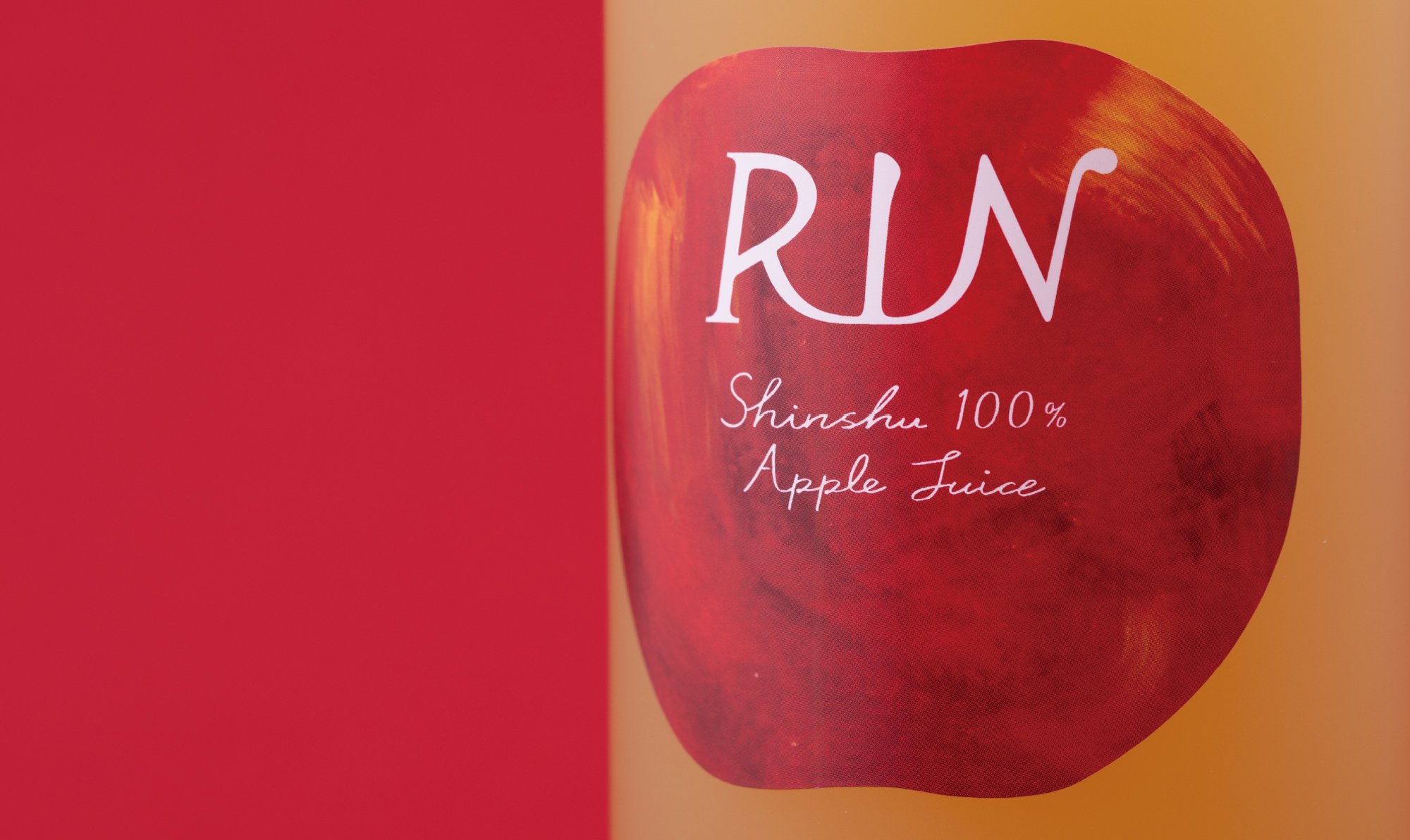
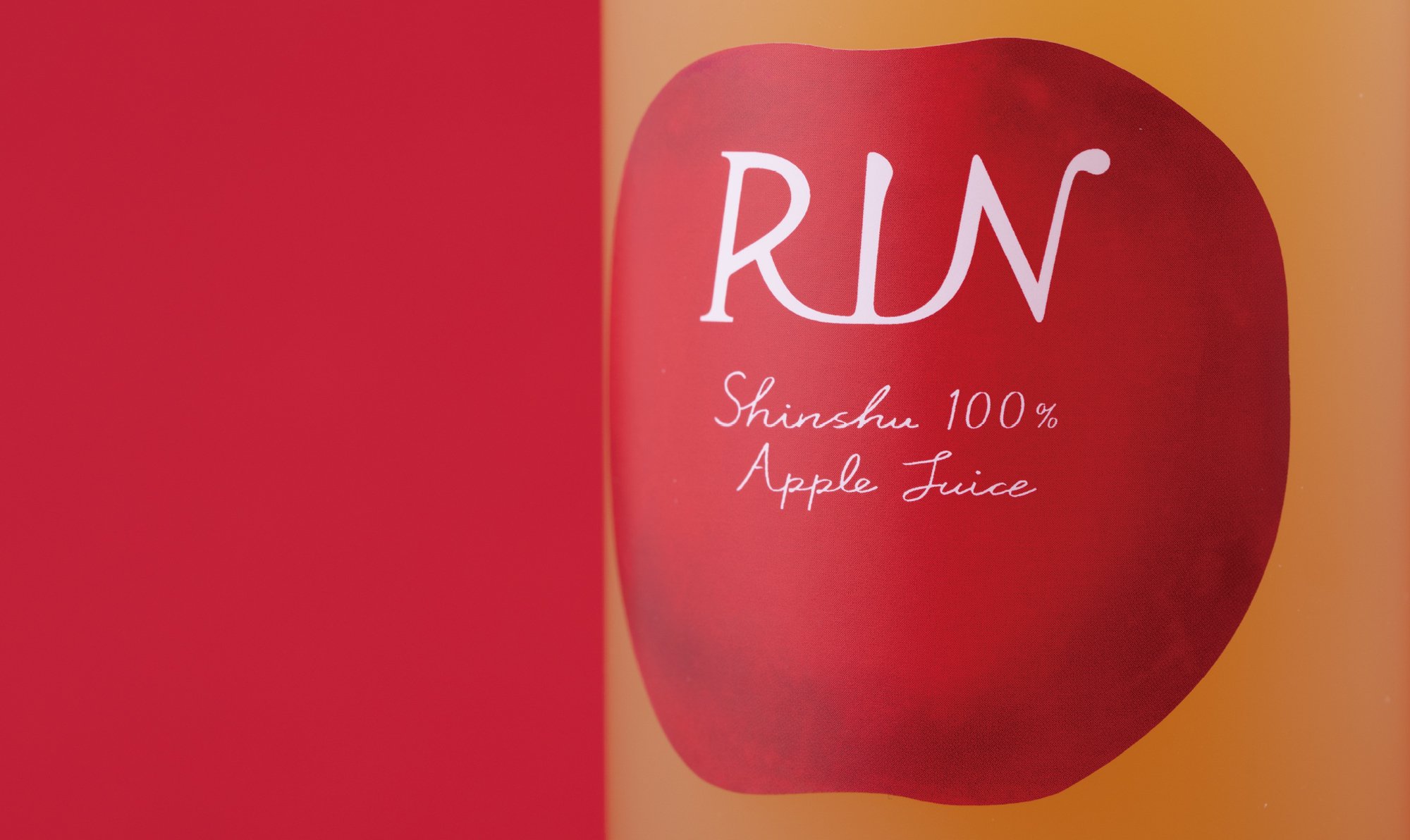
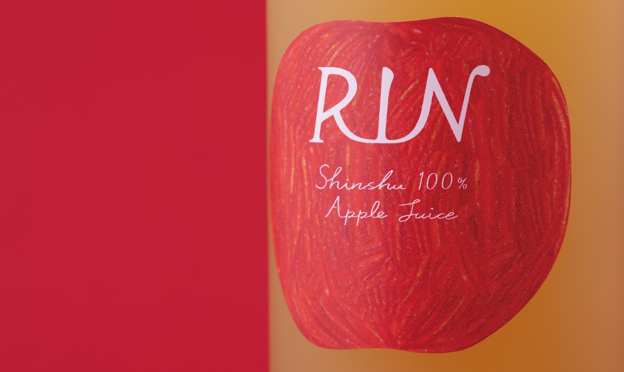
RIN

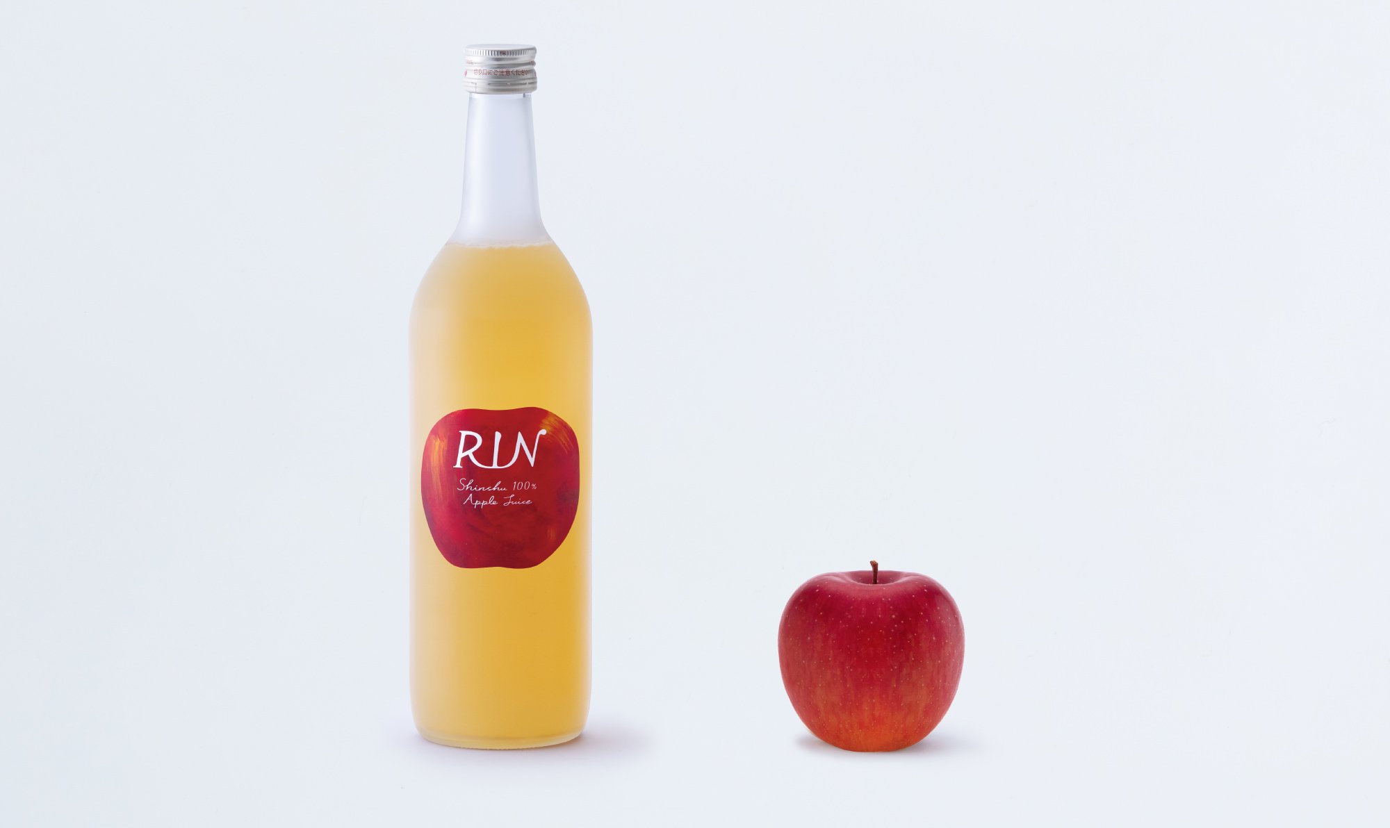
RIN
Client: RINGOTO Co., Ltd.
Design Company: cosmos
Art Direction/Creative Direction: Yoshiki Uchida
Design: Miyuki Mouri
Photography: Shinobu Suzuki
Country: Japan
This juice was produced by a local project in Nagano Prefecture.
In this region, many apple farmers were damaged by the typhoon in 2019.
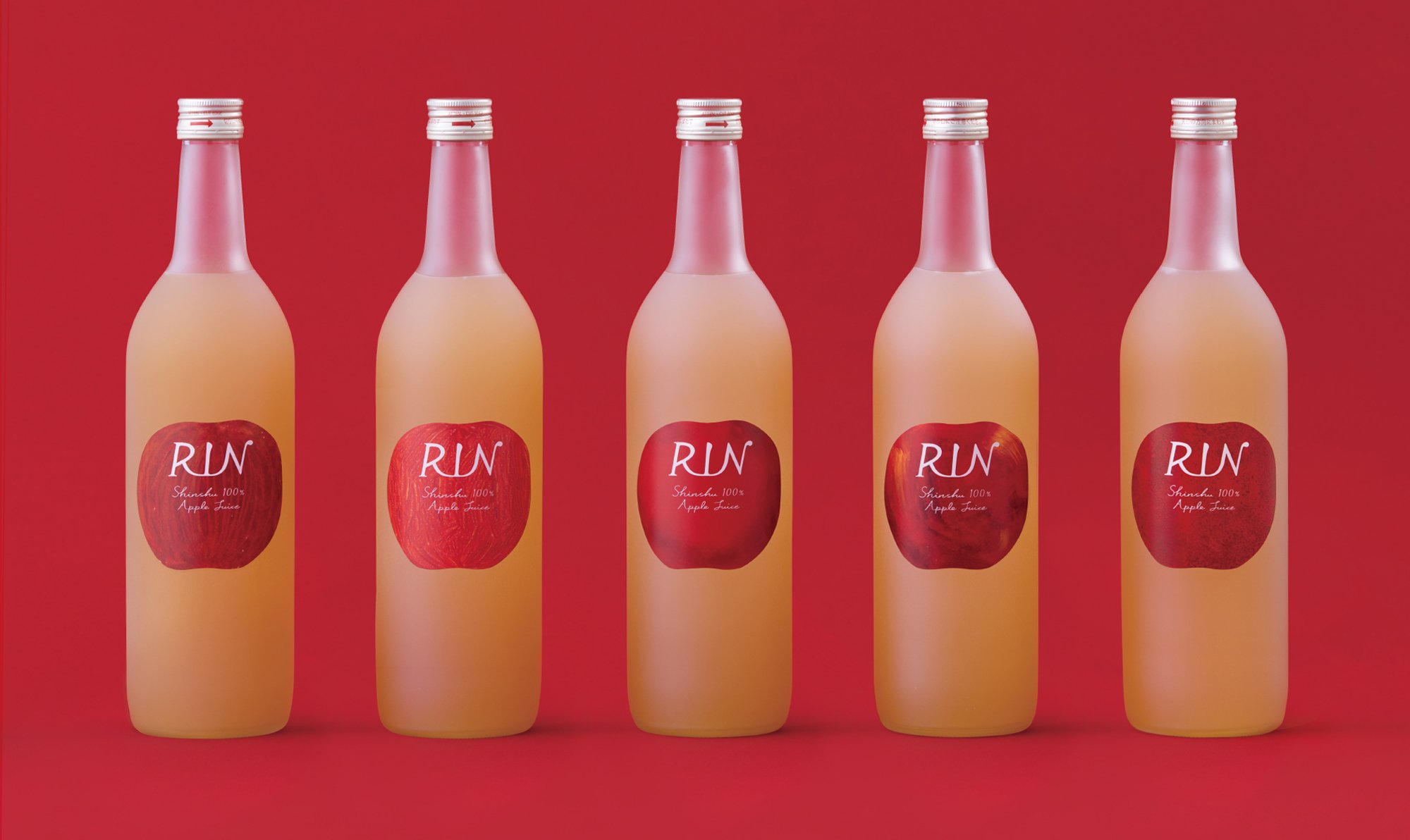
This product is one of the activities in which several farmers cooperate with each other to collect, process, and commercialize apples that are difficult to ship as they are due to irregularities in shape and other reasons, in order to deliver the delicious taste of apples in the future with the aim of sustainable apple production.
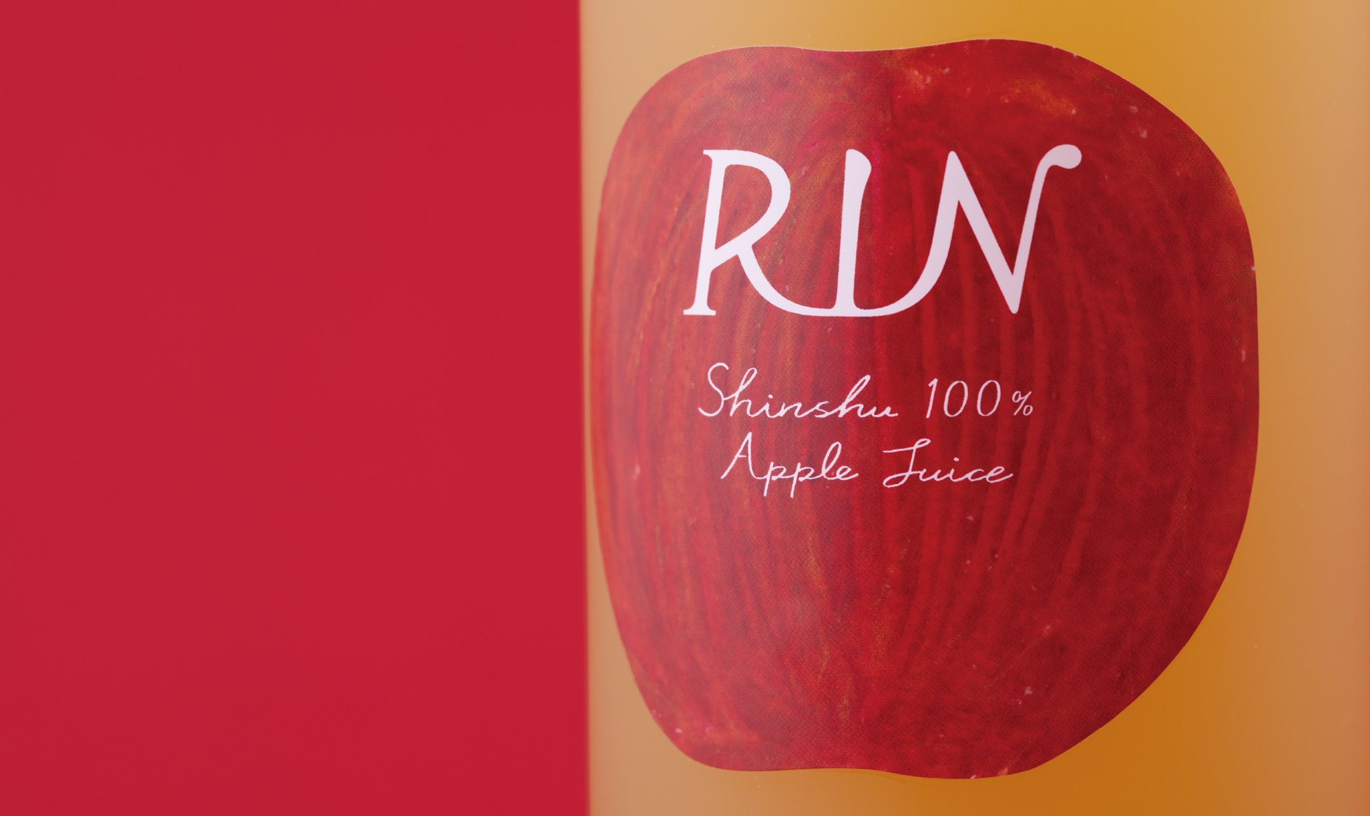
The name "RIN" is intended to connect many farmers and consumers through "apples.
The logo was designed to look like an apple's stem by connecting various types of typefaces using a distorted apple as a symbol to enjoy the irregularities and oddities of the apples. The five different labels were created to express the interestingness of the unevenness of the apples.