SHOCHU X

SHOCHU X
Client: SHOCHU X INC.
Design Company: SAGA INC.
Creative Direction/Art Direction/Design: Kota Sagae
Creation: Keisuke Hashimoto
Marketing Direction: Daiki Okabe
Production Management: Miwa Nishii
Country:Japan
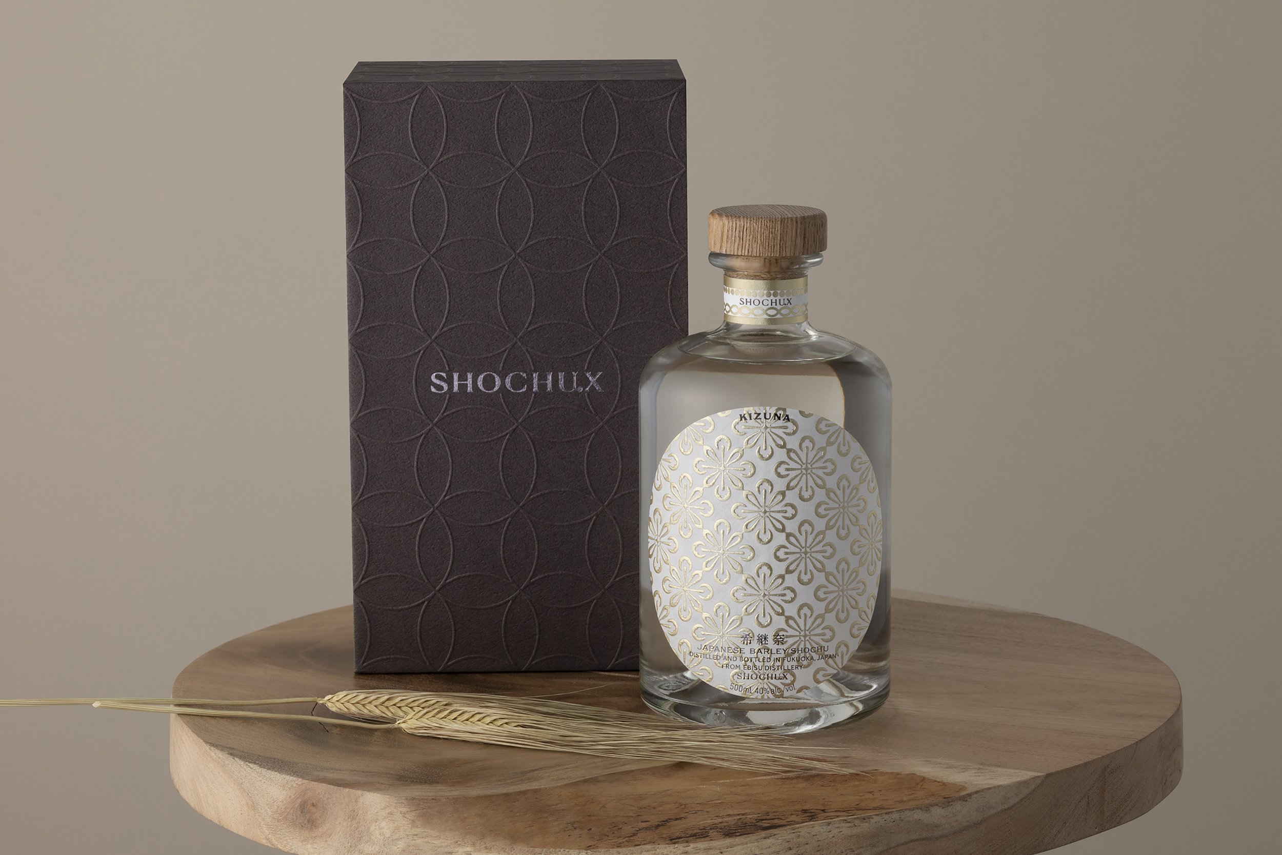
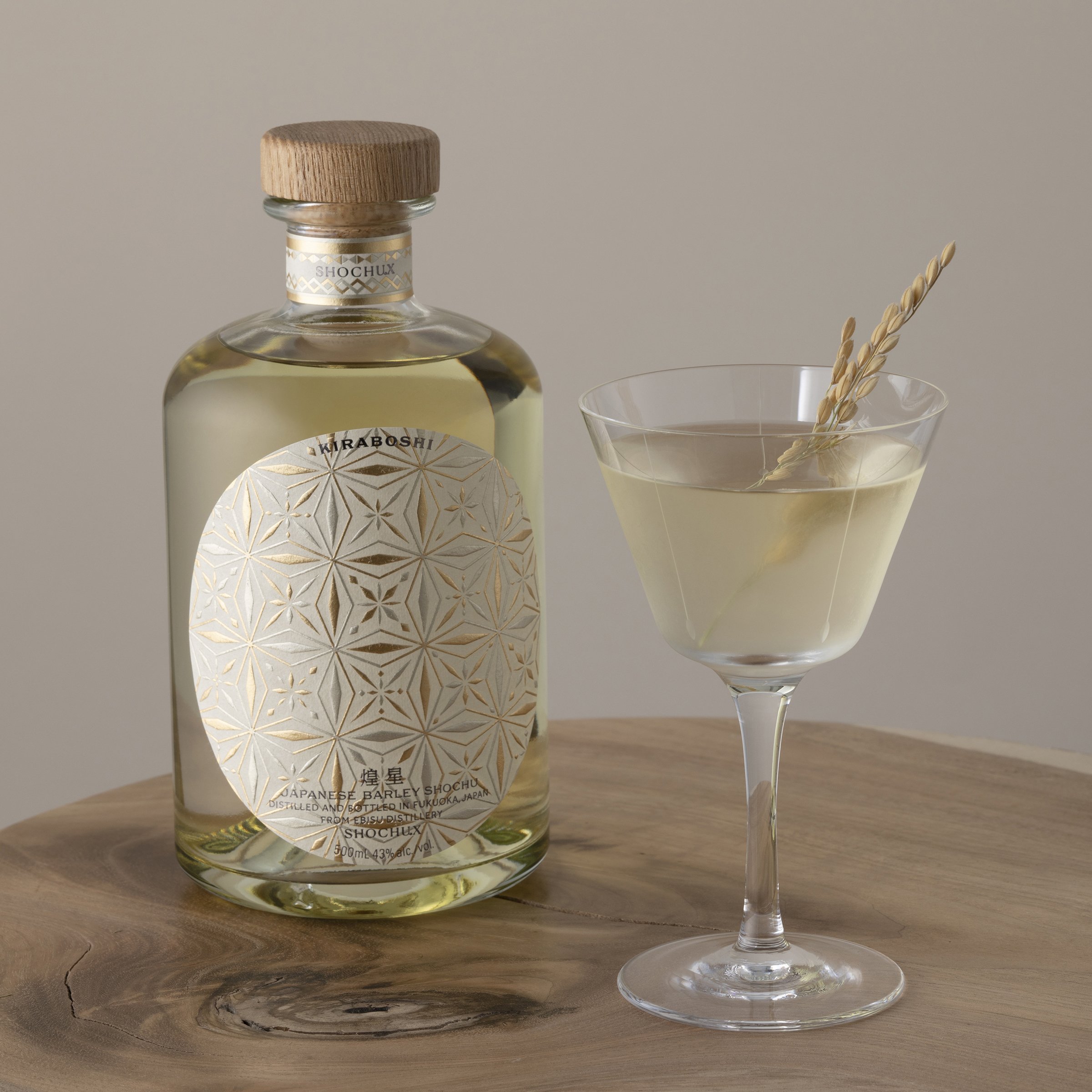
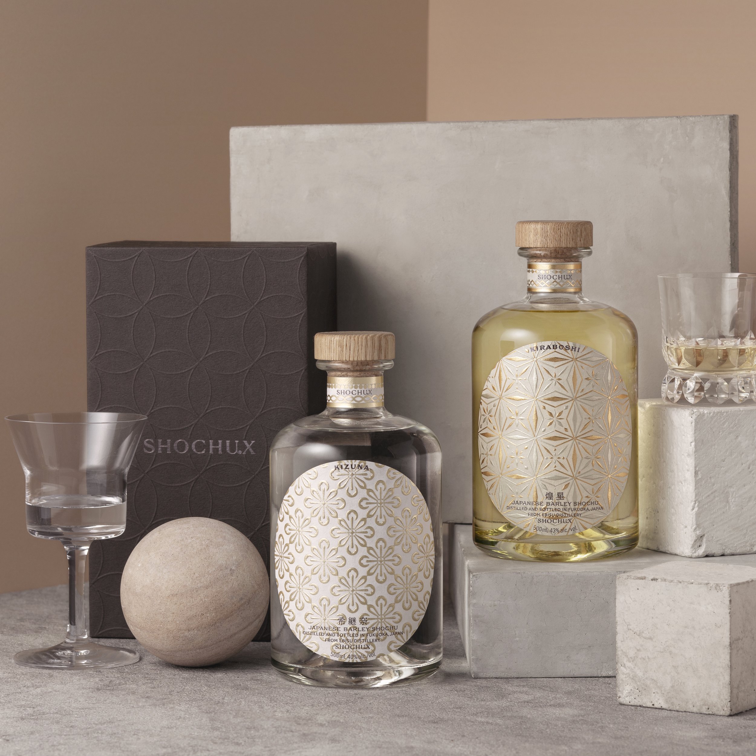
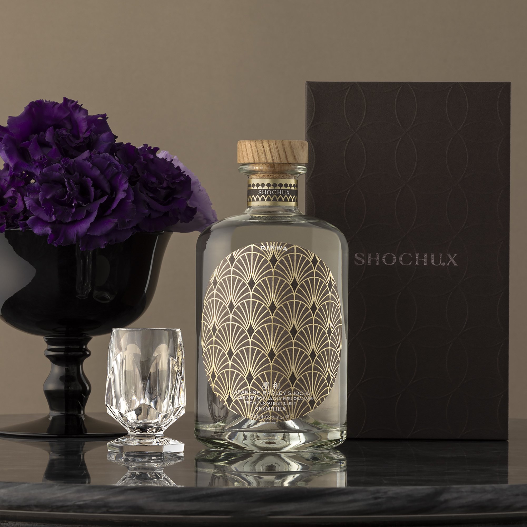
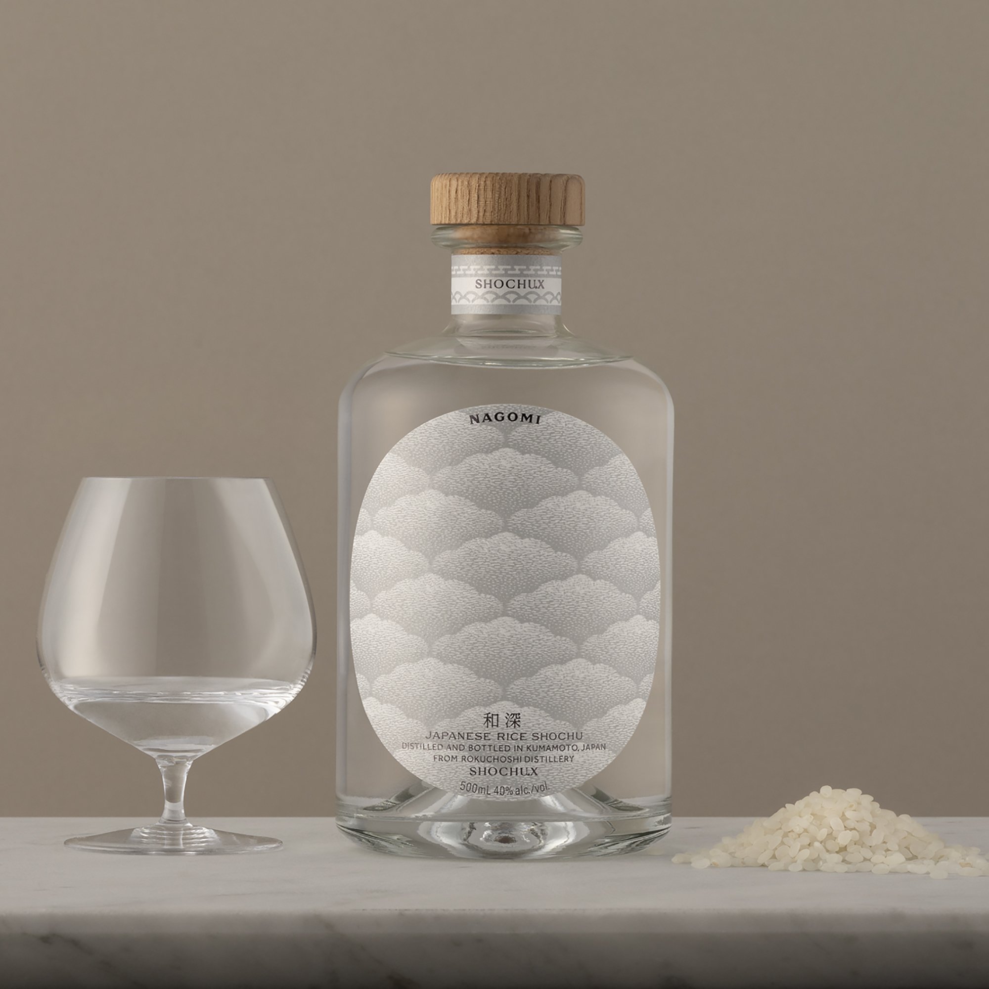
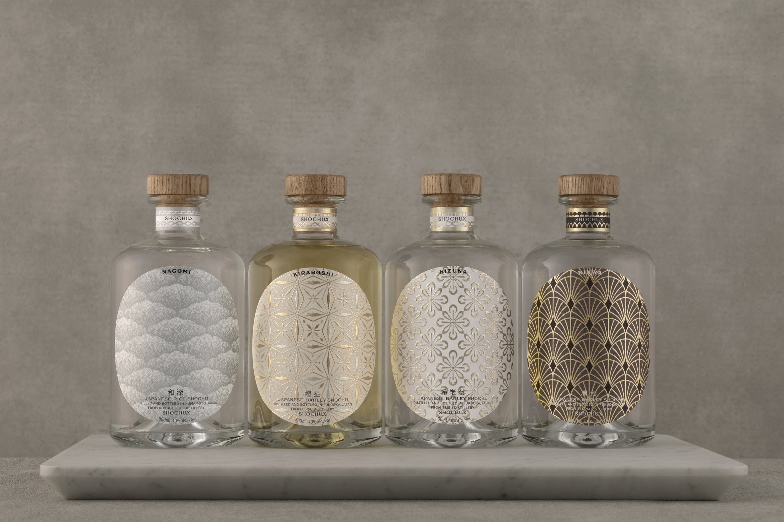
SHOCHU X, a shochu venture by Keisuke Hashimoto, a.k.a. "Shochu-X", is based on the concept of "TRANSFORM SHOCHU".
The rebranding was done to bring about change while respecting the tradition of shochu, and to create a way of being that emphasizes the value of relationships over the value of mere objects.
In design, we combined international sensibilities with Japanese aesthetics to create a design befitting the diversity of shochu.
After the rebranding launch, we saw a change in users from a predominantly male audience and an increase in response from women.Users commented, "It makes a great gift. I want to put it in a prominent place." and other positive comments.Furthermore, the brand has been adopted by hotels and bars, and inquiries have increased, transforming the brand into one that is supported by a wide range of people.
We have also begun collaborating with excellent Japanese foodstuffs and traditional crafts, expanding our sphere of activity to a brand that offers the value of cultural relationships.
Product name
希継奈(KIZUNA)/煌星(KIRBOSHI)/凜和(RINWA)/和深(NAGOMI)