BORRN PPSU series
BORRN PPSU series
Client: BORRN
Design Company: Kimhung Design
Creative DIrection / Art Direction: Kimhung Choi
Design: Cyan Lee
Copywriting: Saki Ho
Country: UK
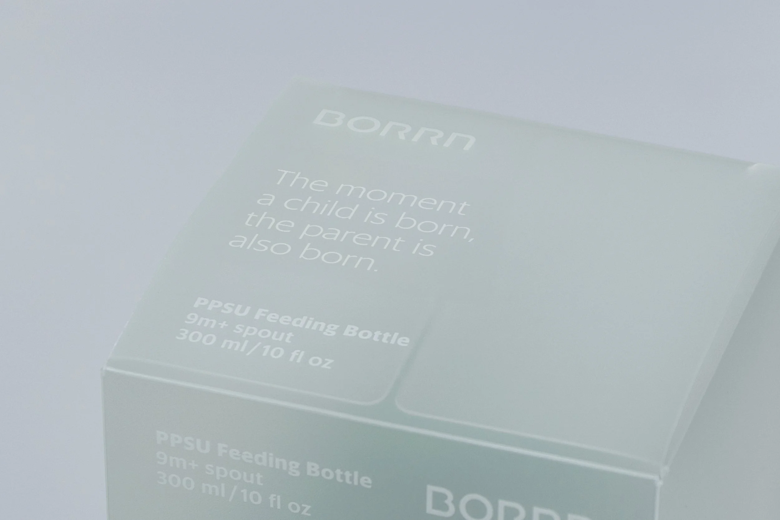
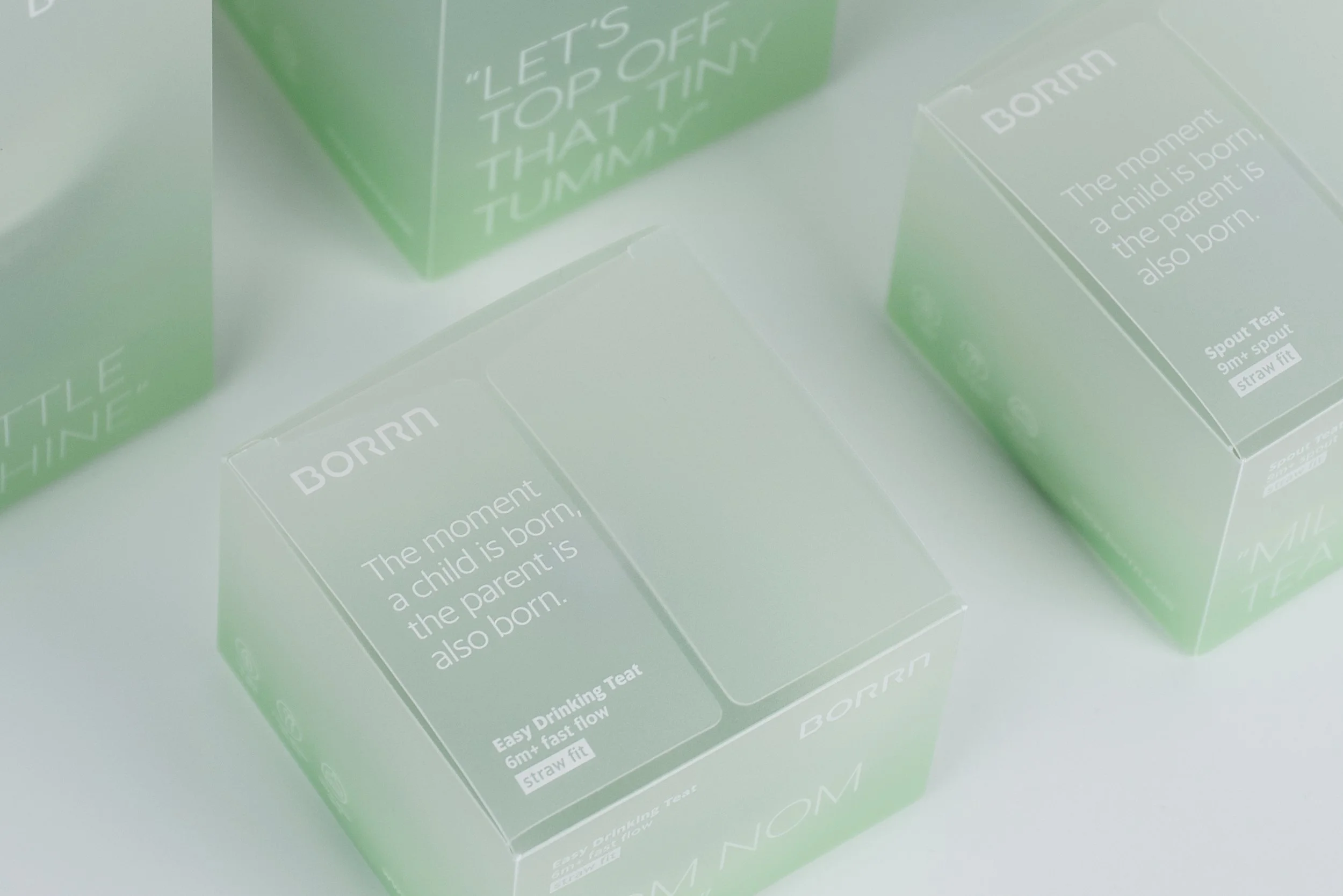
BORRN, a UK-born mother and baby brand, finds its core philosophy in the dual "R"s of its name, echoing the sentiment: "The moment a child is born, the parent is also born." This ethos drives BORRN's dedication to both parent and child, creating thoughtful products that ease parenting's complexities, enabling families to cherish growth together.
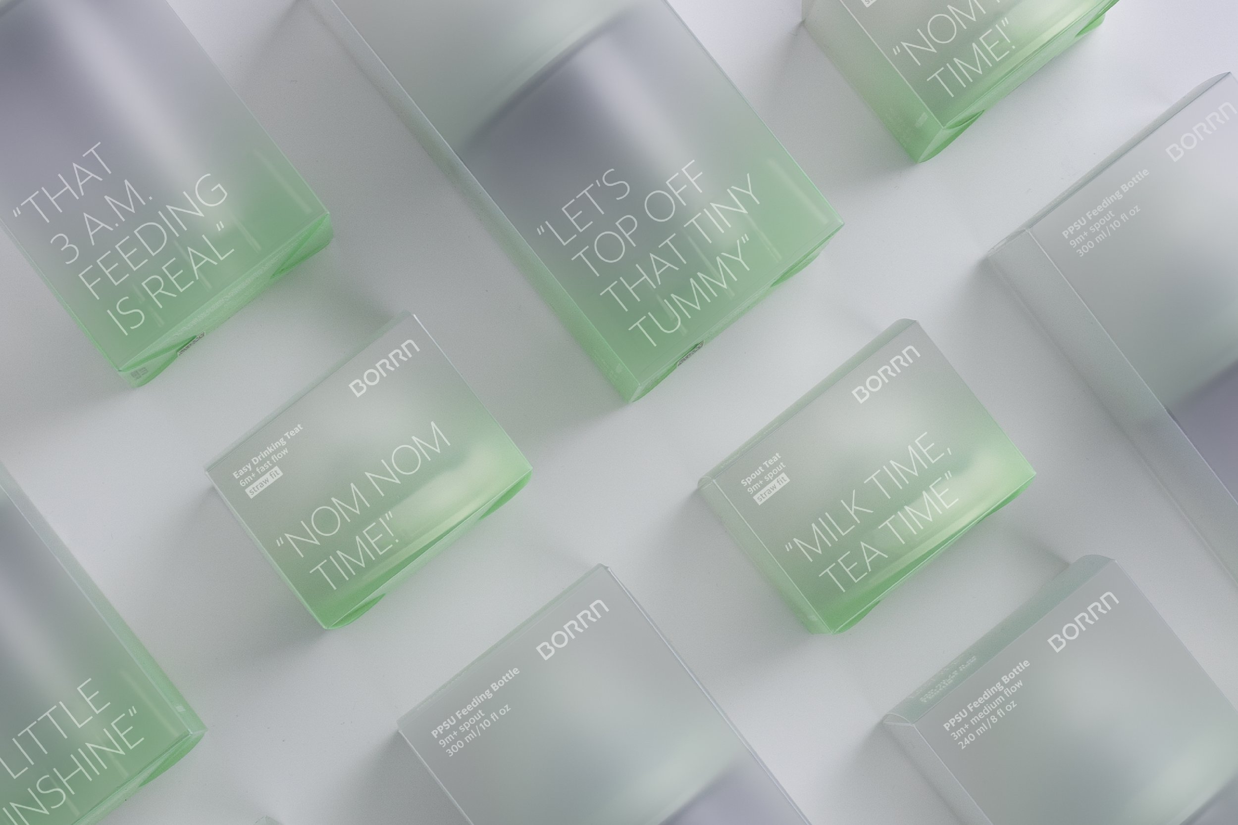
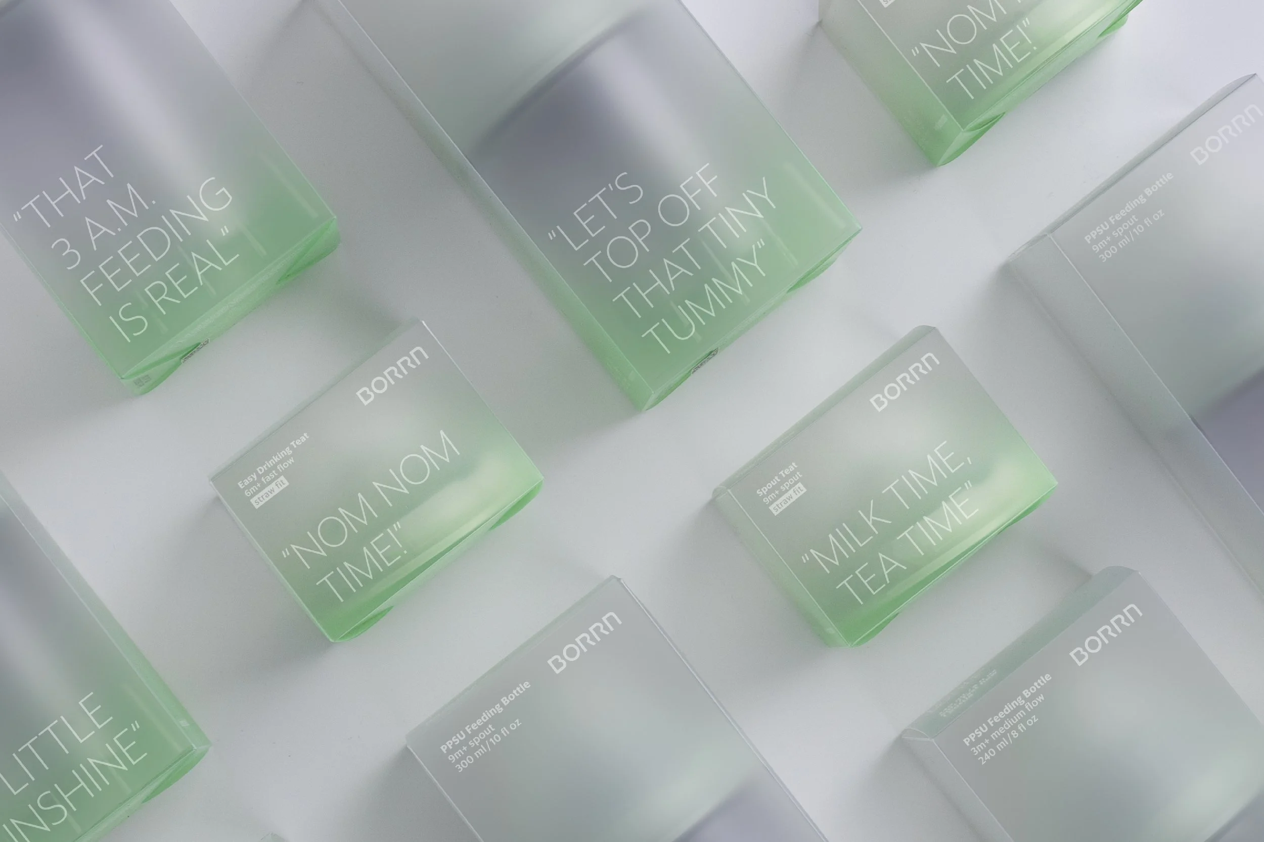
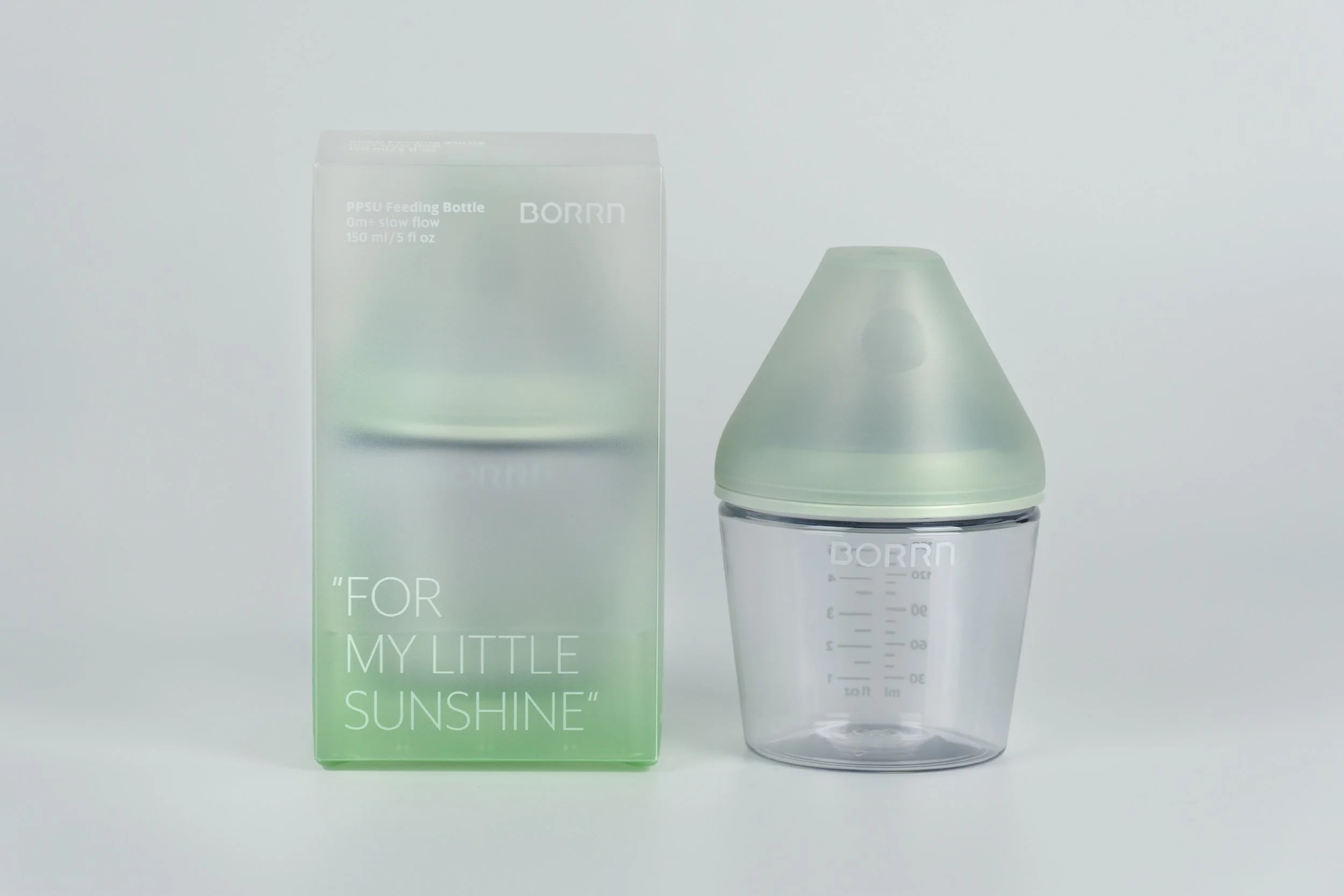
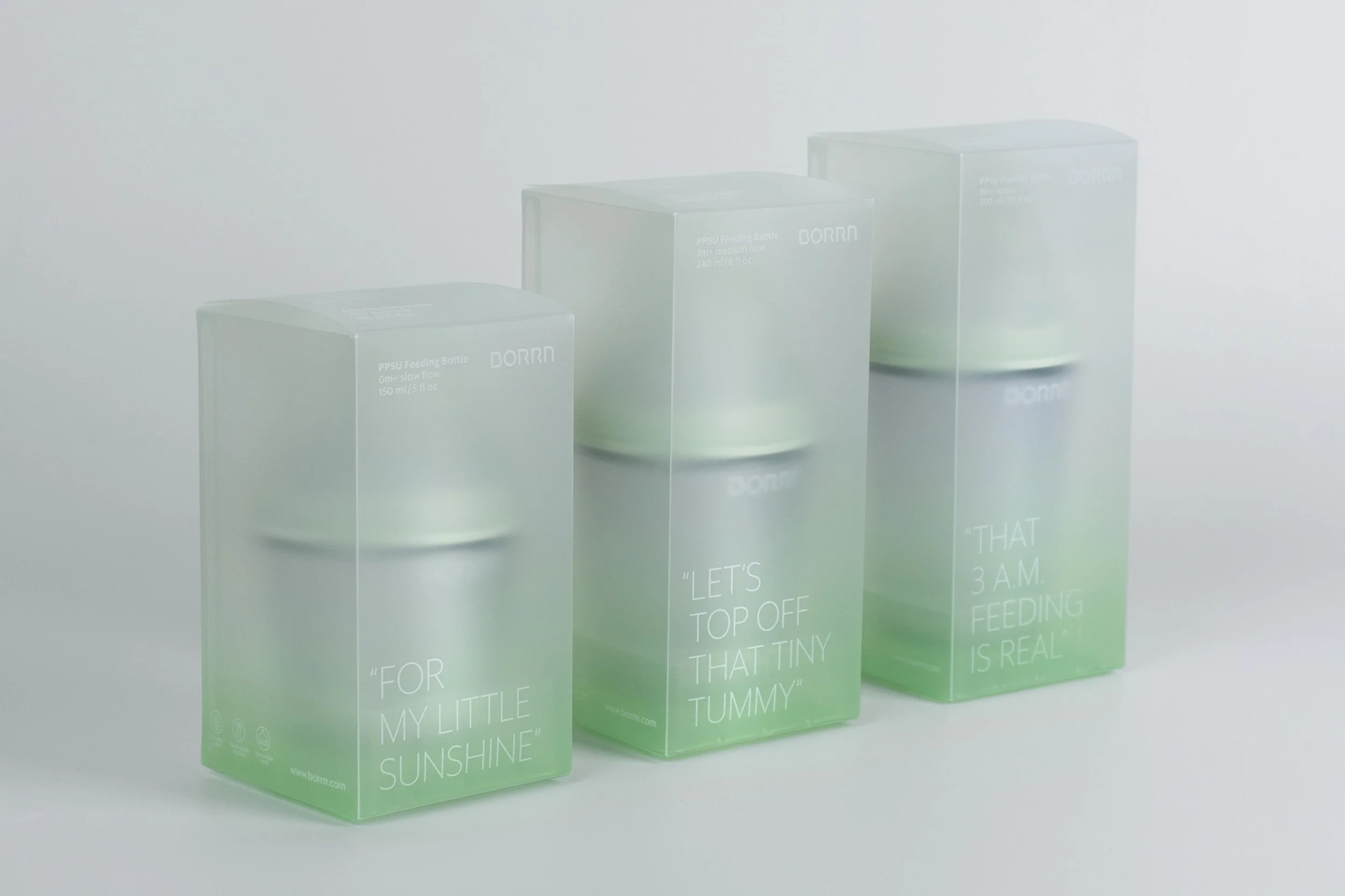
Expanding its presence in the dynamic Asian market, BORRN launched its innovative PPSU series. This new feeding line, following acclaimed silicone bottles, features a comprehensive range of bottles with varying capacities and teat flows, alongside a developing accessory ecosystem (handles, cup lids, and portable straps). This approach extends the product lifecycle, allowing the range to evolve with the child, playing diverse developmental roles.
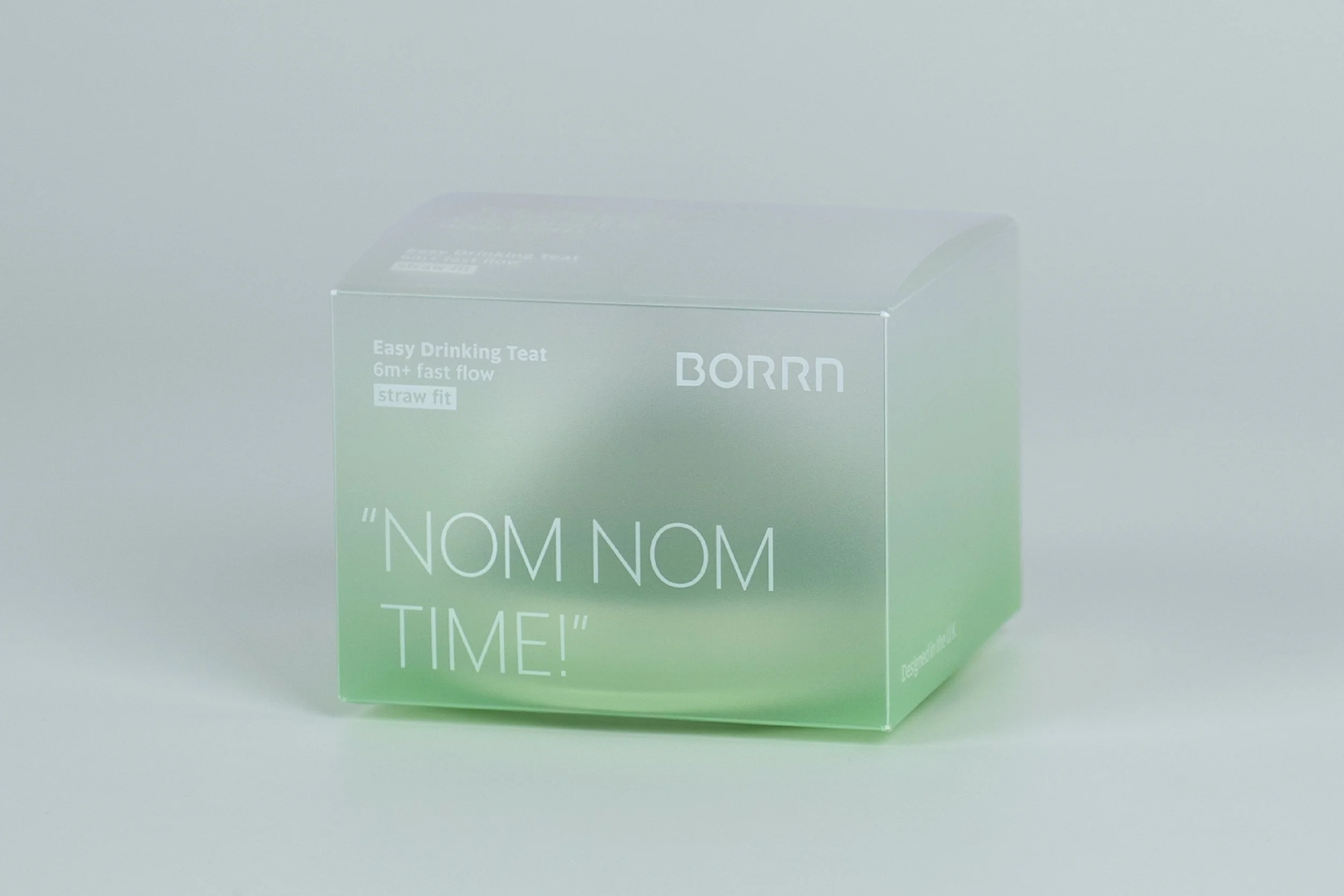
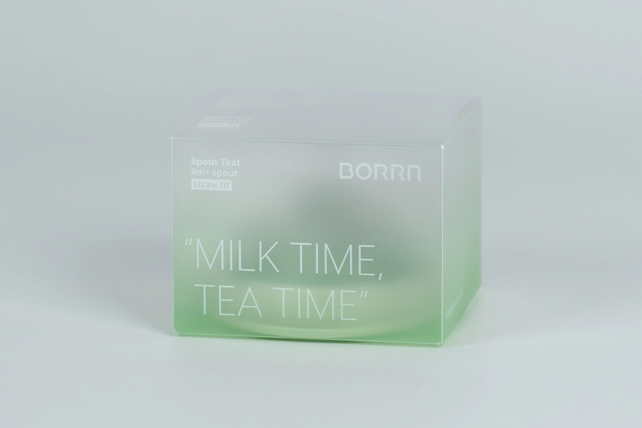
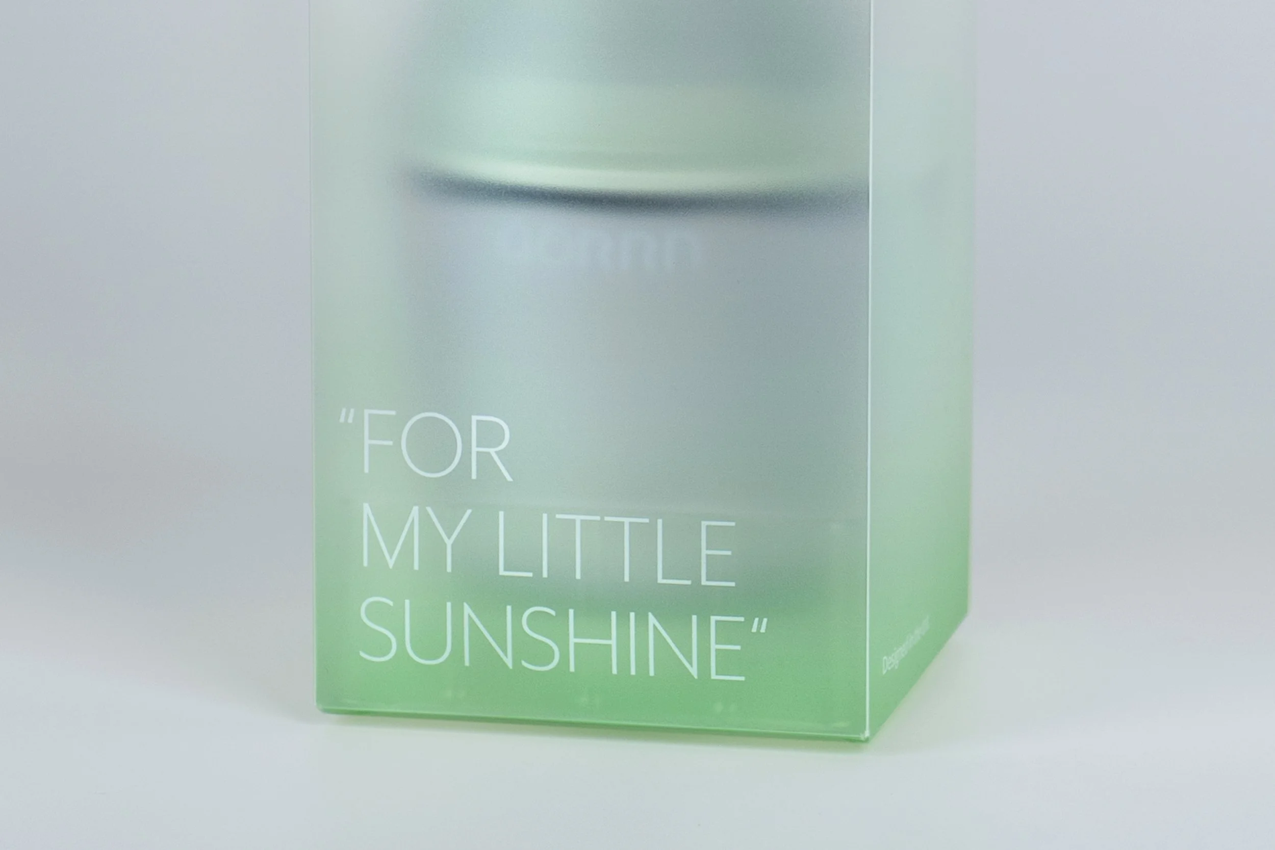
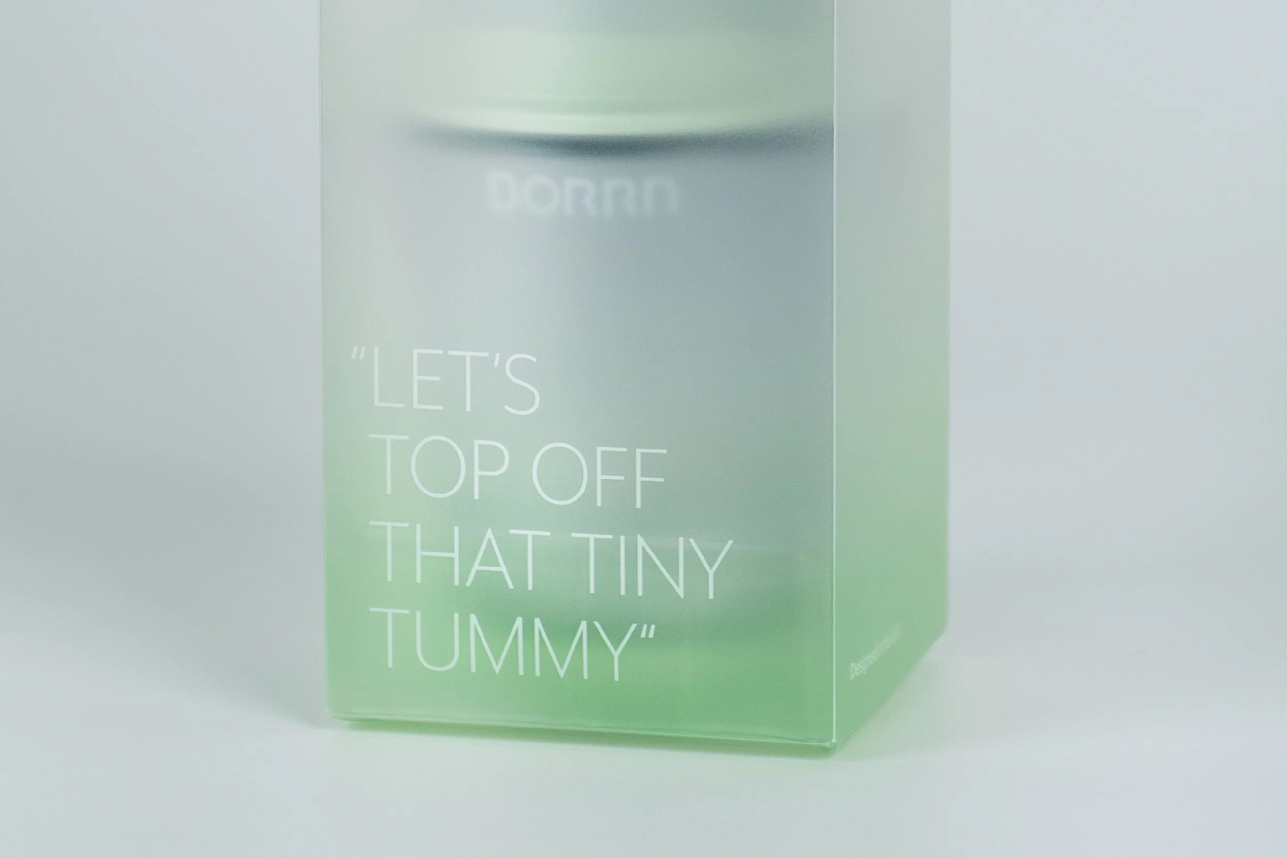
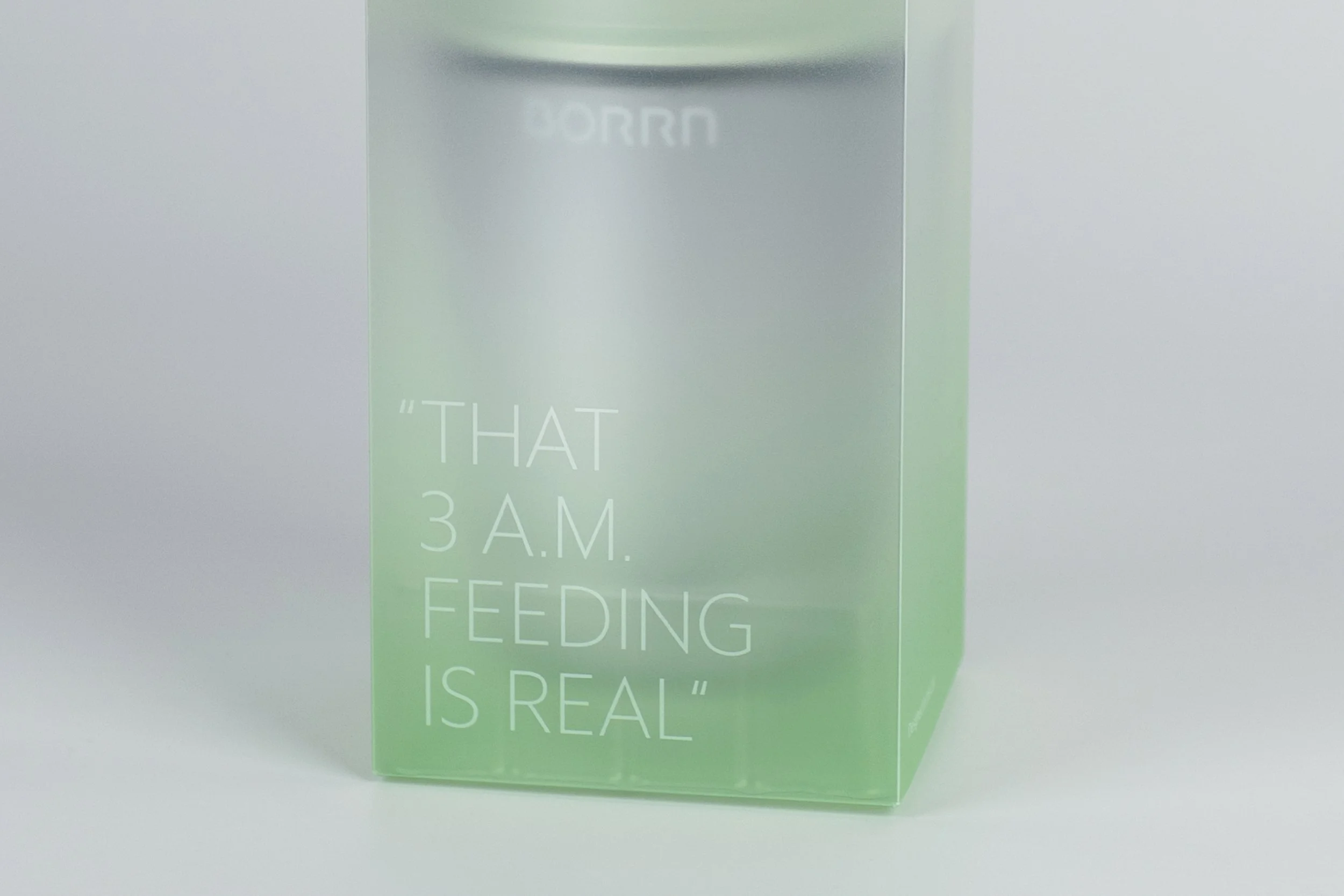
The packaging for the BORRN PPSU series reflects understated elegance and genuine connection. A frosted transparent box subtly reveals the product, enhanced by a serene aqua green gradient – the brand's signature hue. This minimalist yet distinctive design creates a strong shelf presence. Each box features relatable parent sentiments, from the honesty of 'that 3am feeding is real' to the tenderness of 'let’s top off that tiny tummy.’, fostering an instant sense of empathy, and recognition. Crafted from recyclable PP, the packaging embodies safety, durability, and environmental responsibility-harmonising aesthetics with sustainable values and emotional resonance.