DORAIMO

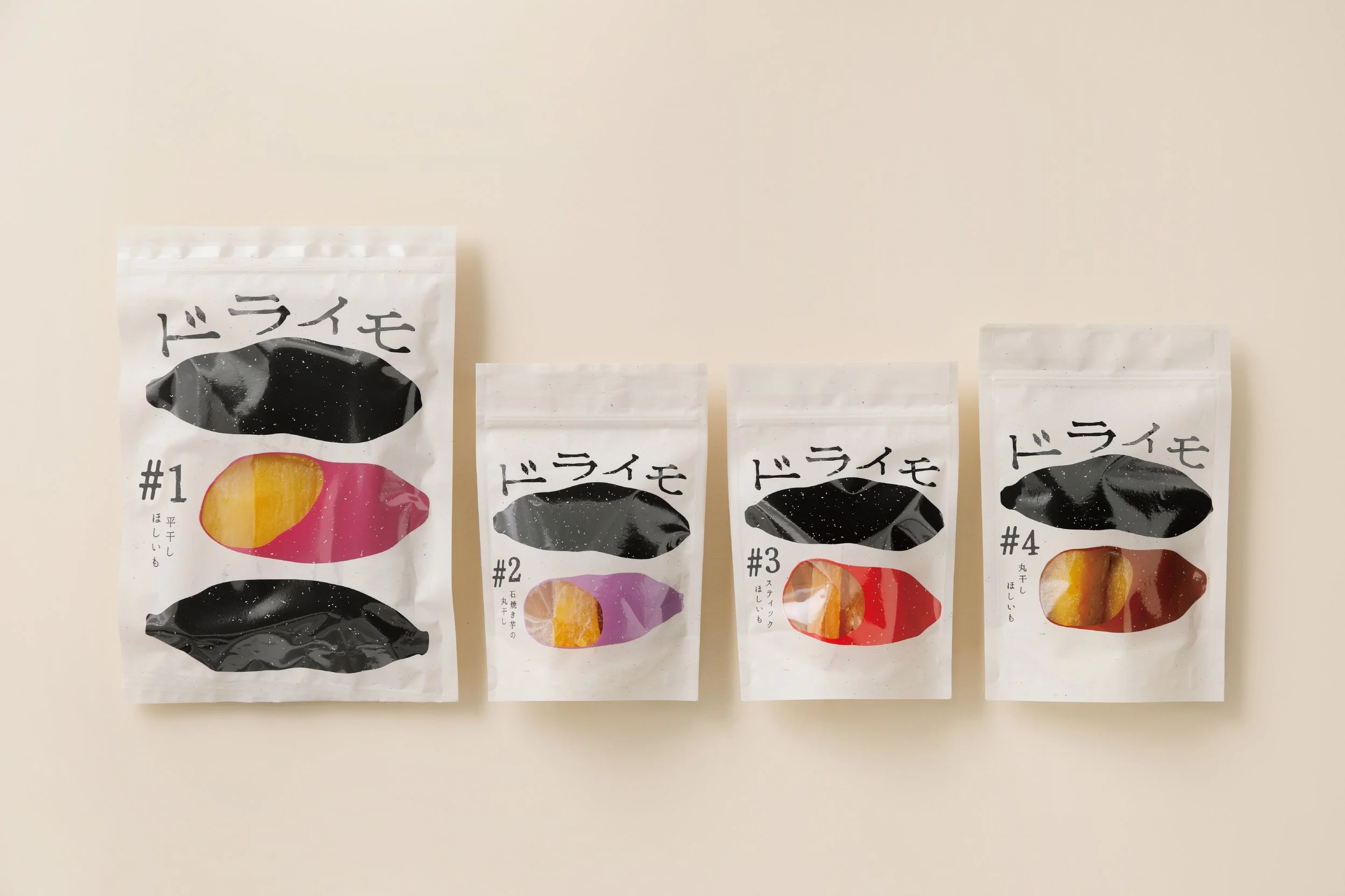
DORAIMO
Client: Social Welfare Corporation Kaibo Fukushikai
Design Company: POOL DESIGN inc.
Creative Direction / Art Direction: Hideyuki Tanno
Design: Chika Takahashi, Hina Ito
Copy Writing: Atsushi Yasuji, Kenji Morioka
Country: Japan
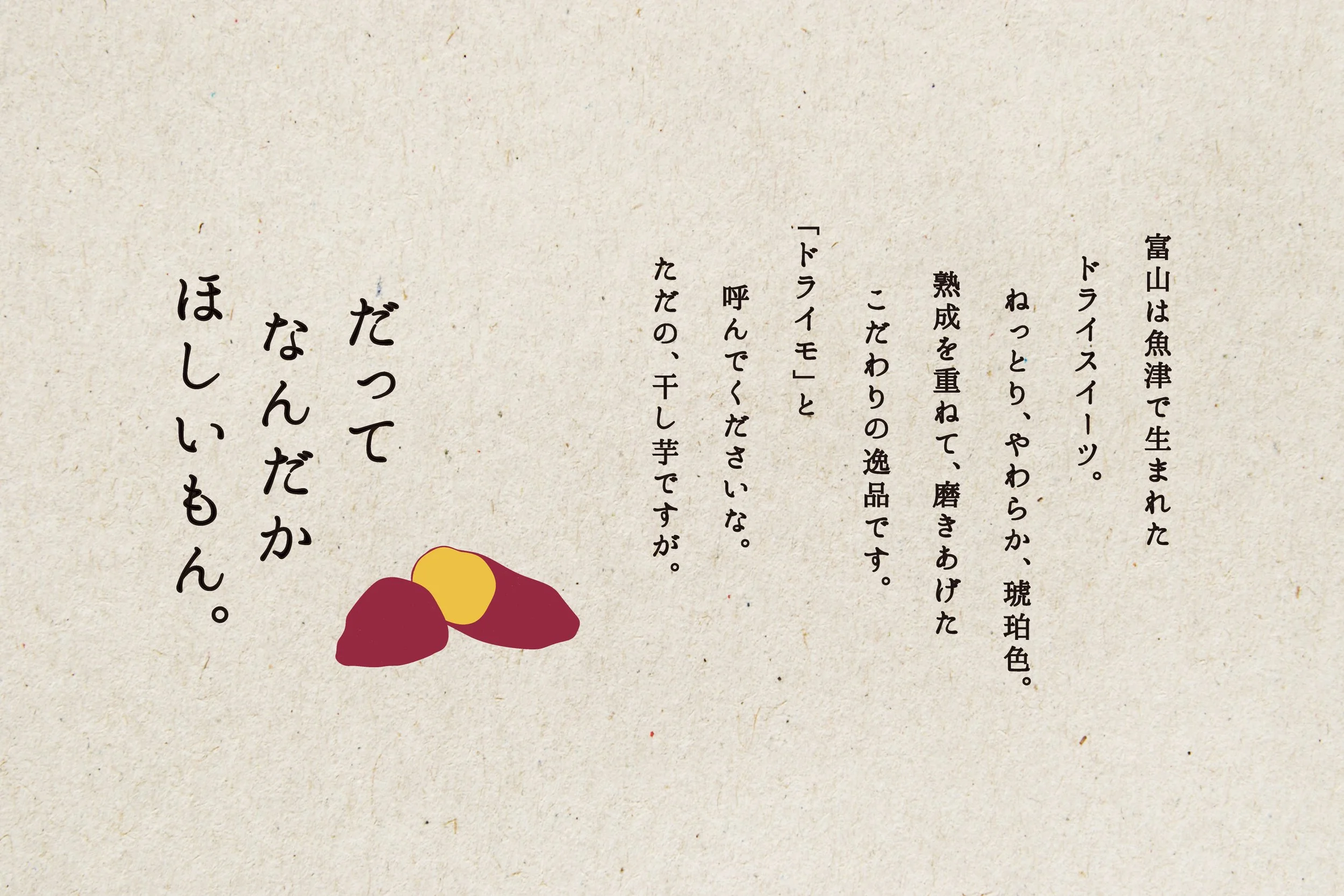
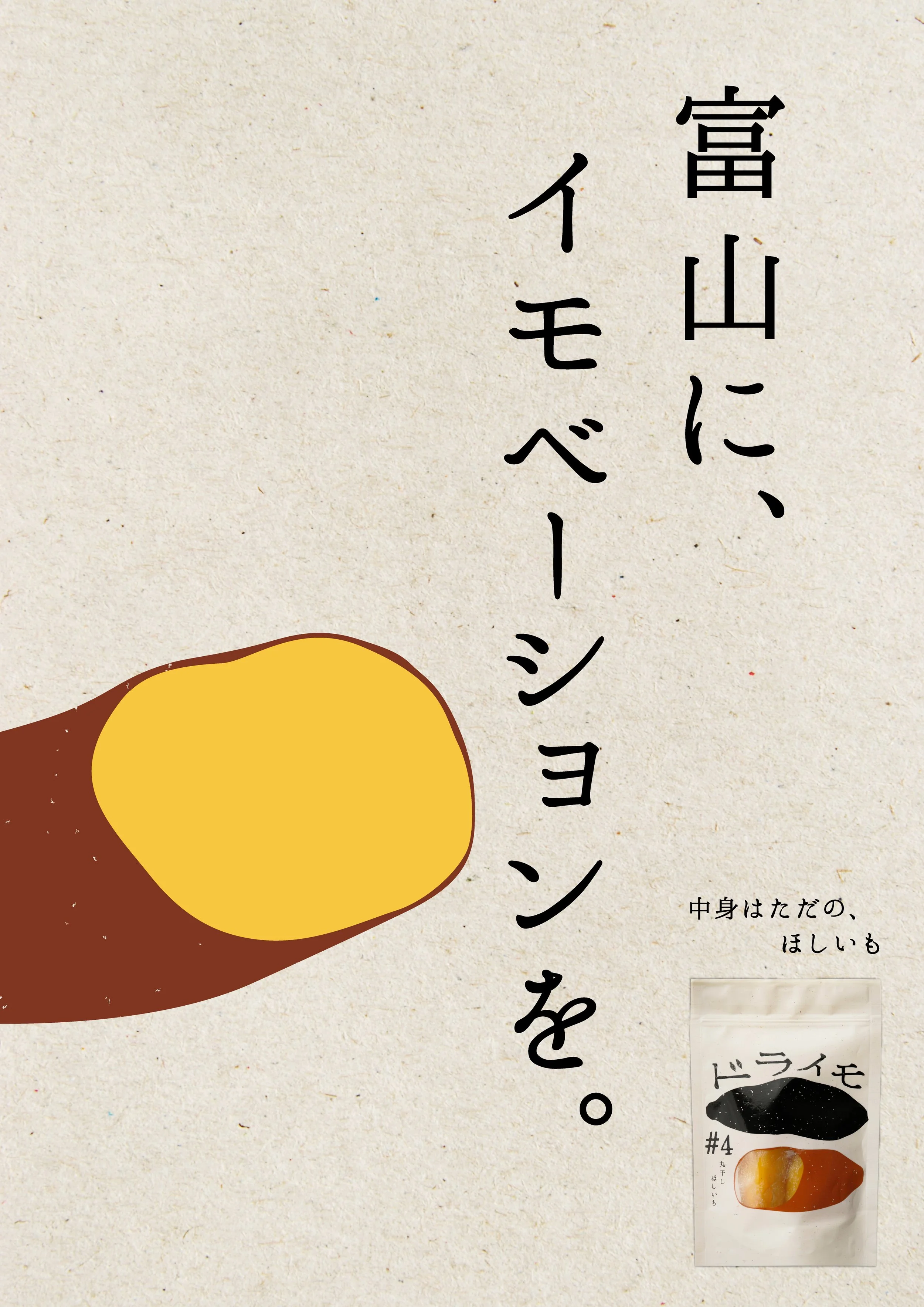
From the initial concept of a product series made using sweet potatoes grown on our own farm in Uozu City, Toyama, we handled everything consistently—from naming and package design to promotion.
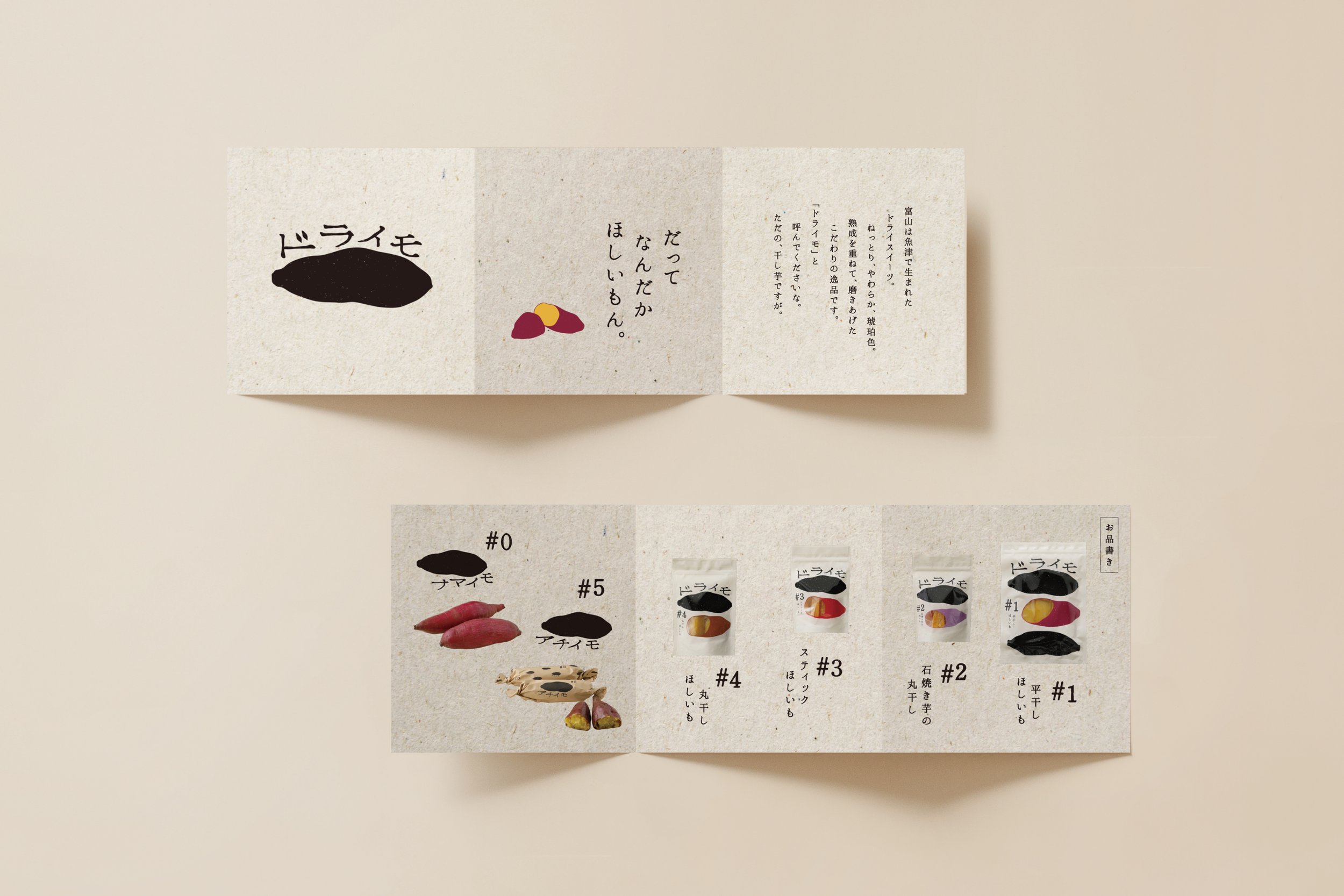
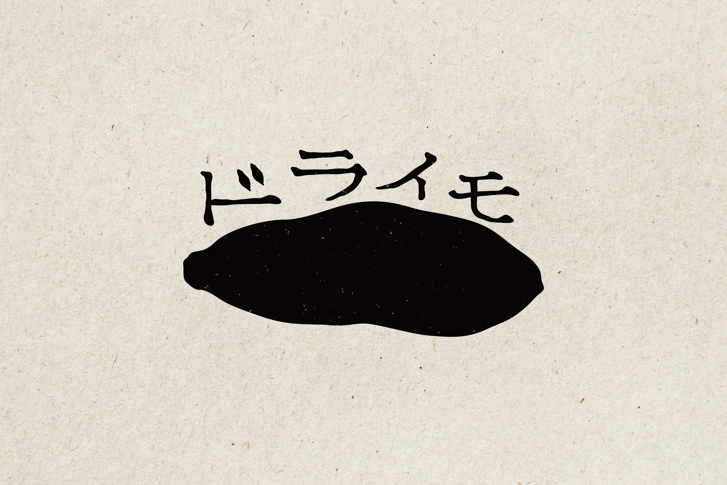
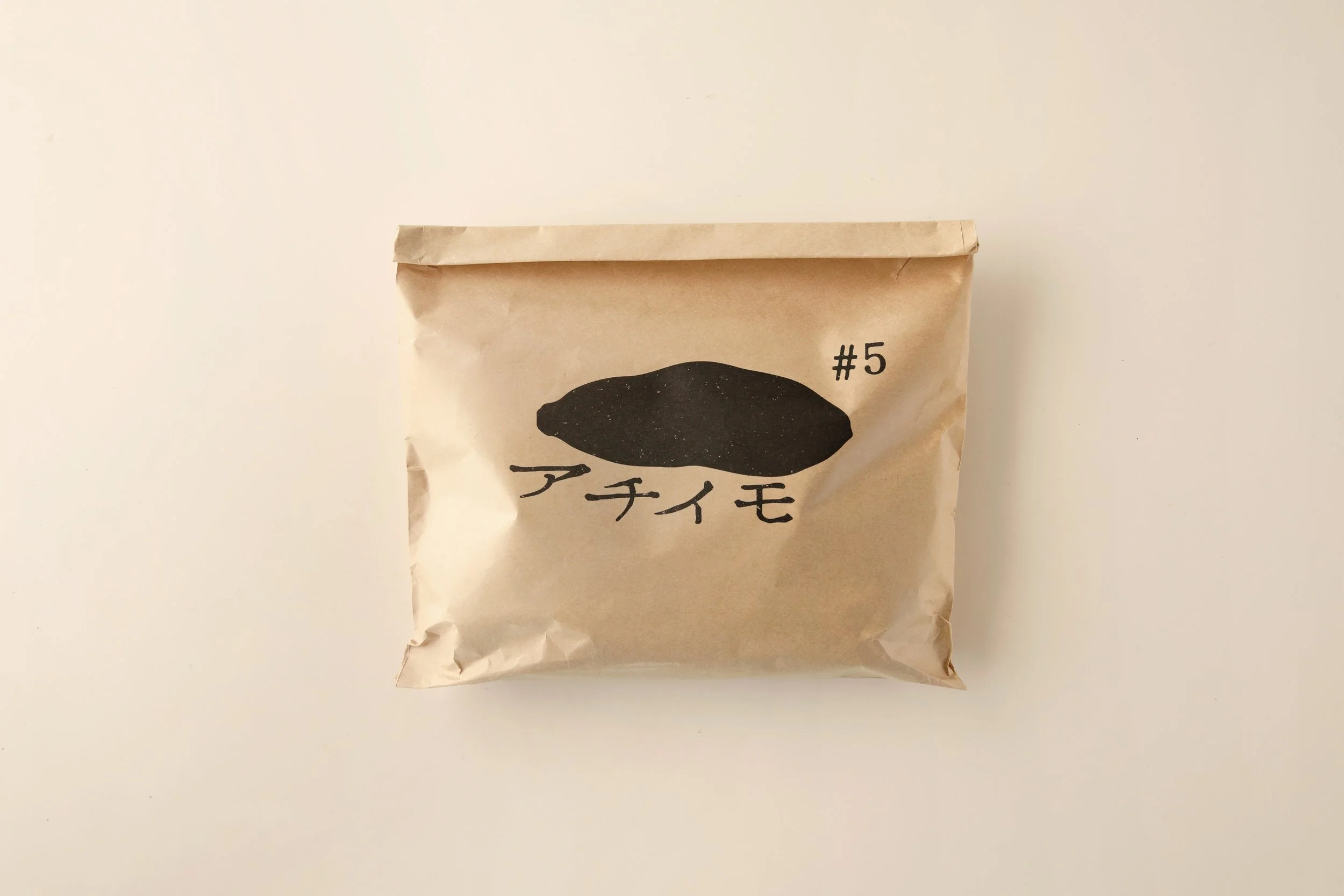
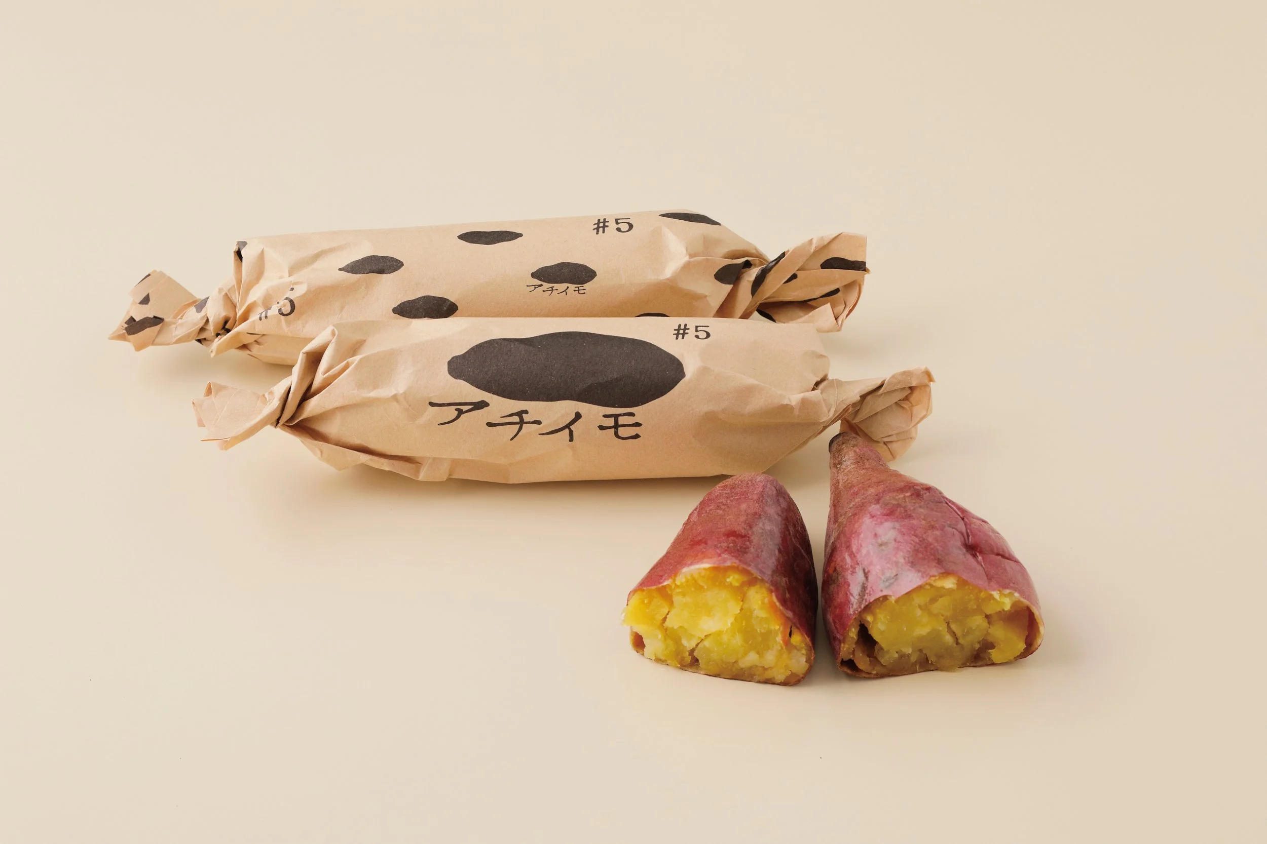
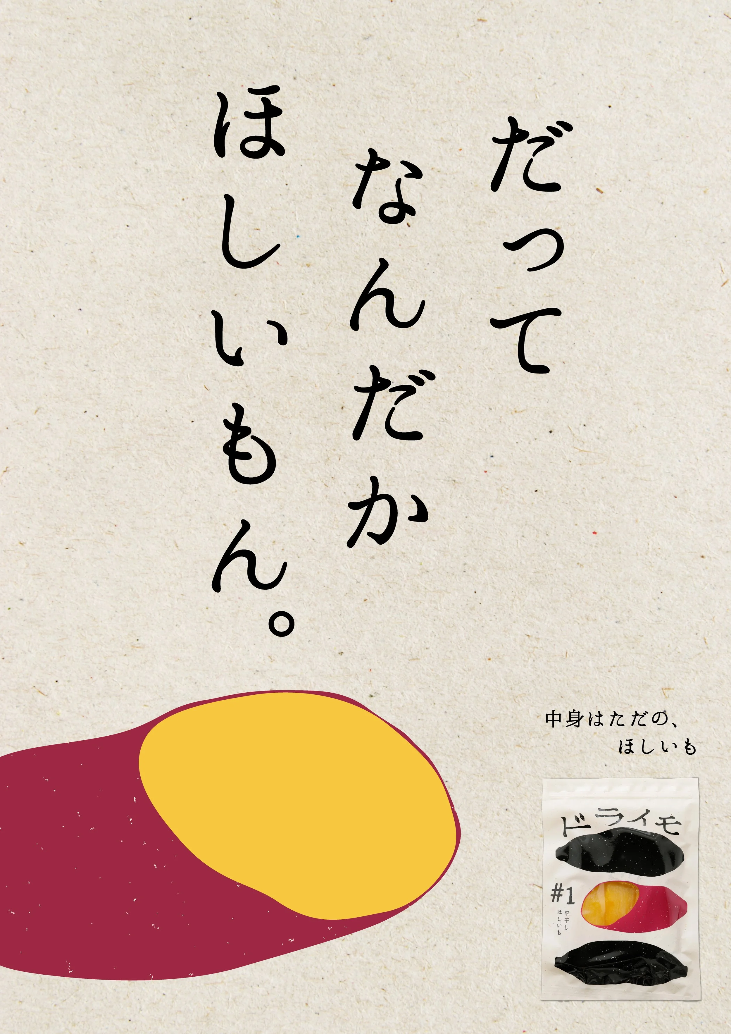
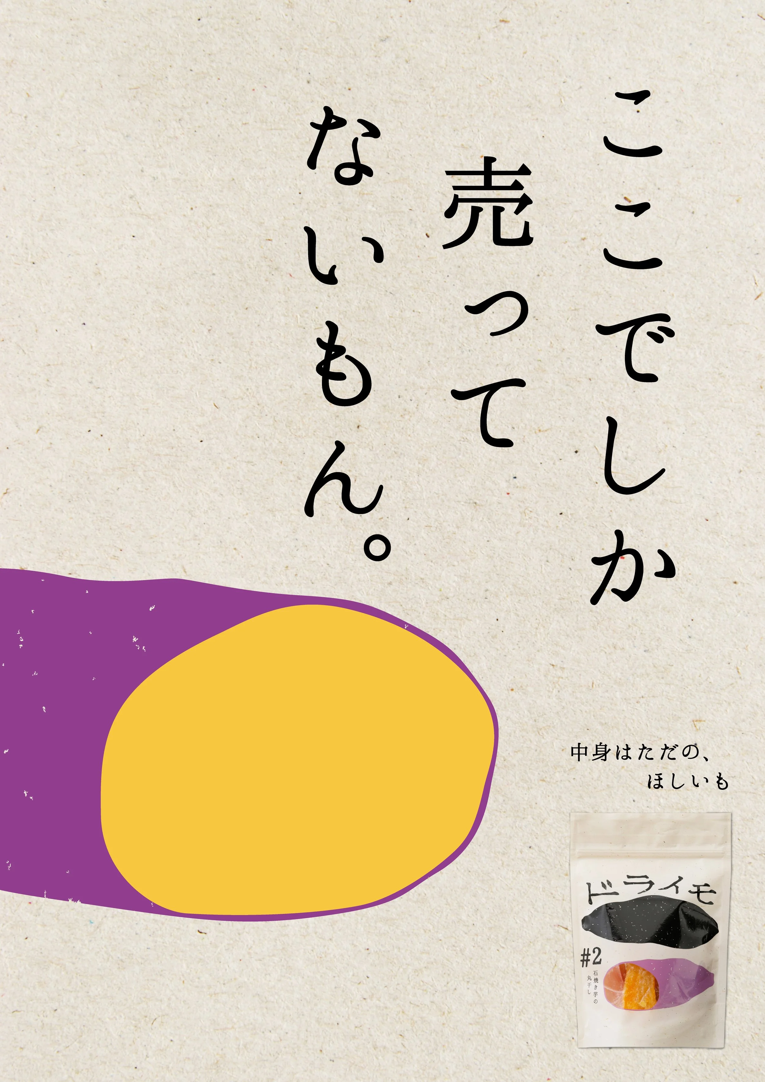
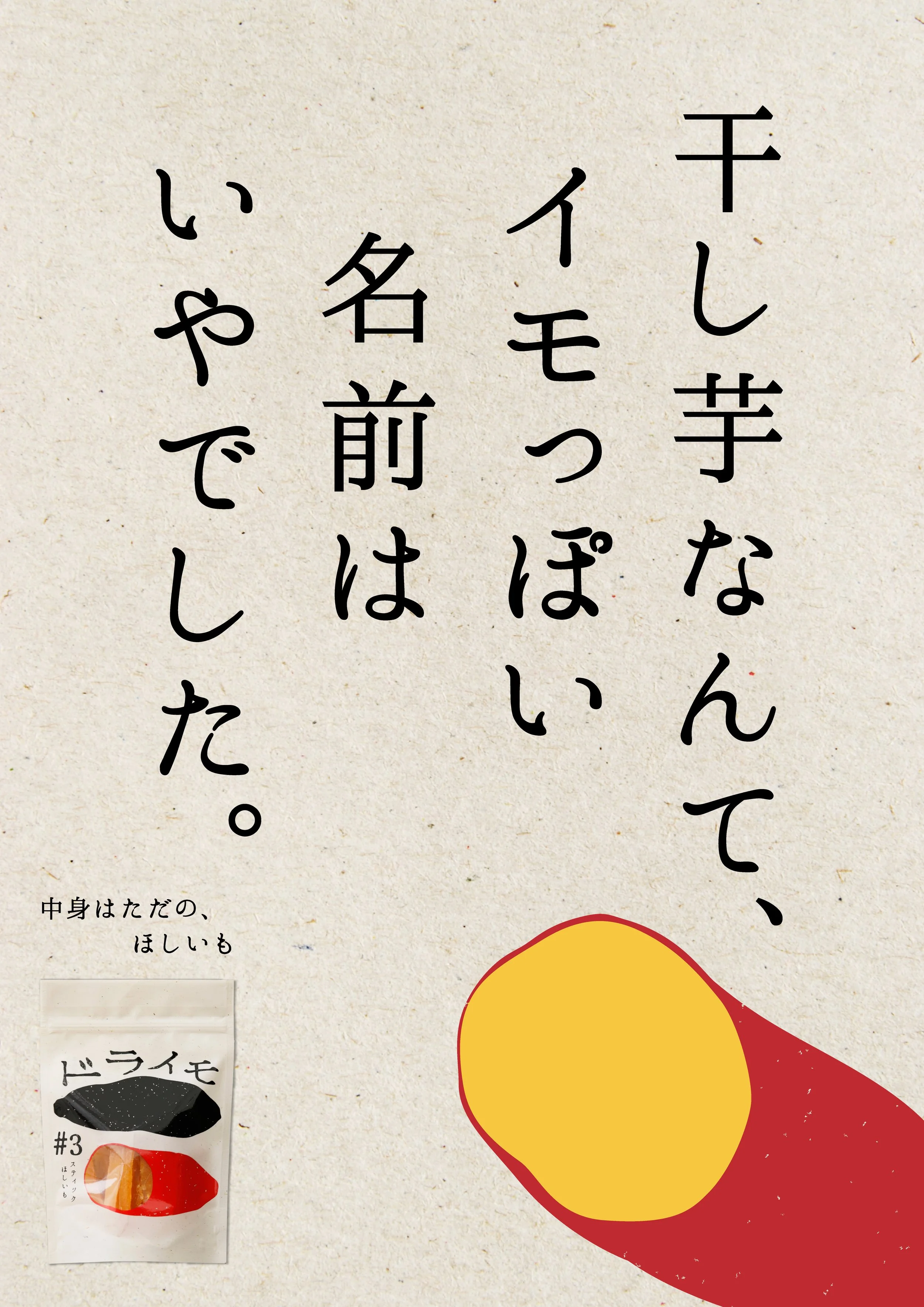
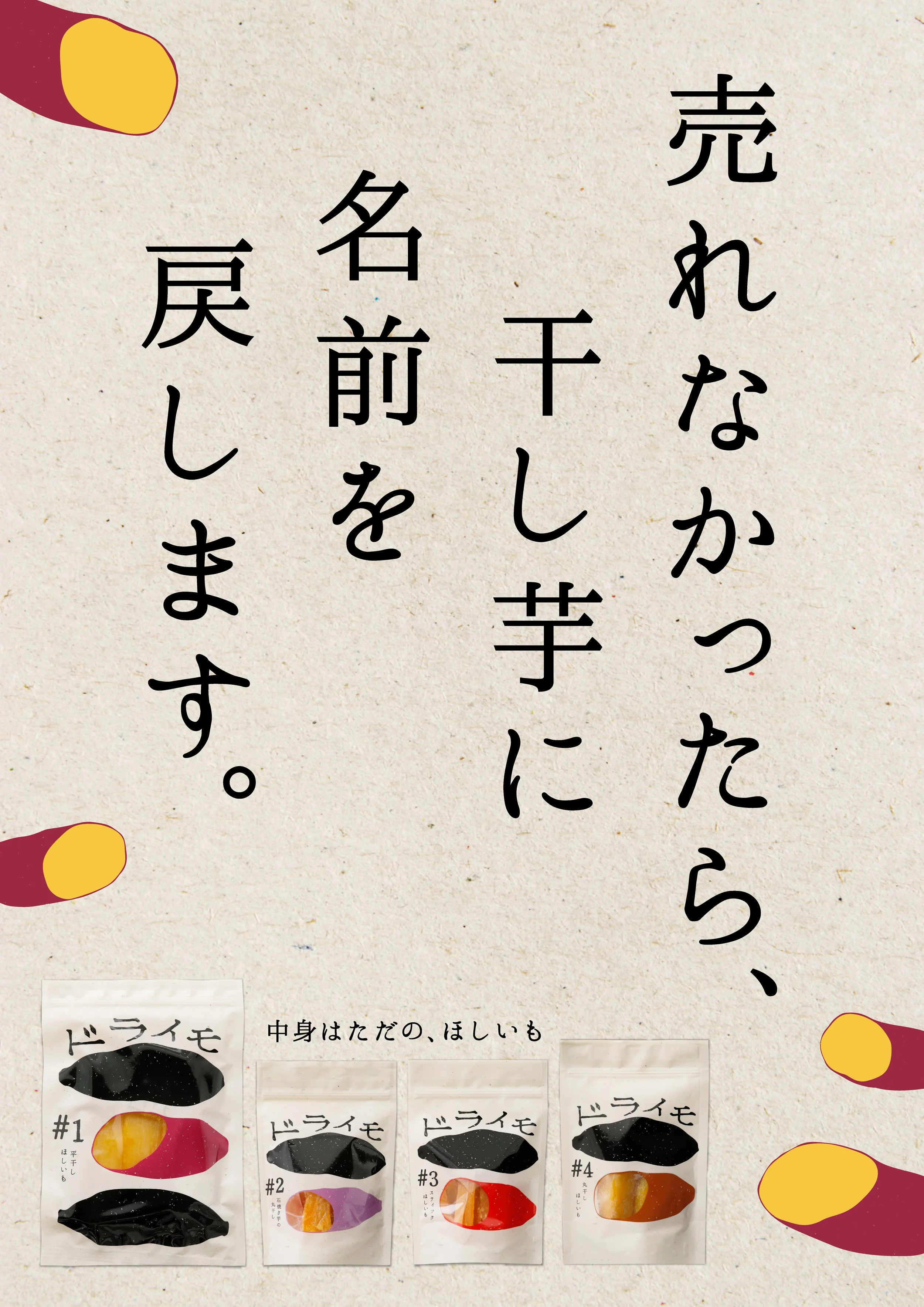
Traditionally, the category of hoshi-imo (dried sweet potato) has always been perceived simply as “dried sweet potato,” with limited room for expansion in both image and target audience. To break away from this conventional, somewhat rustic perception, we developed the name “Draimo”—derived from “dry” and imo (potato)—to create a more refined identity that would also appeal to a younger generation.
The key visual is a bold, black icon with a handcrafted feel, based on the silhouette of a sweet potato. The design is simple, strong, and instantly memorable, while also introducing a slightly humorous and endearing character. It playfully embraces a self-aware tone—no matter how much it tries to be stylish, it’s still just dried sweet potato—positioning the brand as honest, relatable, and subtly self-deprecating.
In addition to Draimo, the series also includes “Achiimo” (roasted sweet potato) and “Namaimo” (fresh sweet potato).