E-g-sain Honey Cake
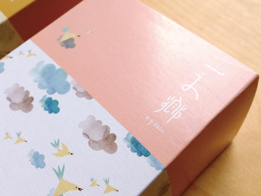
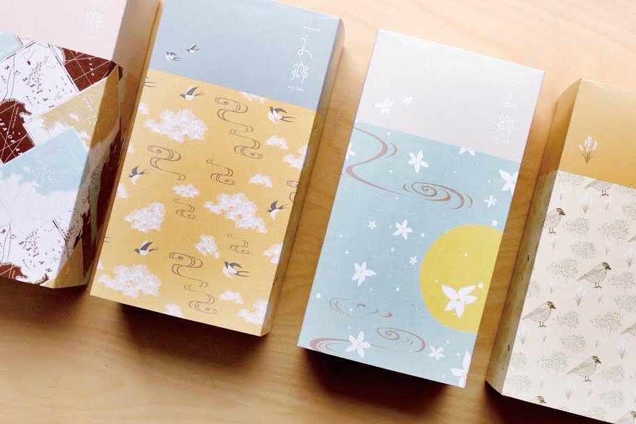
E-g-sain Honey Cake
Client: E-g sain Co., Ltd
Design Company: MURA Design
Creative Director: Tom Chen
Designer: Ssu Ying Pan, Oli Syu
Country: Taiwan
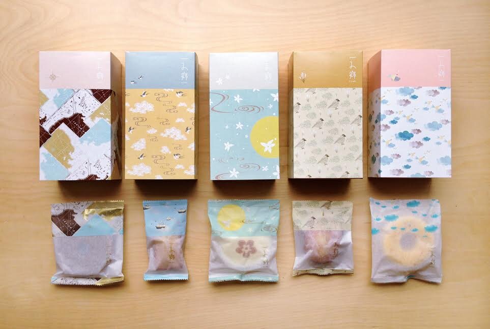
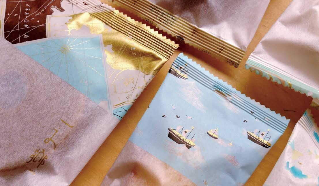
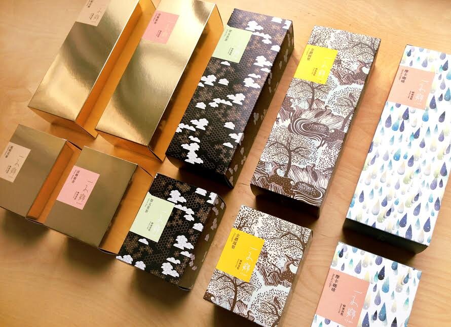
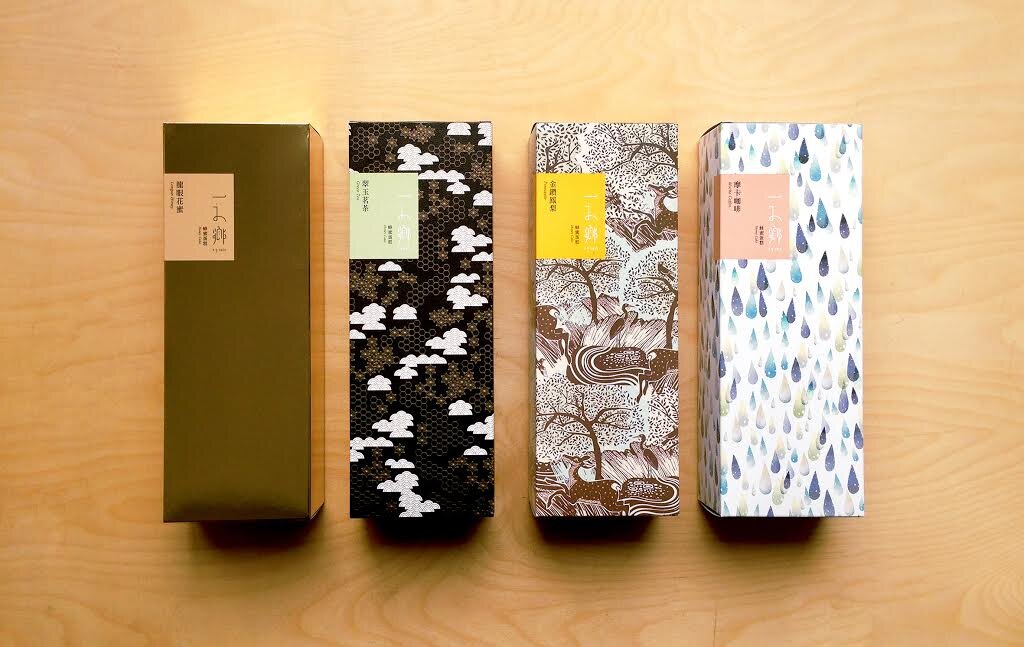
E-g-sain, a pastry brand since 1975, has taken steps towards rebranding an image to better serve an evolving and competitive market. Using “reminiscence” as the concept, a series of visual design for “Honey Cake”, an originality and the most renown product since E-g-sain’s inception, was derived by retracing the four eras, “The Golden Age of Exploration”, “Japanese Castella”, “Rise of new Taiwan”, “Modern Times”, that signifies not only the development of this novelty but also reflects a microcosm of modern Taiwan history. The connection between palette, memory and current events in life resonates with people. And E-g-sain aims to reposition itself as a brand that synonymous with such resonation by means of visual communication.
Digital Communication services, including website design, search engine optimization, social media, and content creation for nonprofit organizations, consultants, and creative entrepreneurs.