Jack Bean Tooth Gel
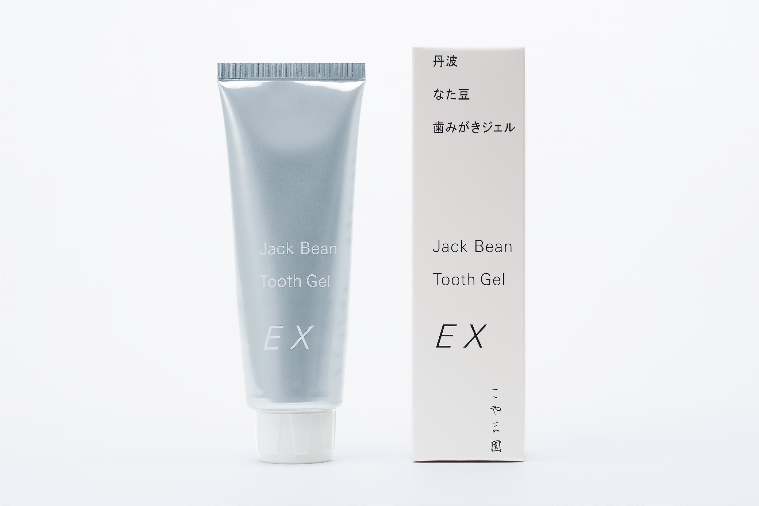
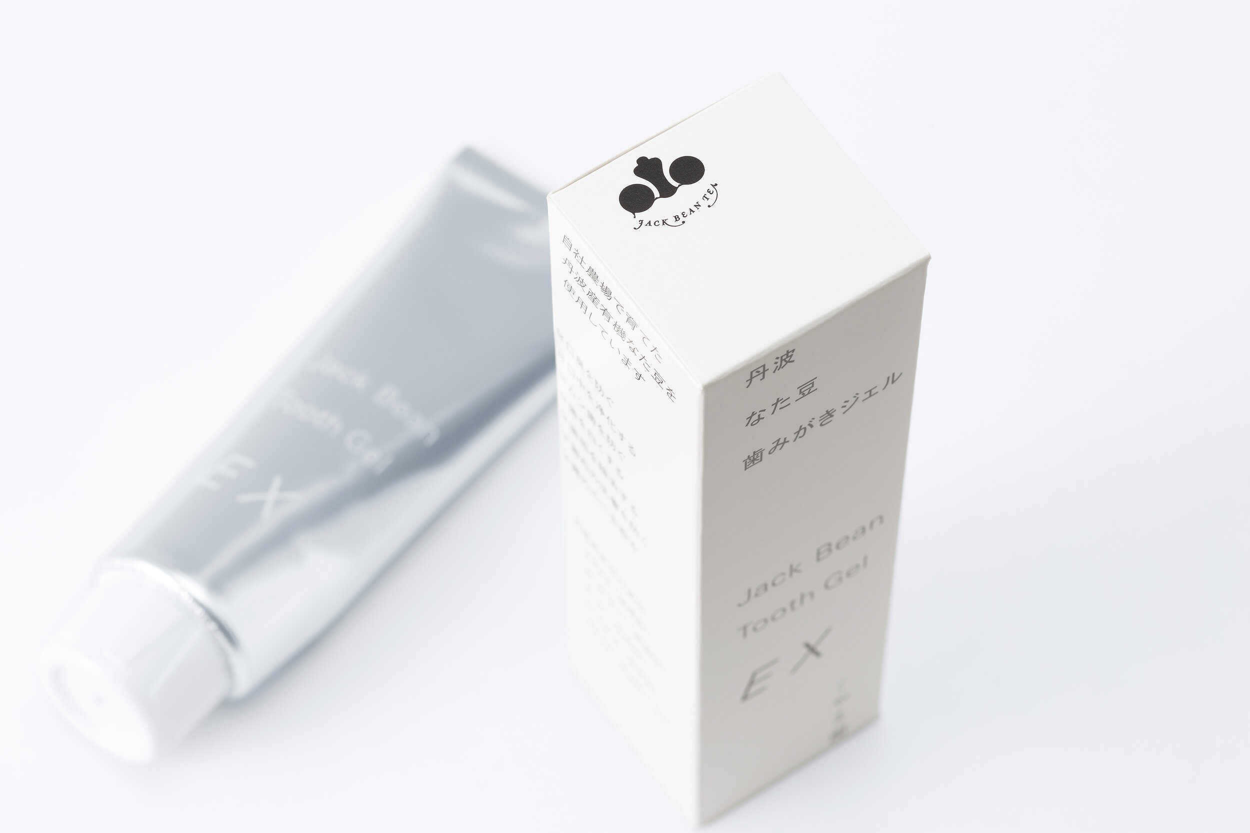
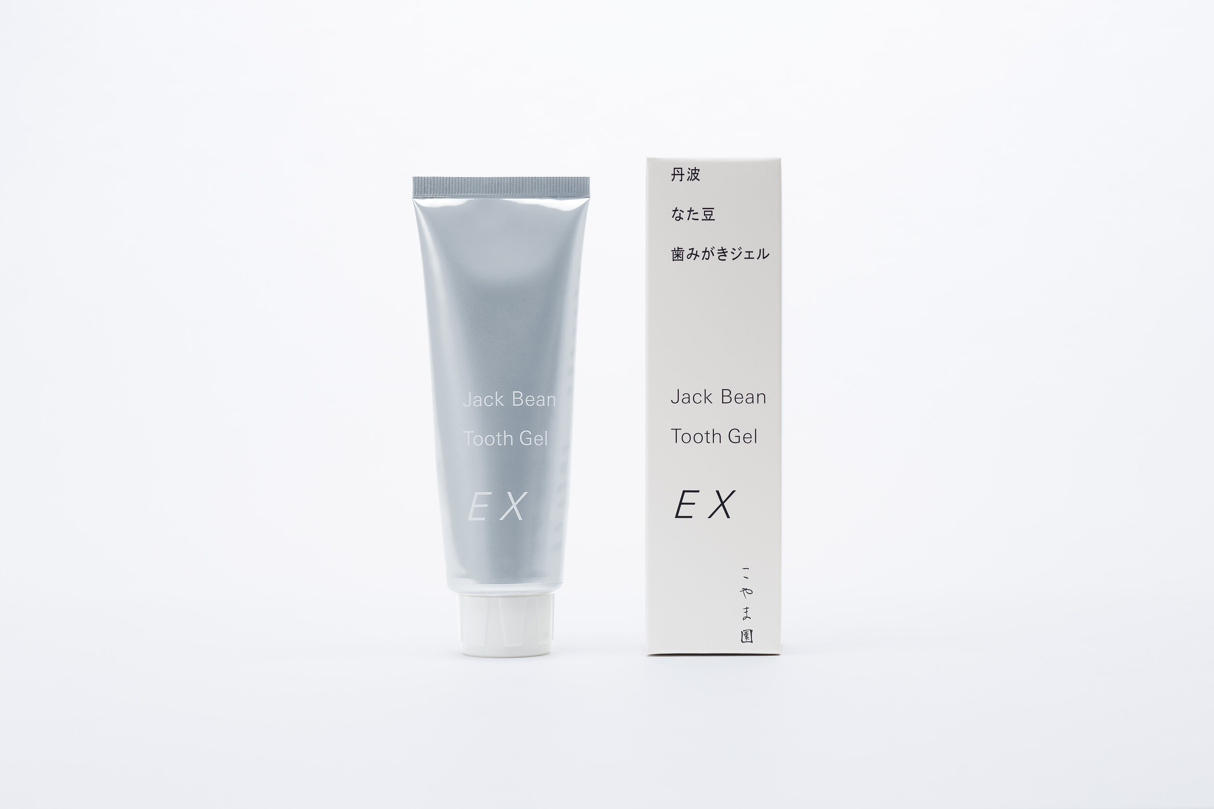
Jack Bean Tooth Gel
Client: KOYAMAEN Co. Ltd.
Design Company: GRAPH Co. Ltd.
Art Direction: Issay Kitagawa
Country: Japan
Majority of the health food products in Japan uses kanji (characters). We wanted to work on this concept but also elevate it to convey the cool, current Japanese-ness, to a wider audience. Assuming that not everybody can read / understand kanji, we wanted our packaging to appear like an image, or a single picture, by utilizing the gaps and spacing, to give a sense of uniqueness and class.
We also designed a logo mark of “nata beans”, which is the main ingredient, to communicate with pictures instead of relying on words. In terms of product development, we wanted to create something good for the people who use it. The product contains nata beans and 14 kinds of natural herbs - adds a sense of freshness and transparency to your breath.
Digital Communication services, including website design, search engine optimization, social media, and content creation for nonprofit organizations, consultants, and creative entrepreneurs.