Japanese Sake "KOI"

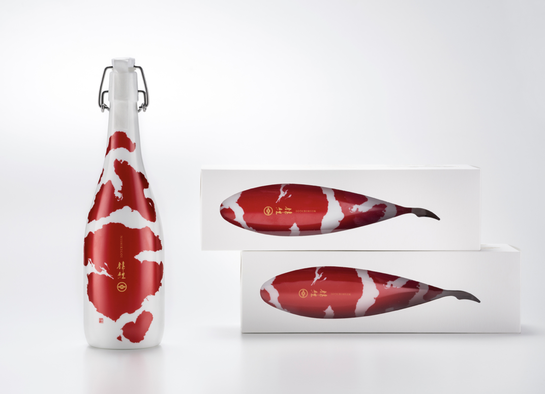
Japanese Sake “KOI”
Client: Imayotsukasa Sake Brewery Co. Ltd.
Design Company: BULLET Inc.
Art Director/Designer: Aya Codama
Calligrapher: Kasetsu
Project Director: Masayuki Habuki
Project Manager: Yosuke Tanaka
Printing company: Yamaharu Glass Co. Ltd, Taiyo Printing Co. Ltd
Country: Japan
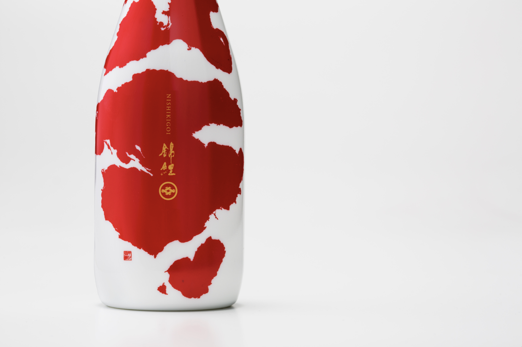
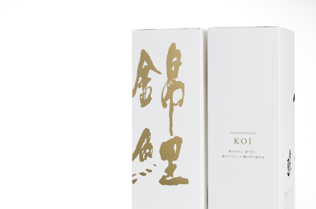
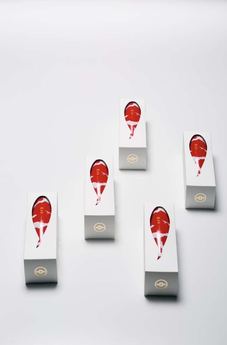
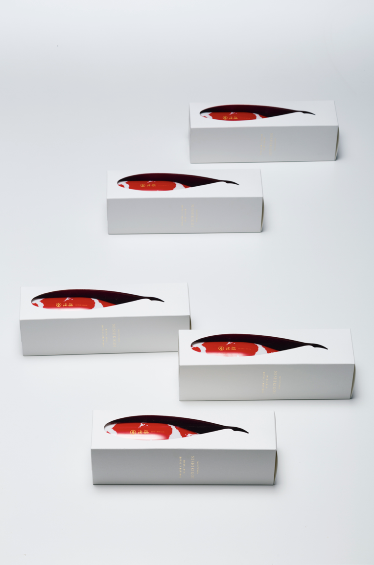
This package is for the Japanese Sake, “KOI”.
The inspiration of this project is “Creating the impressive designed Sake that represents Japan”, and they chose the Japanese most famous ornamental fish “KOI” as the motif. ("KOI" is also known as “Nishikigoi".)
As being called a living jewel, Koi has very beautiful red patterns on the white body, which has gained popularity worldwide. The package expresses the beauty of Koi, the red patterns directly printed on the white bottle resembles the shape of the fish. By cutting out the outer box in fish silhouette, it visually emphasizes the image of Koi.
Digital Communication services, including website design, search engine optimization, social media, and content creation for nonprofit organizations, consultants, and creative entrepreneurs.