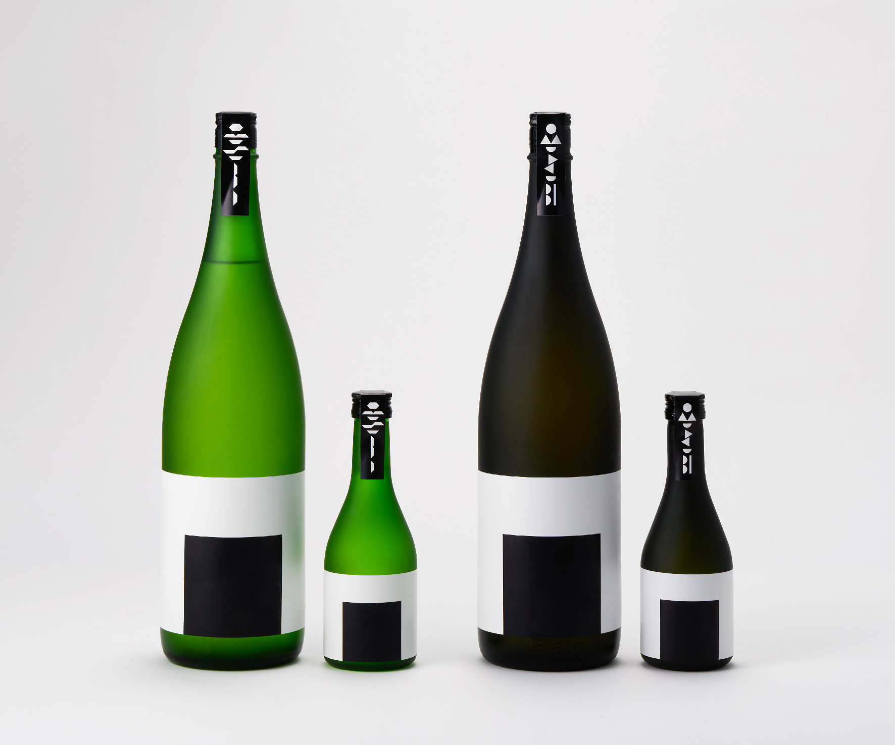
Kiyoizumi
Kiyoizumi
Client: Kusumi Shuzo
Design Company: Katsumi Asaba Design Studio
Art Director: Katsumi Asaba
Country: Japan
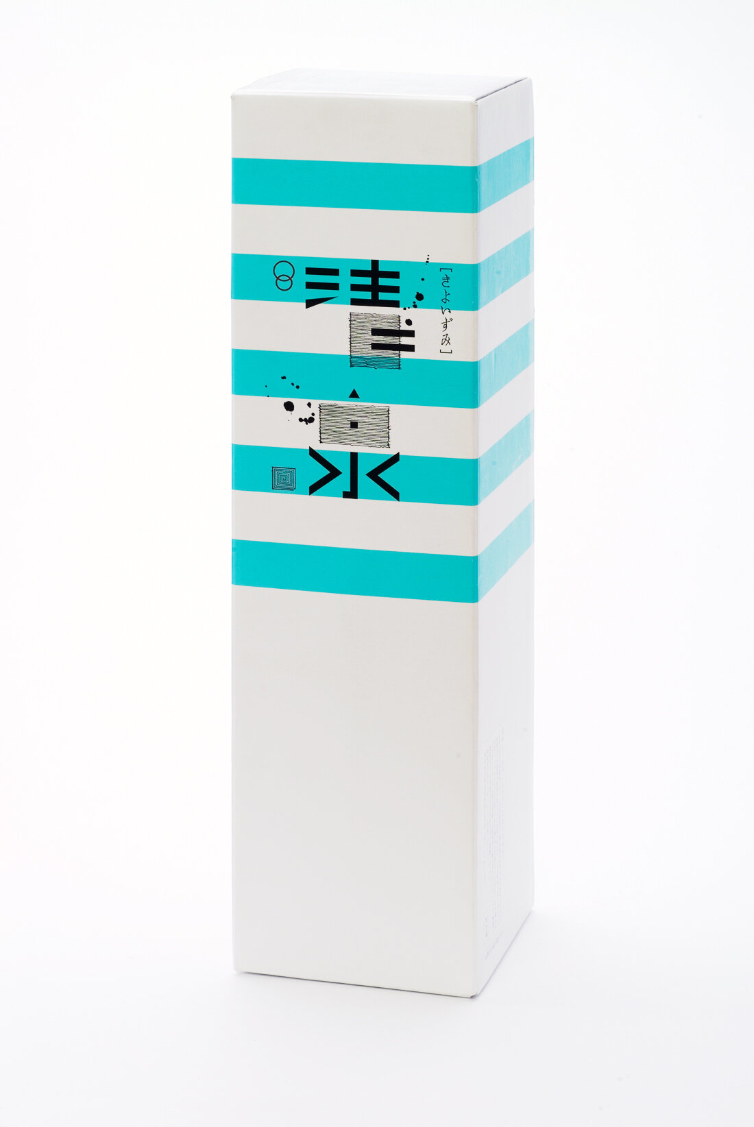
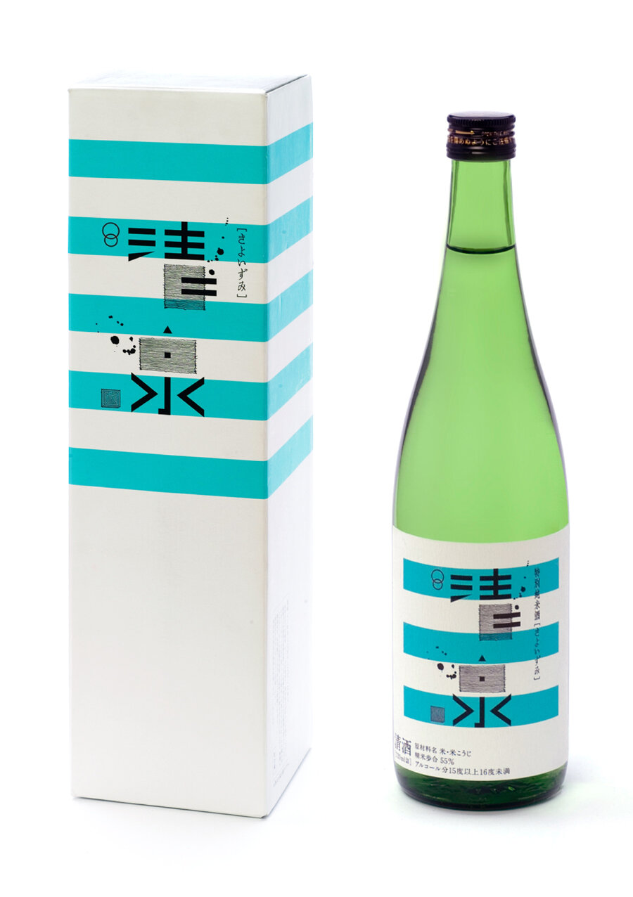
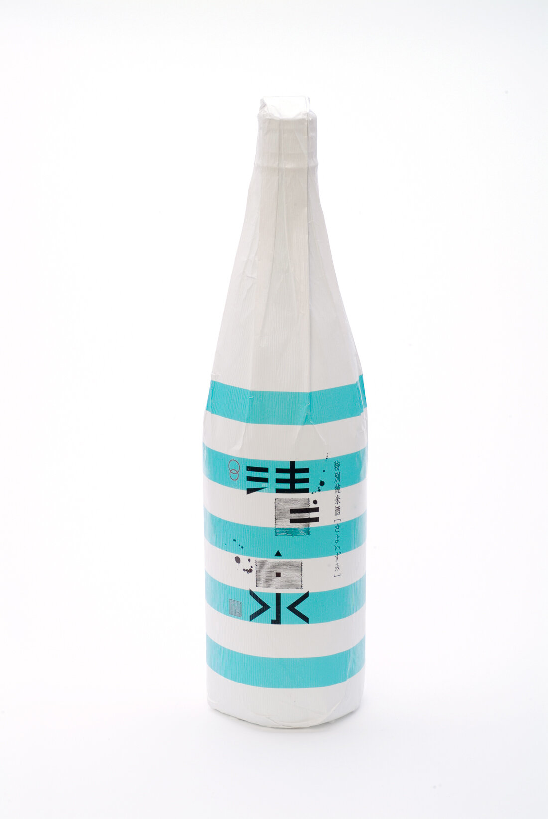
"For both the sponsor and the designer, changing the label of a traditional Japanese sake bottle into something new takes much courage. Kiyoizumi's label design is for Shuzo Kusumi's work in Nagaoka of Niigata prefecture, which has a history of making Japanese sake since 1833. In Japanese years, they have began making sake since the 4th year of Tenpo, 184 years ago in the Edo era. It has won many awards nationwide, such as the honourary prize at the World Expo in San Francisco, back in Meiji 18, in 1884. The times are quickly changing — from Edo, Meiji, Taisho, Showa, to Heisei....
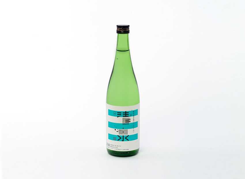
This year the Japan Graphic Designers Association (JAGDA) that celebrates its 40th Anniversary, has launched a design caravan back in 1997. A year that moved on from the 20th to the 21st century. I wanted to think of how people should live and how the earth should be. I was chosen as the chairperson of this organisation, and the theme was to bring the 「アメとムチ」(Japanese metaphor for the "carrot and stick", a combination of reward and punishment) back to design. We focused on Japanese souvenirs, and formed a design appraisal team. I worked with Masahiro Doi from Niigata, just in time when Masakazu Kusumi succeeded as the 7th generation of Shuzo Kusumi, and thus went on to design the label for "Kiyoizumi - 7th generation". Imagining a blue sky that can be seen between the clouds from a satoyama, I used the base of a light blue border on a white background. Since then, several other products have been designed; all of them with tradition and design at its core, I design by thinking of typography from the Edo period and the typography of today."
Digital Communication services, including website design, search engine optimization, social media, and content creation for nonprofit organizations, consultants, and creative entrepreneurs.