KURONEKO AN

KURONEKO AN
Client: Ryo Hasegawa
Art Direction: Ren Takaya
Design: Yukari Okada, Ren Takaya
Photography: Shohei Shoji
Copy Writing: Yukari Okada
Printing: Shoei, K-Bunsha
Country: Japan
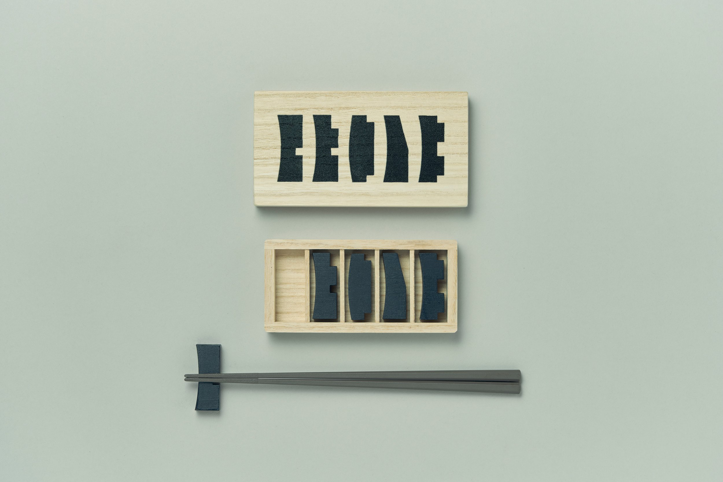
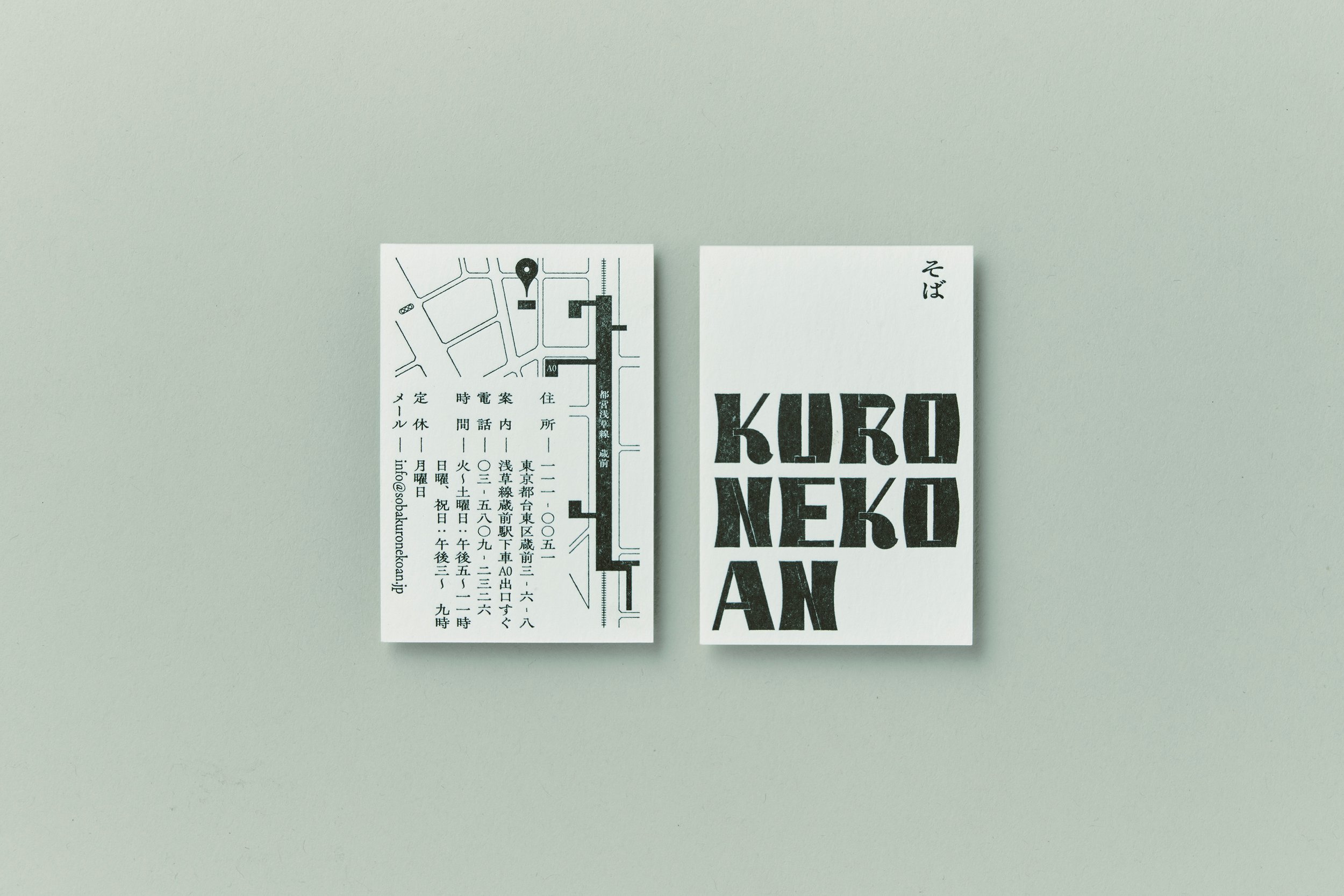
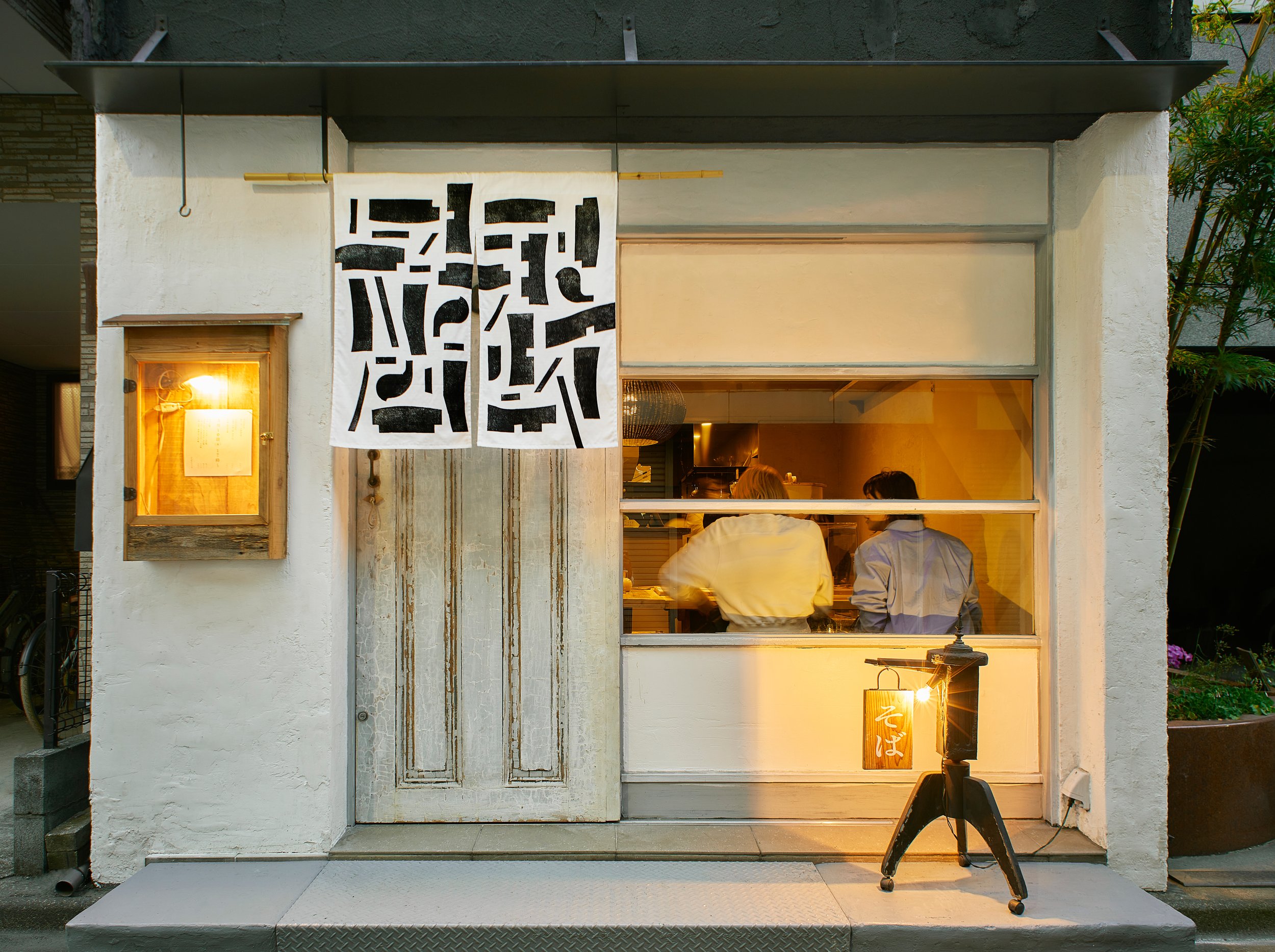
This is the CI (Corporate Identity) for "Kuroneko-an," a soba restaurant that opened in Kuramae.
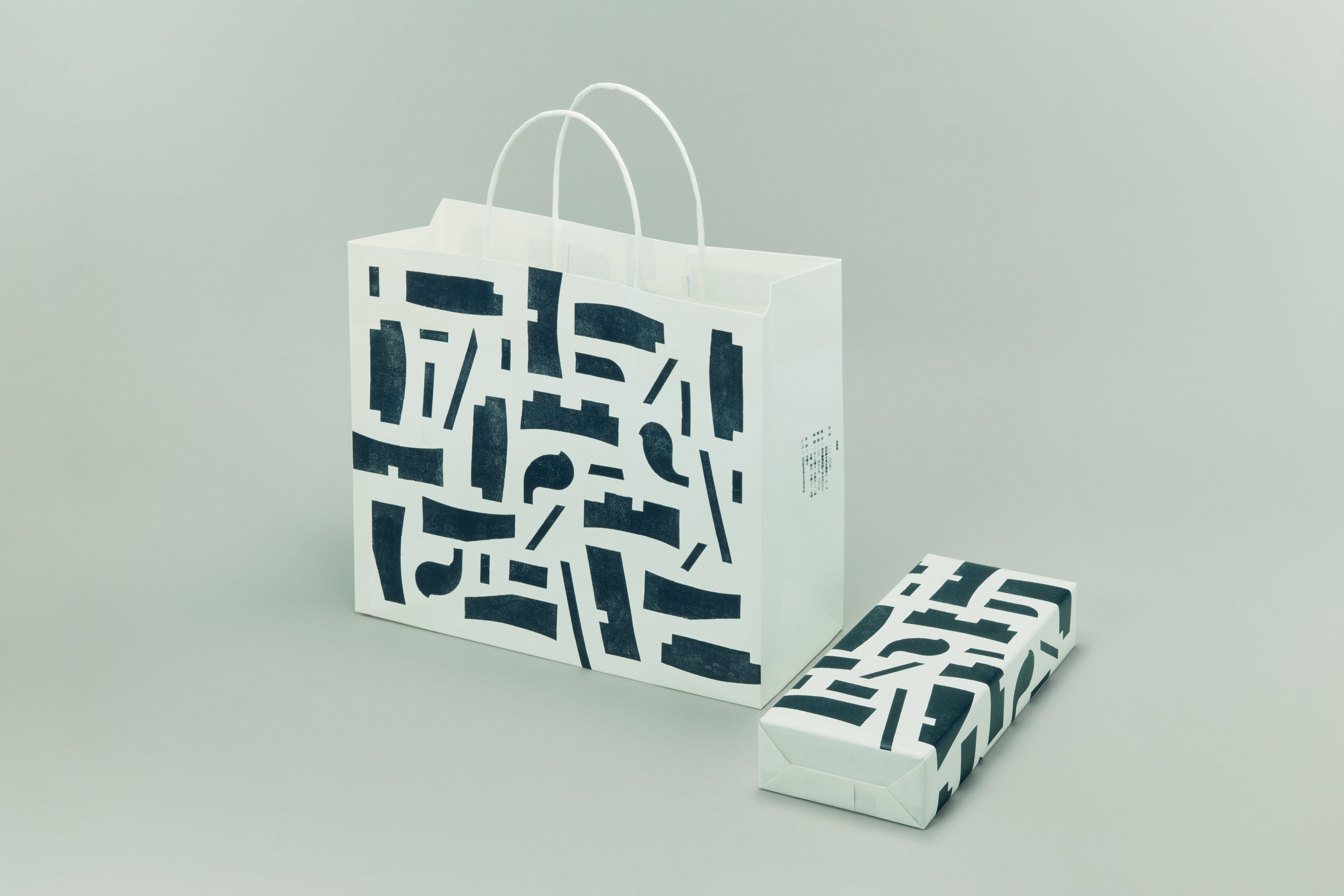
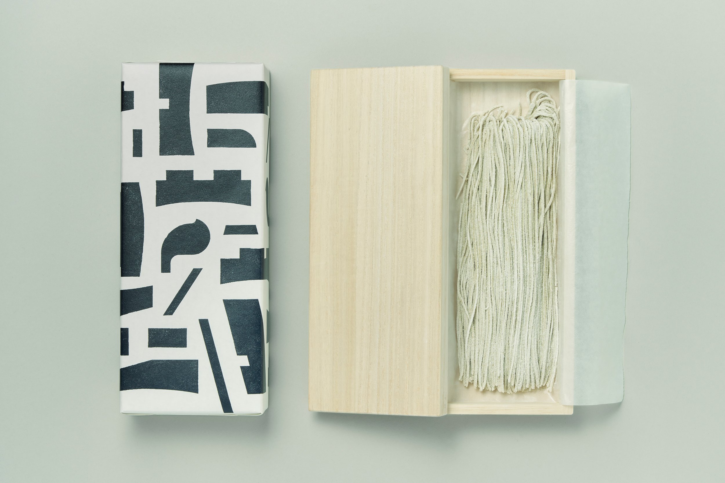
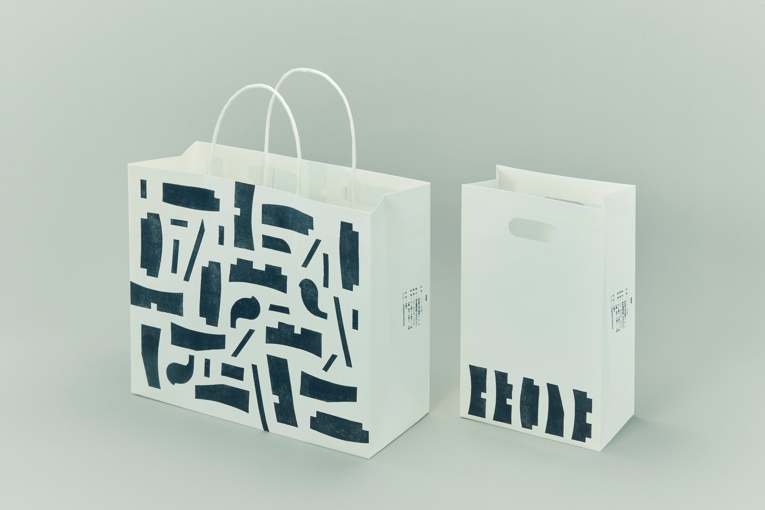
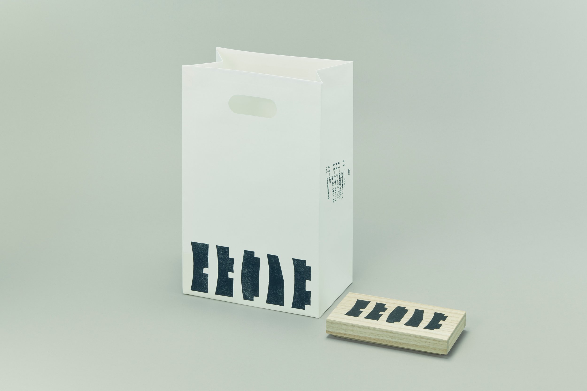
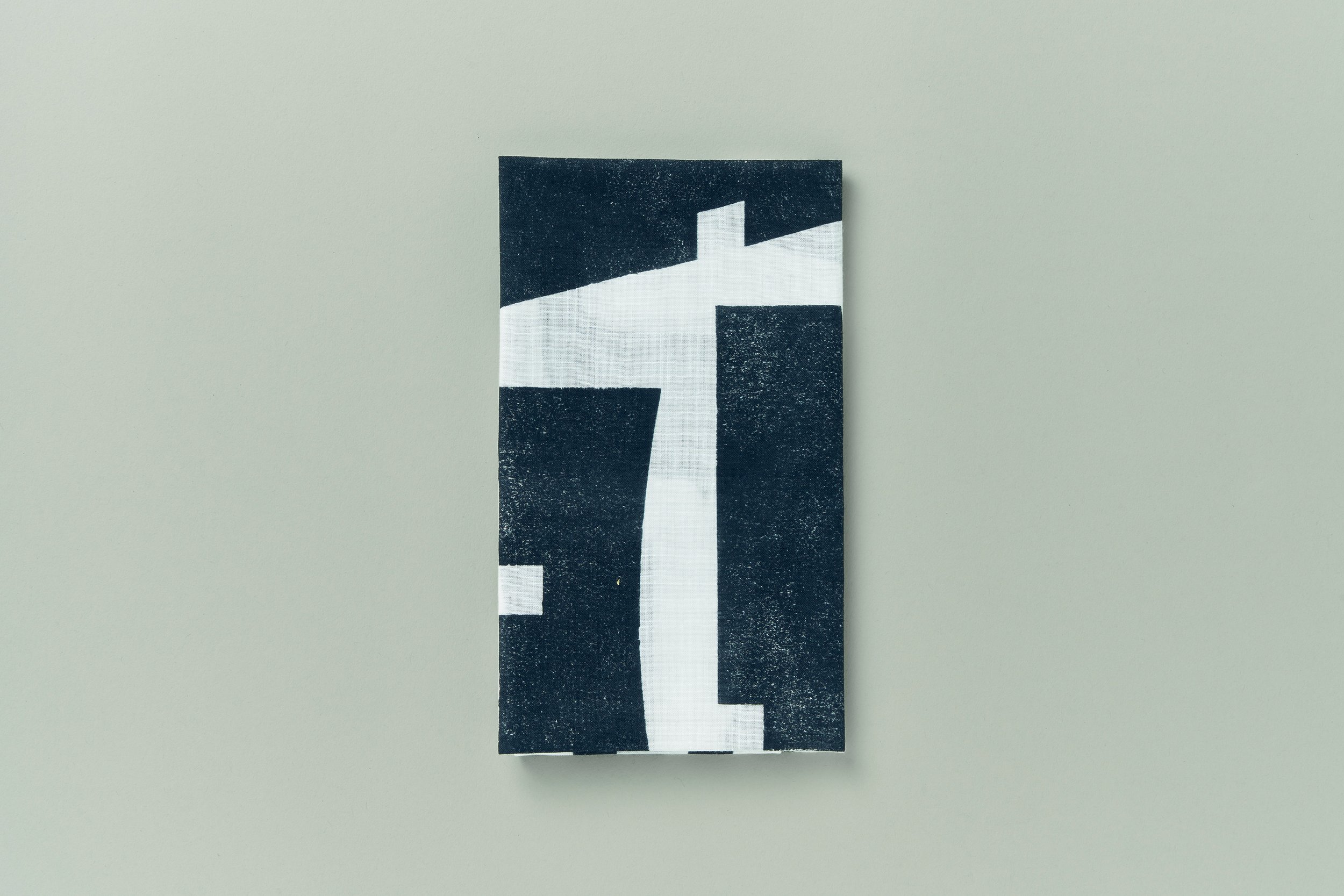
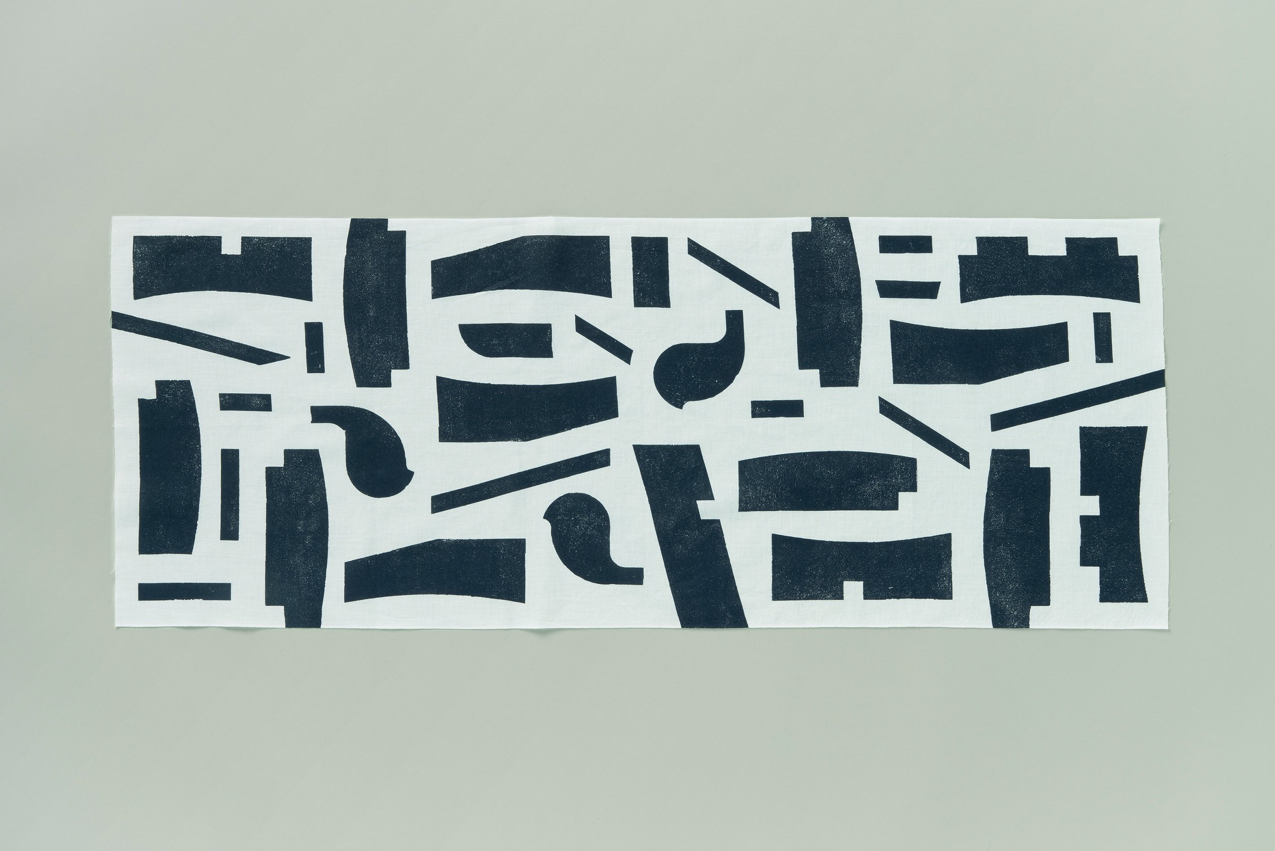
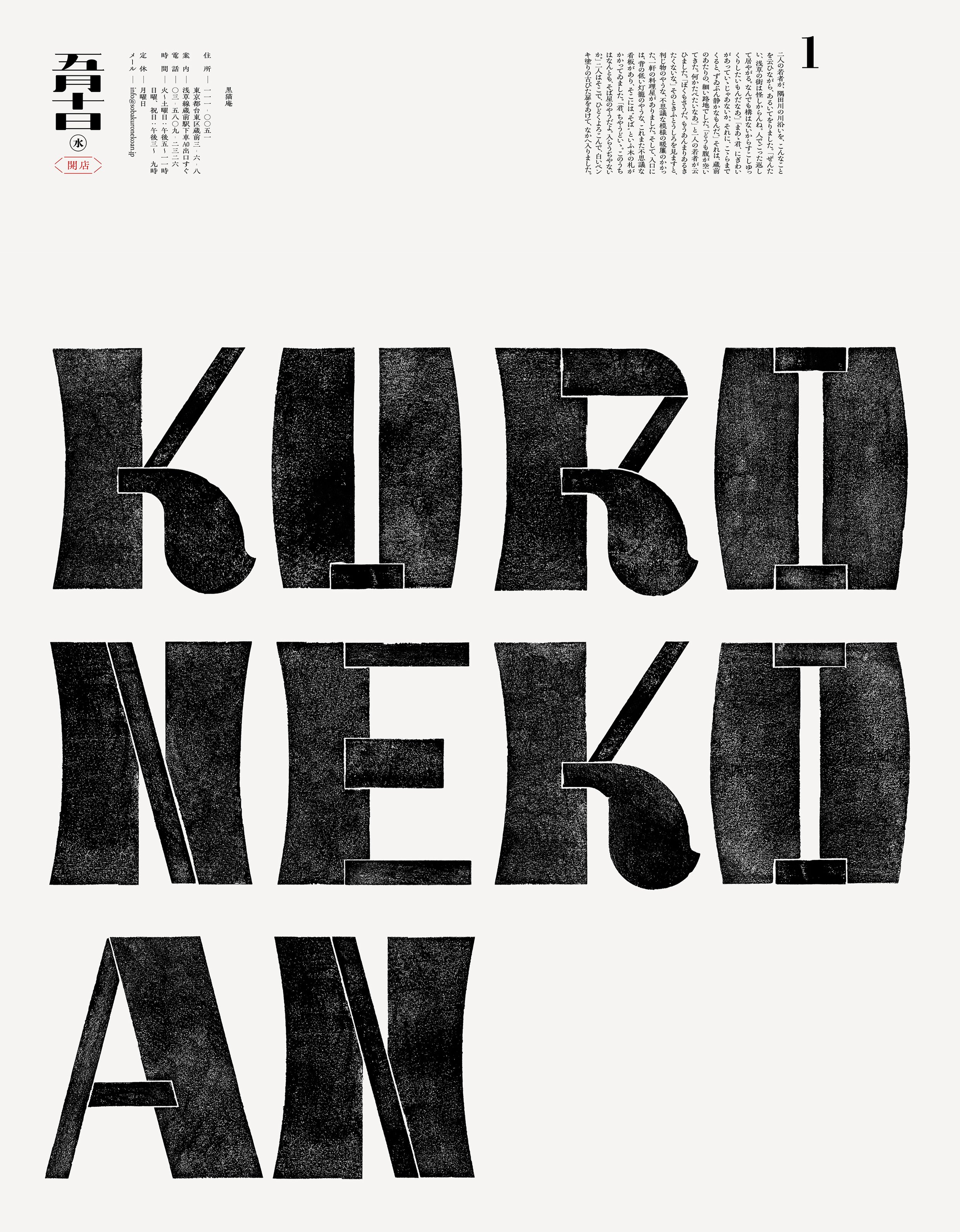
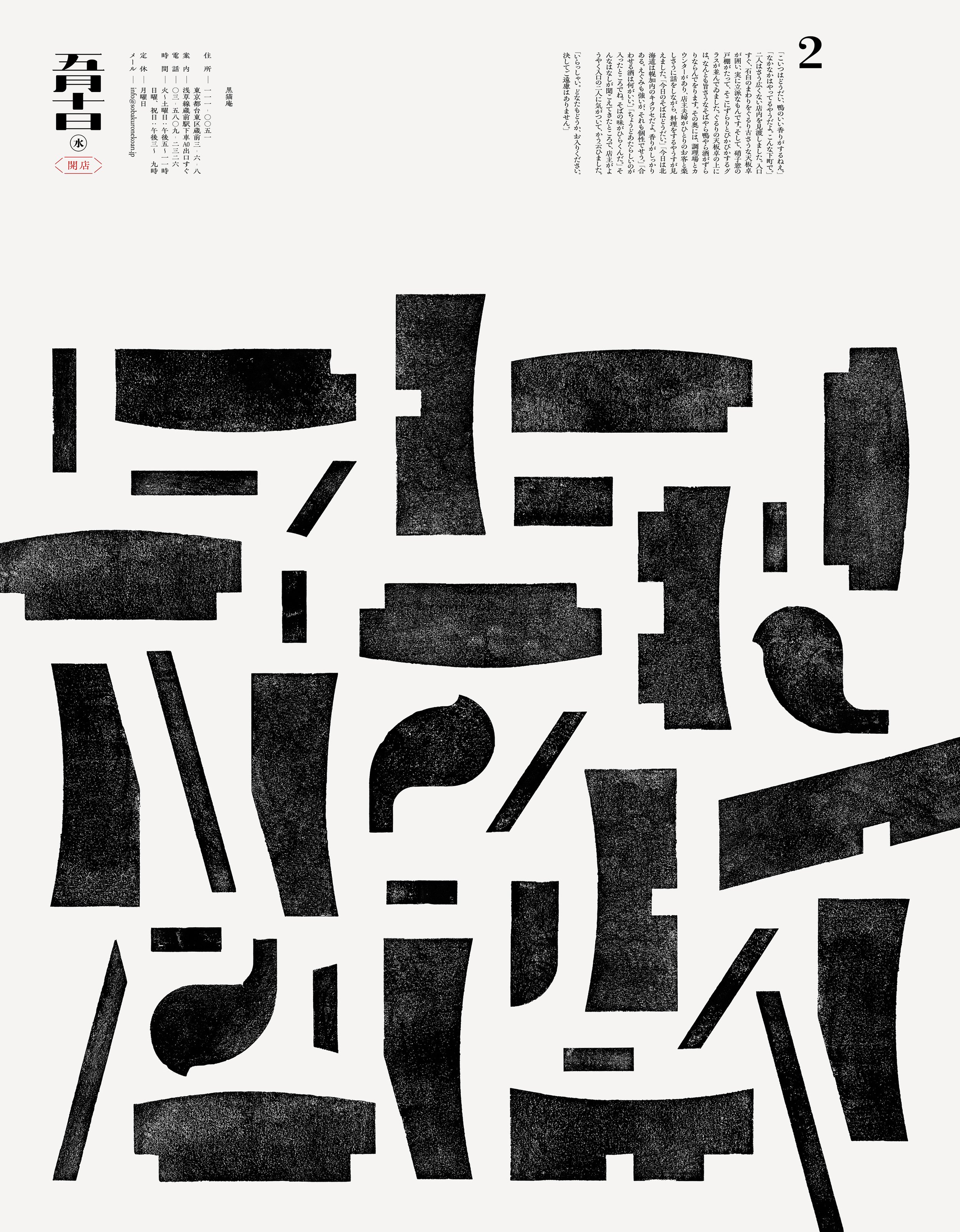
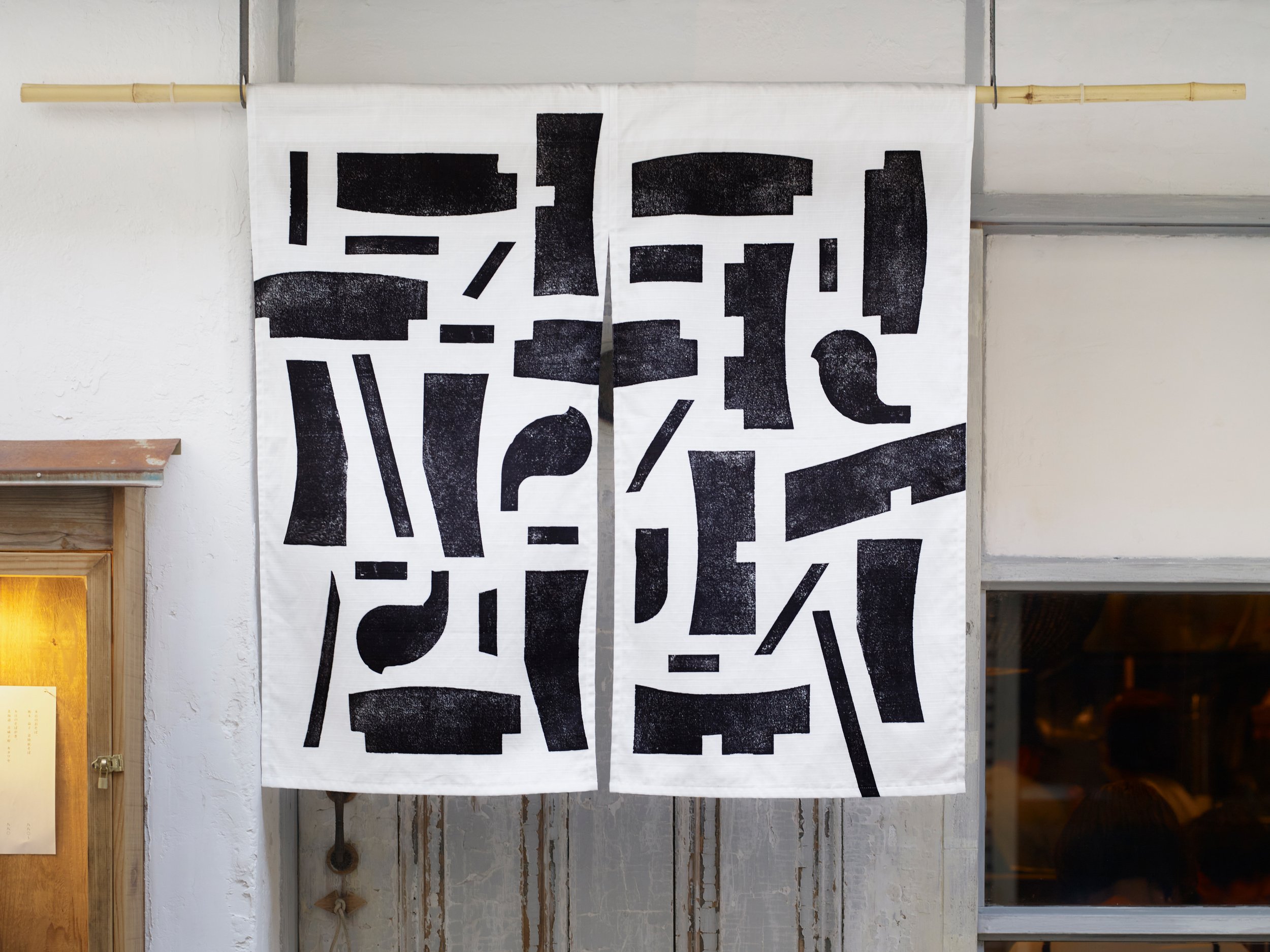
First, we created the logo type inspired by the three main elements of soba making: "soba flour," "flour for dusting," and "water." We then disassembled the elements comprising the logo type into 34 parts and applied them to items such as noren (curtains hung at the entrance of shops), paper bags, and soba packaging.
The texture of the logo type is expressed through woodblock printing. Each element is cut out individually using a laser cutter to create the plate for printing.


