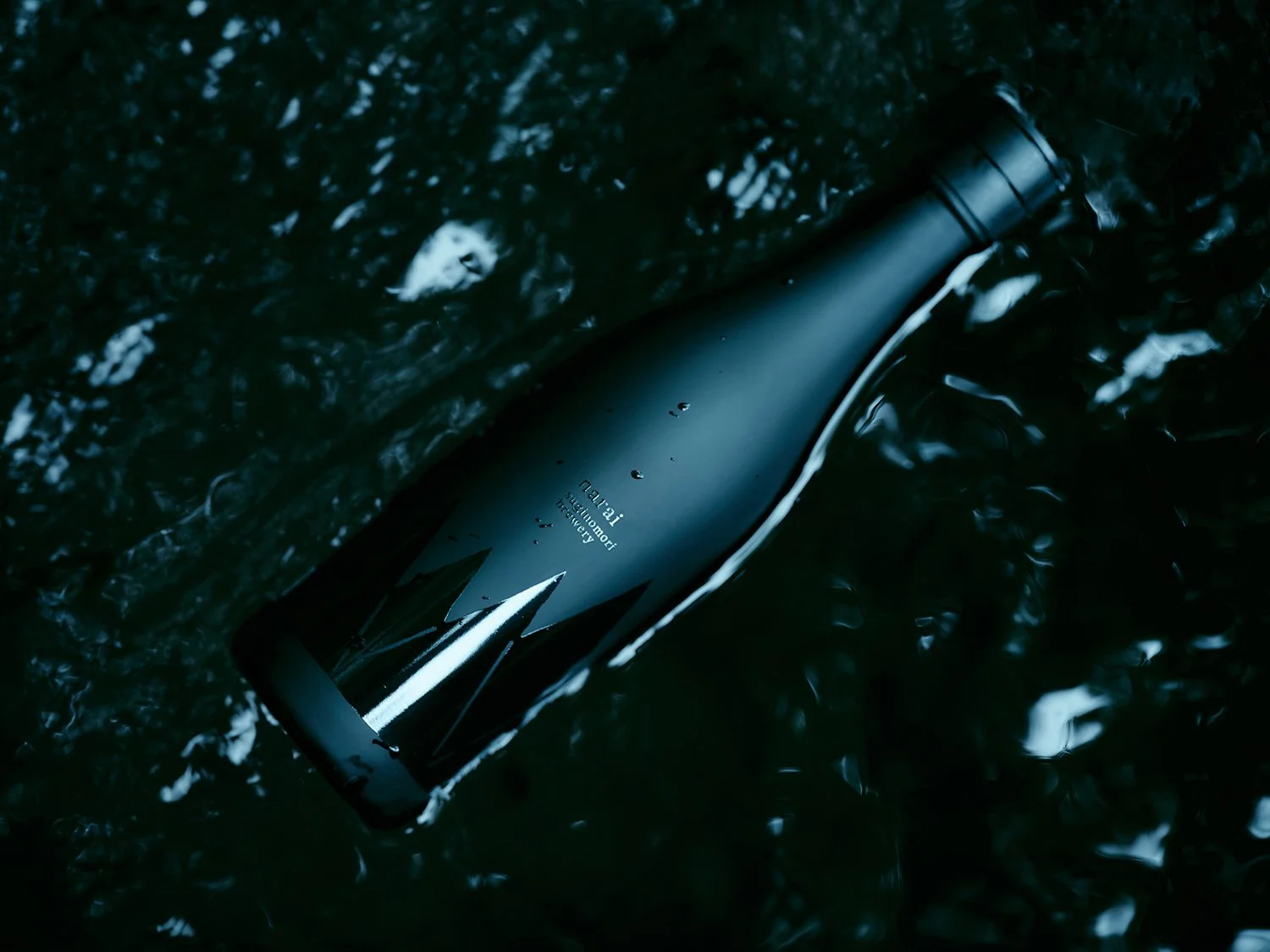
CANELÉ YOKAN

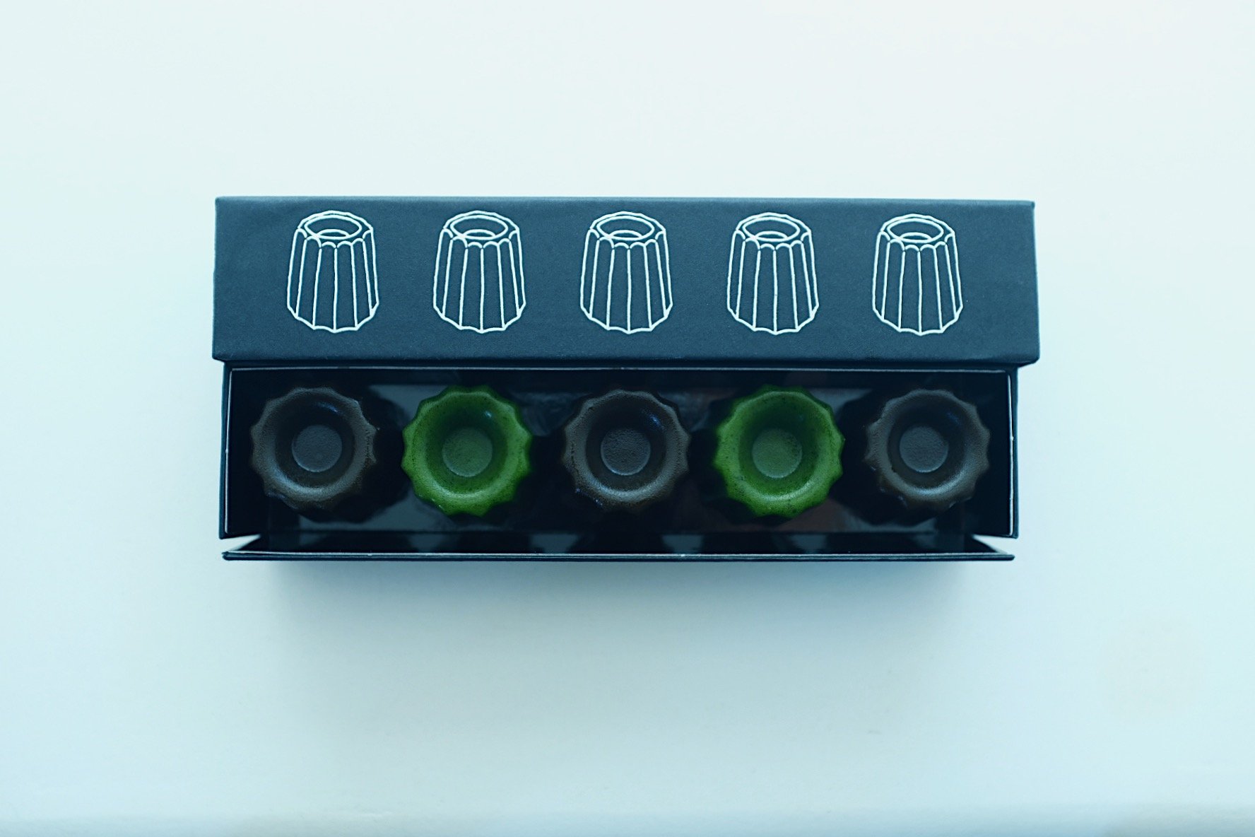
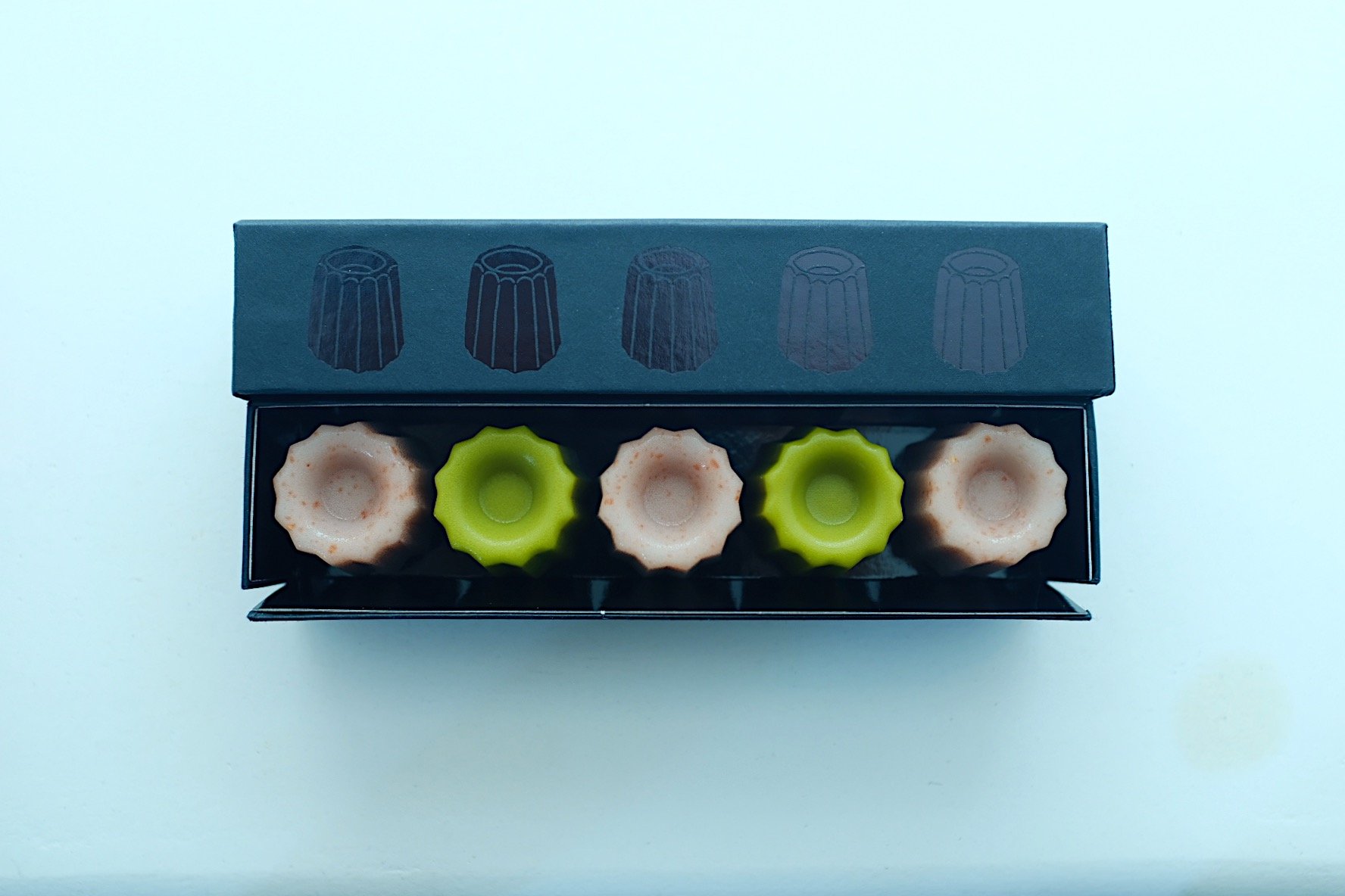
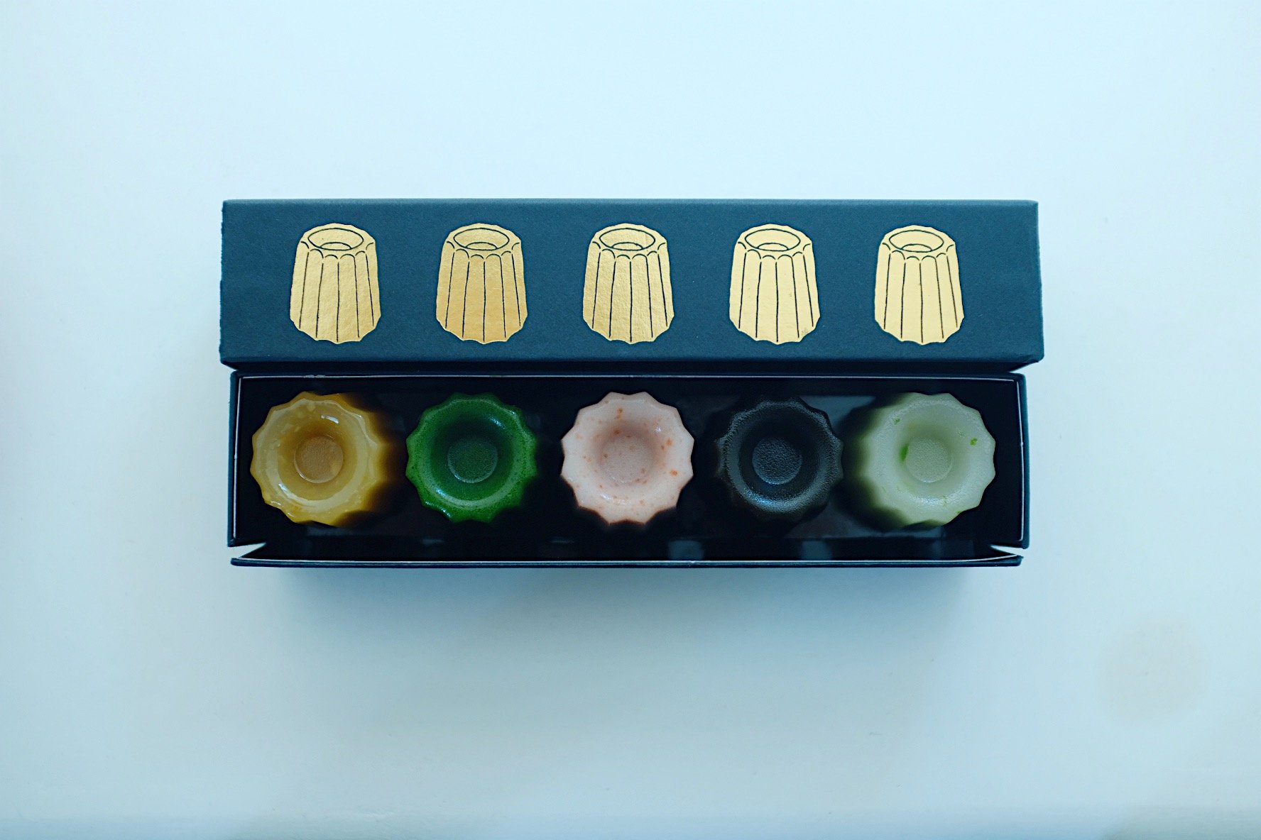
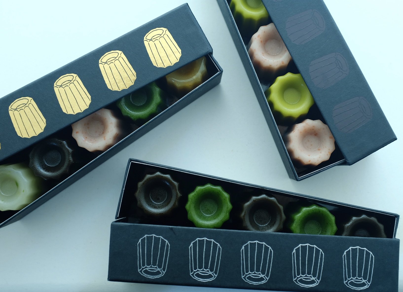
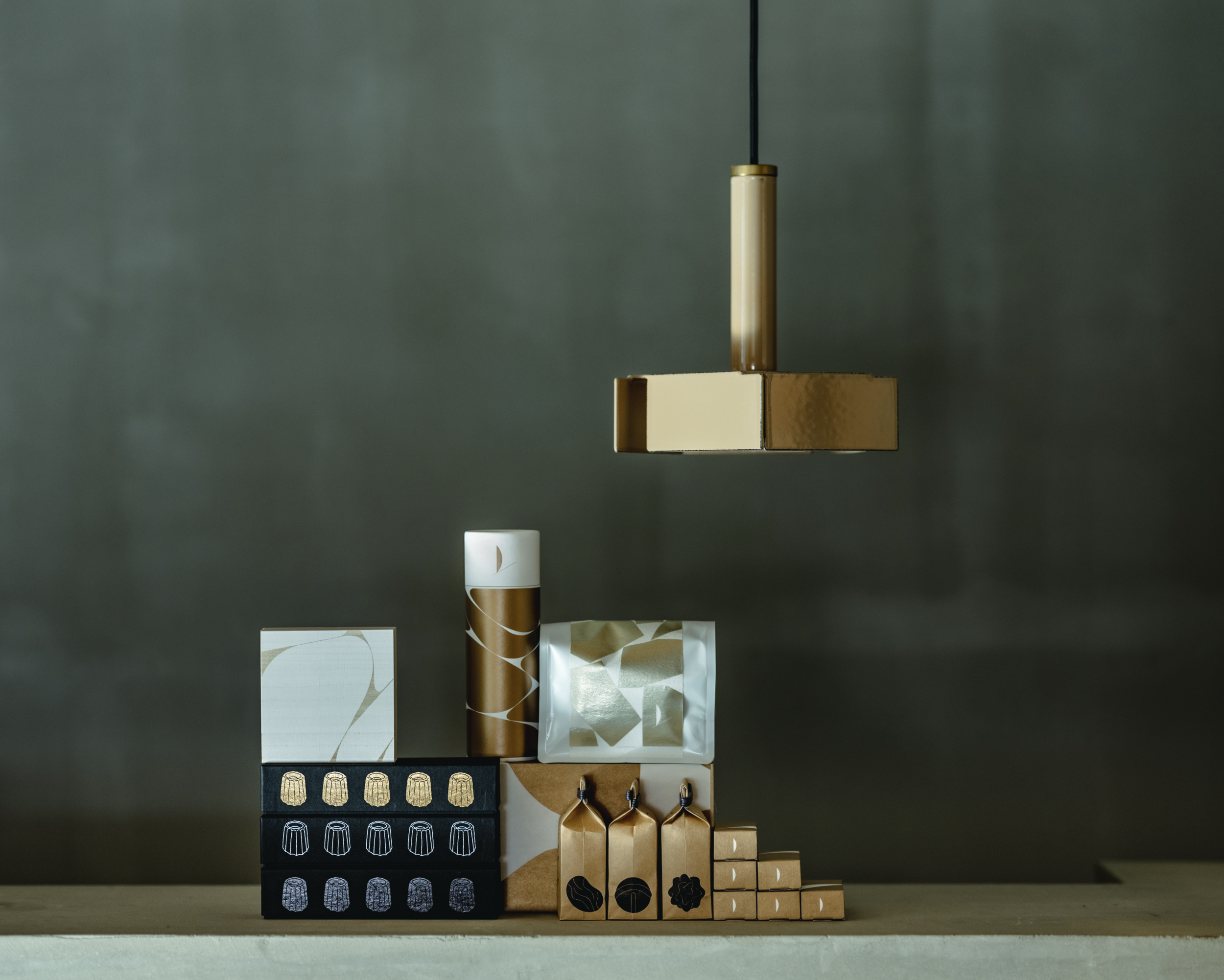
CANELÉ YOKAN
Client: INOUESARYO
Art Direction/Design: Eko Hayashi
Country: Japan
Brand Concept
A tea dormitory that develops, sells, and wholesales tea-related products in Matogata, a port town facing the Setouchi Sea. The brand logo represents a simplified form of tea leaves and stems, and incorporates the philosophy of will to propose the way tea should be in modern times.
Product Concept
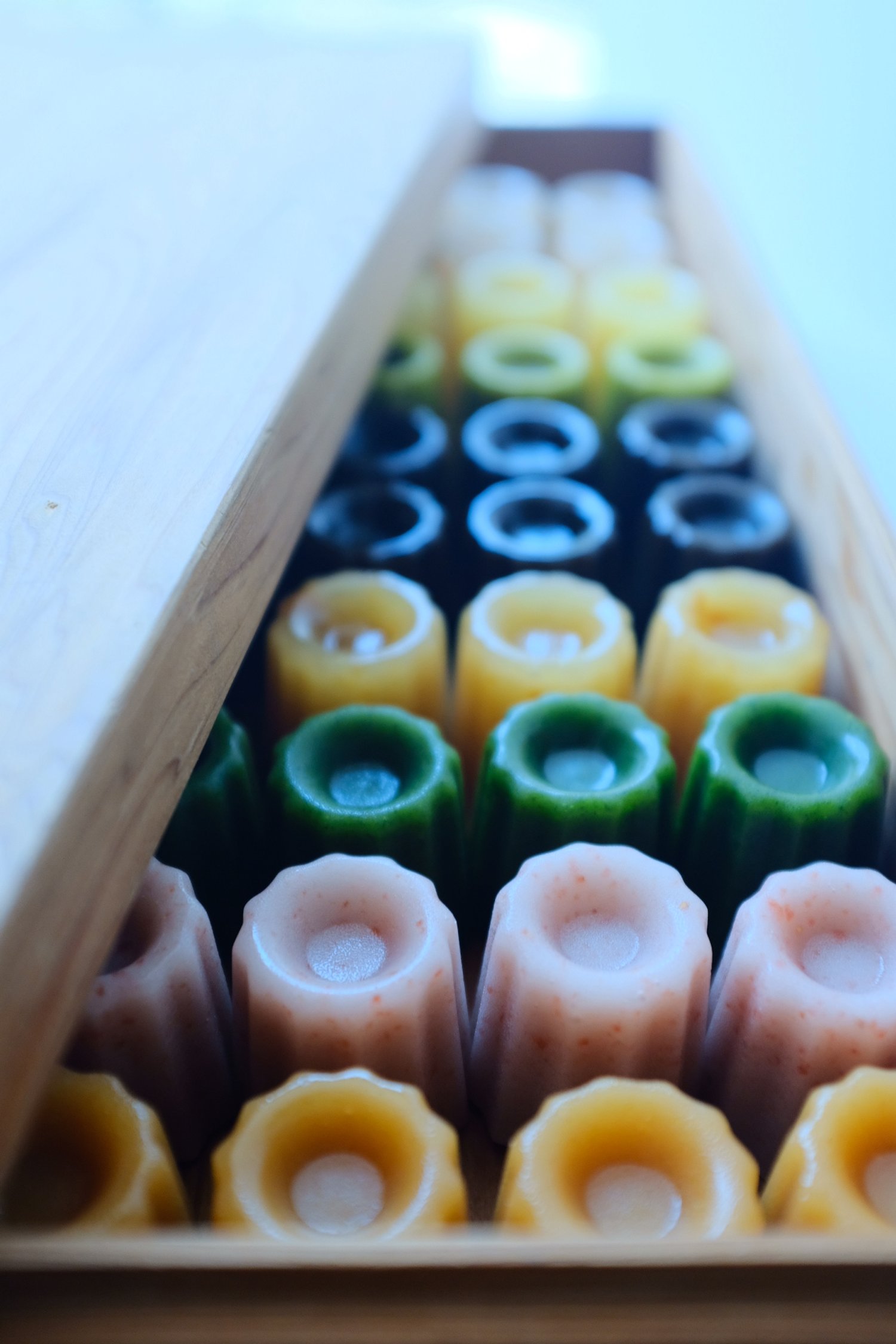
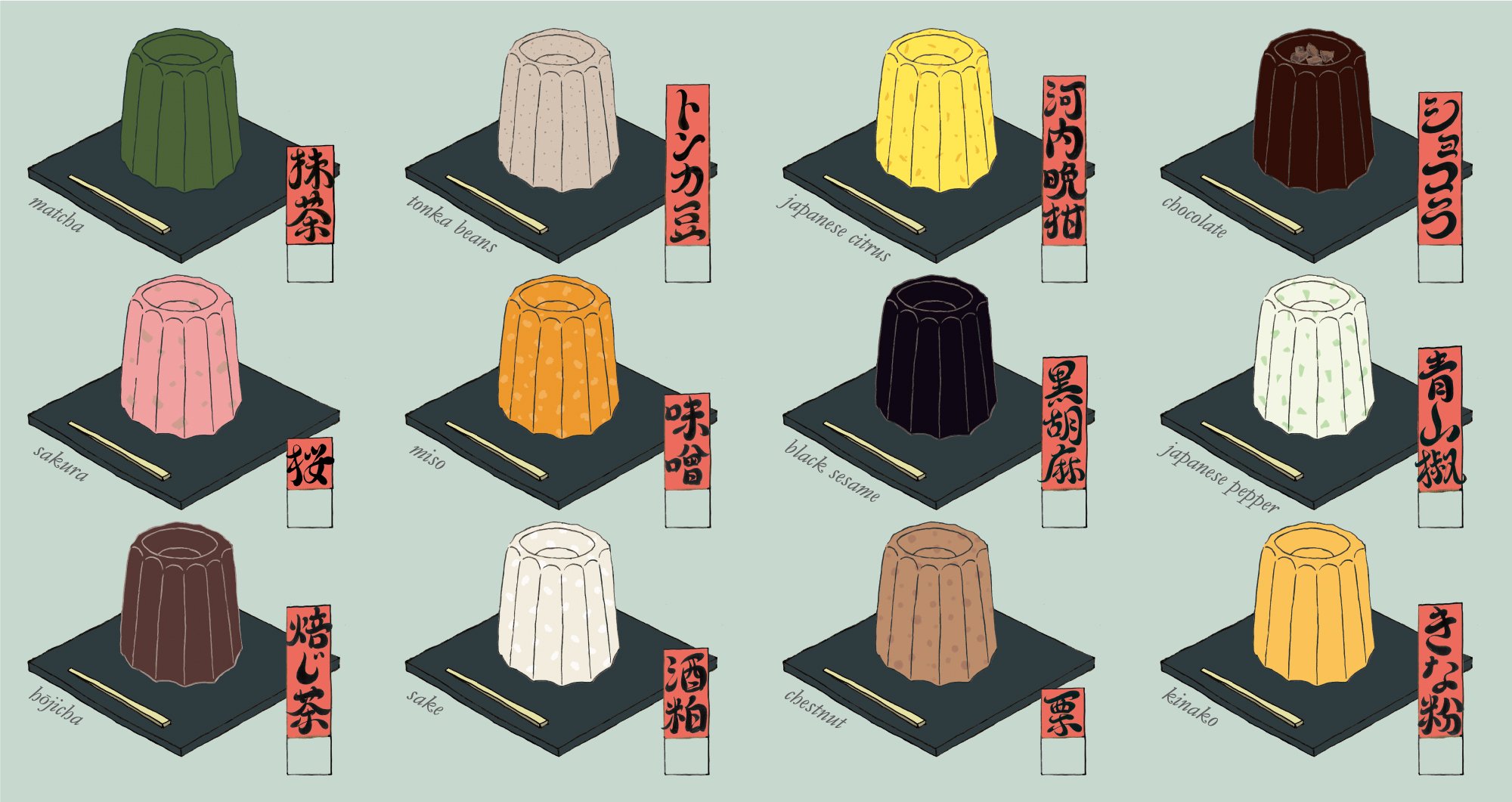
Kanure yokan is made from natural plant-derived ingredients and is gluten-free and lactose-free. Furthermore, by minimizing the amount of sugar, we have achieved an unprecedentedly fresh mouthfeel. In this age of diverse pairings, not only with tea, but also with coffee, sake, champagne, etc., we are exploring a new realm of yokan that is neither Japanese nor Western, by applying the Japanese confectionery techniques that can be considered the wisdom of our predecessors.
Design Concept
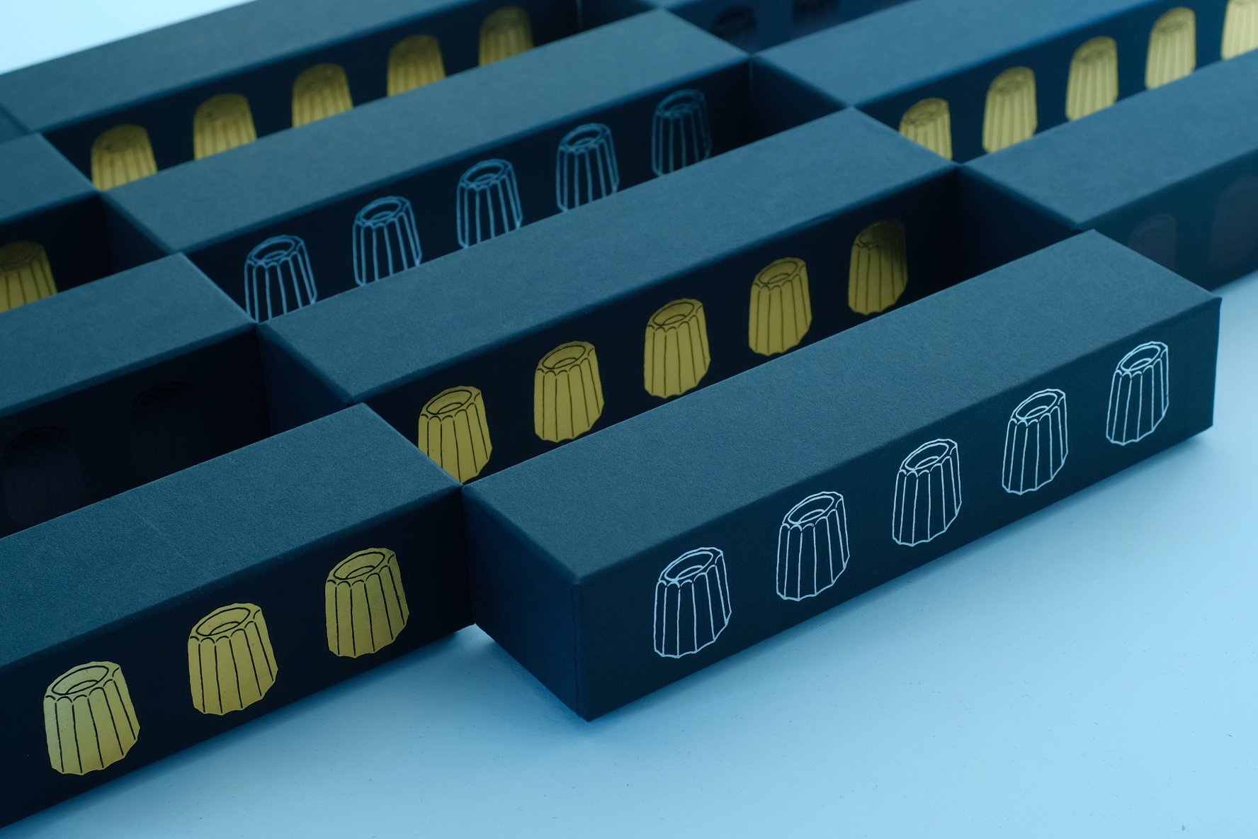
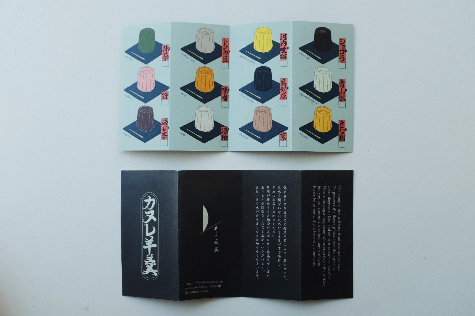
The leaflet and package design were inspired by Ukiyo-e, a type of Japanese woodblock print that is reproduced using plates, since the yokan is made using a canele mold.
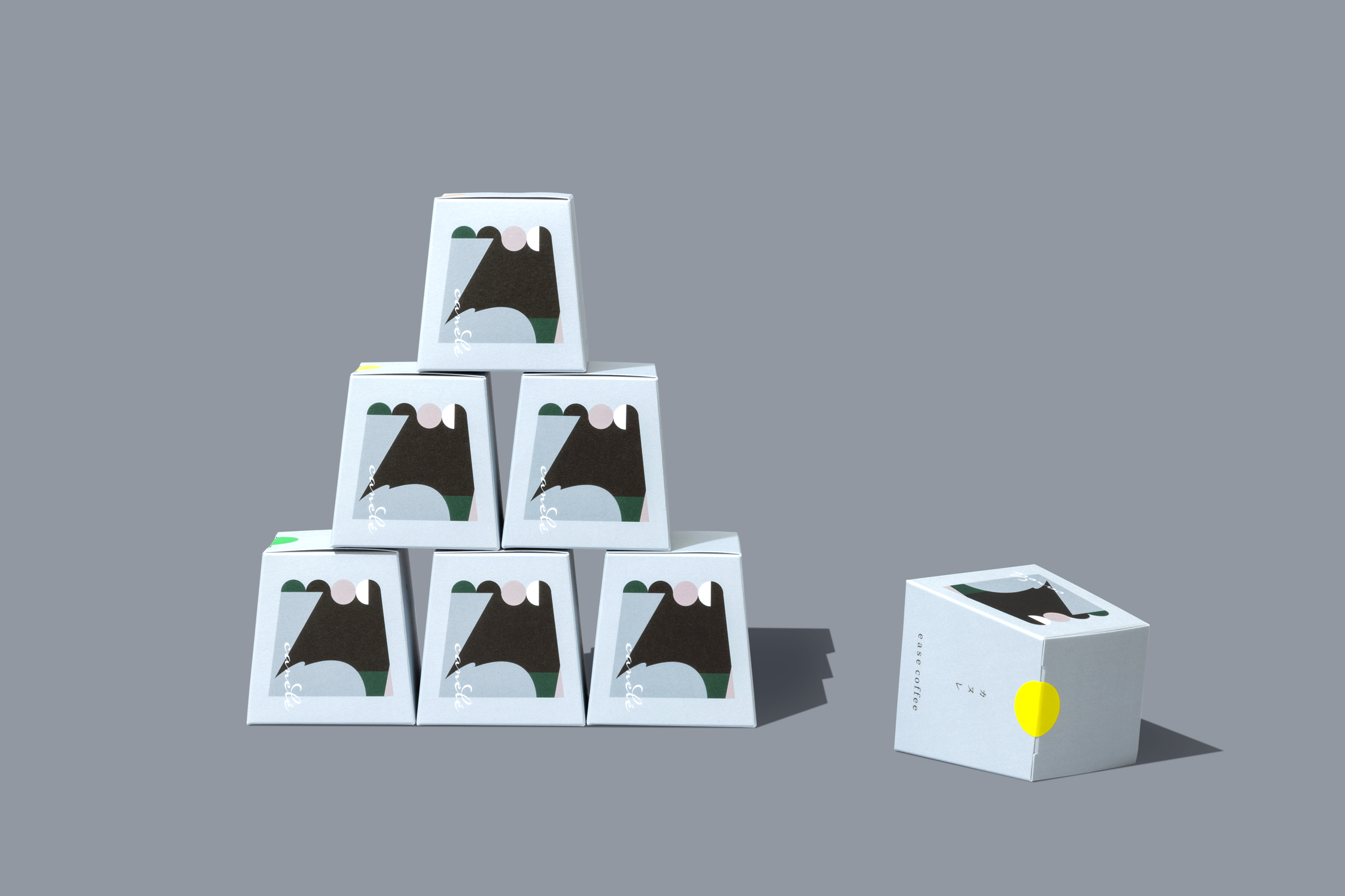
The pasteboxes are made one by one by craftsmen, and you can feel the warmth of the craft when you hold them in your hands.