5W1H Eau de Parfum 100ml Series (10fragrances)


5W1H Eau de Parfum 100ml Series (10fragrances)
Client: KOUYU KARYOU
Design Company: Shinpei Onishi Design Office
Art Direction: Shinpei Onishi
Design: Minako Mori(Shinpei Onishi Design Office)
Photography: Kohei Yamamoto
Country: Japan
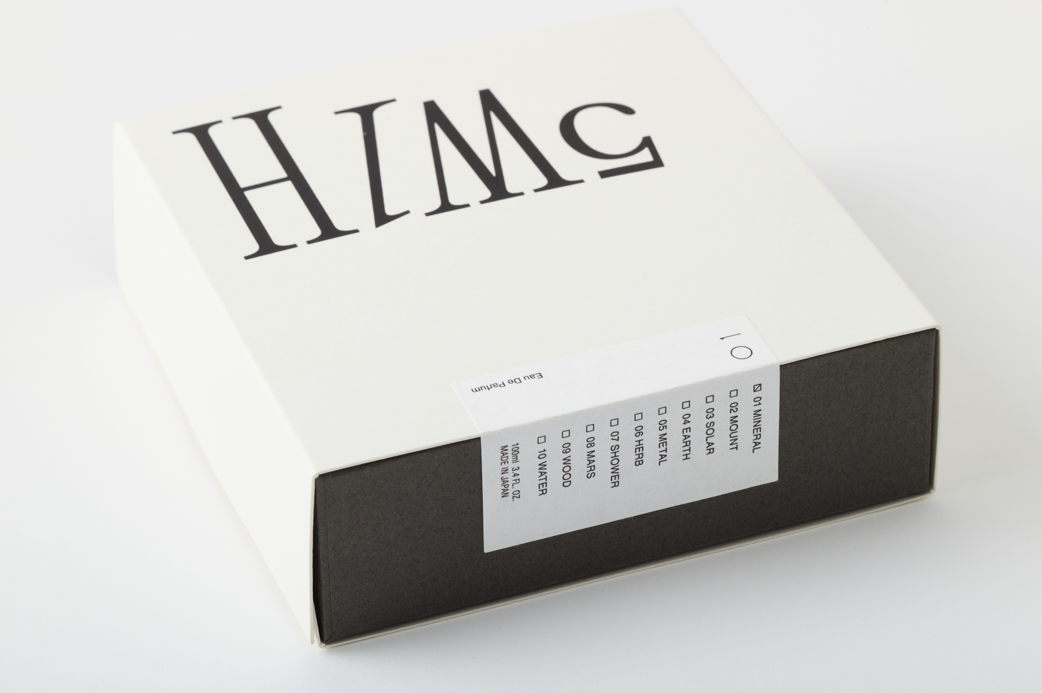
We began by focusing on developing a memorable logotype. In Japan, serif typefaces are used far less frequently in branding compared to sans-serif ones. From the start of the project, we aimed to create the logotype using a serif font to distinguish it from the norm.
To make the typeface even more striking, we introduced variations in letter height and incorporated italics into the design. The arrangement of the logotype differs between the version silk-screened on the bottle and the one prominently printed on the front of the packaging. This was intentional—by allowing for various compositions of the logotype, we aligned it with the product concept of a “personal fragrance tailored to the individual.”
The product comes in a series of ten different scents, all within the same packaging design. To differentiate each scent, we use traditional Japanese numerals on a sealing sticker on the package. These numerals are also silk-screened onto the bottle alongside the logotype, enabling scent identification. This approach also reinforces the brand’s identity as a uniquely Japanese one. We were particularly mindful that kanji-based branding is still relatively rare in the Japanese fragrance market.