UMESHU THE AMBER

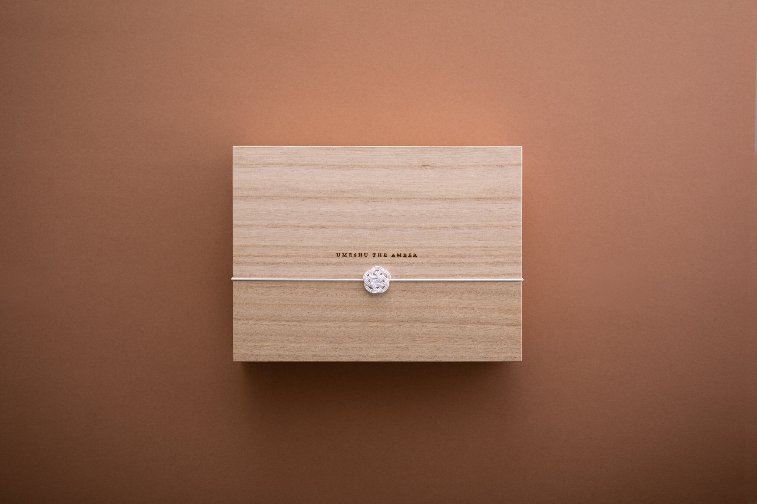

UMESHU THE AMBER
Client: KURAND(Liquor Innovation Co., Ltd.)
Design Company: P.K.G.Tokyo Inc. P.K.G. Magazine
Art Director: Kazutoshi Amano
Designer: Ayana Shirai
Producer: Hideki Aoto / KURAND(Liquor Innovation Co., Ltd.)
Printing: Fukunaga Print Co., Ltd.
Country: Japan
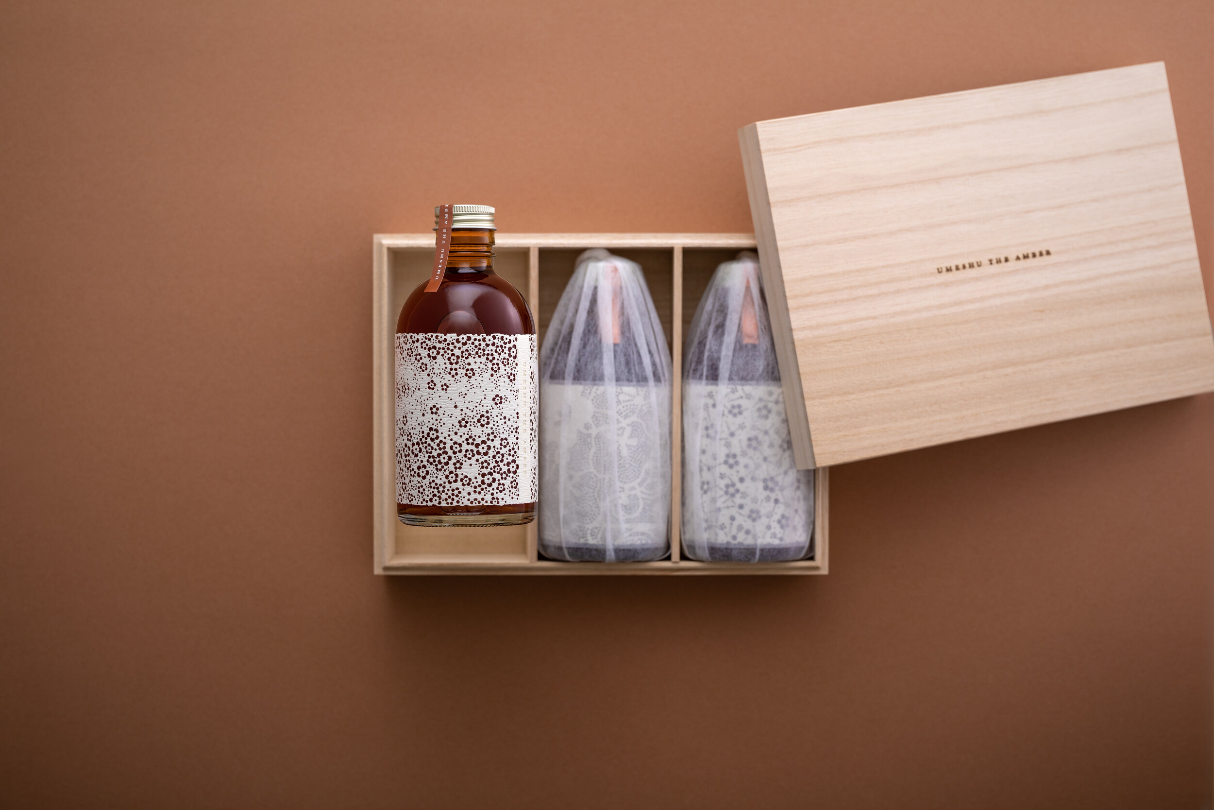
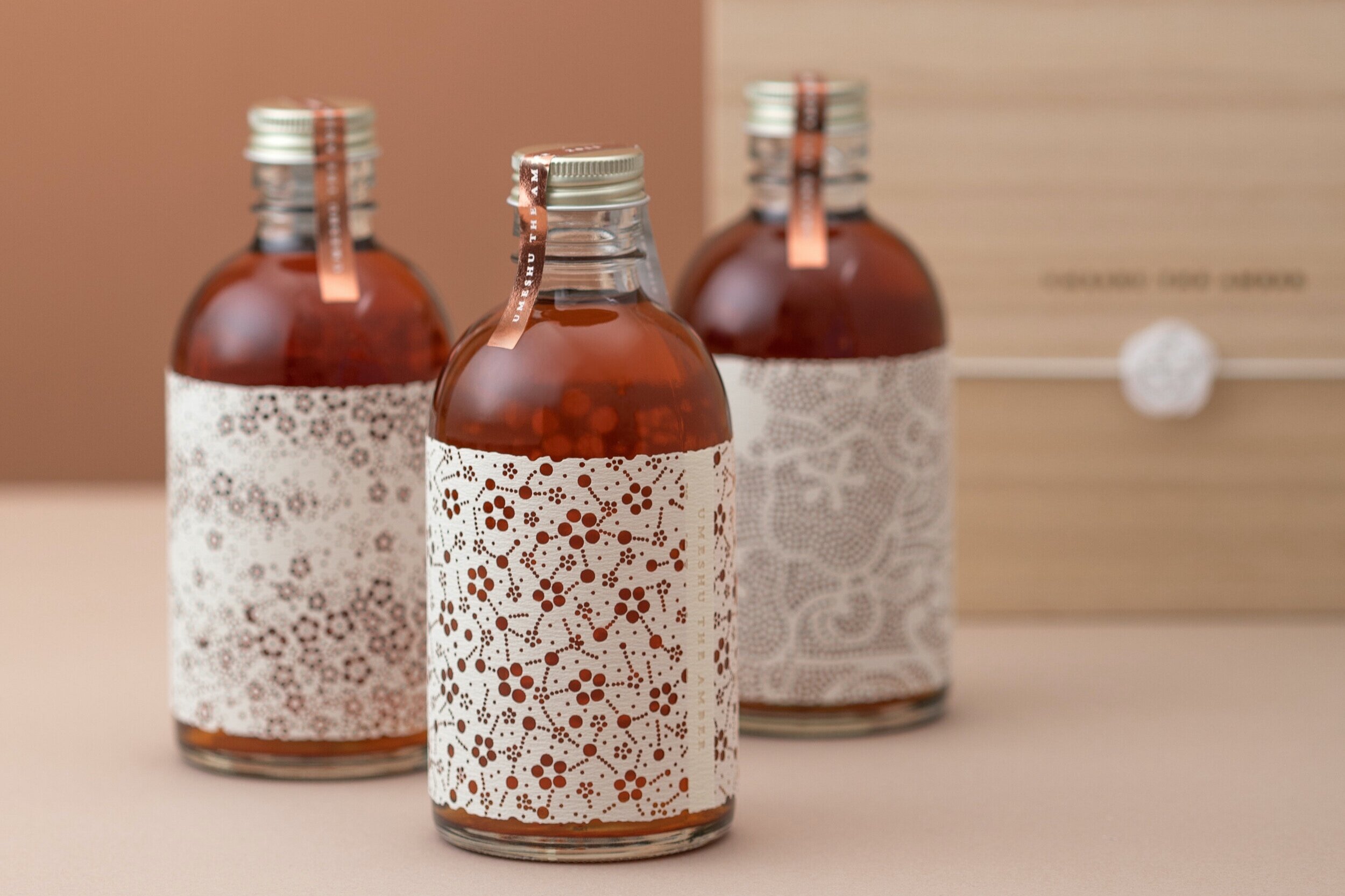
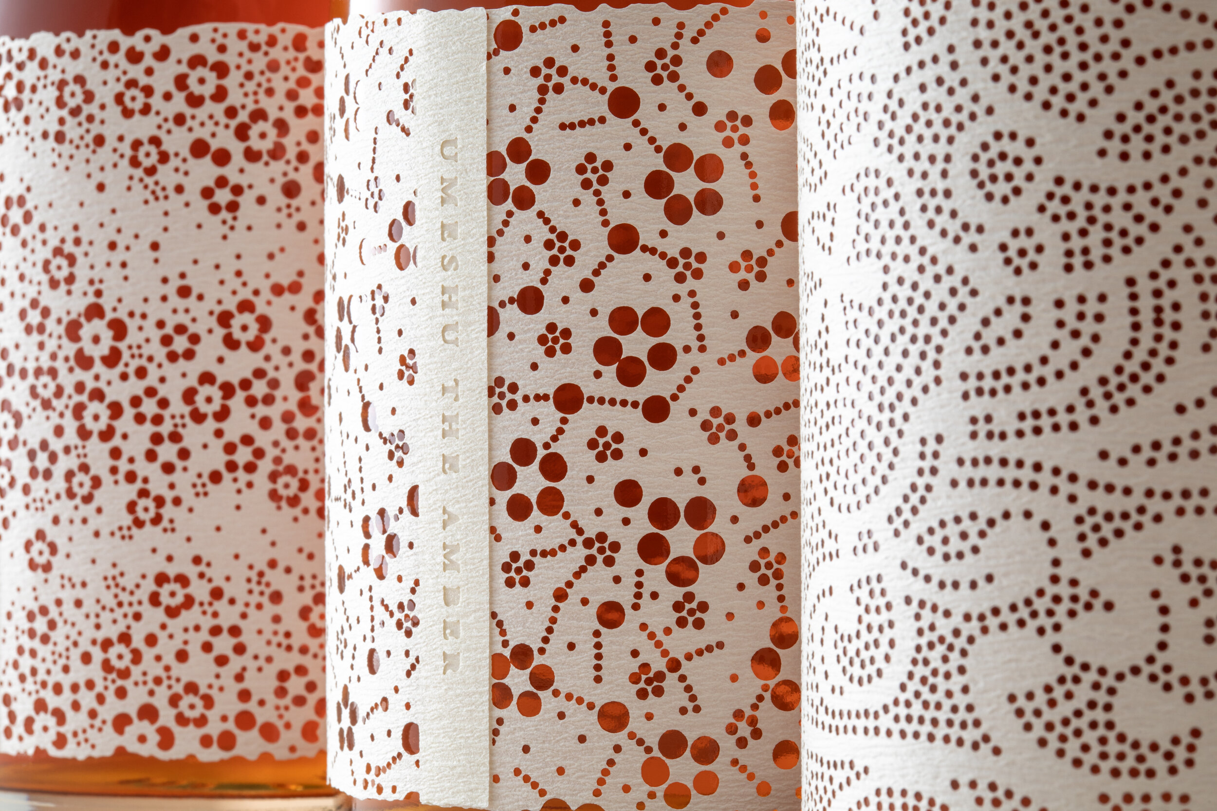
“UMESHU THE AMBER” is a set of three vintage plum wines with different tastes by different aging periods. The delicate white labels are inspired by the traditional Japanese patterns, used for Kimono in the area where these plum wines were produced. A beautiful contrast between the umber liquid and the pure white label is seen before tasting.
Kiribako (wooden box) and Mizuhiki (decorative paper cord) are both traditional handcrafts. When opening the lid with the branding iron of UMESHU THE AMBER, there are three bottles wrapped with white cloth. The bottles are sealed with sticker made of gold foil stamping. The body of the bottle is covered with Japanese paper label with laser cut-out pattern of plum, a motif inspired from patterns used for dyeing kimono. The amber-colored liquid can be seen from the small windows that mimic the real cut-out paper patterns. This is a package design that truly represents traditional Japanese culture.