VERTERE
VERTERE
Client: VERTERE
Design Company: VERTERE
Design: Kokage Tsujino, Kei Ueki
Country:Japan
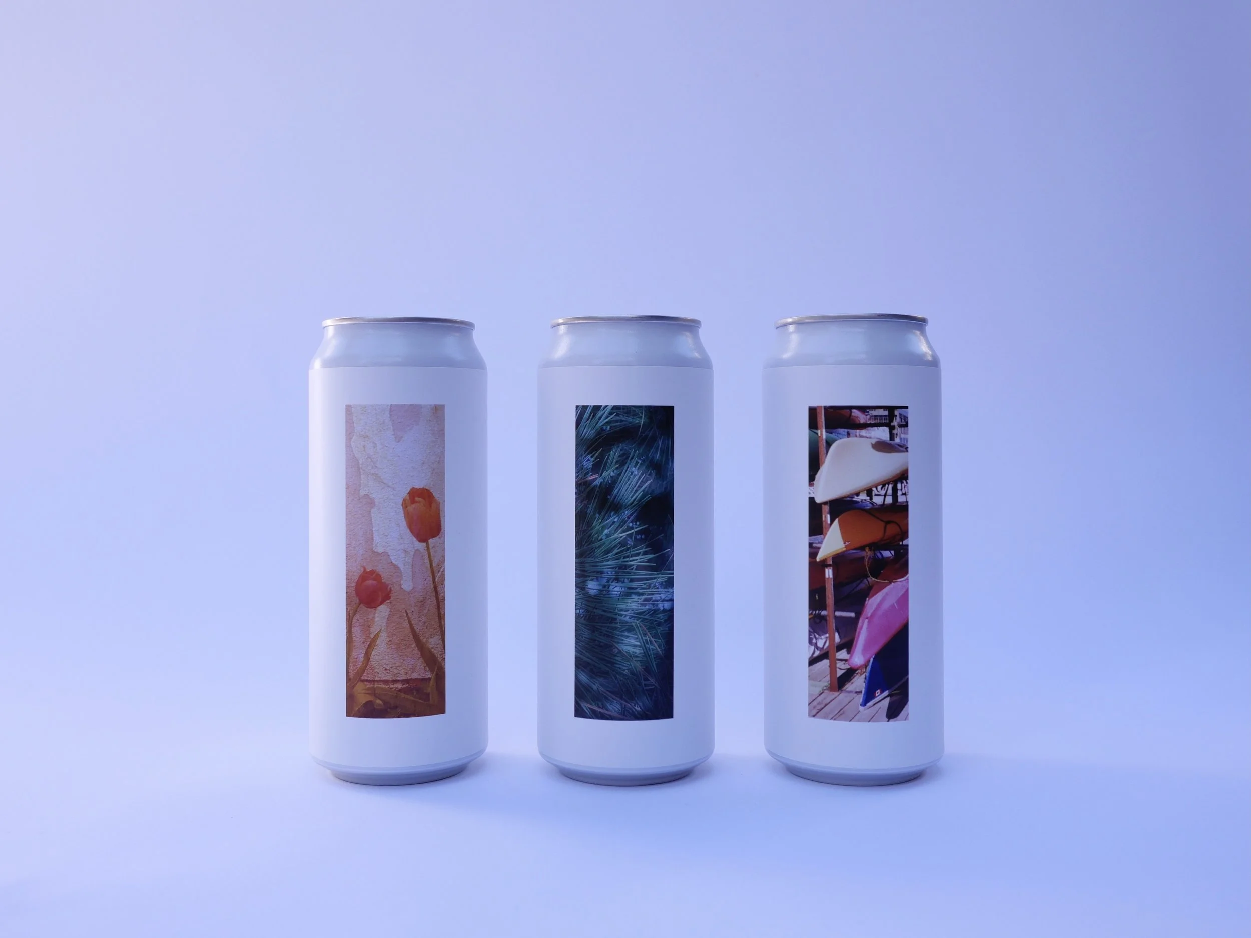
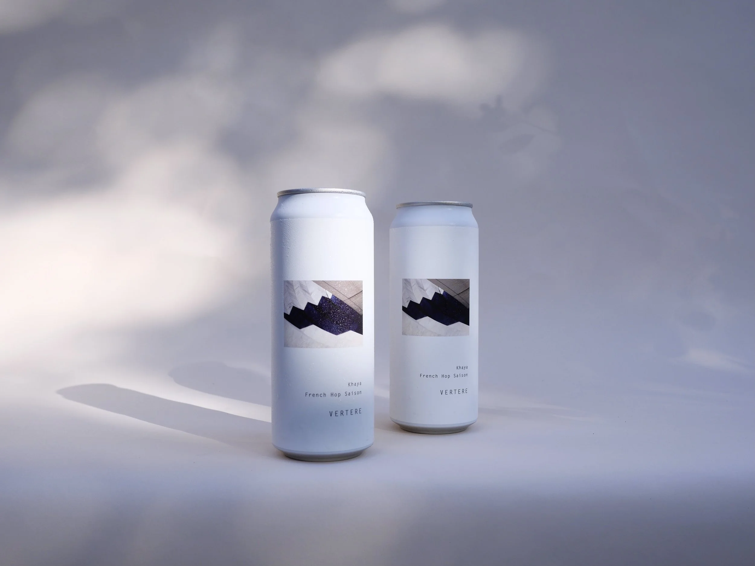
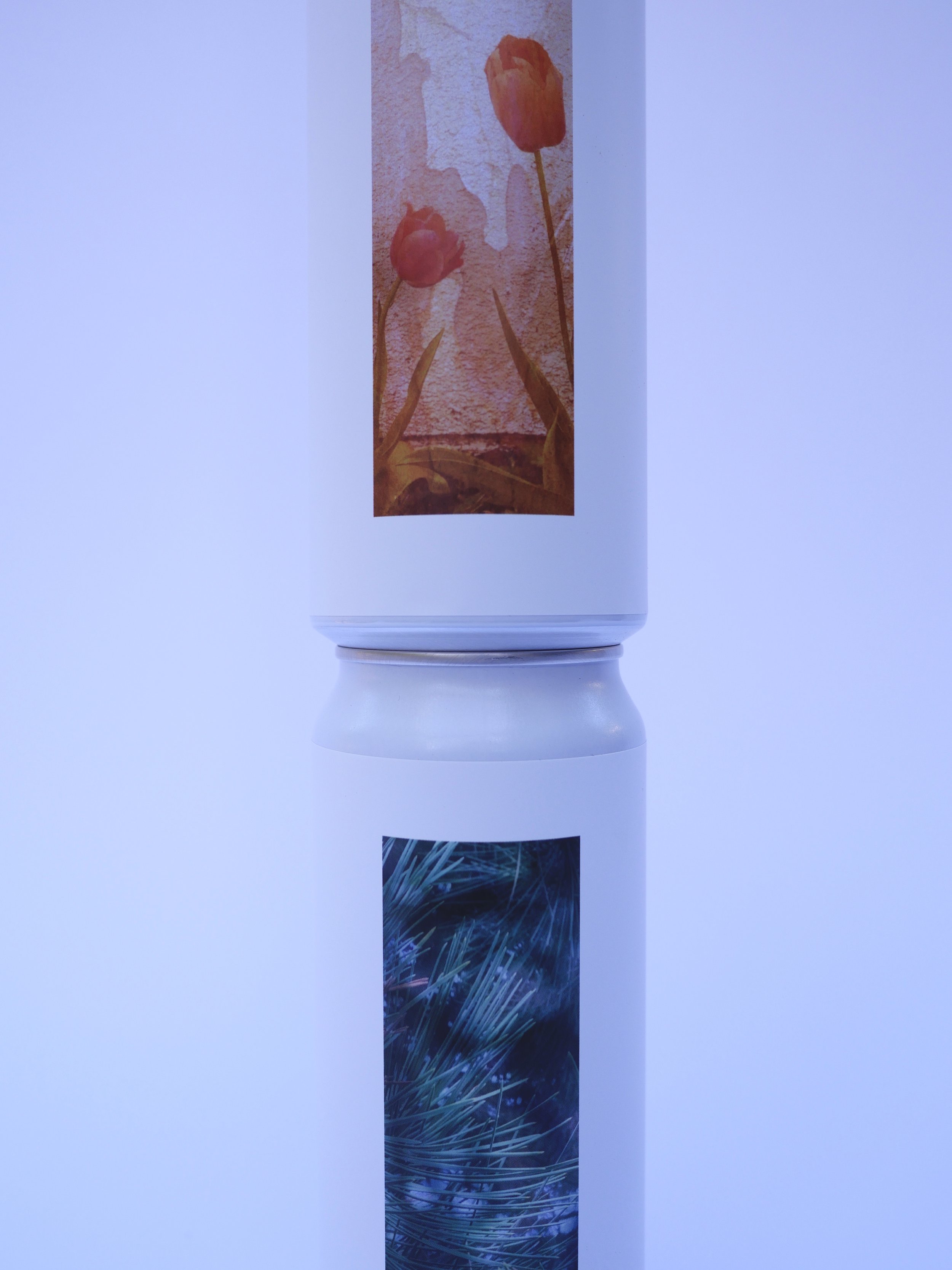
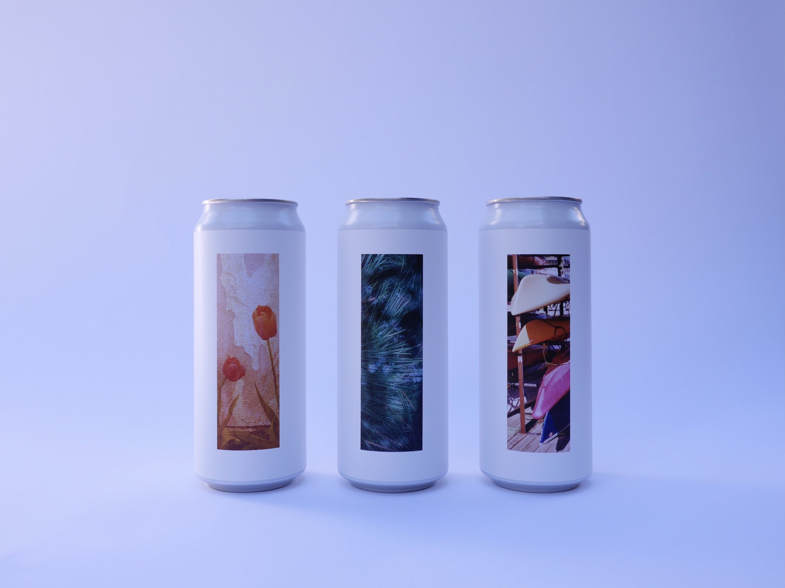
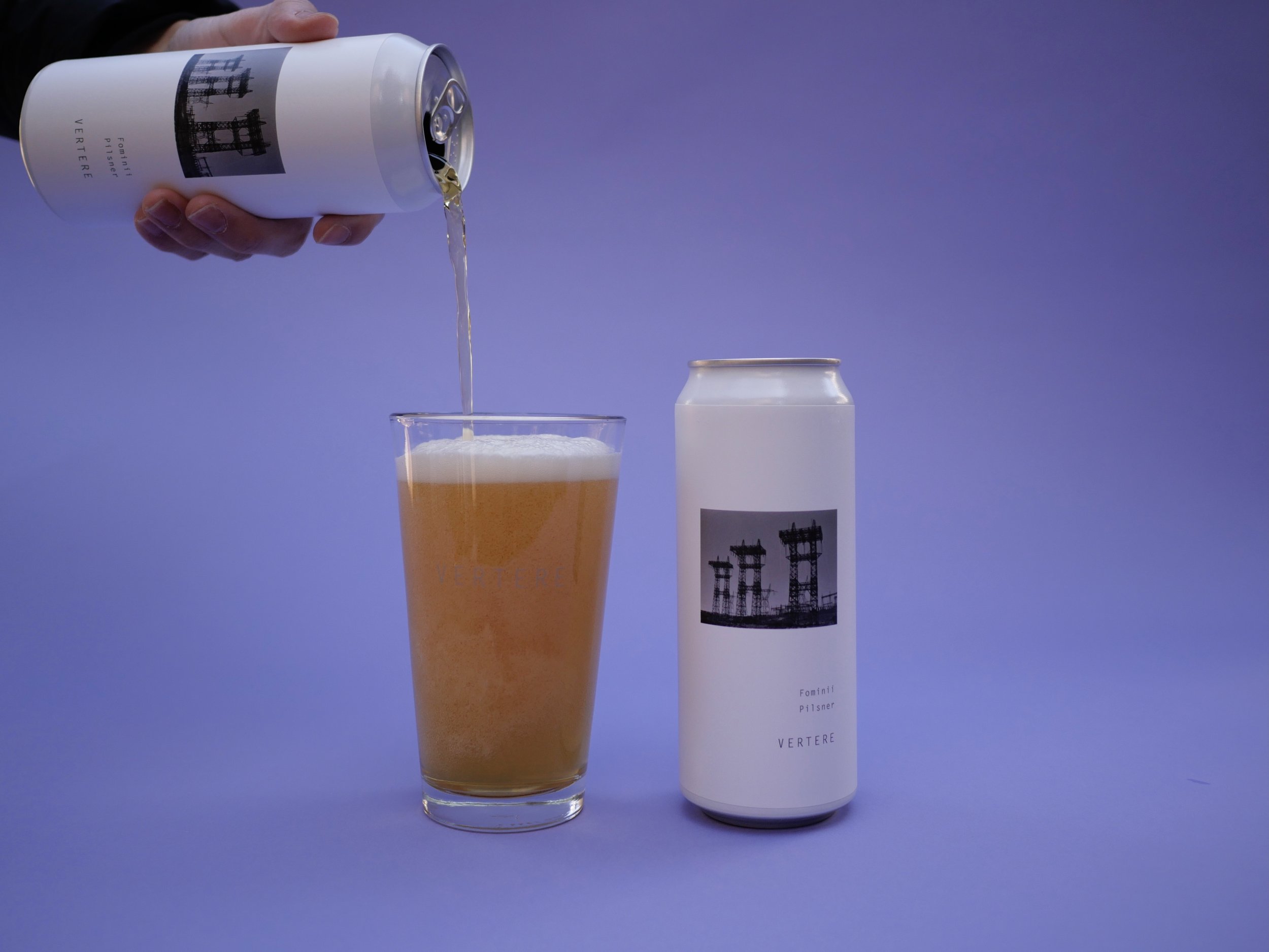
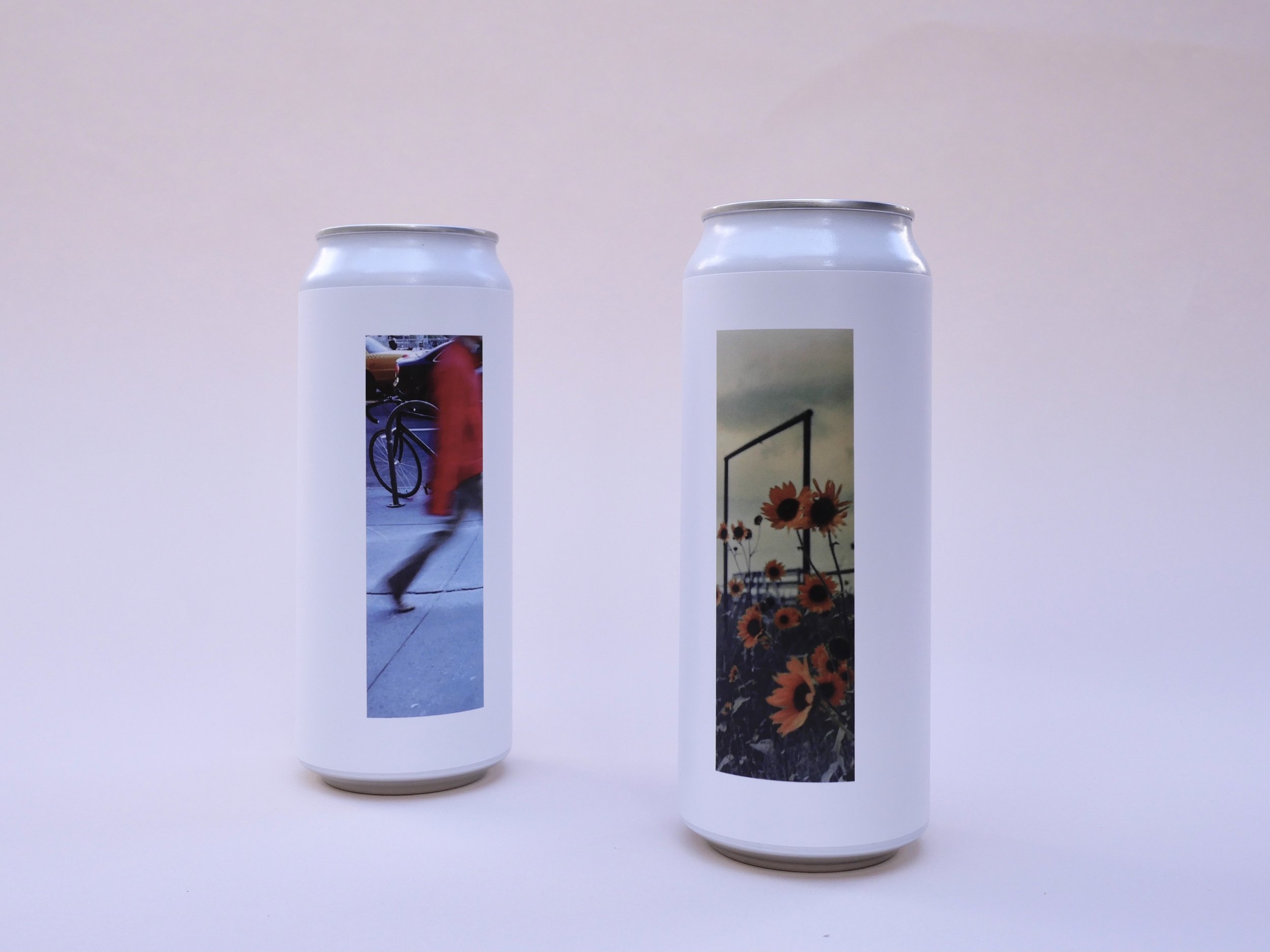
Our visual style is essentially based on simplicity. We use an especially minimalistic approach to our labels and brand. Pure white background,a square photo in the middle,and the least written text possible. The photos on our labels usually have little to no correlation with the beer inside the can, as we want people to enjoy the beer without any preconceived notions of what it will be like.
Our main design was inspired by exhibits from art museums. Often when you go to art meuseums,paintings are framed on a blank wall to focus attention on the art. We thought we would try to replicate that on our beer cans. Plus,the ability to change the center photo while keeping the same design is a big bonus.


