ameiro ringo
ameiro ringo
Client: Seino Rikiji Apple Farm
Design Company: HITSFAMILY
Brand Managing: Kotoe Seino
Creative Direction: Arata Sasaki
Art Direction: Takashi Kawada
Design: Mai Minoshima
Country: Japan
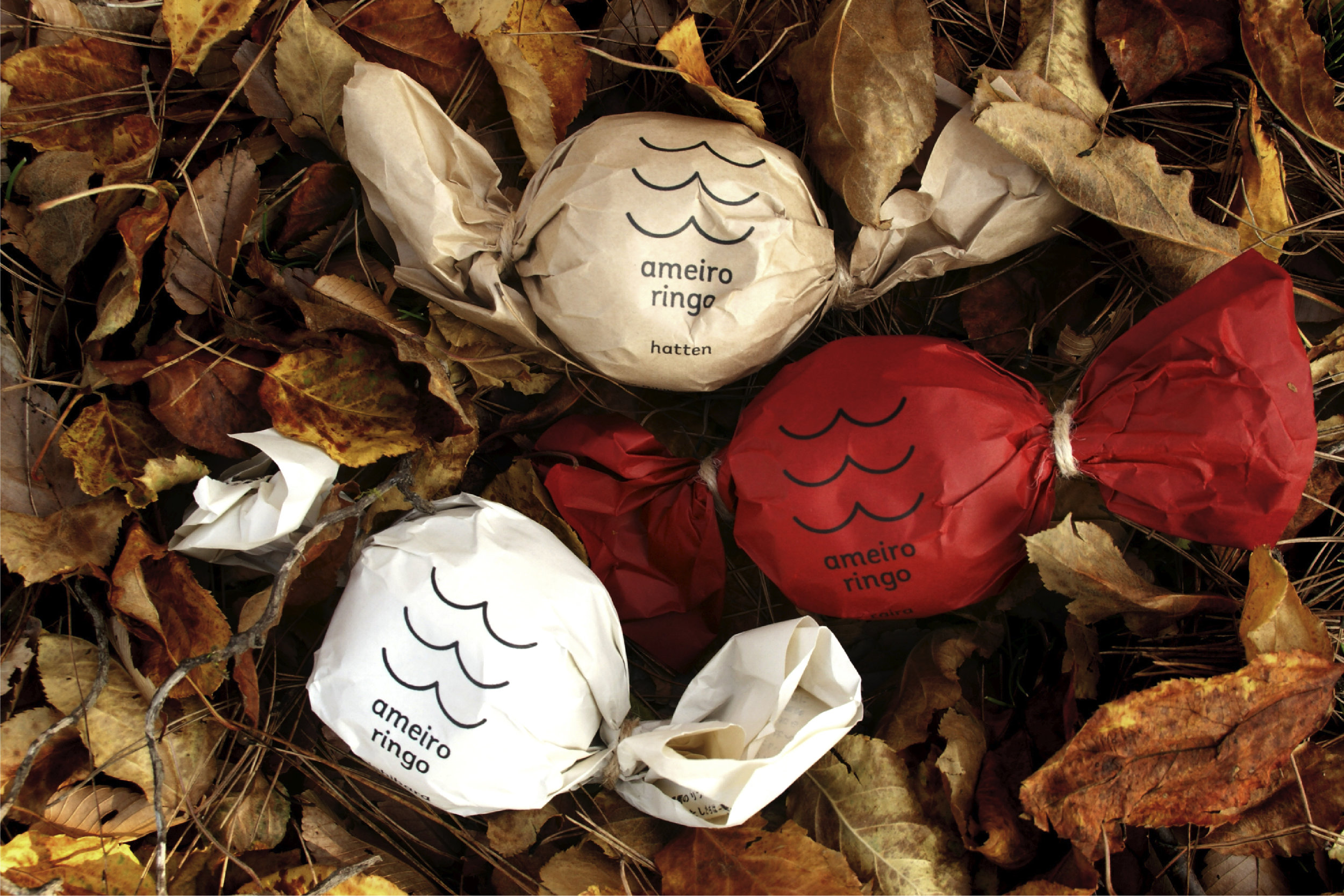
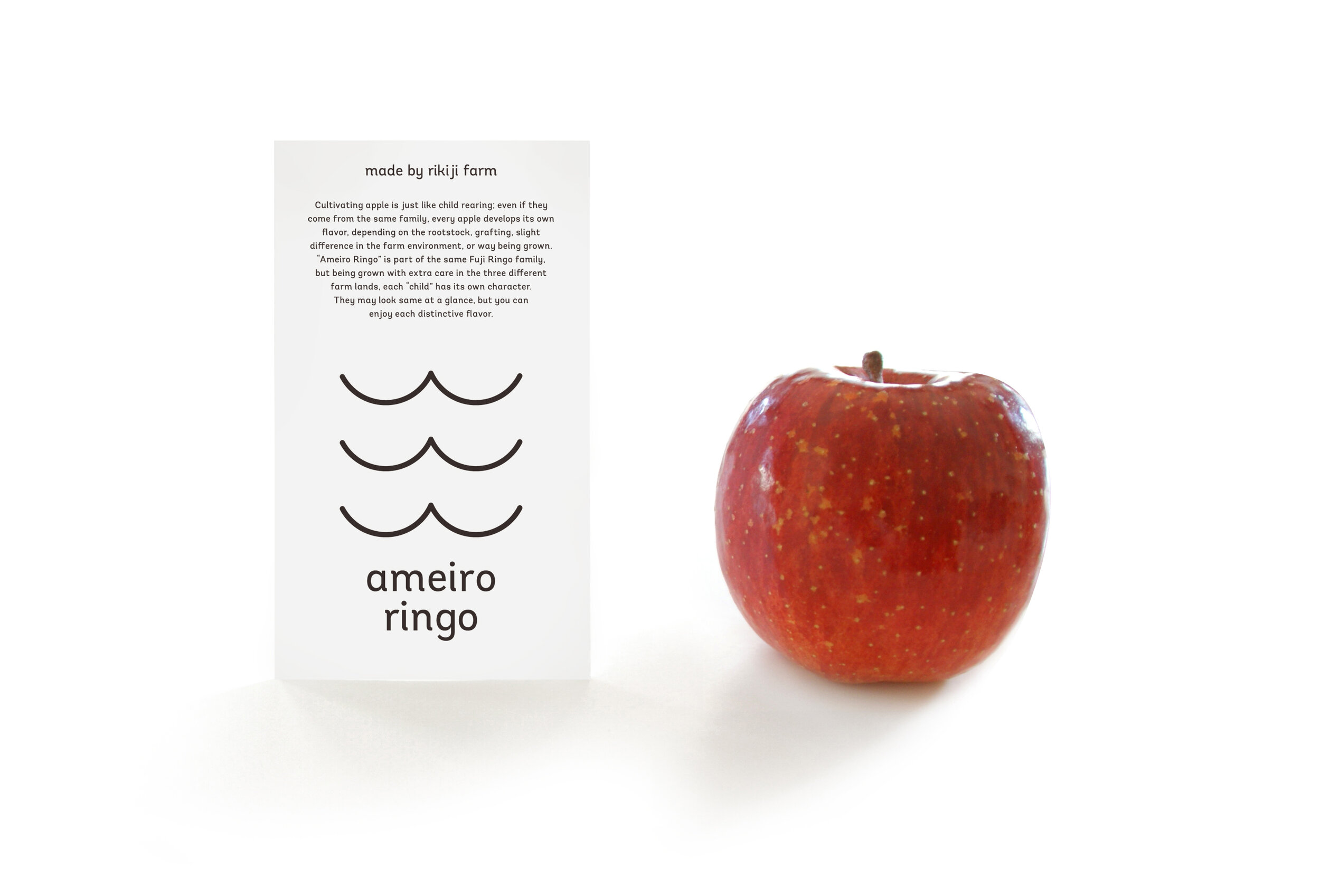
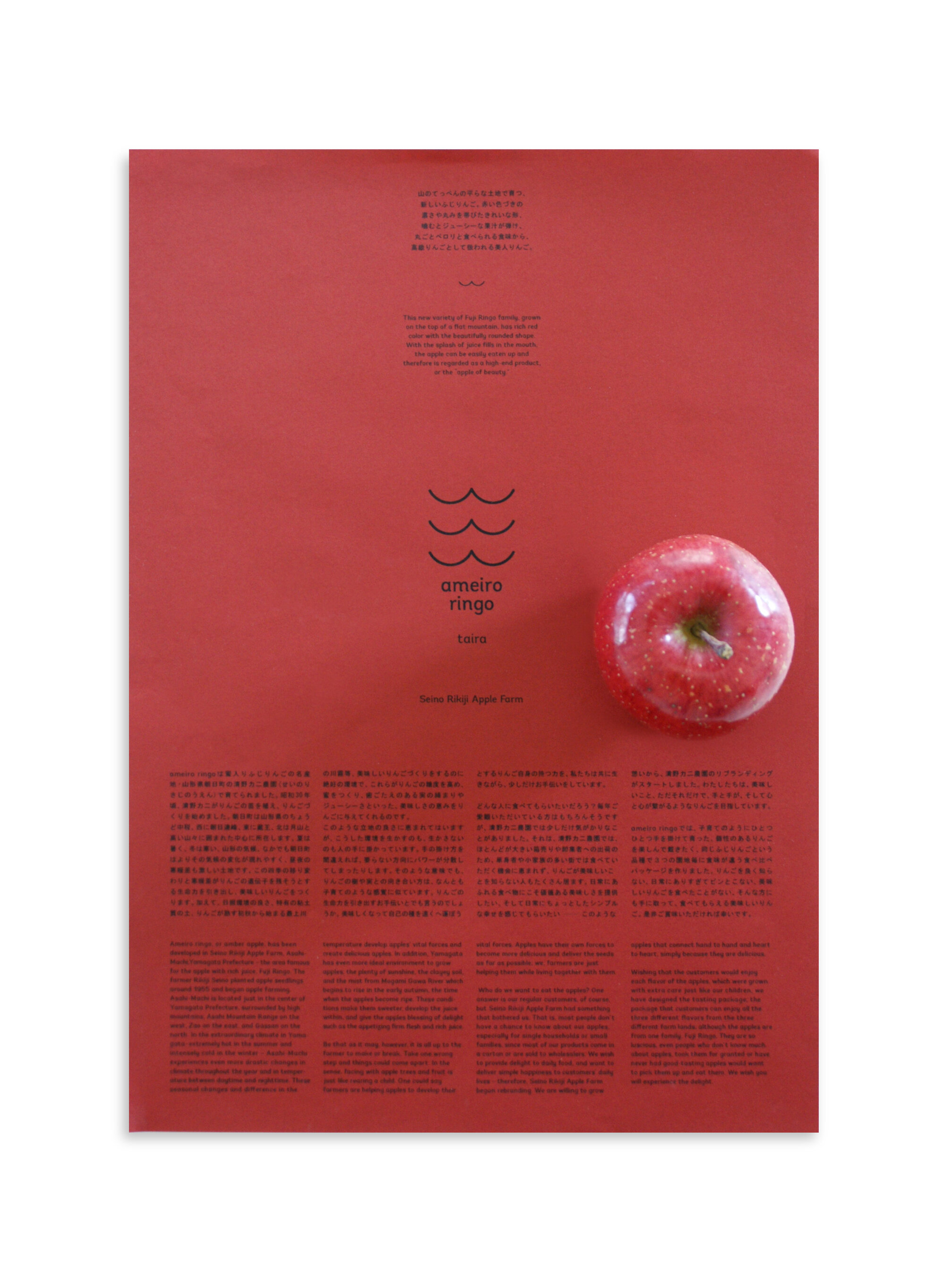
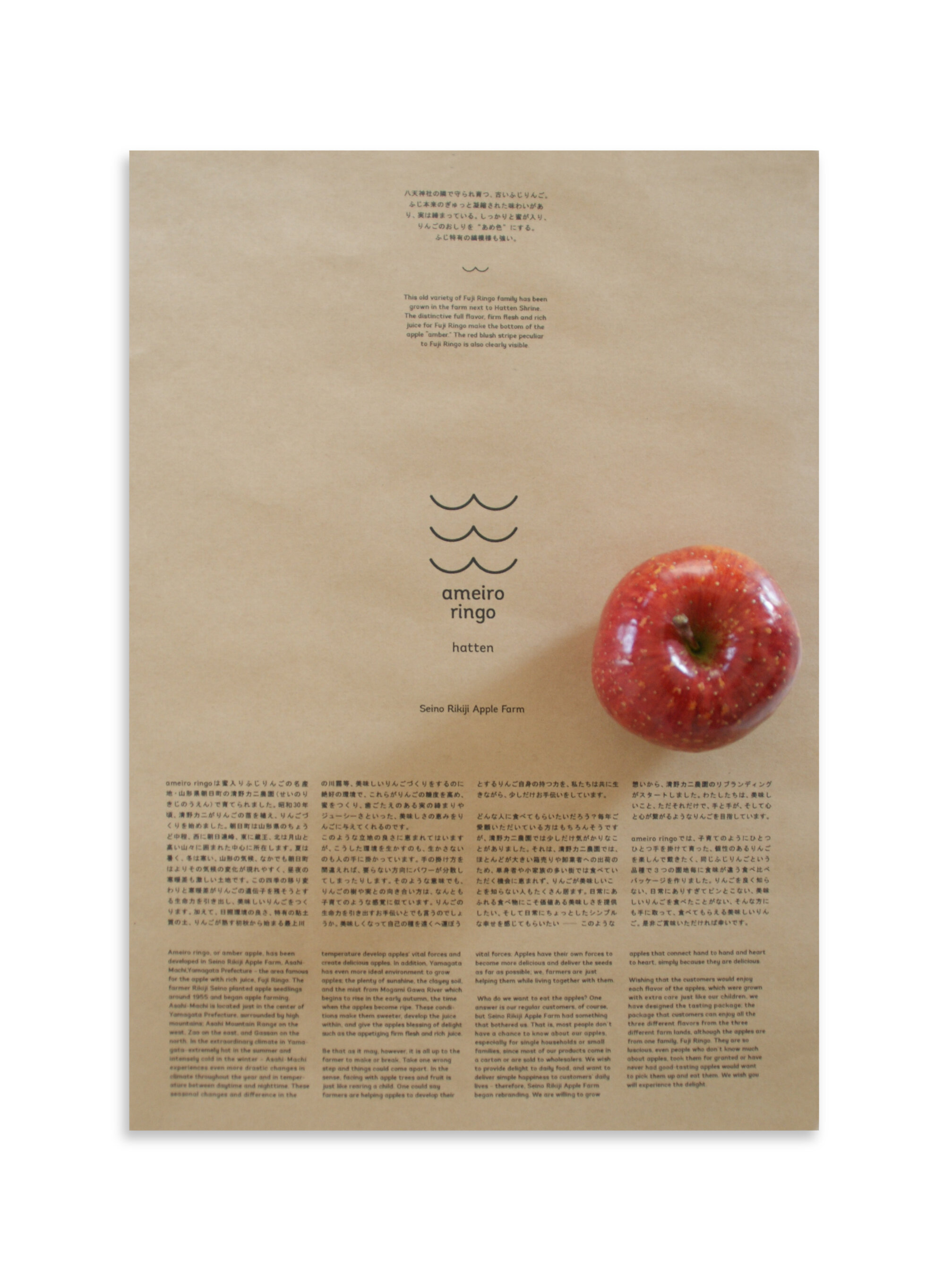
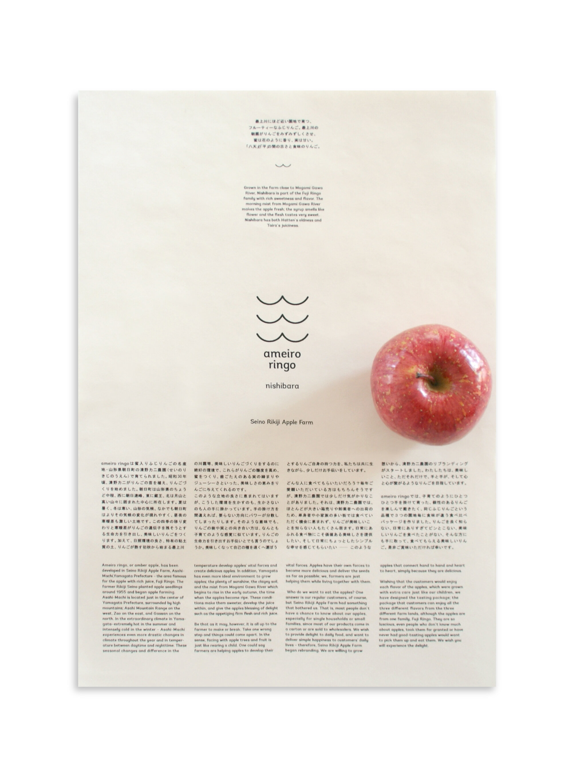
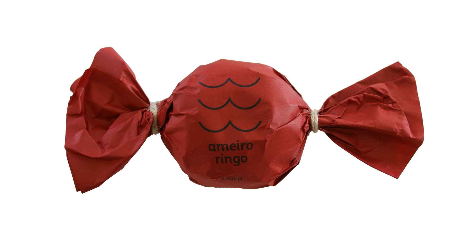
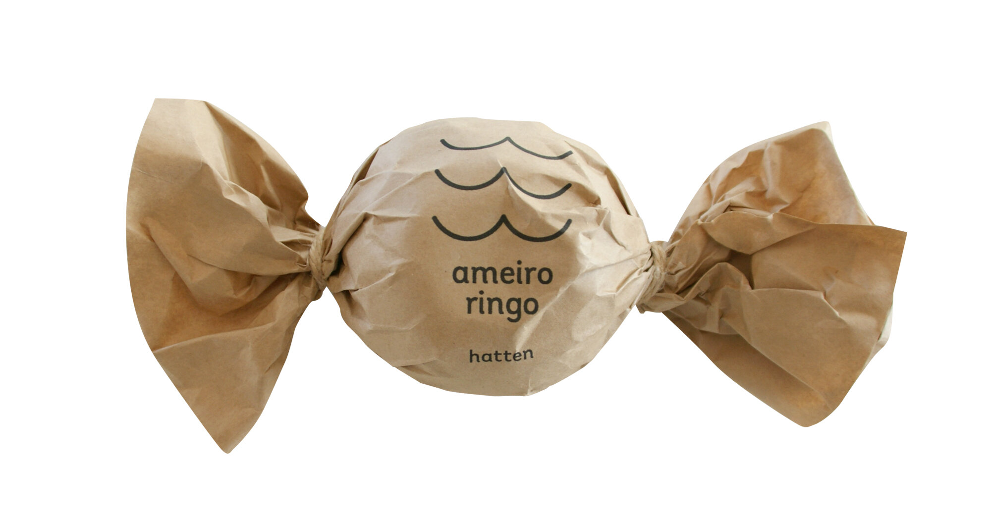
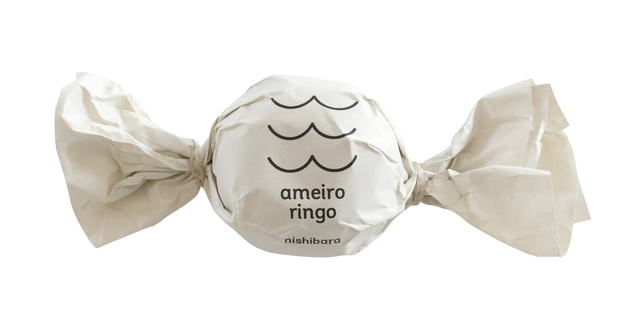
ameiro ringo” translates to candy color apple. These apples are grown in Asahi Town, Yamagata Prefecture; a famous production area for amber core apples. When you hold a ripe amber core apple up to the sun, it’s bottom appears to be clear candy (amber) in color. Hence, the name “ameiro ringo” was given. This is proof showing how each apple was nurtured to reach it’s full ripeness. The logo design incorporates the shape of the apple bottom (iconic representation of ameiro ringo) in graphic form.
We changed the wrapping according to where the apple has been harvested within the three different areas of the farm. Though apples of the same variety may appear the same, depending on the tree and environment, creates slight differences in the taste. The personality, taste and birth story of “ameiro ringo” is conveyed using candy-wrapper like packaging.
As a common fruit in daily life, we need to value it’s taste. And we want to deliver simple and warm happiness with apples.
Cherishing the hopes and needs of Seino Rikiji Apple Farm, and combining it with the needs of the city, the branding and packaging design of “ameiro ringo” was born.
Digital Communication services, including website design, search engine optimization, social media, and content creation for nonprofit organizations, consultants, and creative entrepreneurs.