
yoikotopan

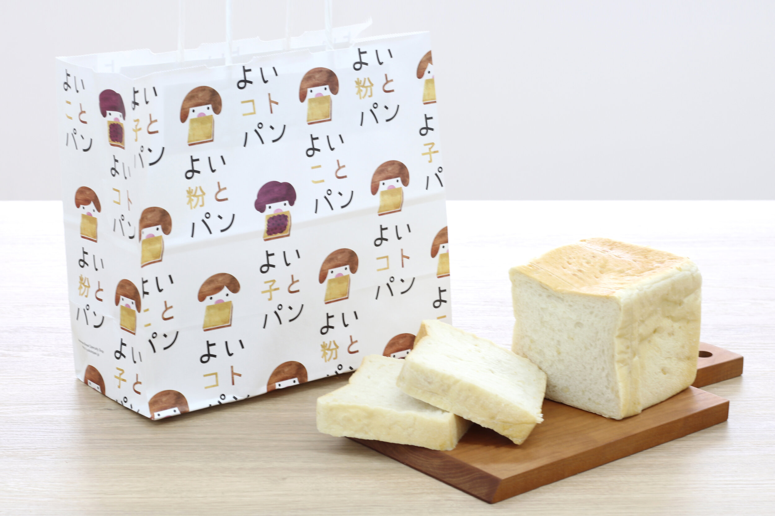
yoikotopan
Client: Hotey Shokuryo Co., Ltd.
Design: Yuka Shiramoto
Country: Japan
yoikotopan has multiple messages; the packaging was thought out to convey these messages. The shopping bag, for example, uses wordplay on ‘yoikoto’ from yoikotopan which means: good powder (flour), good child, and good thing(s). The brand’s character logo - a child eating a piece of toast - was created to convey the taste and safety of the brand. Moreover, variations were designed to reflect and highlight each product’s characteristic and quality.
Because bread (toast) is something we eat every morning, everyday; our brand was born thanks to flour producers who carefully reviewed, reinvented and improved the ingredients and production methods used for our products. Our bread is very soft and springy, it uses only the best and safe ingredients - as we want you to enjoy our bread daily.
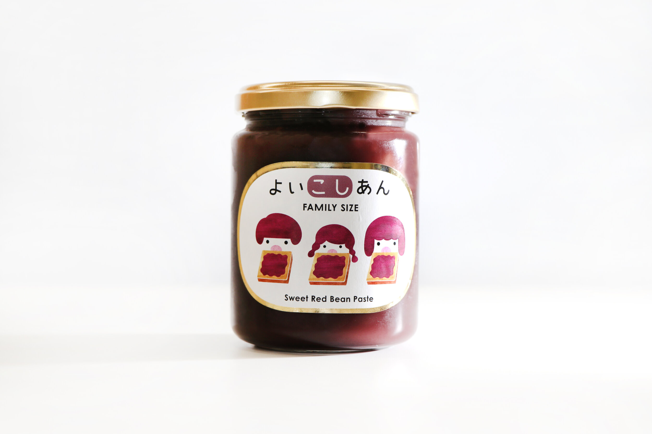
Our family-size grainy and smooth sweet red bean pastes are additive-free; made from azuki bean from Tokachi in Hokkaido Prefecture.
Digital Communication services, including website design, search engine optimization, social media, and content creation for nonprofit organizations, consultants, and creative entrepreneurs.


