Basara Silk Lingerie
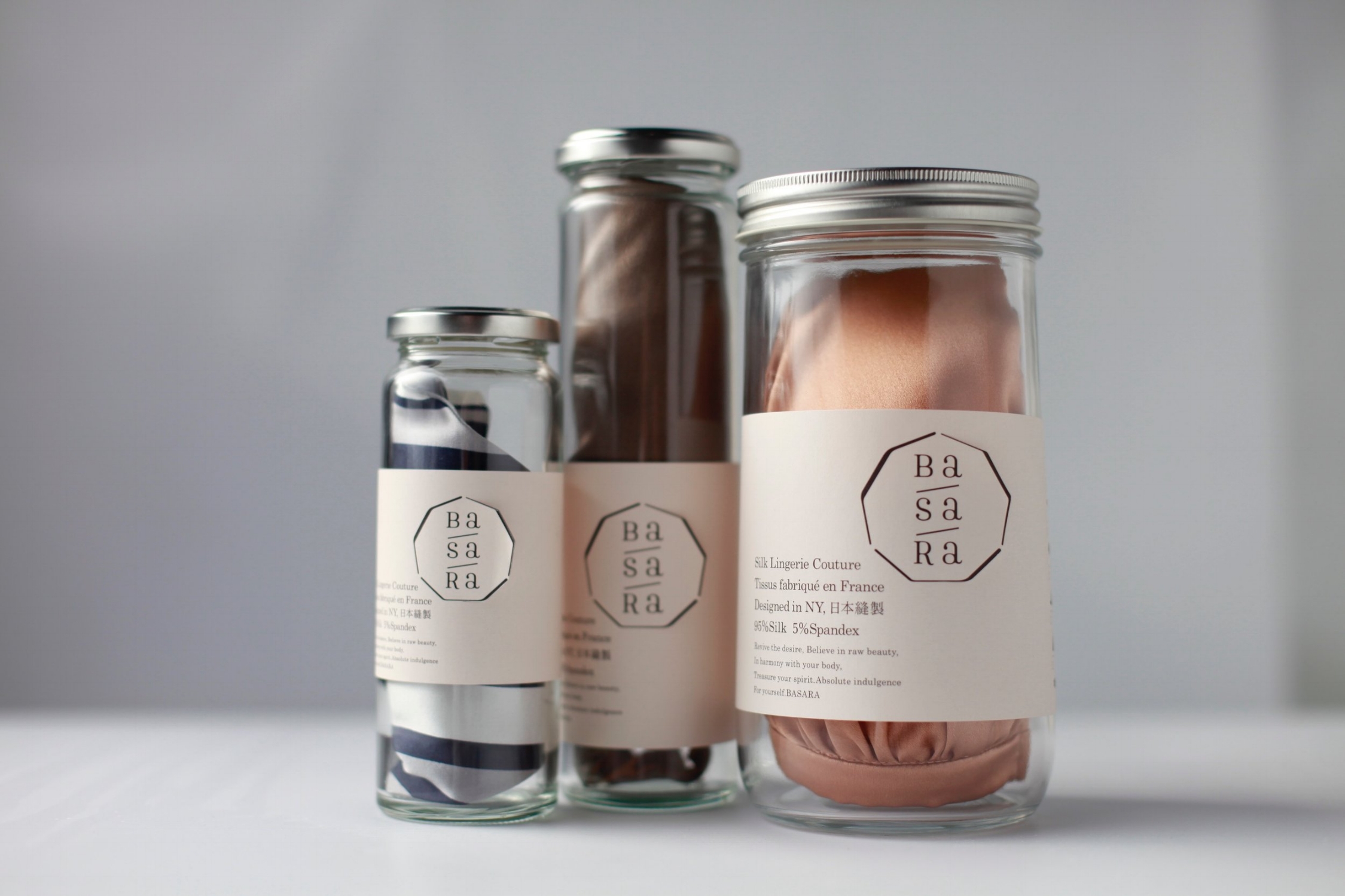


Basara Silk Lingerie
Company: atelier-wai
Art Director / Designer: Shoichi Maehara
Country: Japan
"To begin with, the logo "BaSaRa" was produced vertically, separately from the brand name. The design communicates Basara Silk Lingerie's contradictory themes — "I love you, that's why I'm angry", "Men and women", "Special yet everyday", "Like an animal, but also a human being", "An intimate and private secret, yet with an openness that can be released out to the public."
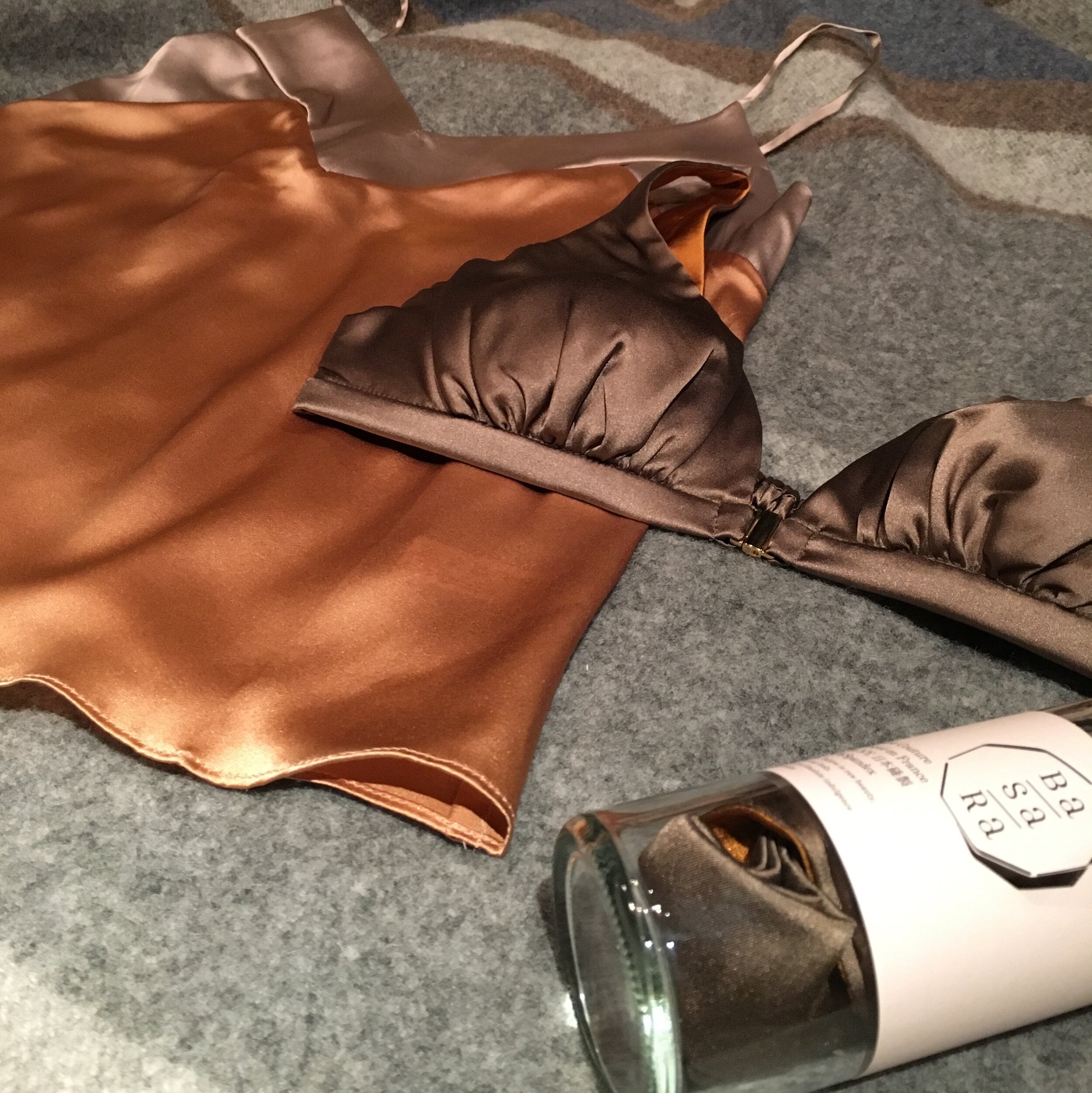
The logo also uses roman letters that are placed vertically like Japanese characters; imagining a world that doesn't intersect, but originally belonged together. Basara Silk Lingerie's features are unique in the way that the inner fabric is made in different colours of the same quality silk as the front. When worn, the inner fabric subtly peeks through and adds an accent to the design. This uniqueness is extended to the packaging design, where large cuts were added to the label on the glass jar, allowing a glimpse of the back label. Without misrepresenting the beauty of the silk, and instead having the user give value to the contents within, along with the aim for women to give as a gift to another, as well as a gift from men to women as a concept, we've chosen a narrow glass jar — neutral and inorganic — as the packaging. For a moment one would not know what it is, and with that refreshing sense of surprise in mind, we chose a glass bottle for its package."
Digital Communication services, including website design, search engine optimization, social media, and content creation for nonprofit organizations, consultants, and creative entrepreneurs.