
GOKATTEYA YOKAN

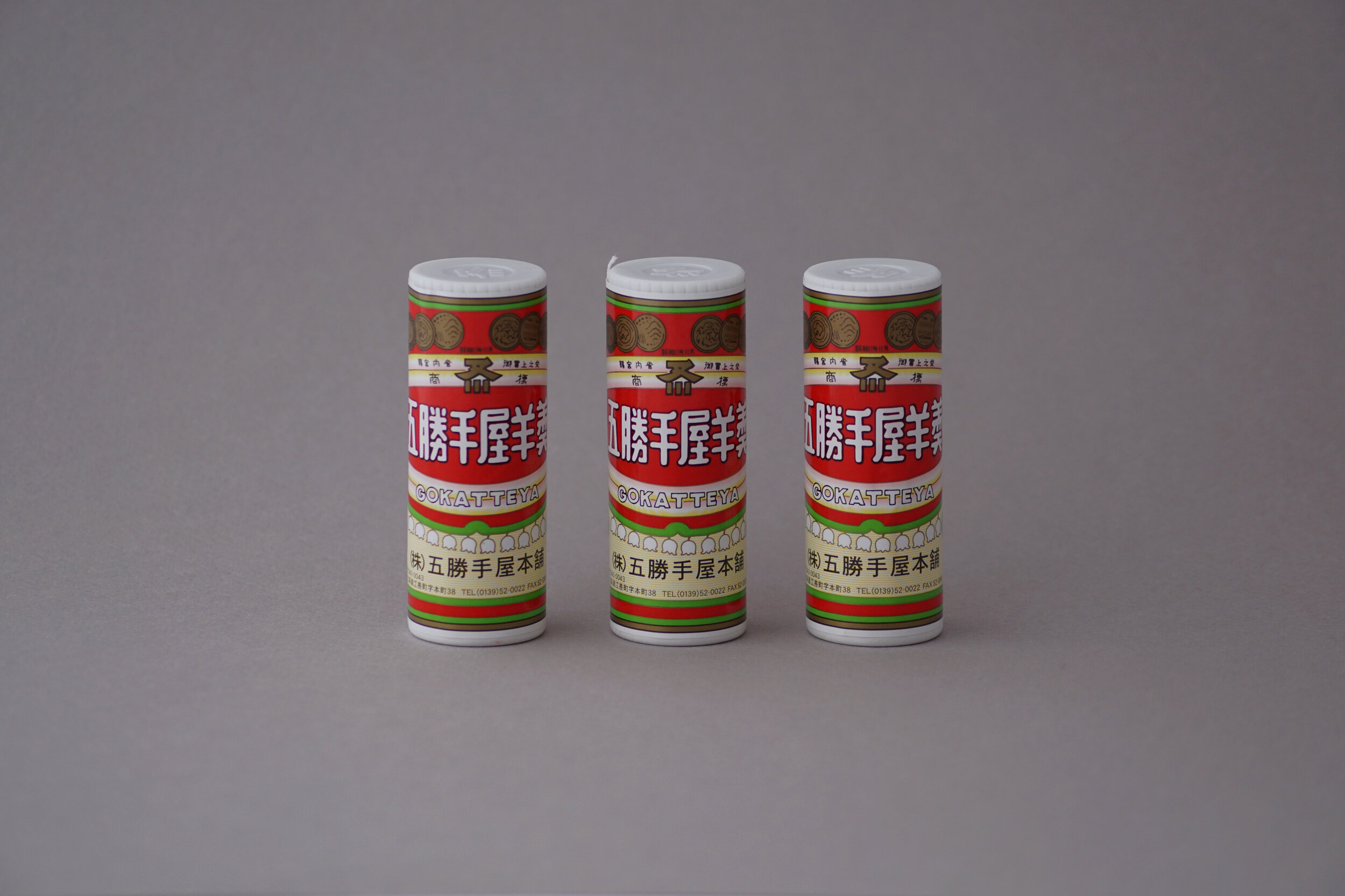
GOKATTEYA YOKAN
Client: GOKATTEYA Co.,Ltd.
Design Company: Studio AP Co.,Ltd.
Creative Direction: Isamu Ozek
Art Direction: Miyuki Takei
Design: Mari Hirabayashi
Country: Japan
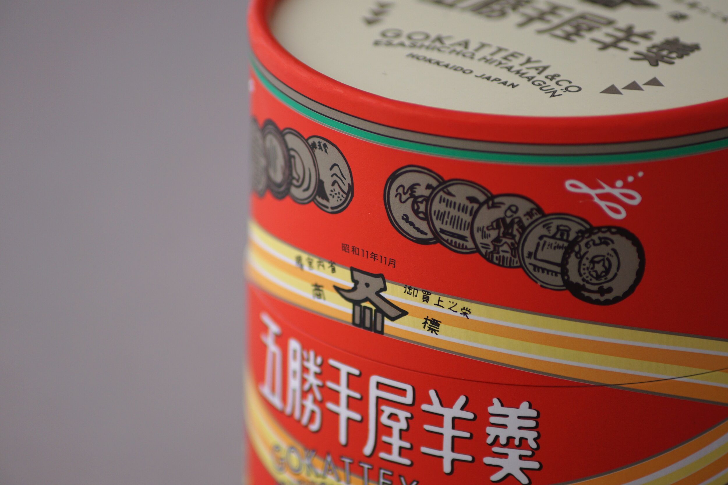
Esashi, an old port town in Hokkaido, once flourished with Kitamae-bune, well-known merchant ships. It is not an exaggeration to say that the history itself is in this store, and this yokan. Gokatte (五勝手) comes from Gokatte (五花手) in Ainu language. It is interesting to note that this traditional sweet comes from the history of being able to grow beans for the first time in Hokkaido.
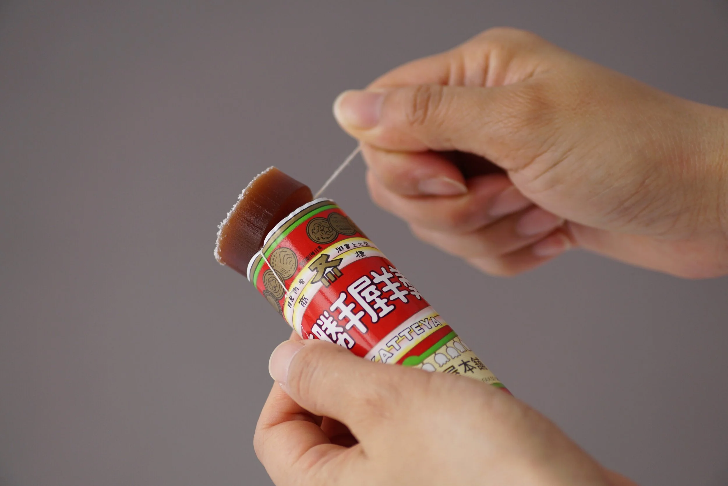
Our unique round paper cylinder packaging is a style from the early Showa period. To elevate this retro design, we made slight adjustments and modified the layout for the 4 individual sized paper wrapped products. We only want to make small changes to maintain the history and tradition, and make sure to pass them on to the next generation. We believe that the conic elements of the design is a resemblance of Hokkaido’s pioneering history and should be cherished and protected.


