Coordy Choco Cocoa Powder


Coordy Choco Cocoa Powder
Client: Coordy Choco
Design Company: Team CIRCORE
Creative Director: KO LIN
Project Manager: Nelly Yang
Designer: Zixuan Yang
Photographer: Amber YJ LaiLee
Country: Taiwan
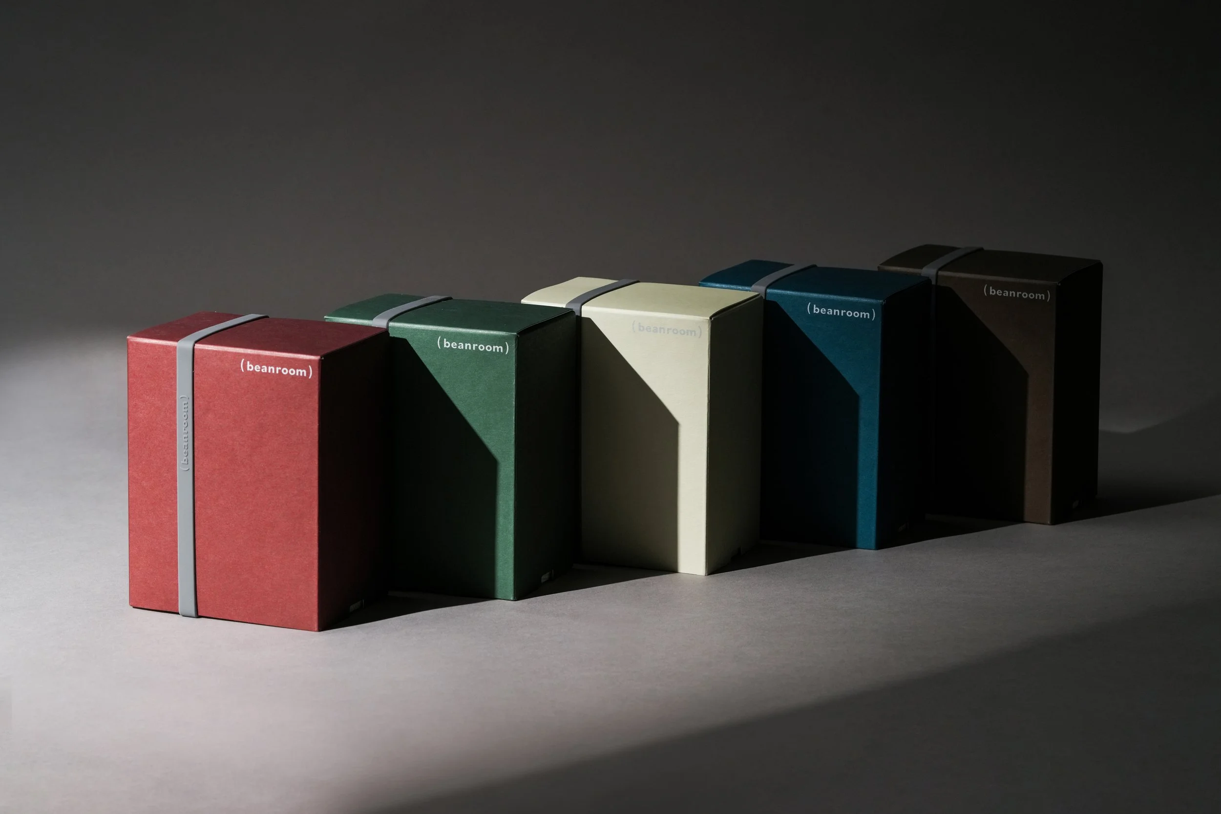
Inspired by the motion of a vinyl stylus gliding across a record, the design captures the ease of a lazy afternoon, where each cup of cocoa unfolds like a melody, weaving a world of senses and memories. The logotype inherits this rhythm: the structures of C, O, and R outline the swirling motion of stirring, while a fine line within the vertical stroke of D recalls the grooves of vinyl, infusing the visual language with echoes of sound. The cocoa powder sachet boldly showcases the brandʼs identity, with an overprinted stylus turning the simple act of opening into the curtain-rise of music. The outer box features a striking turntable graphic that mirrors the swirling of cocoa powder in a cup, where its aroma and layered flavors bloom on the tongue like concentric grooves on vinyl. Colorful cups represent how everyone can find their own cup of cocoa with Coordy, capturing the languid, carefree mood of a quiet afternoon. Embossing techniques are applied to the logotype, adding a tactile dimension and enhancing the visual layers so that every detail becomes more captivating. Six unique color variations were selected for the outer box, creating a strong and distinctive market identity while reflecting the brandʼs diversity and personality - showcasing Coordy Chocoʼs capacity for vibrant expression.