COW BRAND SOAP RED BOX / BLUE BOX

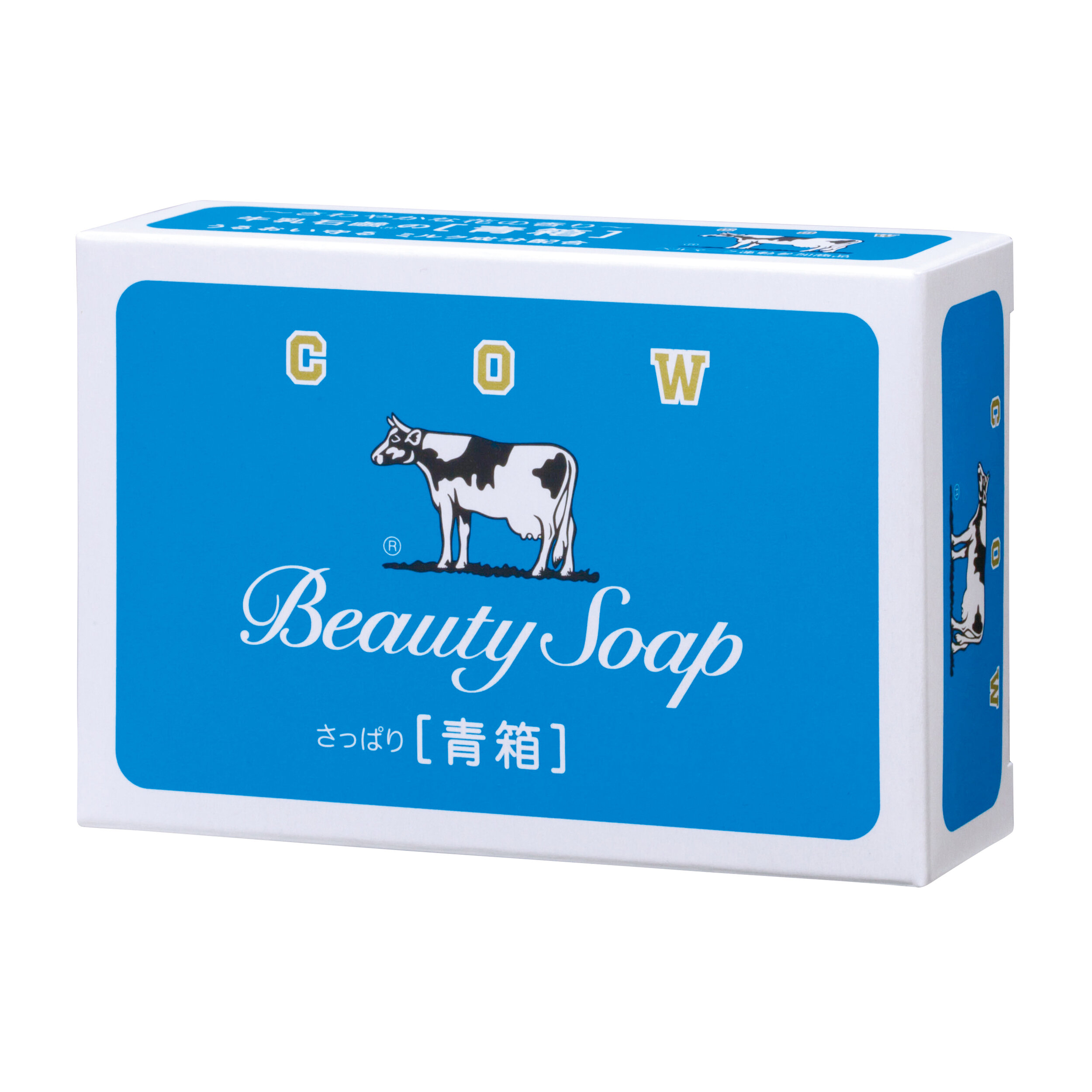
COW BRAND SOAP RED BOX / BLUE BOX
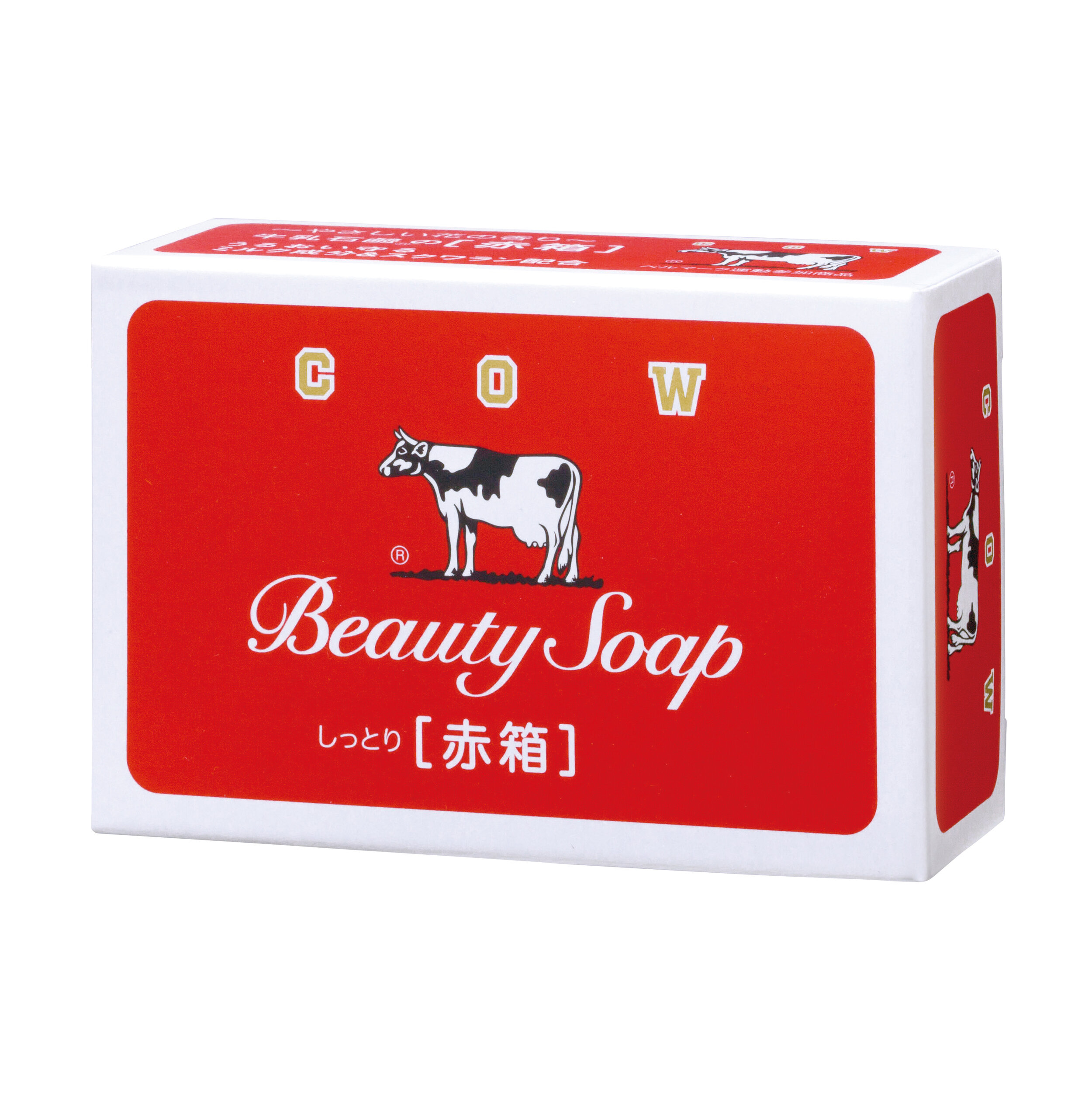
Client: Cow Brand Soap Kyoshinsha Co., Ltd.
Designer: Akio Okumura
Country: Japan
"Since its release in 1928, the cow logo with its white framed red background is continuously used, renewed to suit the changing times, and maintained our trust toward the brand that comes from its history and traditions whilst making sure that it doesn't feel old. (The current design is in its eleventh generation) When the Red Box was first on the market, many of the soaps sold in the country was relatively low in purity, but since you could tell how high its purity was by the whiteness of the soap, a design that would bring out the white of the soap to leave an impression was needed, and for that the red colour was used as its base. The Blue Box was released in 1949. Before the war they were sold mainly in western Japan, but ever since the headquarters disappeared and was rebuilt due to air raids, there was an attempt to sell the blue boxes nationwide, and was sold alongside the white and red boxes as a sister product. According to one theory, it is said that it is based on the French flag (tricolour) that represents liberty, equality, and fraternity. With the renewed design in 2015, 「しっとり感」("shittori-kan", a moisturising feeling) and「さっぱり感」("sappari-kan", a refreshing feeling) was added to the Red Box and Blue Box respectively to bring out the differences in finish and make it easier for customers to choose. The cow mark that is also the company symbol is as always, in the heart of the design, based on the saying 「商いは牛の歩みのごとく」(literally translates to "trade is the way of the cattle", meaning to not look back as you move forward, and to go forward tenaciously). And even as the illustration of the cow changes, "lovely eyes, tails well-behaved, and feet clean" is always kept as our policy."
Digital Communication services, including website design, search engine optimization, social media, and content creation for nonprofit organizations, consultants, and creative entrepreneurs.