GOKURI
GOKURI
Client: Suntory Beverage & Food Limited
Design Company: Suntory Communications Ltd.
Creative Director: Hiroyuki Ishiura
Art Director: Kiyono Morita
Designer: Yukiko Shibato
Country: Japan
"Gokuri's brand name comes from the Japanese onomatopoeic word for the sound one makes when gulping down a delicious drink. This series, sold on the market since 2002, is popular among our customers as a beverage that tastes as good as eating the whole fruit itself.
The design concept is Simple & Symmetry; with eye catching colouring — and delicious, refreshing imagery.
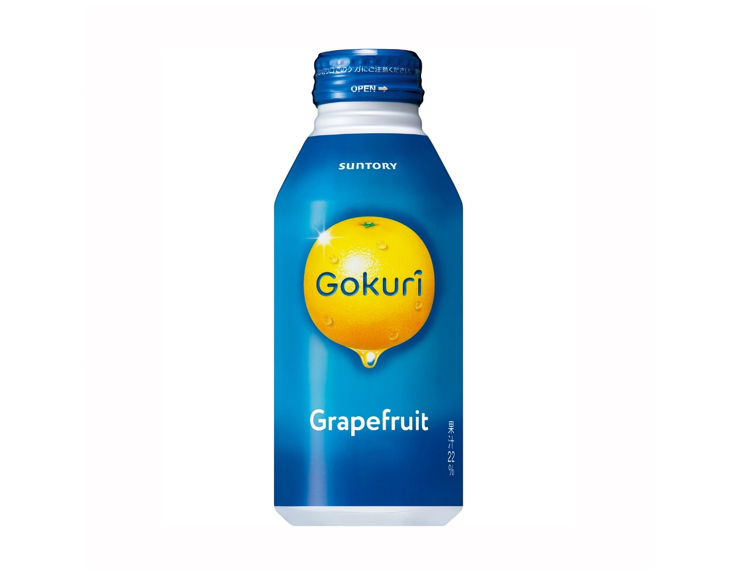
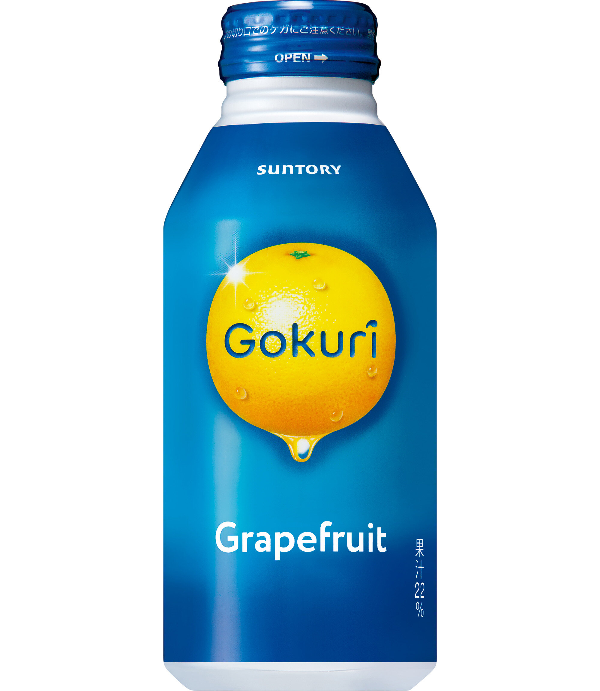
"Gokuri Grapefruit" — a juicy and refreshing image of a grapefruit is symbolically displayed against the metallic blue background, the brand's trademark colour.
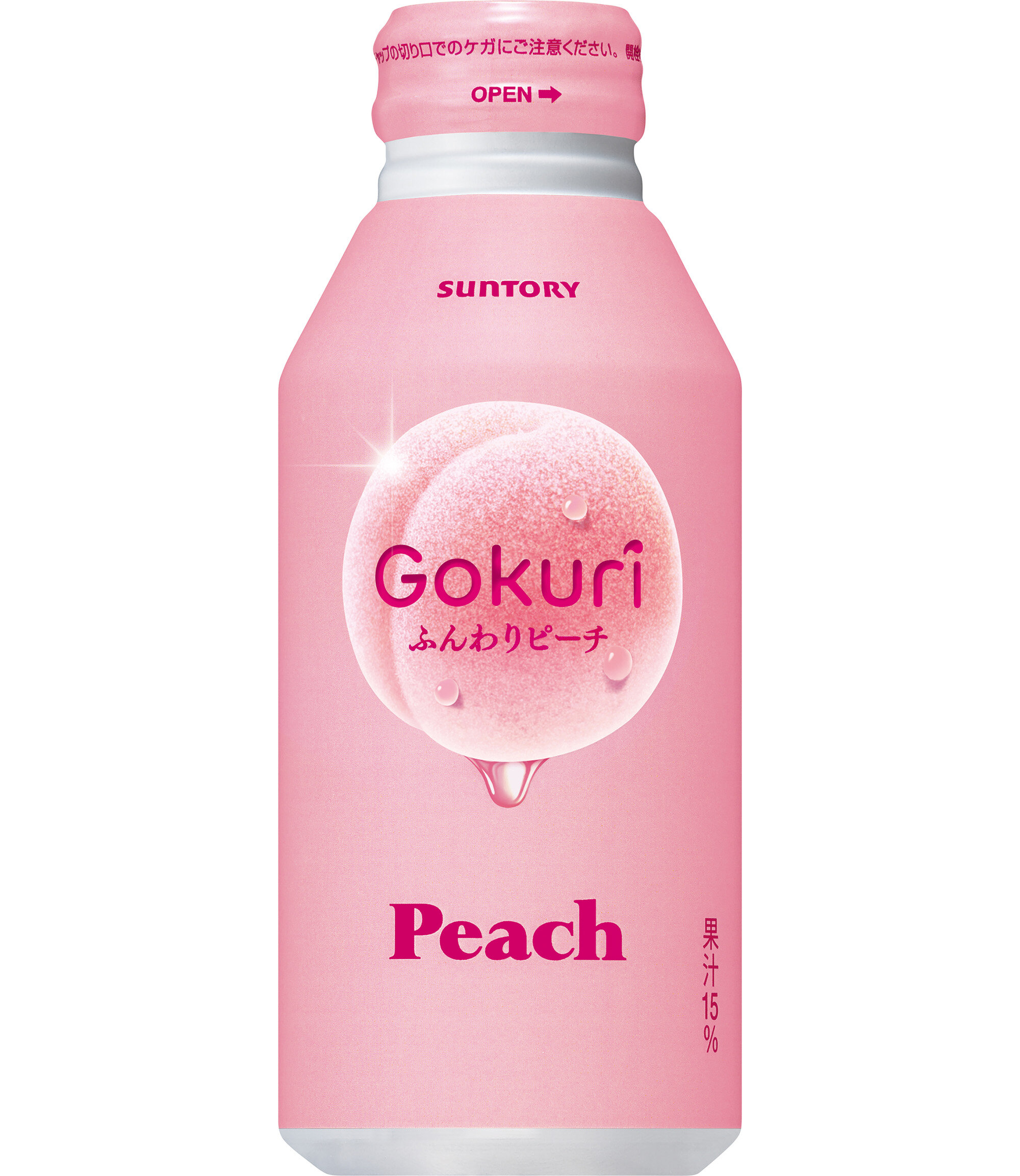
"Gokuri Funwari Peach" — fitting for the peach season, a pale pink colour is used to express lightness and fluffiness. The unexpectedness of expressing a soft tone on a metallic can made an impact on stores shelves, and became a hit on social media as well.
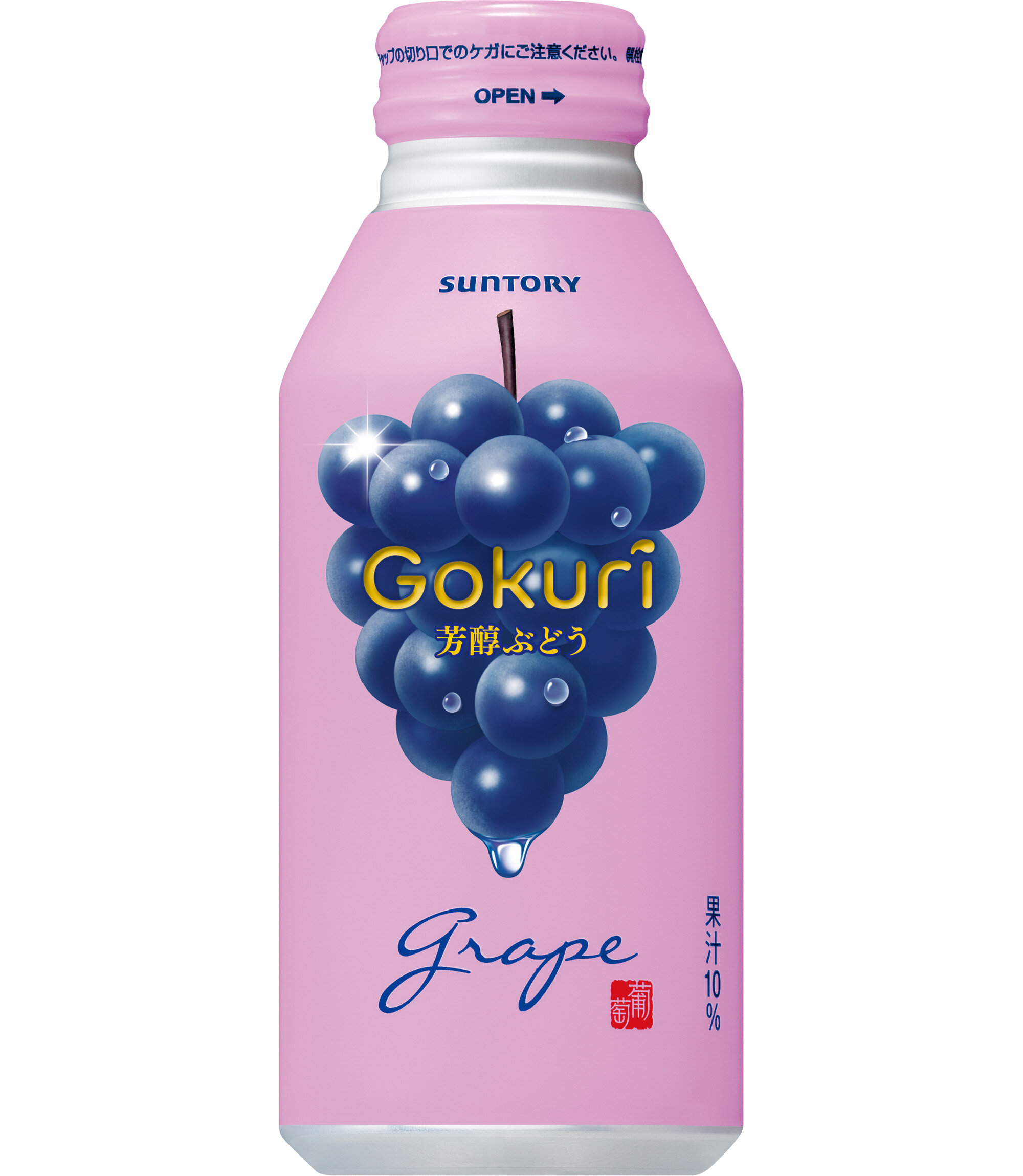
"Gokuri Hojun Grape" — as if eating a large grape, we expressed the rich aroma and texture. To illustrate its deep, grown-up flavour, a traditional Japanese purple was used as the base colour, and arranged a ripe grape on top."
Digital Communication services, including website design, search engine optimization, social media, and content creation for nonprofit organizations, consultants, and creative entrepreneurs.