POCARI SWEAT
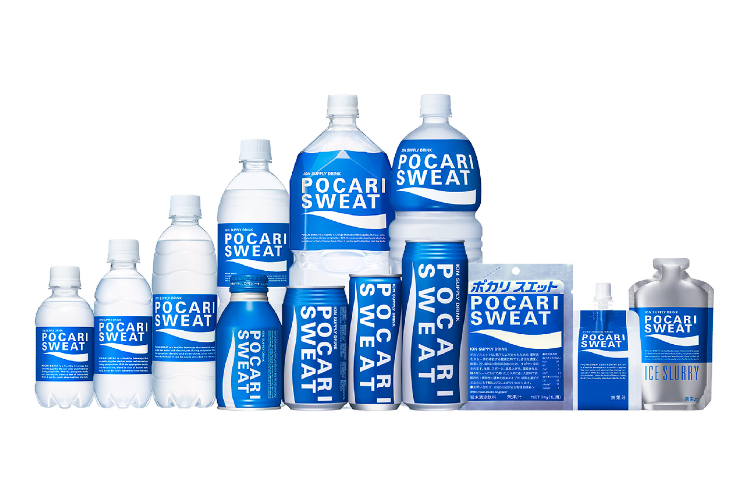

POCARI SWEAT
Client: Otsuka Pharmaceutical Co., Ltd.
Design: Helmut Schmid
Country: Japan
I worked for NIA and I was asked to visualise this new drink.
First, I tasted the prototype; ‘different!’ was my impression.It was not easy to design a 250 gram can. Cans were overflowing with information which was also new at the time. The uniqueness of this drink was explained to me with a graph showing the difference between this drink and fresh water in absorption speed, in the body. This became the seed for the wave idea.
11 letters make up POCARI SWEAT which was extremely long. I arranged the name into a logo: two lines with spaces between each letter. This solution created a memorable graphic effect. I chose deep blue to remind me of the ocean. And the wave, originally based on the graph, became a shorthand graphic that conveyed the meaning.
Akihito Otsuka (at the time, President of Otsuka Pharmaceutical) had a strong challenging spirit. He wanted a fresh, informative and reliable design. In other words, a design that was one step ahead and nurtures the company in competition.
The true value of the product is hidden in the product itself. The essence of POCARI SWEAT must be shown with the packaging. Design is born from the contents of the product.
- Helmut Schmid, Helmut Schmid Design
POCARI SWEAT was launched in 1980. Developed around the concept of “drinkable IV”, it is a beverage close to the composition of the body’s natural fluids that would easily replace lost electrolytes and water. With growing interest in health, sports and outdoor leisure activities amongst the general public; and on seeing people exercising and perspiring more, we developed a healthy beverage that could be easily consumed as a part of daily life.
The design of the POCARI SWEAT logo is a visual representation of the product's functionality. The use of “cool” colors at the time of launch was considered inappropriate for food products. The blue represents the ocean, and the white suggests a wave. The white wave is also an abstract representation of the curve of a graph showing the absorption rate of pure water versus that of POCARI SWEAT. In this way, the company has retained its focus on universal concepts while continuously ensuring that products stay fresh and new. We continue to innovate around POCARI SWEAT to meet society’s changing needs, and effectively communicate the benefits of this ionic beverage for nearly 40 years after its release.
Digital Communication services, including website design, search engine optimization, social media, and content creation for nonprofit organizations, consultants, and creative entrepreneurs.