IHADA


IHADA
Client: Shiseido Co., Ltd.
Creative Director: Taisuke Kikuchi
Art Director / Designer: Asako Hase
Producer: Masamichi Ogaki
illustrator: Noritake
Country: Japan
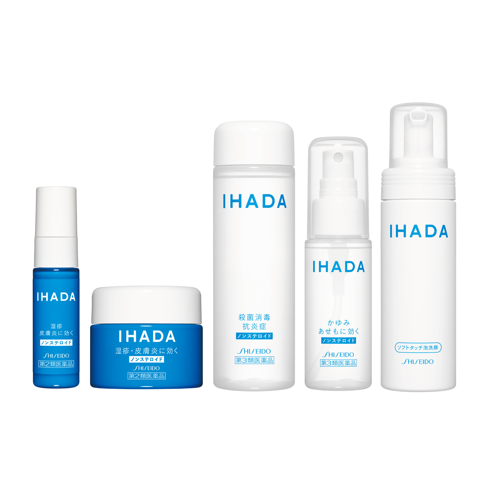
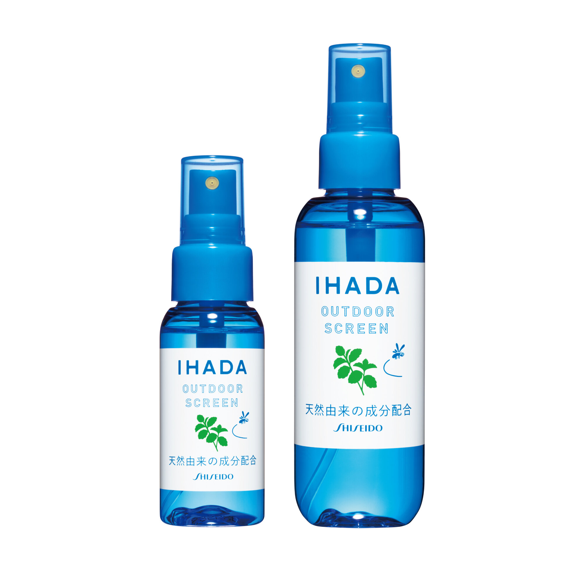
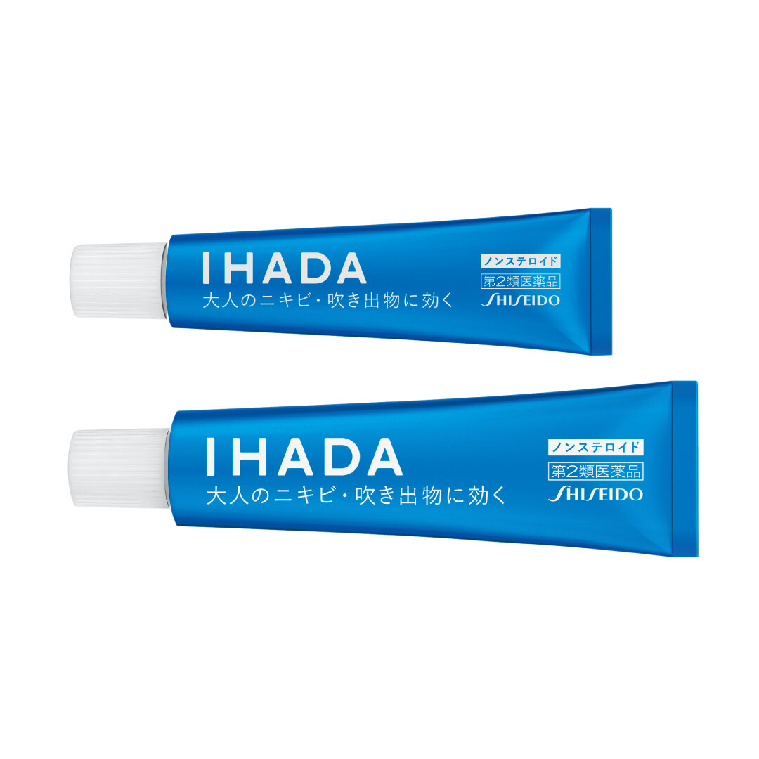
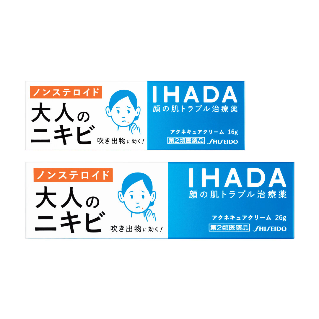
"IHADA is medicine for the skin.
I designed this package for the brand renewal.
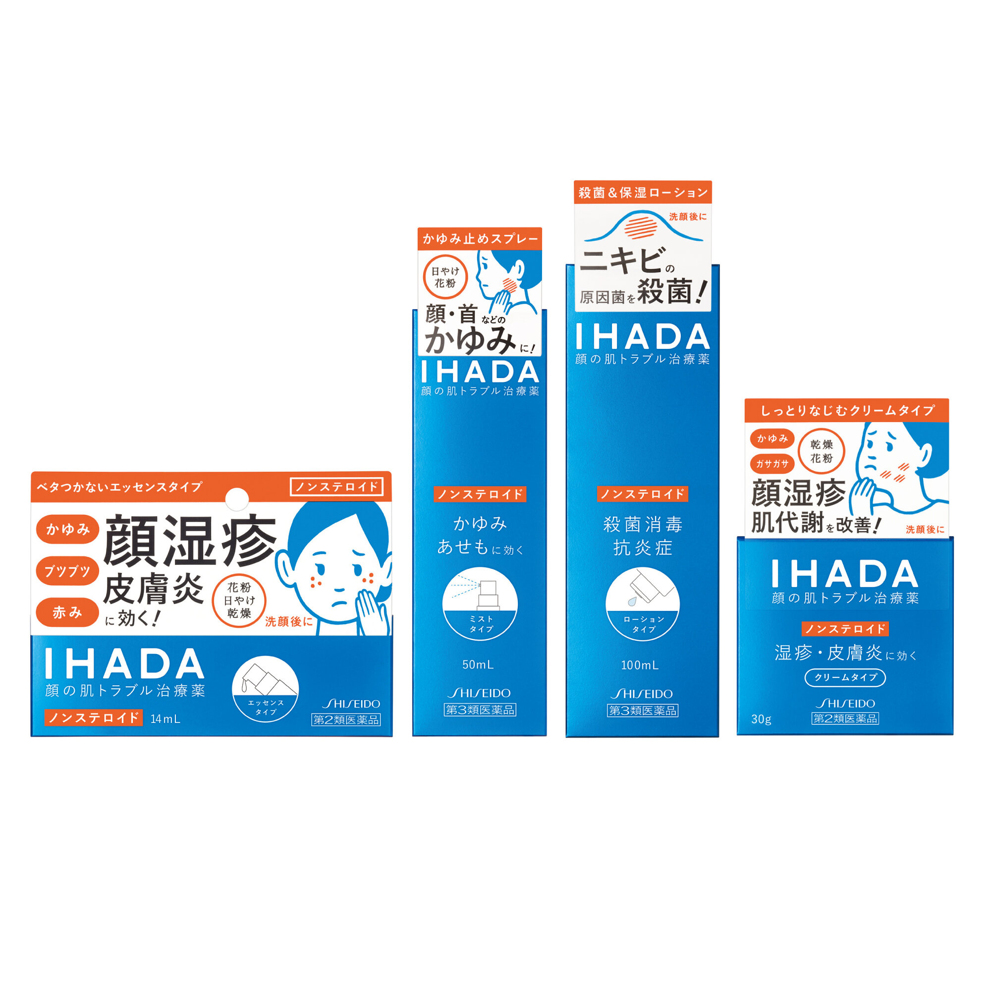
When I researched the market, I found that many women preferred to use non-steroidal medication. Ihada has been a non-steroidal medication from the beginning, and when I realised this fact, I decided to add a "non-steroid" label to the bottle.
By positioning Ihada as a non-steroid brand, we can differentiate ourselves in the market as there has never been a non-steroid brand before.
Unlike the typical steroid based products that use designs that portray immediate results and potency, I focused on something that one's skin can use for a long time without any worries, and a sense of honesty — like a friend that one can depend on.
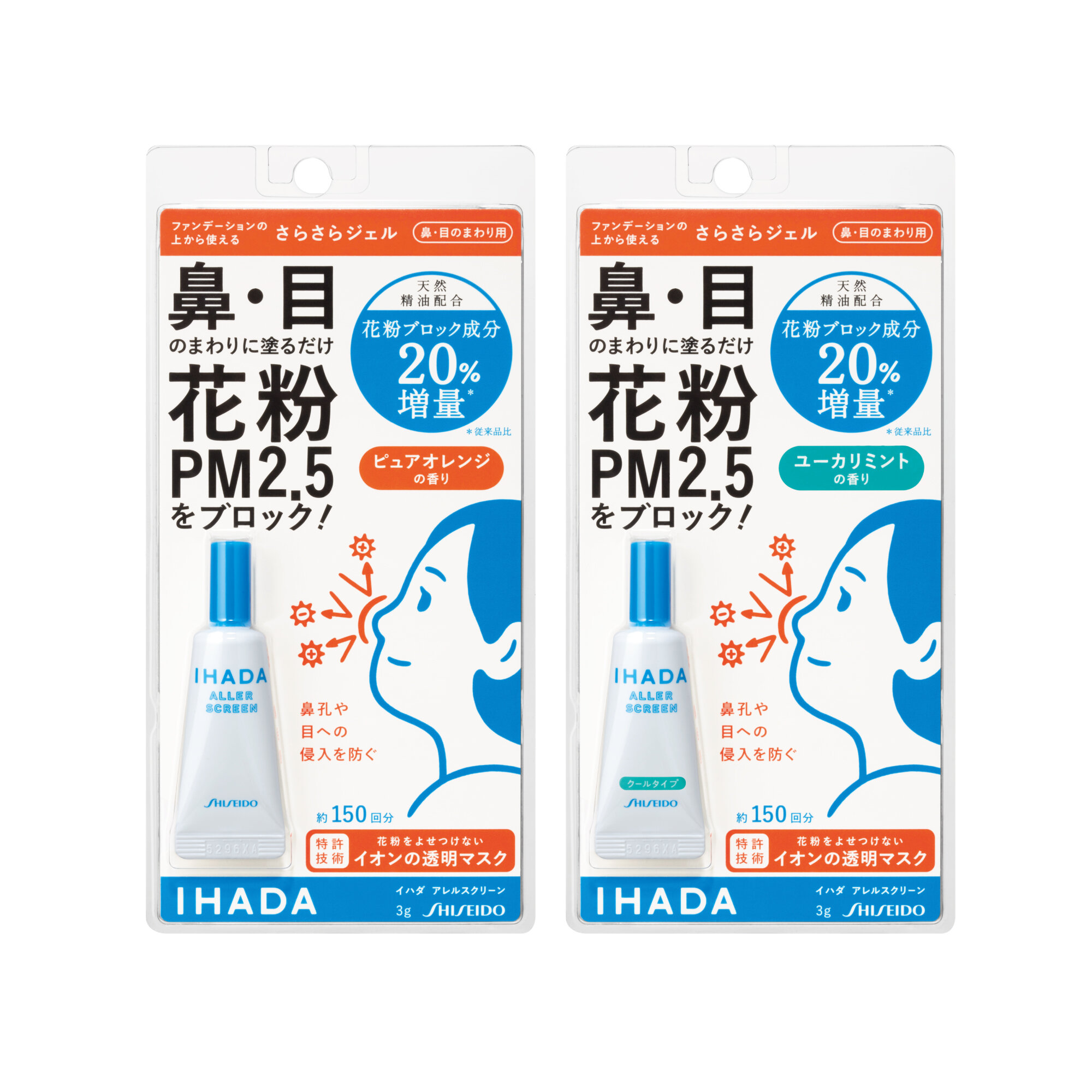
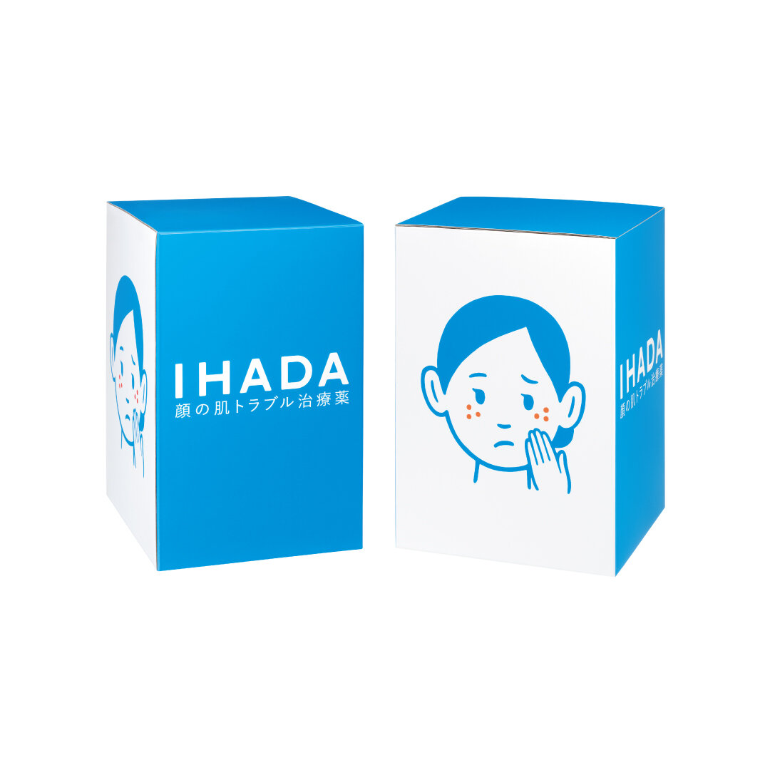
As for the colors, they are all unified under blue, orange, and white to create an image of healthy skin.
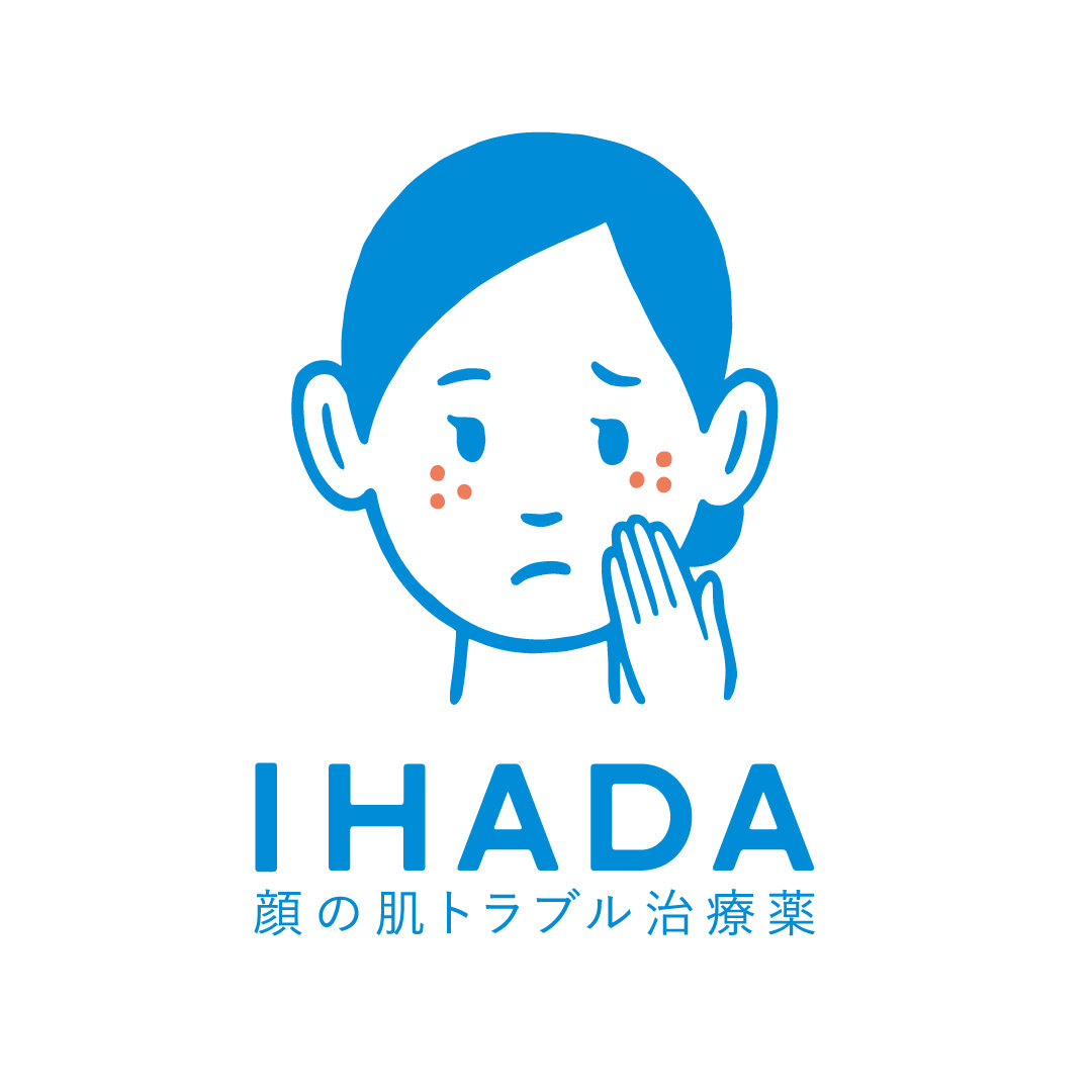
The illustration also focuses on a sense of security and approachability with a tone that one can lean closer into. (As many steroid type packaging display symptoms and have a masculine feel), the logo was made as simple as possible, to communicate cleanness and strength; and a sense of warmth and functionality.
I changed the format of the TV commercials from one using real women to one using illustrations because there were already so many other similar commercials showing women who were suffering.
I wanted to draw attention to the uniqueness of Ihada as we have many other competitors on the market, and took charge in directing the commercial and even provided the voice of the narrator, Hadako-san."
Digital Communication services, including website design, search engine optimization, social media, and content creation for nonprofit organizations, consultants, and creative entrepreneurs.