ZINE GIN

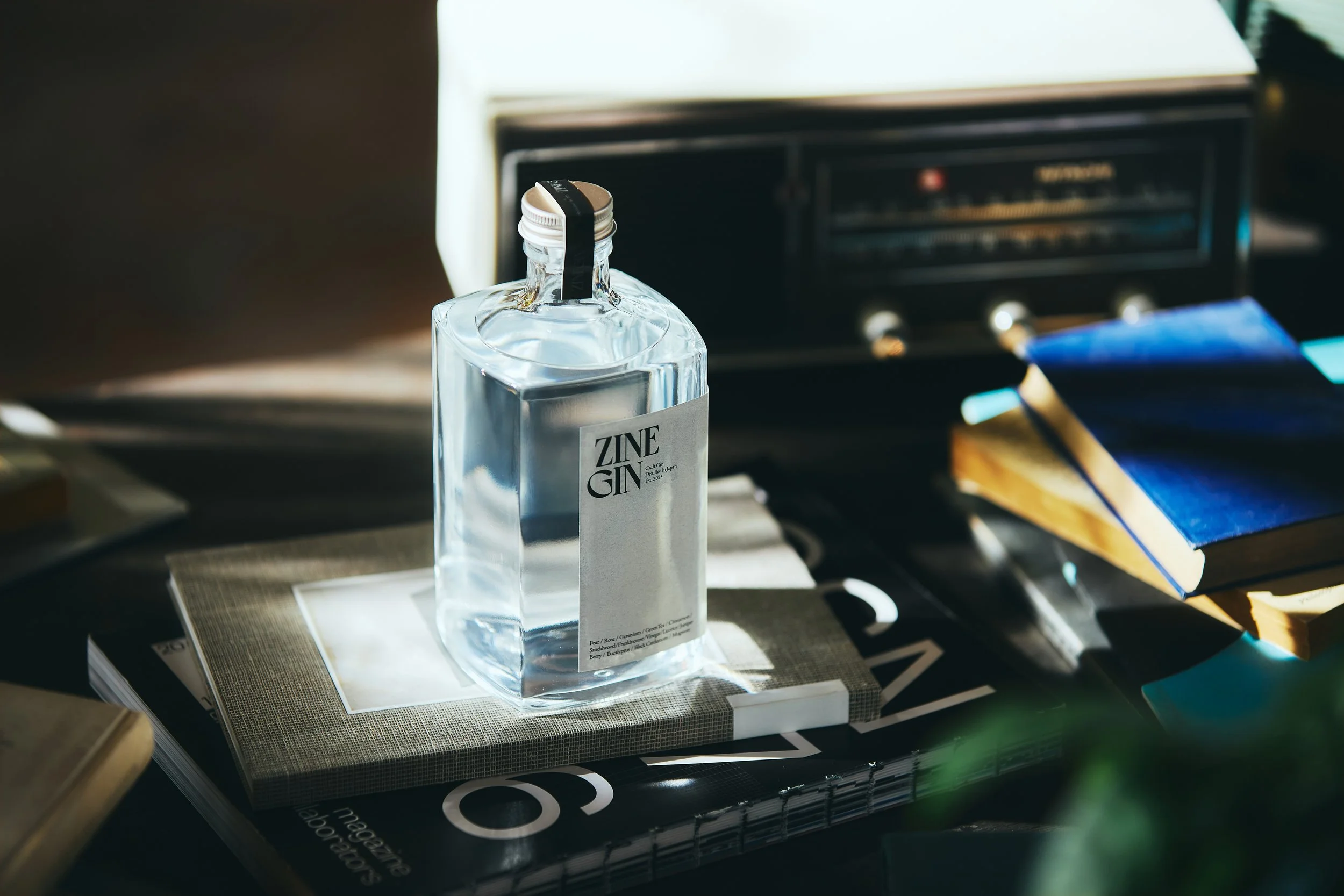


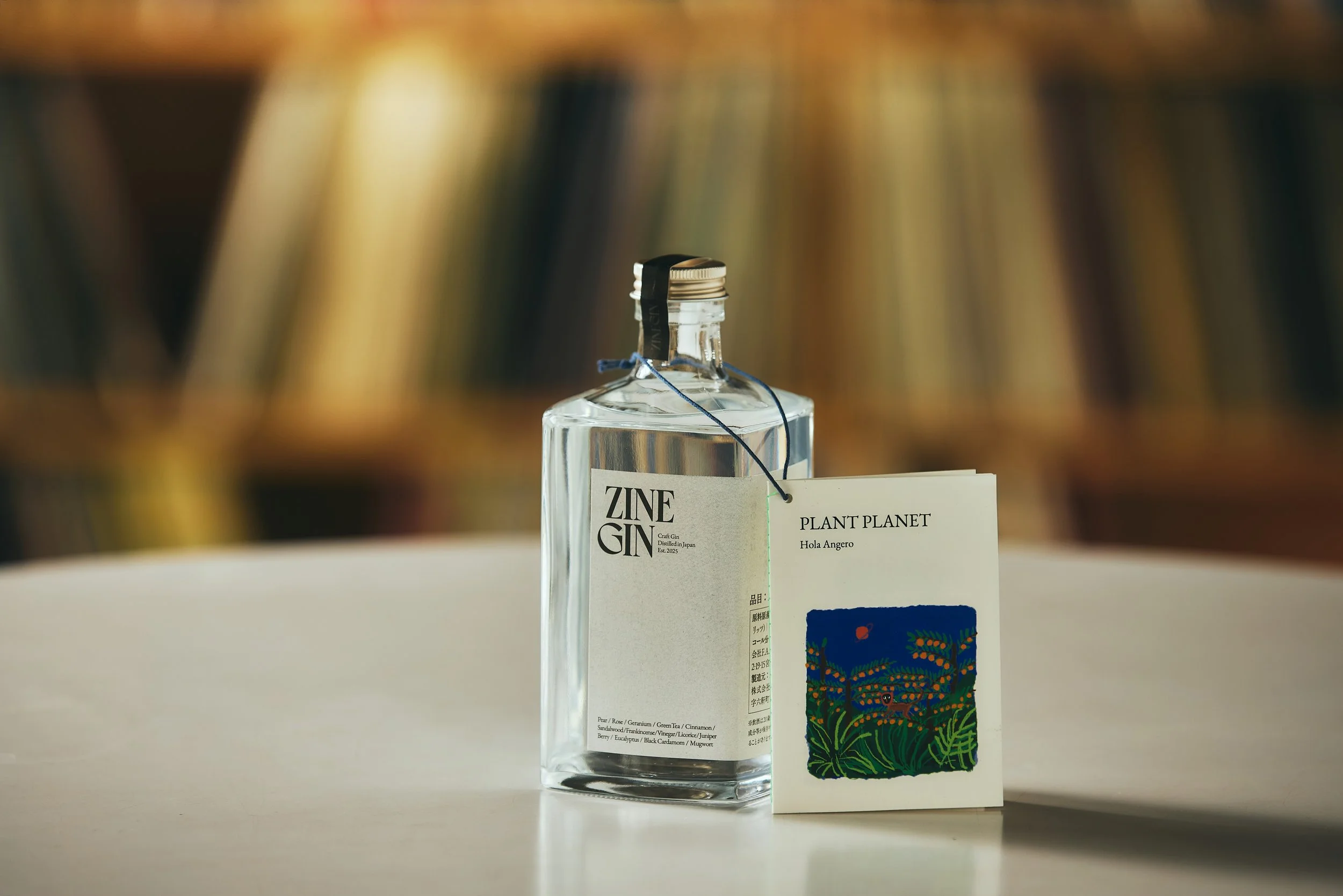
ZINE GIN
Client: F.A.R
Design Company: F.A.R
Creative Direction: Meito Shirasaki
Art Direction: Kazuha Nakamoto
Direction / Photography: Takeshi Kudo
Country: Japan
【Design Concept】
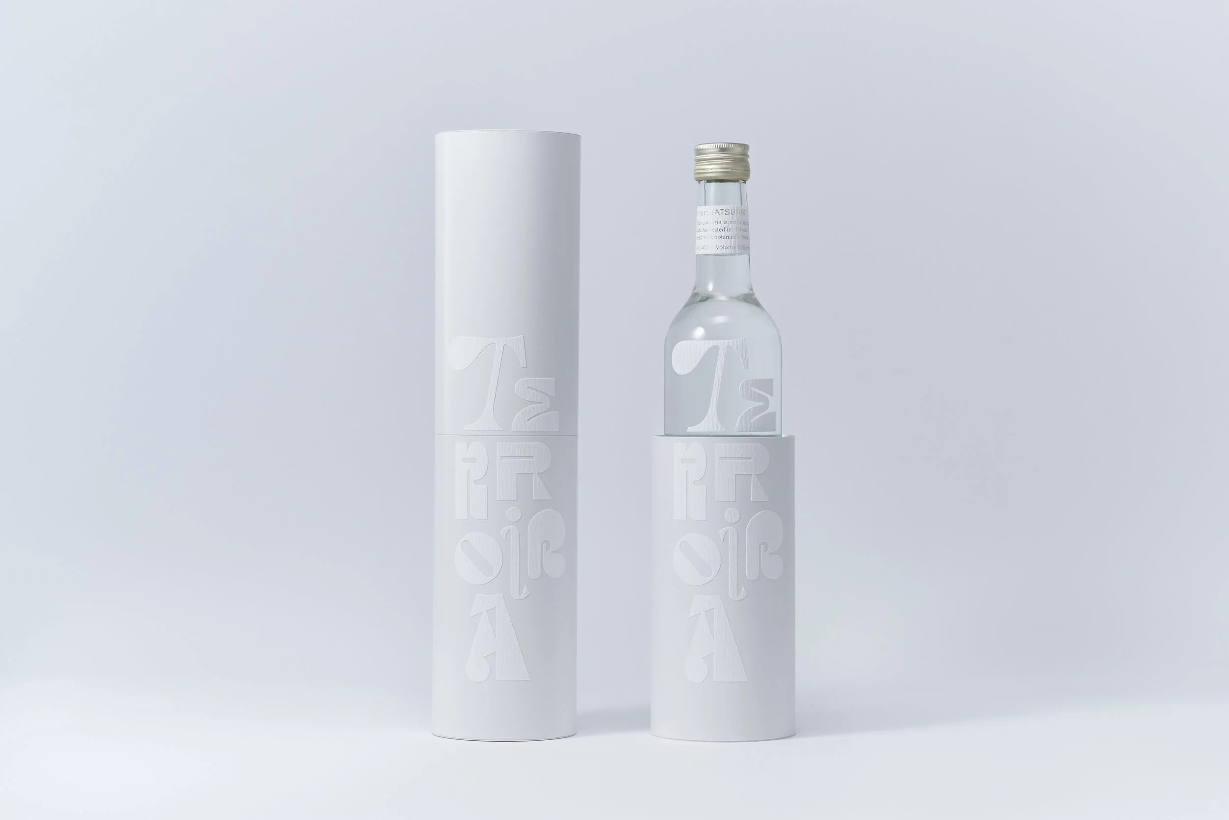
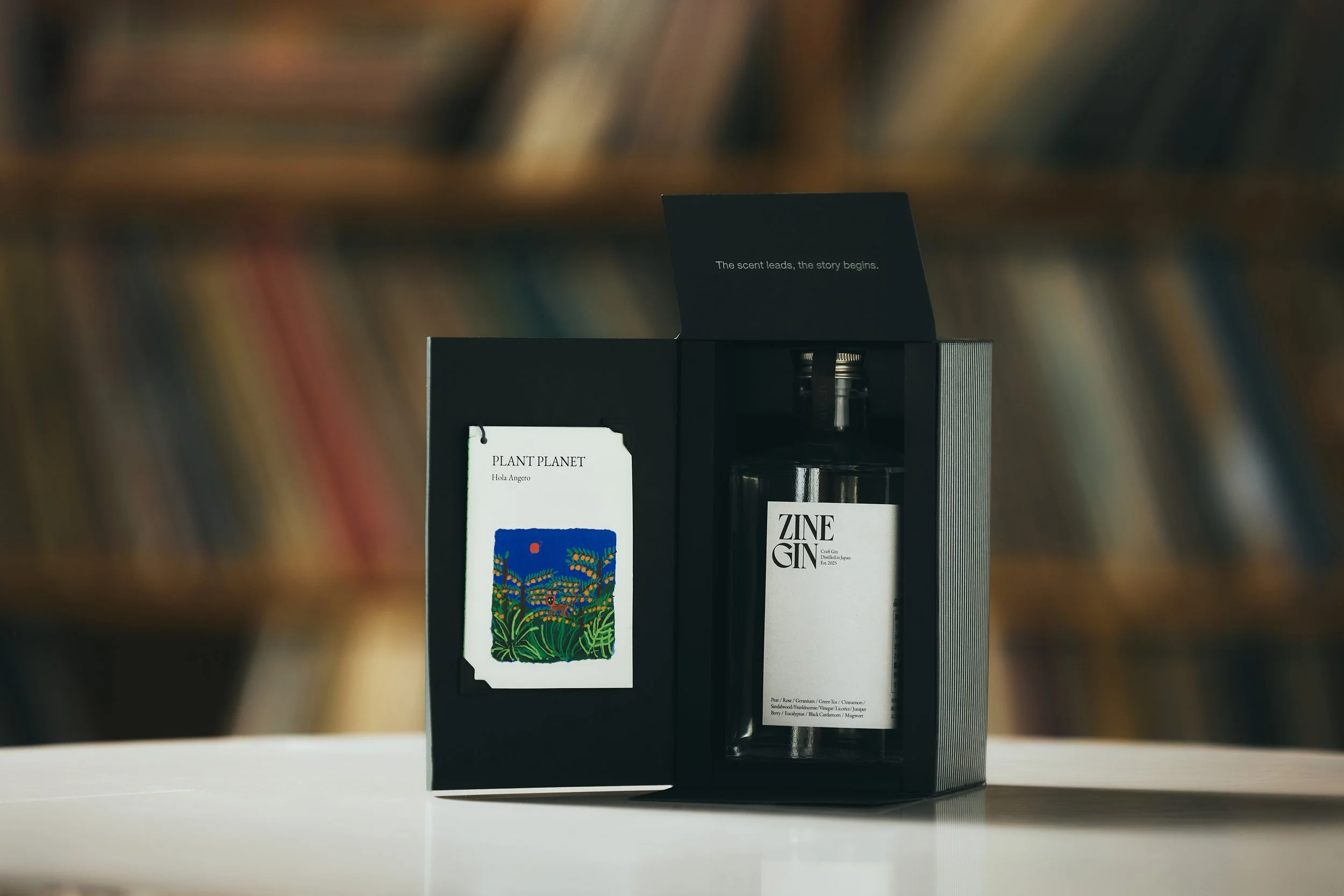
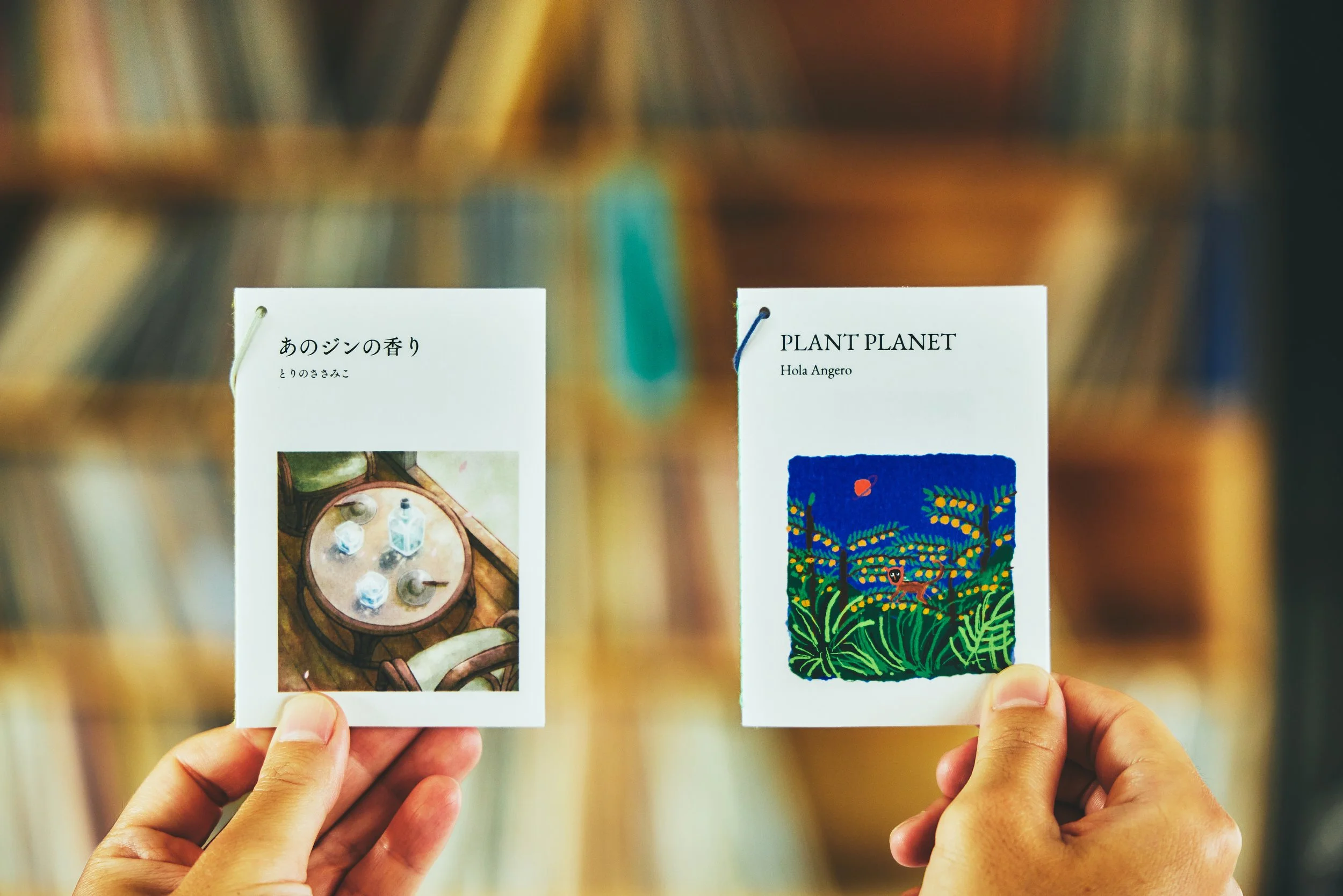
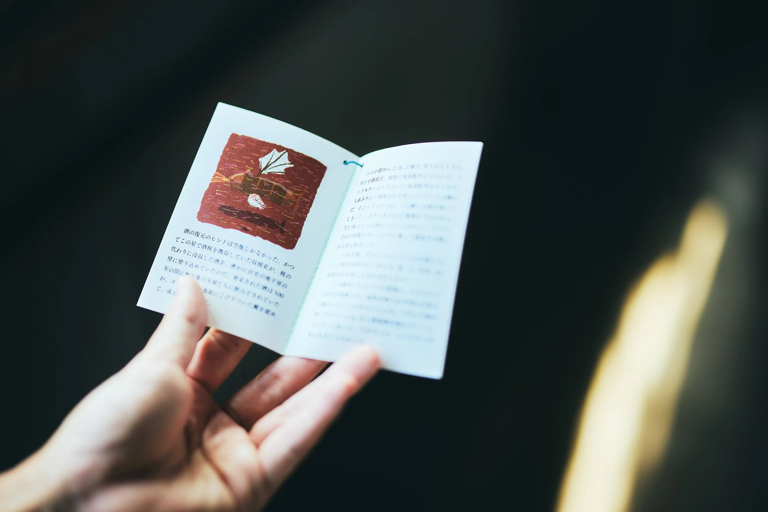
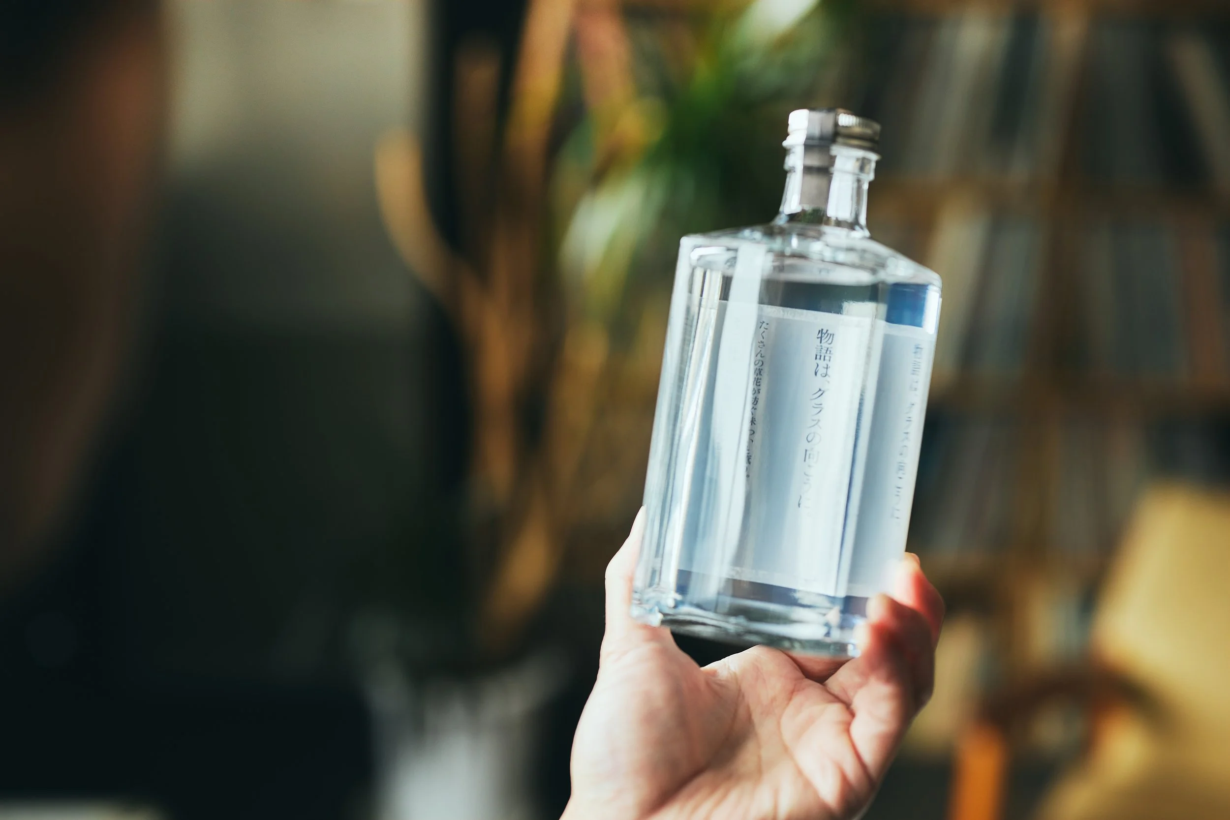
The outer box is designed to resemble a book. When opening, it reveals a mini ZINE created in collaboration with a creator, along with the brand concept message. The label is placed in an L-shape along the side of the bottle, resembling an open book gently resting beside it. By reading the message through the transparent gin, the design embodies the brand’s idea of immersing the cutomers in various stories.
【Product Concept】
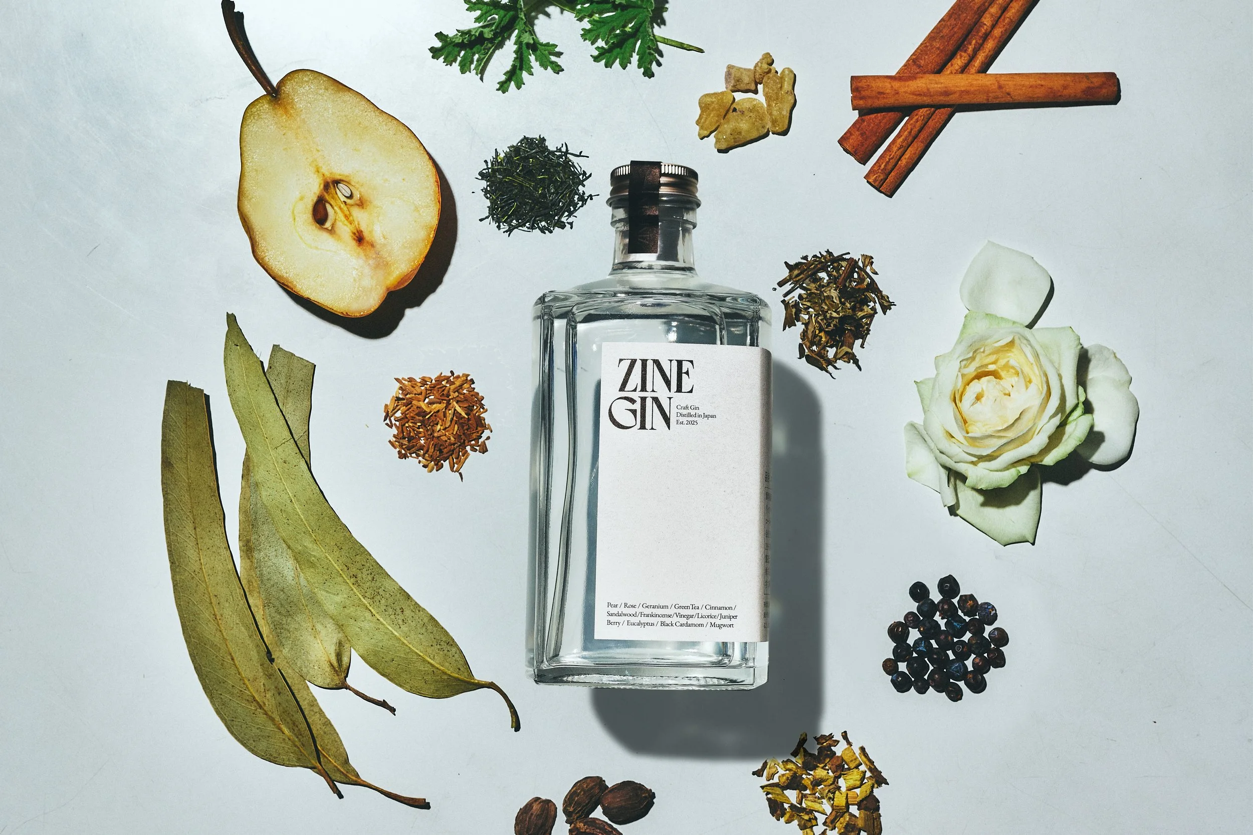
ZINE GIN is not just a craft gin, but a medium that weaves together people’s stories. Like a ZINE—an open and expressive format—it carries the creator’s passion while allowing each customer’s story to intersect. Its defining feature is a complex flavor that creates “space” in the mind. A rich blend of botanicals—pear, rose, geranium, sandalwood, frankincense, eucalyptus, brown cardamom, mugwort, green tea, juniper berry, licorice, and cinnamon—interacts in layers, unfolding new dialogues and connections with every sip.