
COCONCA

COCONCA
Client: FUJIIYA Co., Ltd.
Design Company: Hitomi Sago Design Office, Inc.
Art Director / Designer: Hitomi Sago
Copy Writer: Shoko Nagamatsu
Country: Japan
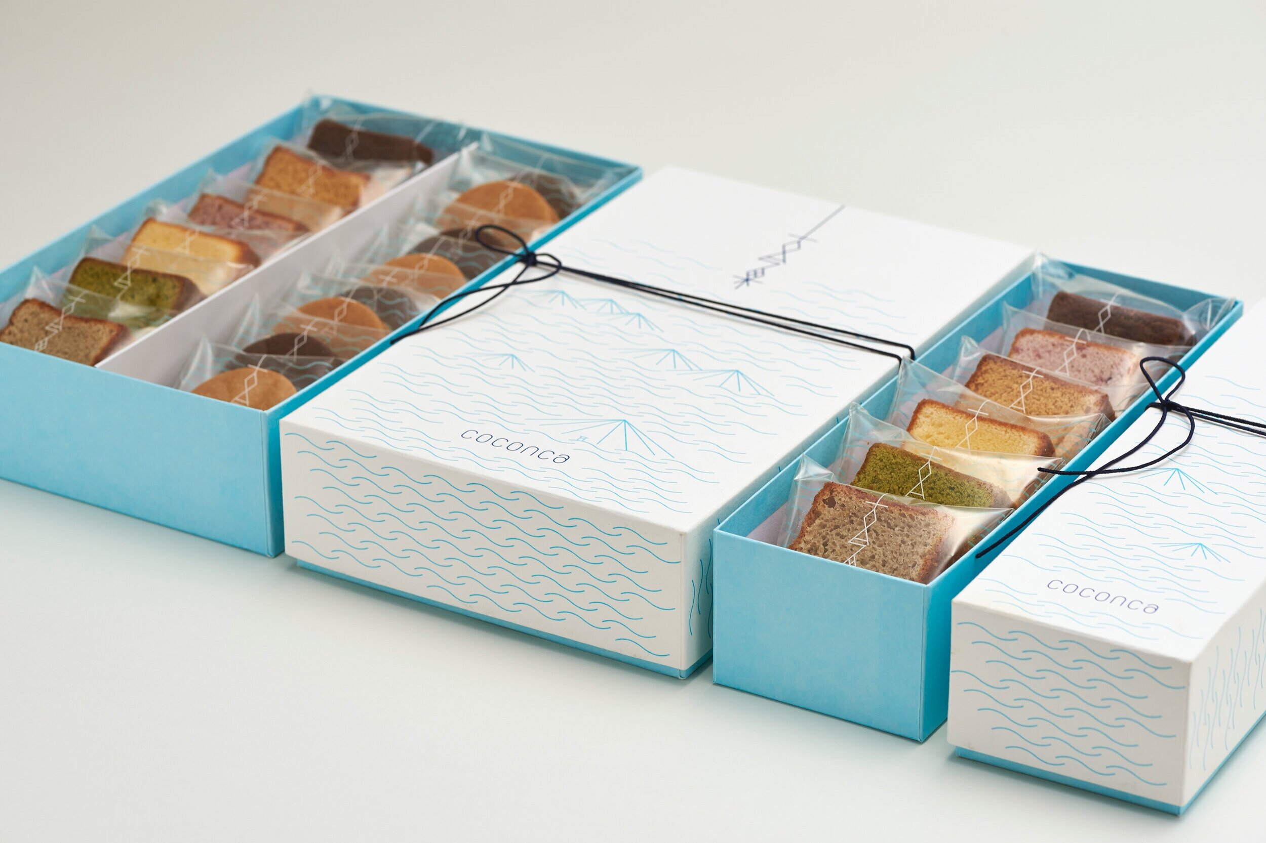
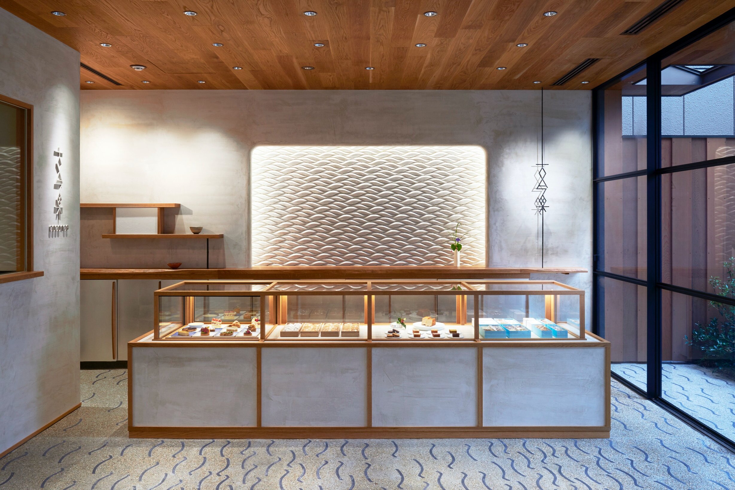
"COCONCA is a brand born in 2015 from a long established Japanese confectionary shop called "Fujiiya". They aim to create sweets that go beyond the boundaries of the East and the West; sweets that connect the past and the present.
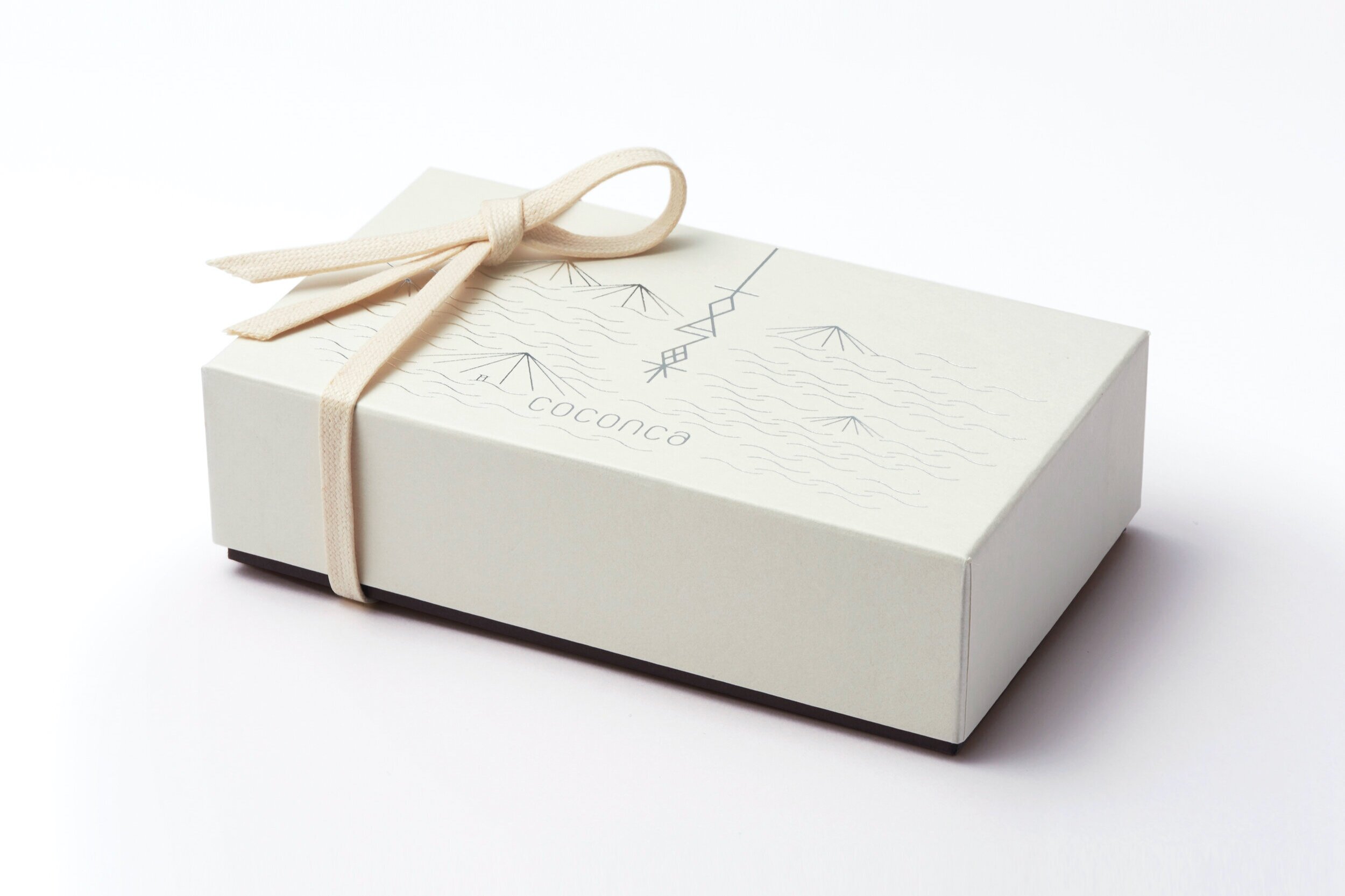
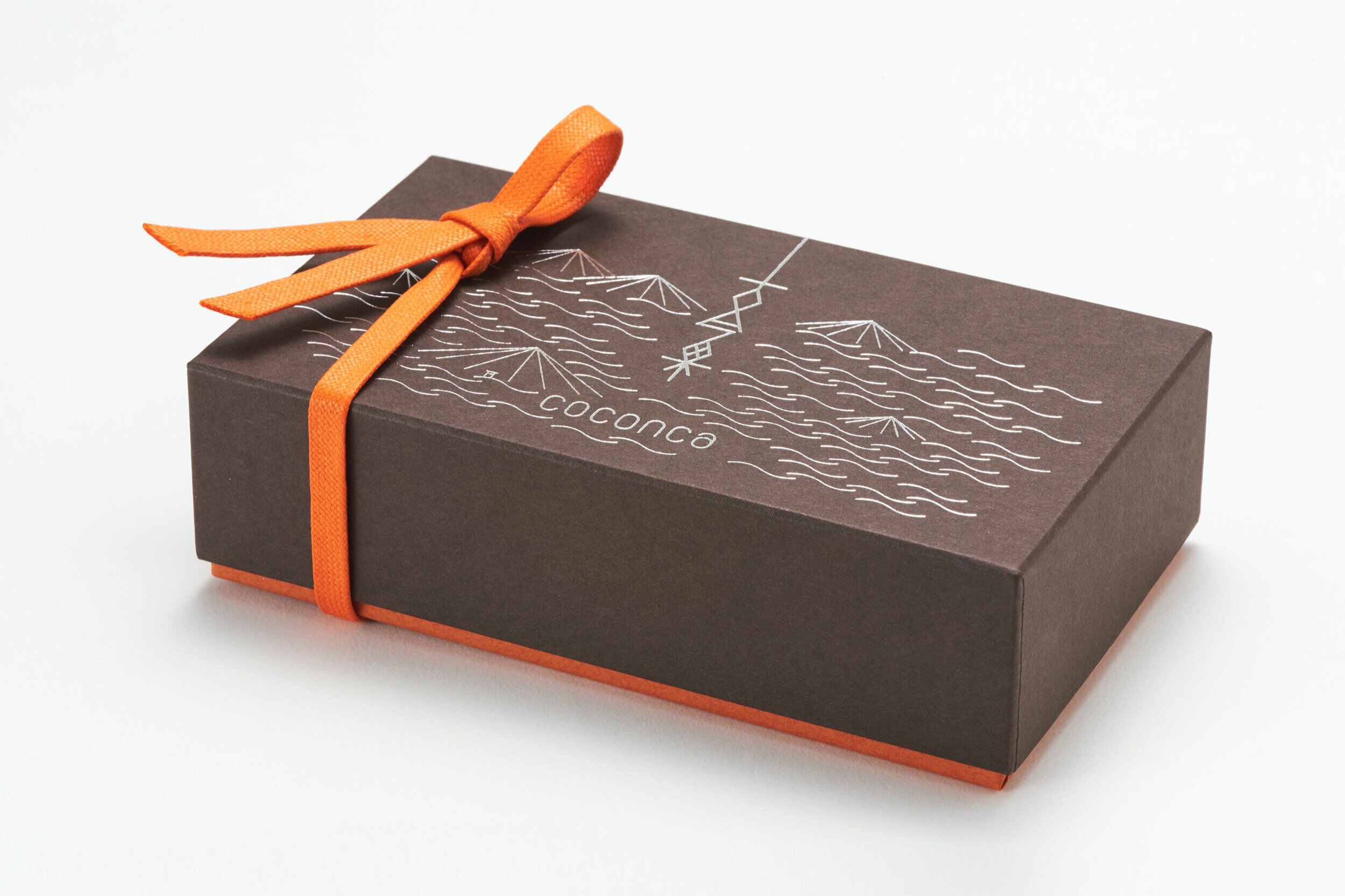
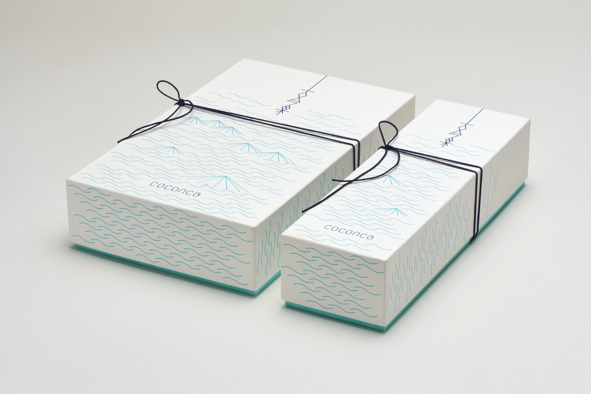
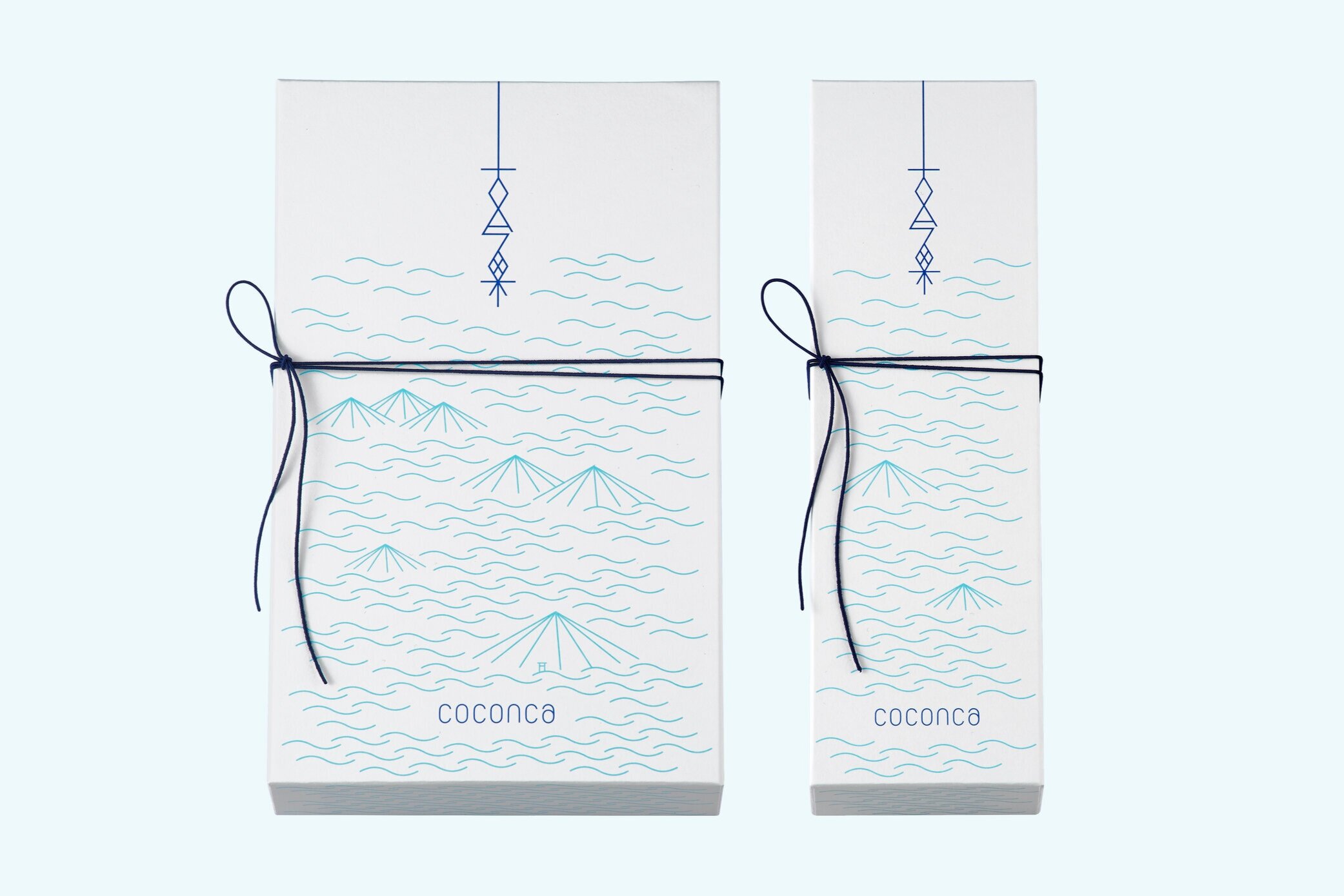
The Japanese logo expresses a form that connects the past and present, and reaches out into the future. The visuals for the packaging intend to express the landscapes unique to this region through a combination of classic and modern. I designed the islands and waves that can be seen from Miyajimaguchi, which is where the main shop is located, and on the larger box illustrates Miyajima with the torii (a traditional Japanese gate found at the entrance or within a Shinto shrine), where Fujiiya and the Itsukushima Shrine, a World Heritage Site is located. When the large and small boxes are aligned, they complete one full landscape.
The colours are the light blue of the ocean, the illustrations a pale colour, the logo and string a deep colour to accent the box. The colours are changed in the smaller boxes, creating a sense of unity whilst being diverse."
Digital Communication services, including website design, search engine optimization, social media, and content creation for nonprofit organizations, consultants, and creative entrepreneurs.


