
neyuki


neyuki
Client: Flanders
Design Company: nendo
Creative Direction, Art Direction & Design: nendo
Country: Japan
Find out more on: nendo.
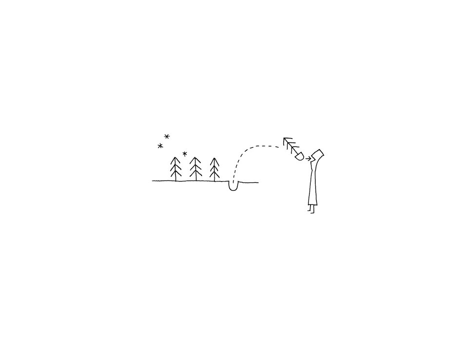
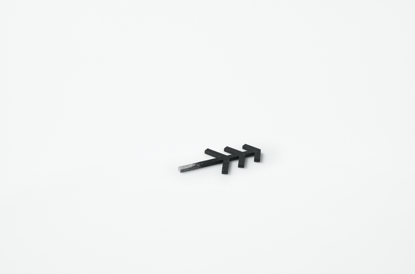
Product design and branding project for Flanders, a company based in Hokkaido that specialises in producing confectionary products. Hokkaido, located in the Northern part of Japan, is renowned for its dairy farming and products. The letter “n” from “neyuki” was taken from the word “north” and the logo, was kept to a minimal with just a triangle pointing North - reflecting the company’s expertise in making confectioneries using ingredients from Hokkaido.
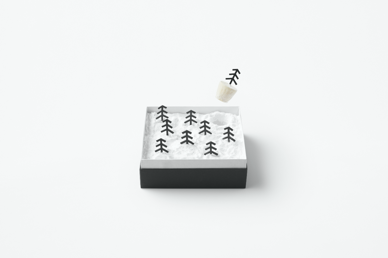
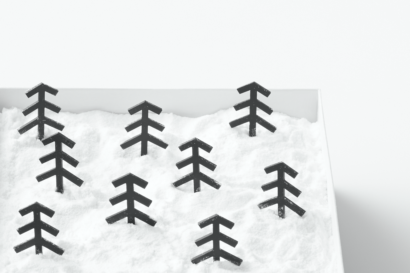
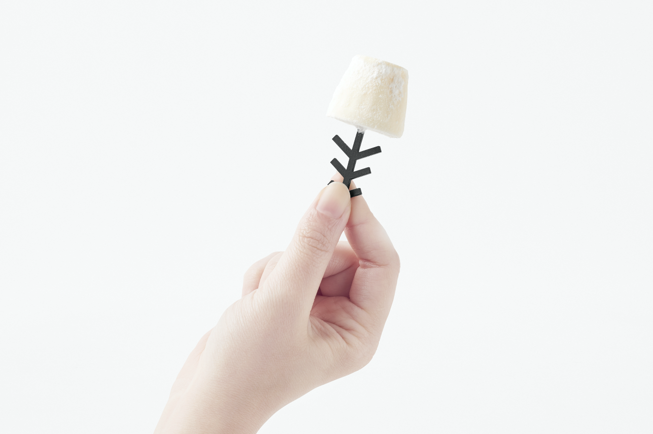
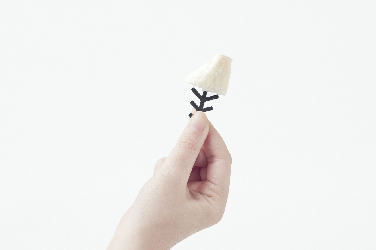
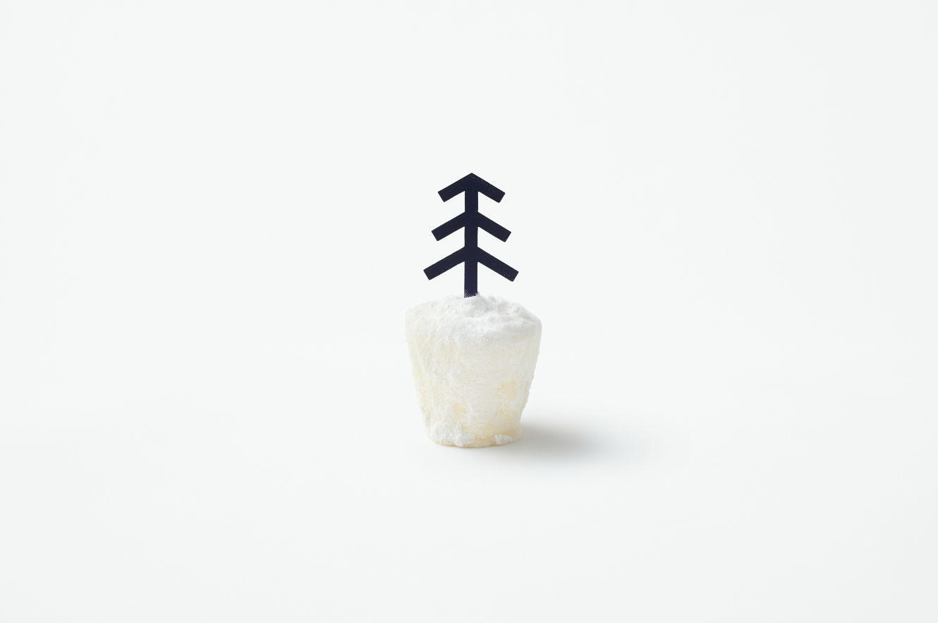
The cheese cake is the company’s first product. When the box is opened a snowy landscape is present. When you pull out a tree, a piece of cheesecake (attached to the tree) appears from beneath the snow. The “snow” is made from icing sugar, and the “tree” can be picked up like a cocktail stick. The idea was inspired by the traditional techniques of the North - by storing vegetables and fruits in the snow as a way of preservation and enhancing the sweetness intensity of the produce.
Digital Communication services, including website design, search engine optimization, social media, and content creation for nonprofit organizations, consultants, and creative entrepreneurs.


