Peanuts Monaka


Peanuts Monaka
Client: YONEYA Co., Ltd.
Design Company: IDA Co., Ltd.
Creative Direction: Isao Inoue
Art Direction and Design: Reiko Nishioka
Country: Japan
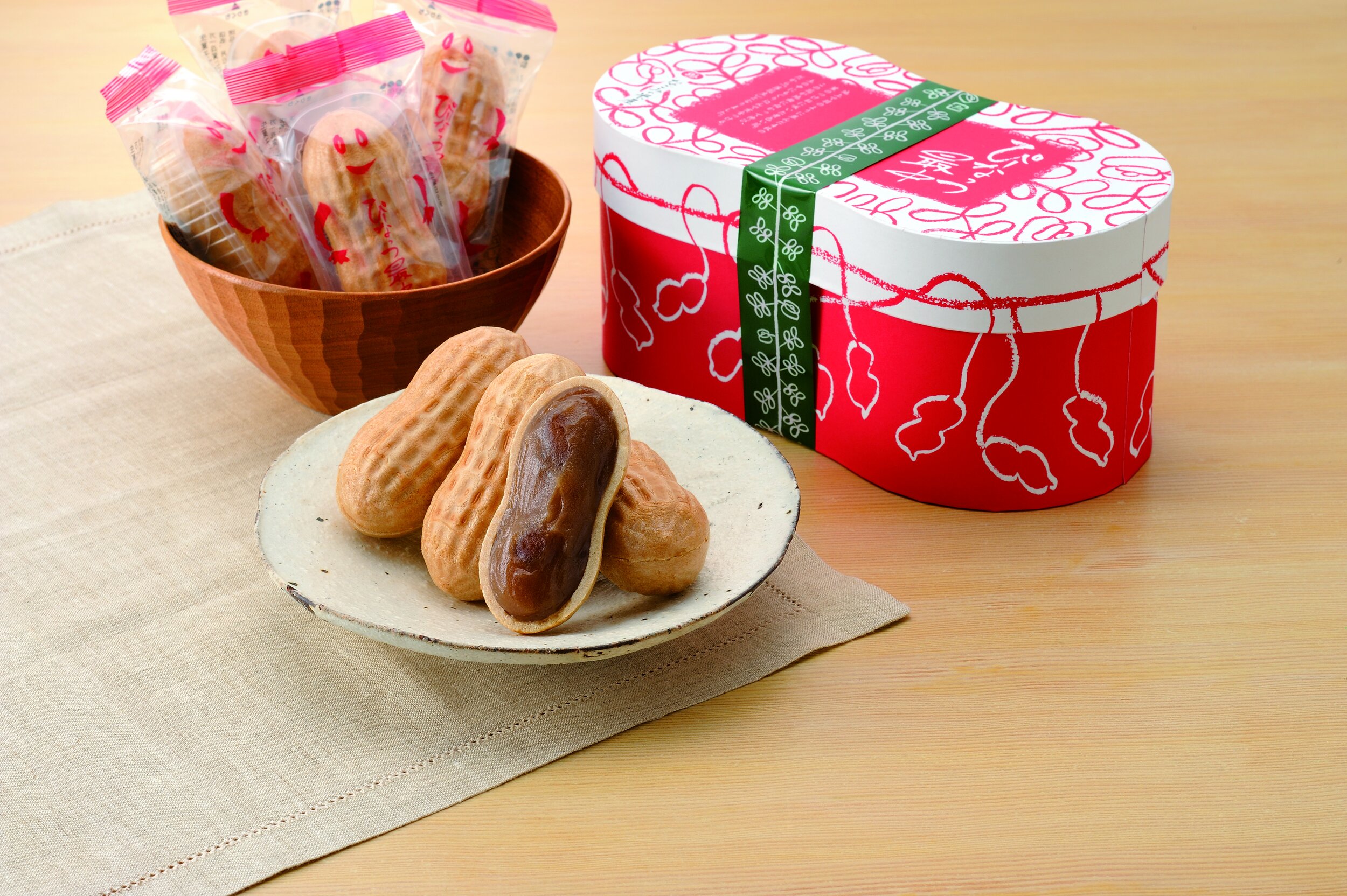
Started in 1899, NAGOMI-YONEYA is a long-established company engaged in the production and sales of Japanese confectionary items. Based on the brand’s concept to “change the traditional storefront and introduce something more bright and fun,” this product was born.
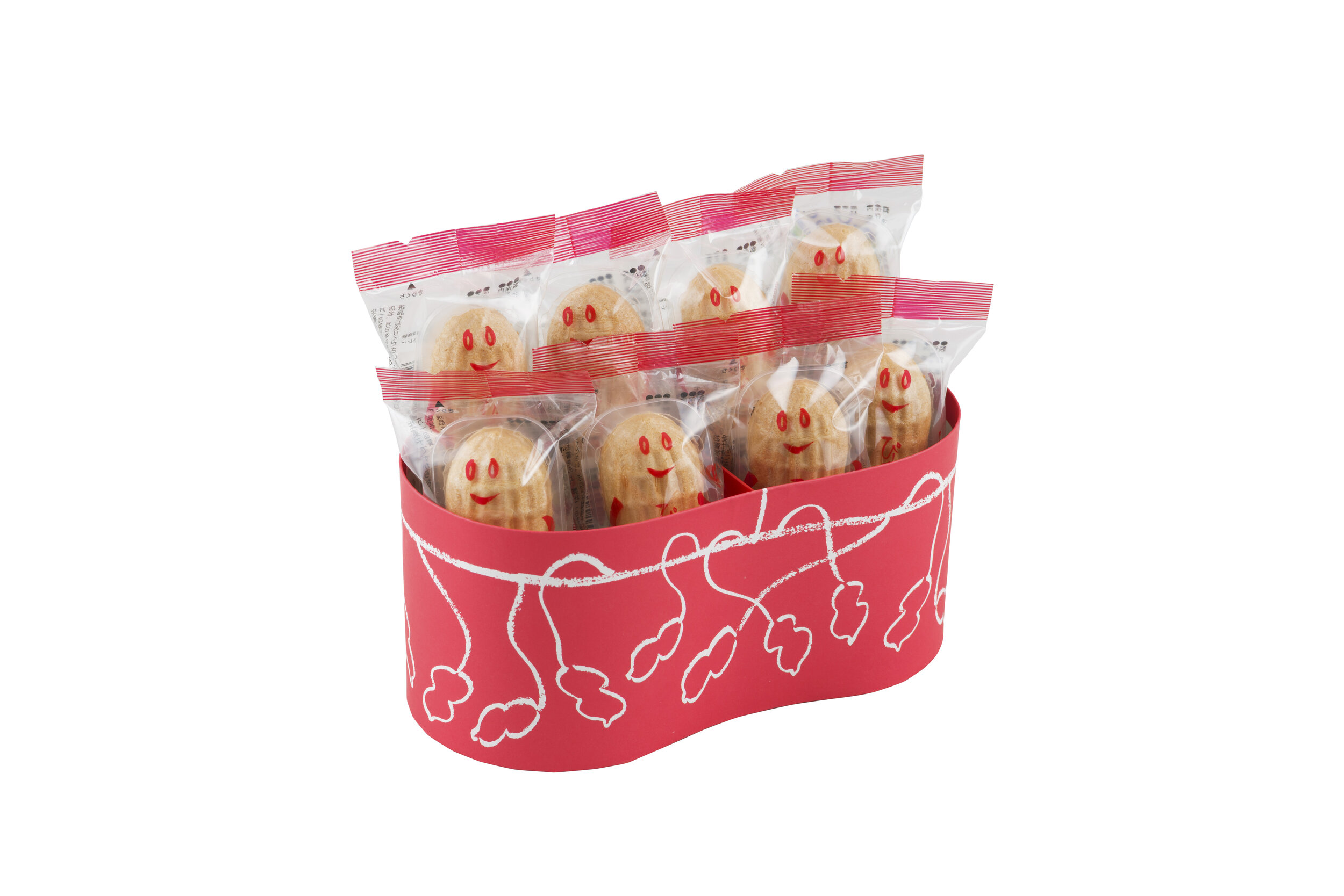
Peanuts Monaka, as the name suggests, is a Japanese sweet made of red bean and peanut jam filling sandwiched between two peanut shaped crispy wafers. Each sweet is individually wrapped in transparent packaging, introducing the product’s shape and character to its consumers.
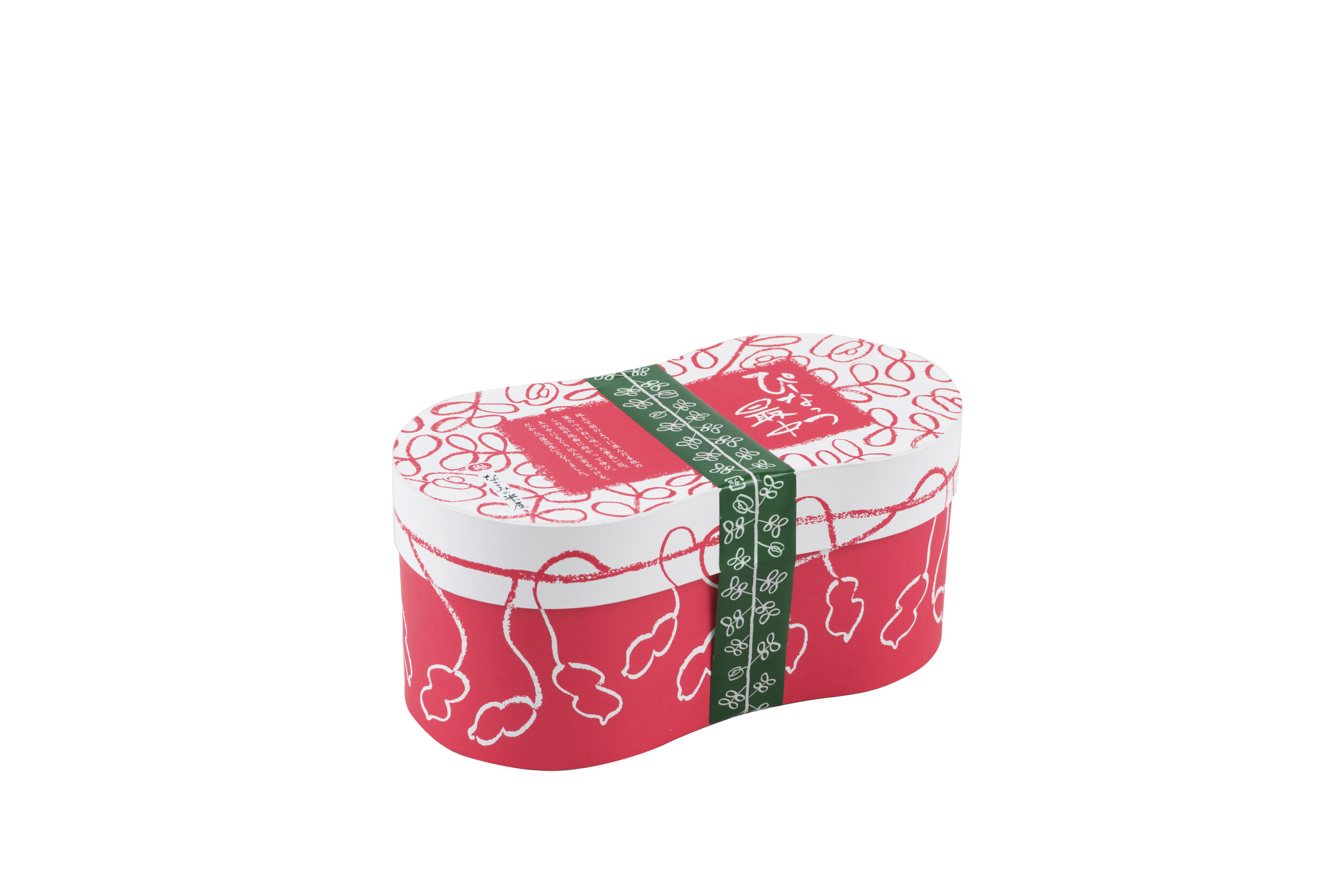
The box is also peanut shaped. “Peanut” or “Rakkasei” (in Japanese), means “to be born from fallen flower”. An elaborate red and white illustration is drawn on the box to convey this concept. Though the production took several rounds of trial and error, the outcome was successful in producing a bright, fun and unique product.
Digital Communication services, including website design, search engine optimization, social media, and content creation for nonprofit organizations, consultants, and creative entrepreneurs.