GARI GORI

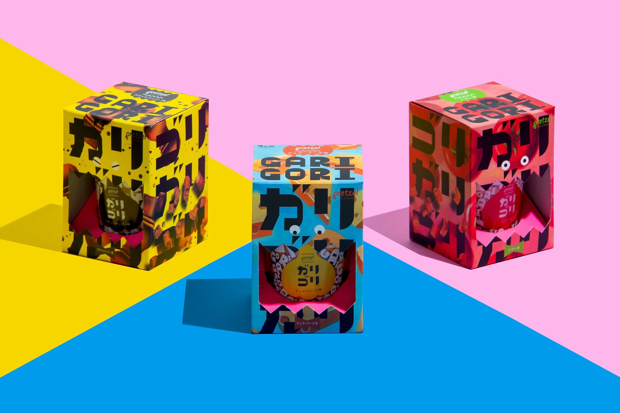
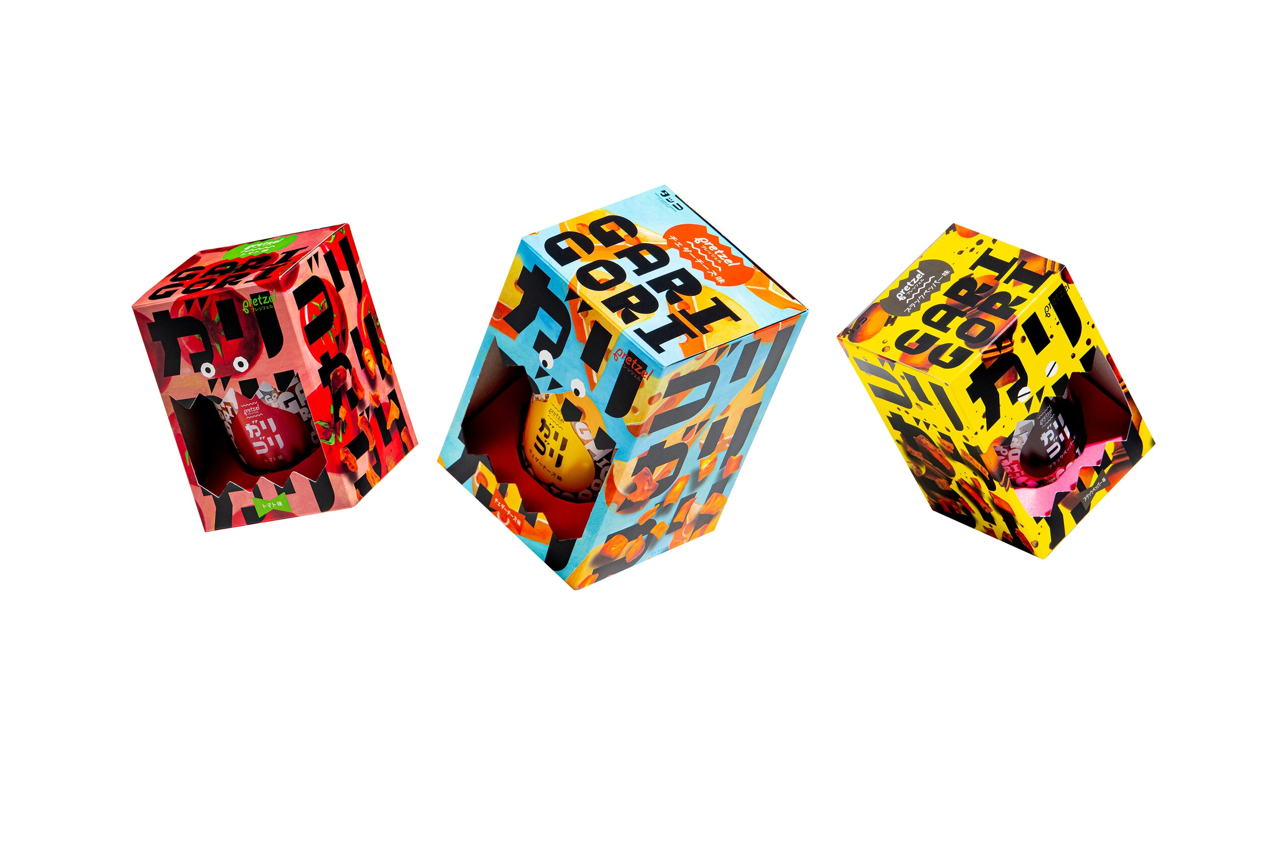

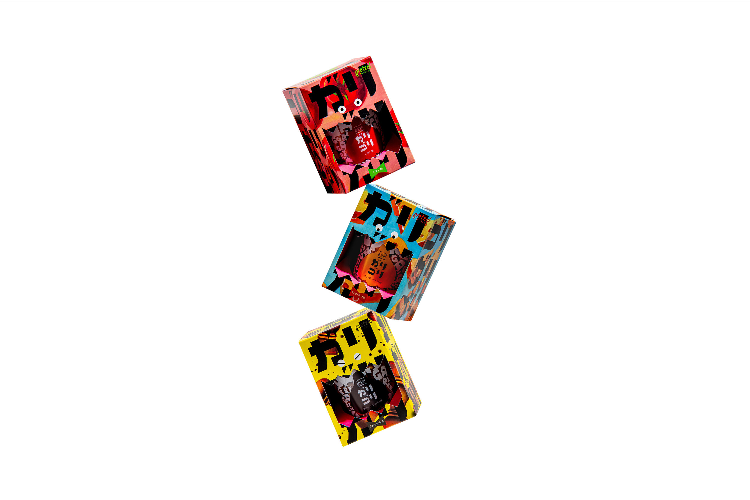
GARI GORI
Client: Takko Garlic Center
Design Company: HUMAN CREATIVE CO.,LTD
Art Direction / Design: Yasuharu Kamiyama
Web Design: Miyuki Sakamoto
Illustration: Ryoko Fukaya
Photographer: Takashi Yamamoto
Country: Japan
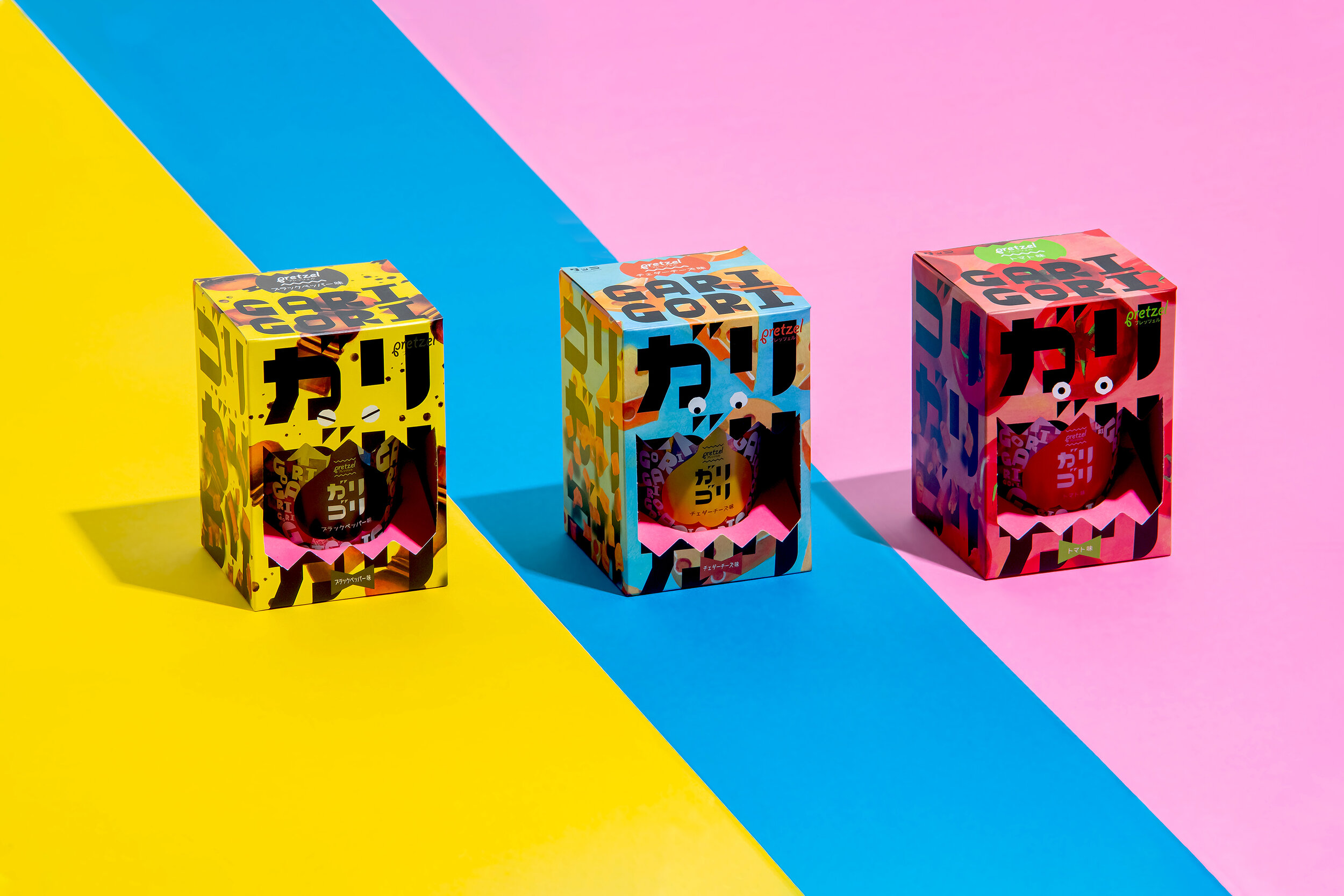
Known for its garlic, this original product comes from Takko Town, Aomori Prefecture. The theme was to create a pretzel packaging for its variations: garlic with 3 different flavours. Because the texture of the pretzel is hard, we decided to take the biting sound in Japanese (gari gori) and use it as its product name. The typography has been repeatedly checked to make sure its form matches its name. The illustrations are cutely drawn combining flavours as motifs in three distinct colours that stand out individually. The container uses a transparent garlic sticker, and is covered with a sleeve design that is associated with crushing the garlic. Designed with fun and playfulness, the product displays liveliness.
Digital Communication services, including website design, search engine optimization, social media, and content creation for nonprofit organizations, consultants, and creative entrepreneurs.