HAKURYU


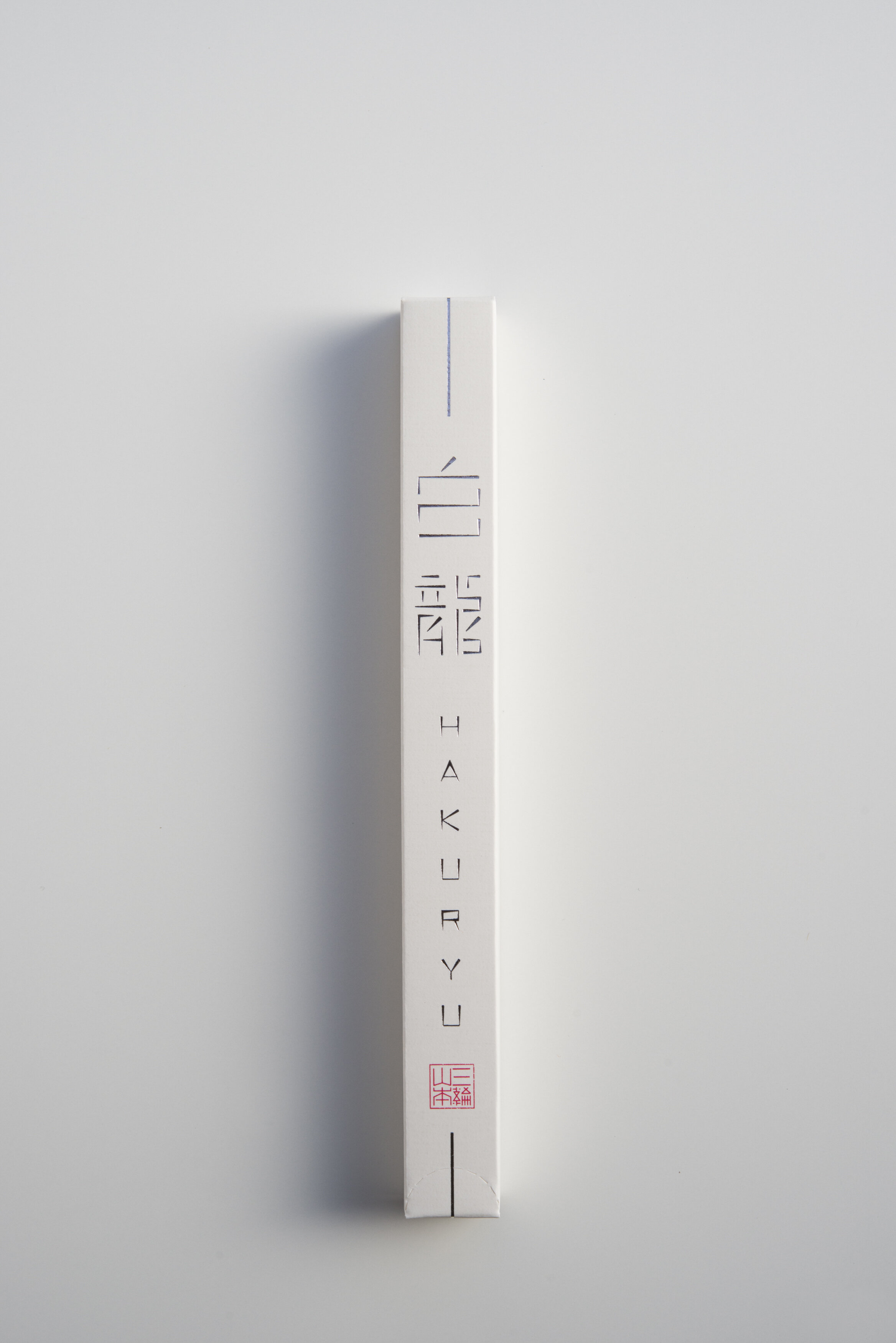
HAKURYU
Client: Miwa Yamamoto Co., Ltd.
Design Company: Samurai Inc.
Creative Direction: Sato Kashiwa
Art Direction: Yoshiki Okuse
Country: Japan
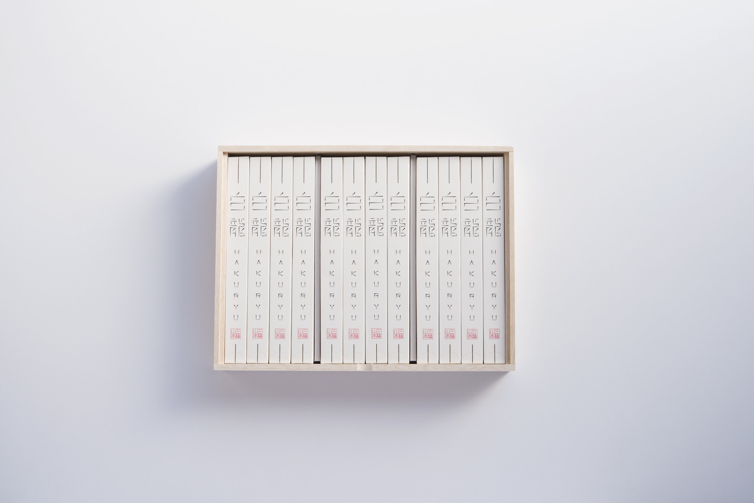
With more than 300 years of history, Miwa Yamamoto has realized a simple design of its iconic product; “HAKURYU”, to convey its long established traditions and techniques in contemporary context. The white package is to give a sense of fresh quality, while its silver centre line is to reflect the company’s strong intention to develop new food culture.
The HAKURYU logo was inspired by the extra fine noodles - it expresses the uniqueness and intricacy of the brand’s manufacturing method and techniques. The design also gives the competitive differentiation, since other competitors' products are using traditional calligraphy for their packages.
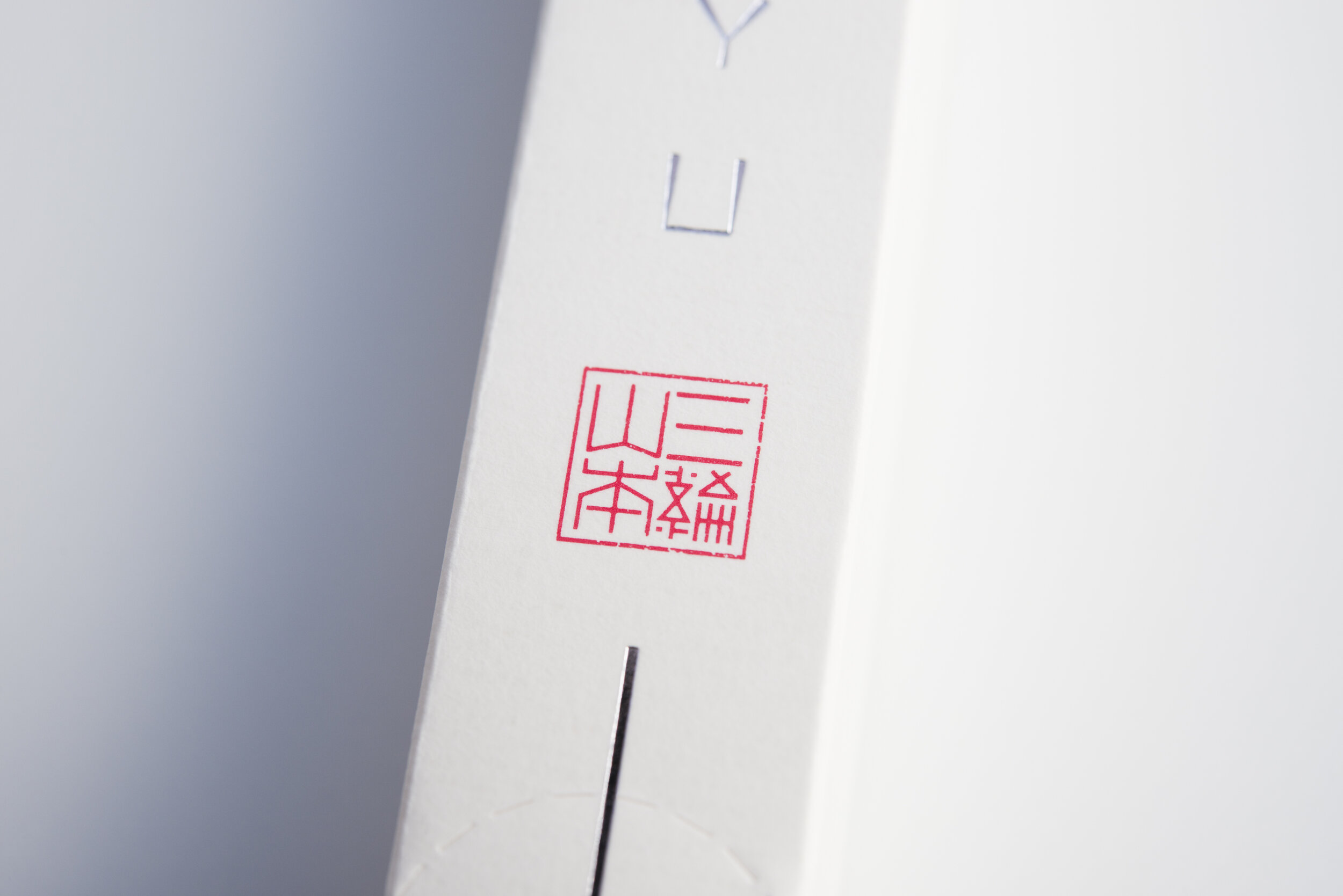
Coming from the idea of its signature and seal, the Miwa Yamamoto logo symbolizes the spirit of the brand's efforts to continue innovations over 300 years in harmony with the rich tradition of Nara Prefecture. The logo in red also expresses the lasting passion for the brand.
Digital Communication services, including website design, search engine optimization, social media, and content creation for nonprofit organizations, consultants, and creative entrepreneurs.