GYOKUSENDO

Gyokusendo
Client: GYOKUSENDO inc.
Design Company: HAKUHODO Inc.
Creative & Art Direction: Shigeyuki Takaoka
Design: Maika Saitou
Country: Japan
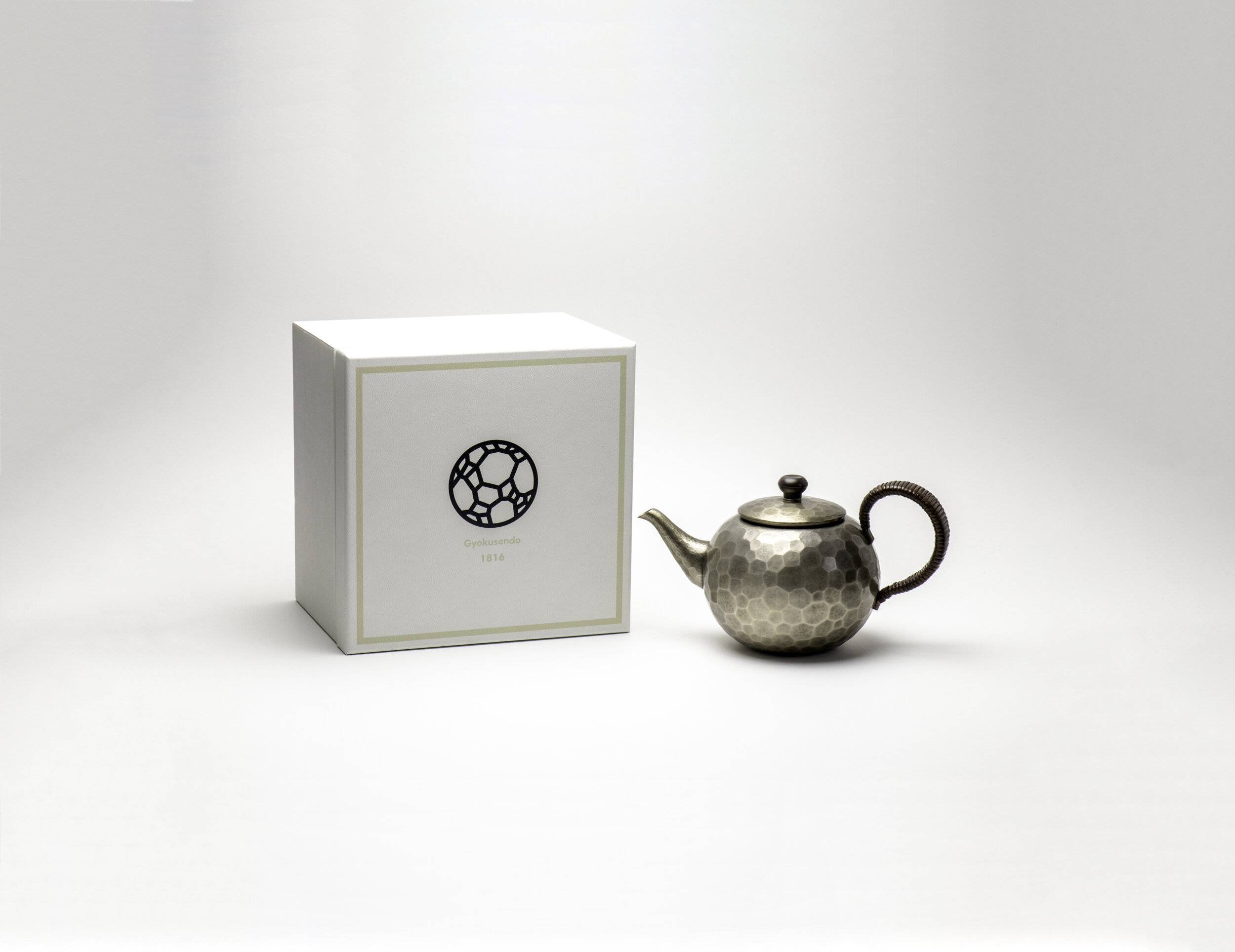
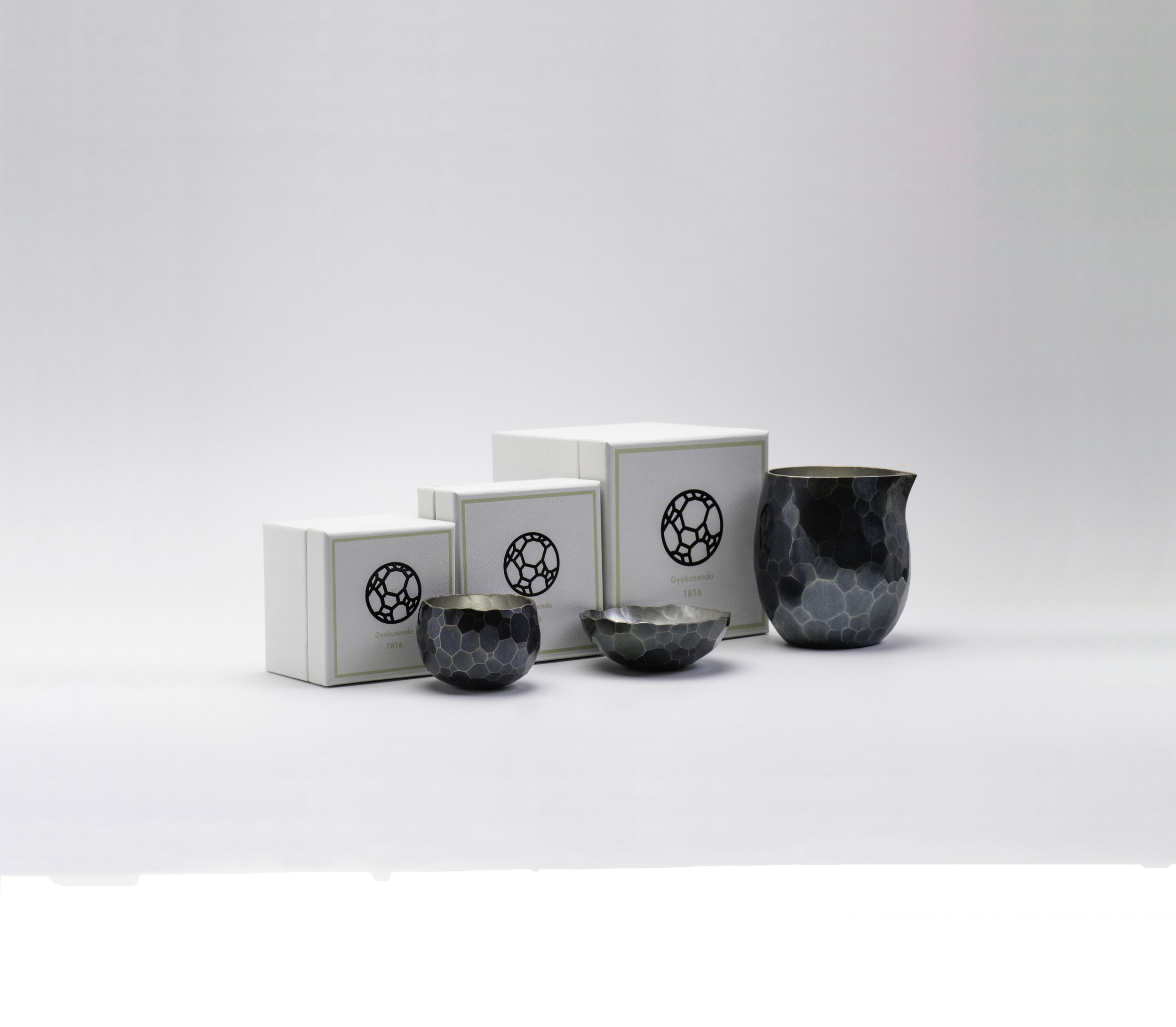
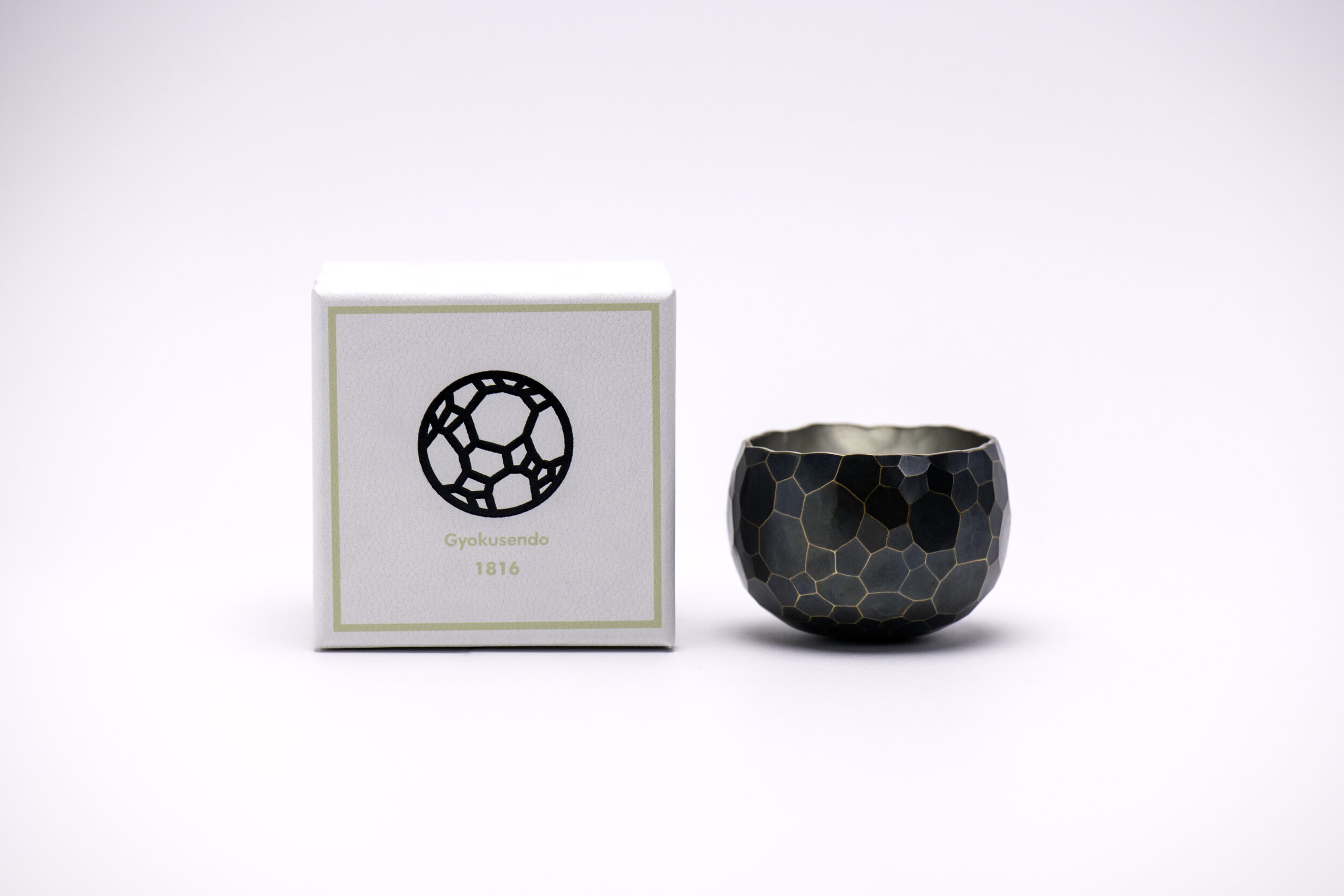
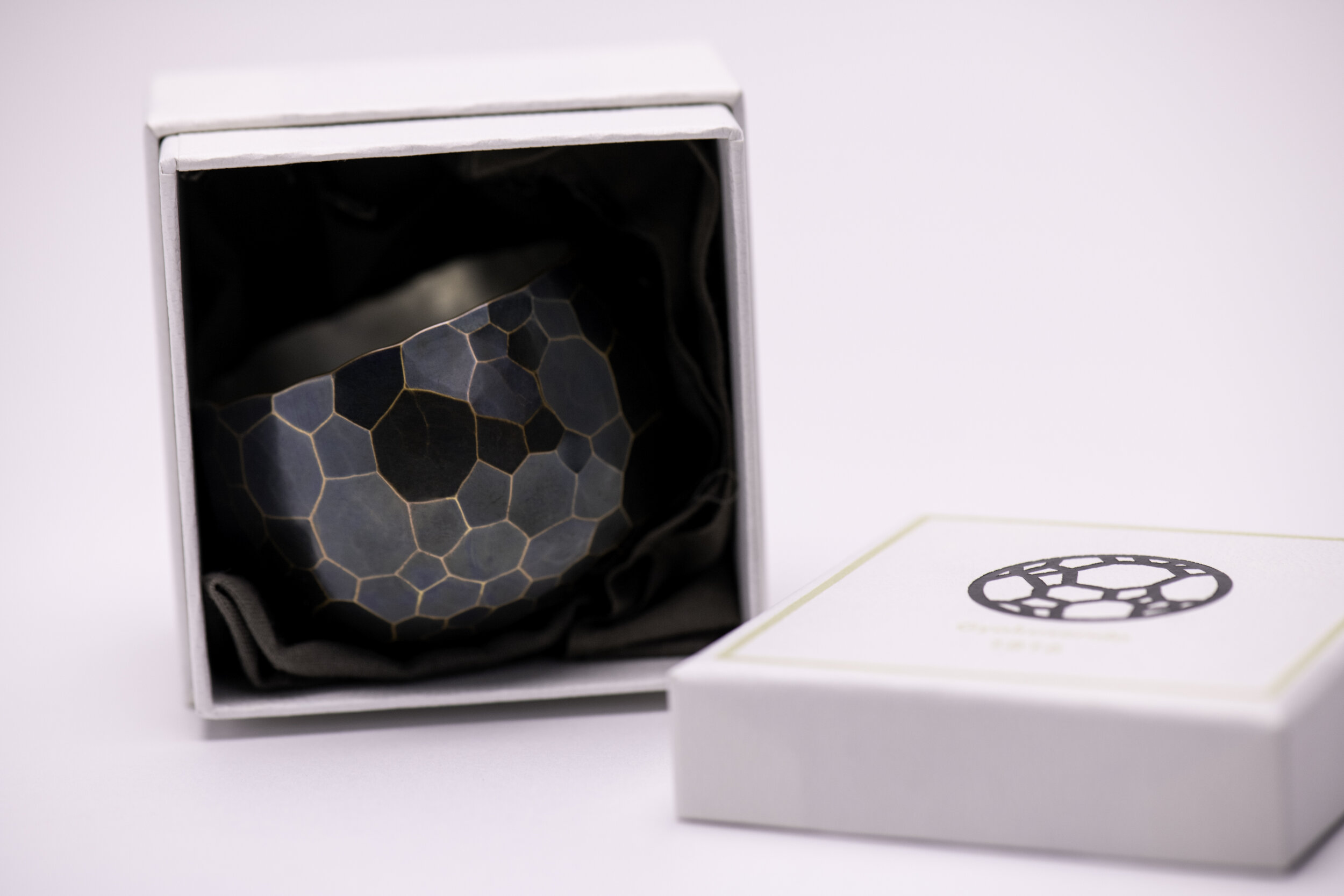
There is more to the appeal of Gyokusendo than just the history and techniques. Its true charm lies in our customers’ use of our copperware for generations; in essence, its ‘timelessness’.
Though many machine-made industrial products are at their most beautiful when the customer receives them, this beauty soon fades. However, the timeless beauty of Gyokusendo’s copperware, beaten repeatedly by its craftsmen, begins to increase the instant the customer lays their hands on it. It is this enduring beauty that is passed down from one generation to the next.
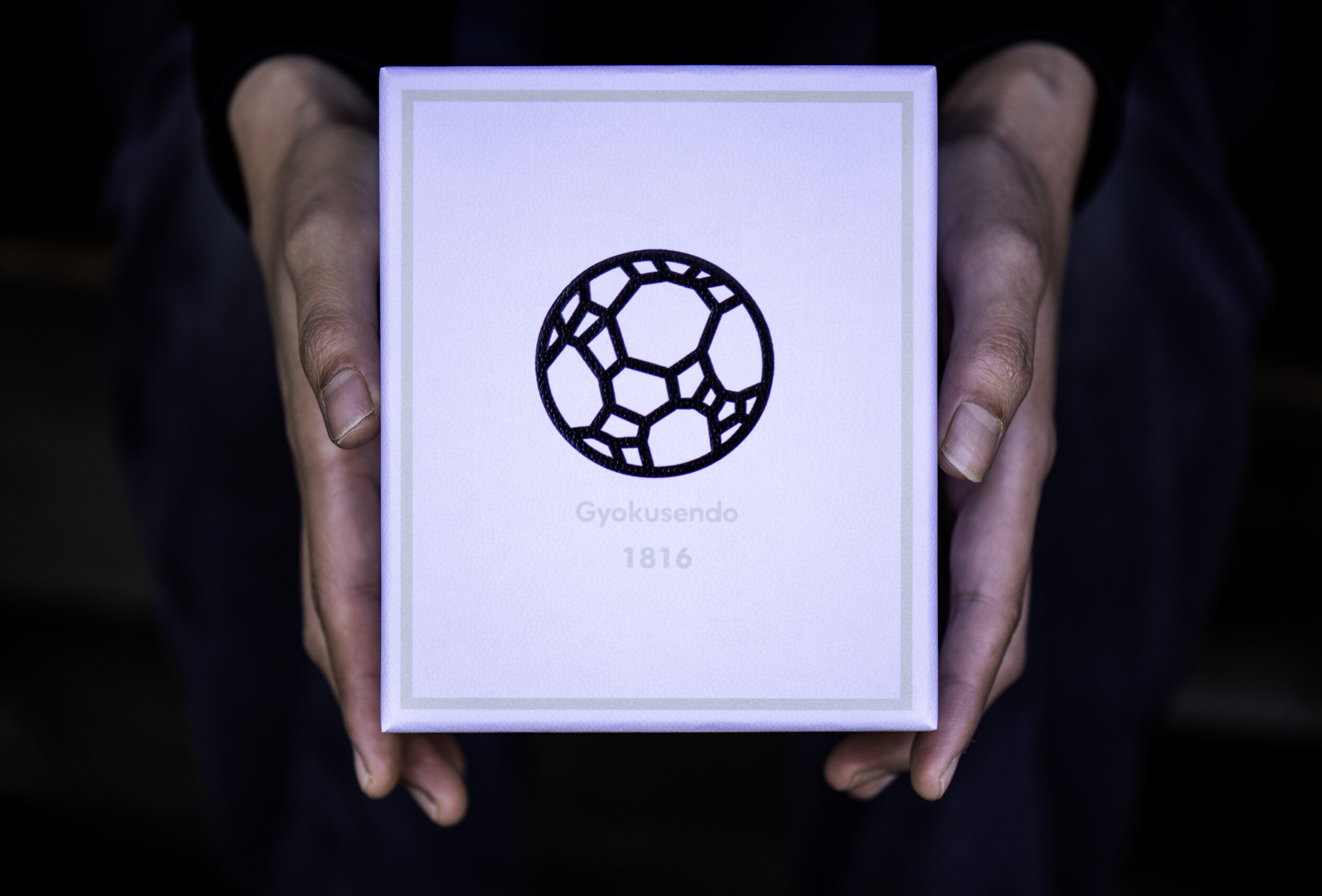
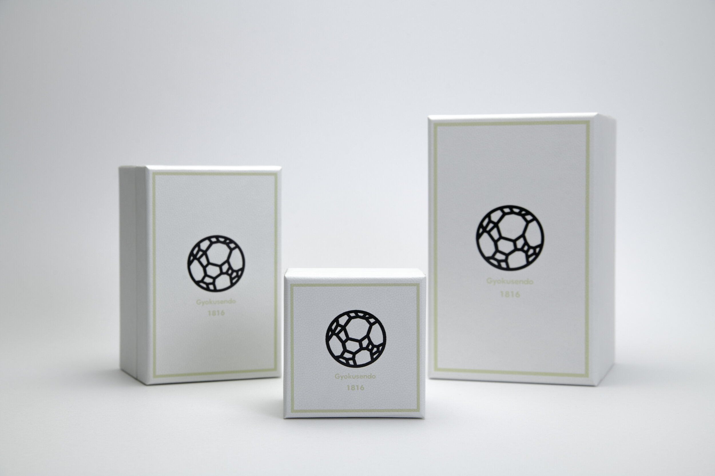
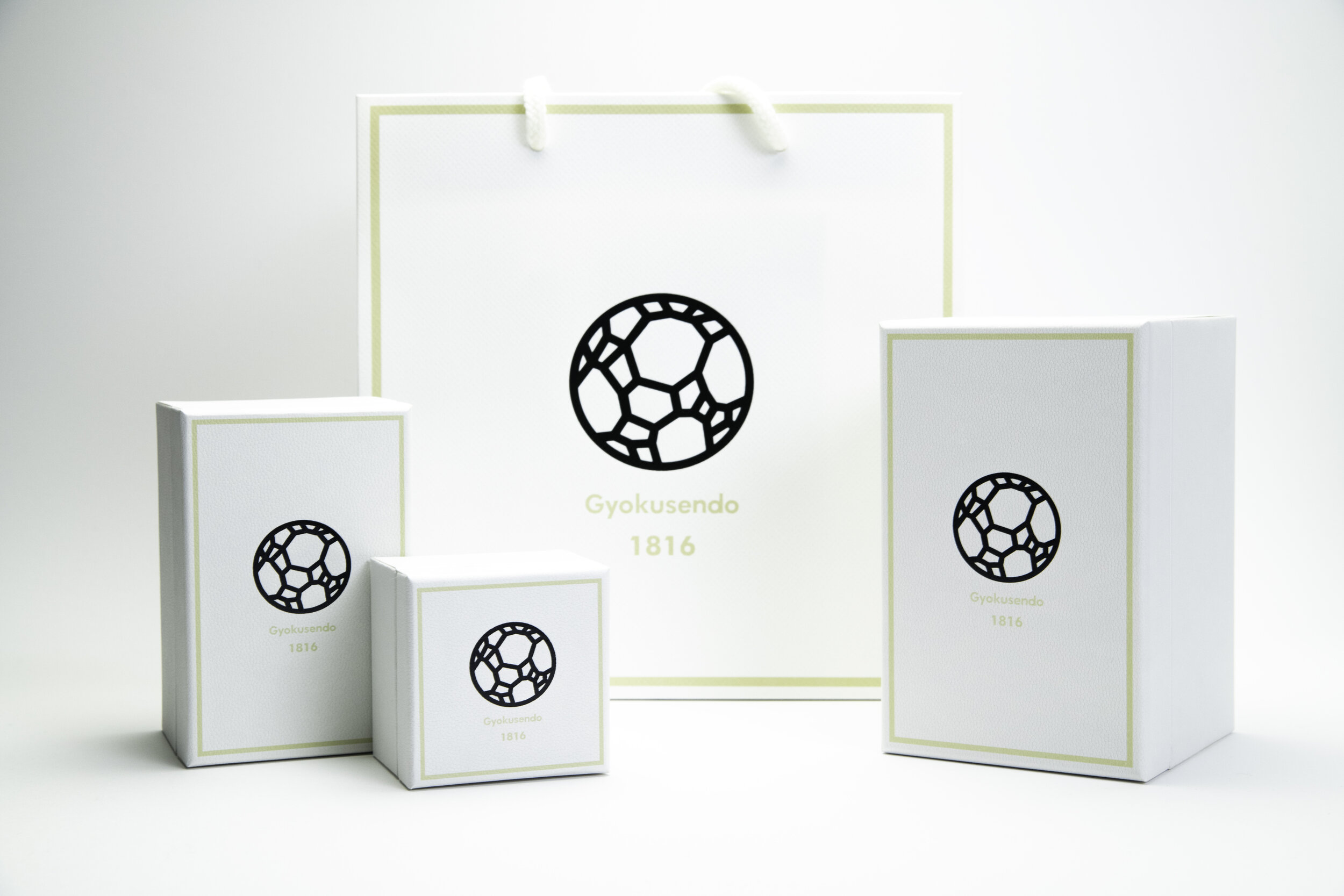
To celebrate its 200th anniversary, the logo designed with Japanese flag and family emblem in the motif of a large hammered mark is used for a distinguishable design across national and linguistic borders.
Digital Communication services, including website design, search engine optimization, social media, and content creation for nonprofit organizations, consultants, and creative entrepreneurs.