Mag-on (Mag-on Powder)

Mag-on (Mag-on Powder)
Client: CERROTORRE Inc.
Design Company: TYPEFACE
Creative Direction: TAMIHITO WATANABE
Art Direction: MAMI KOBAYASHI, TADASHI NINOMIYA
Design: MARIKO SHIMIZU
Country: Japan
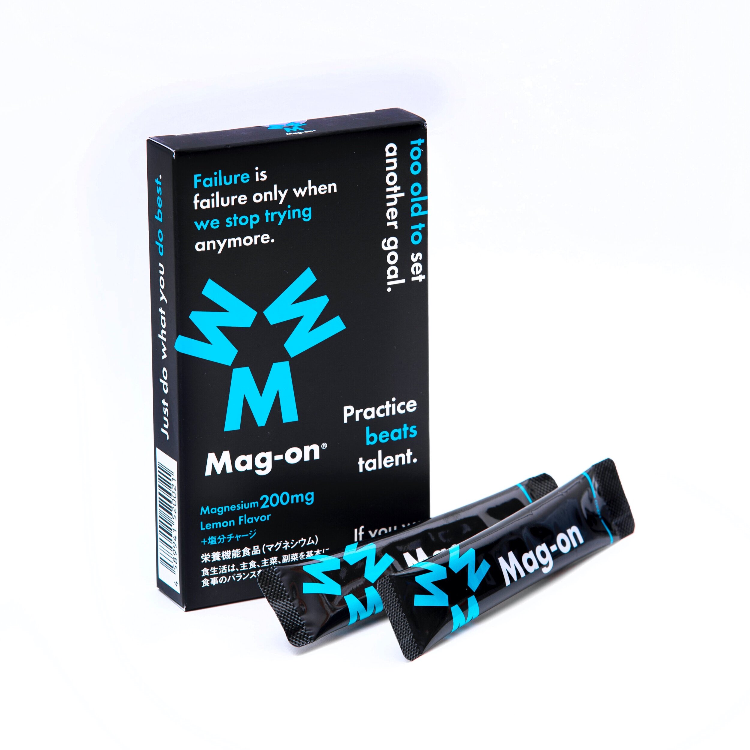
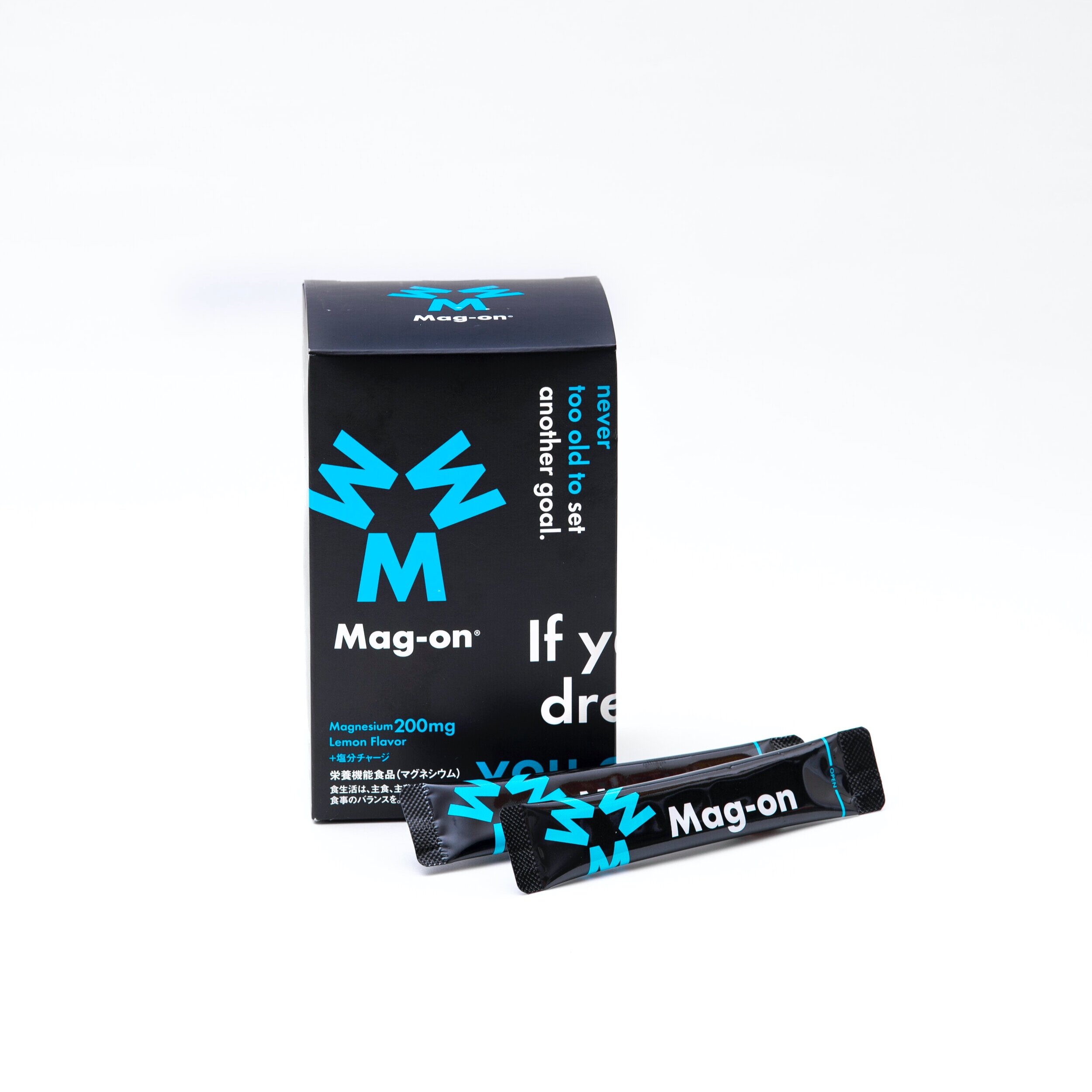
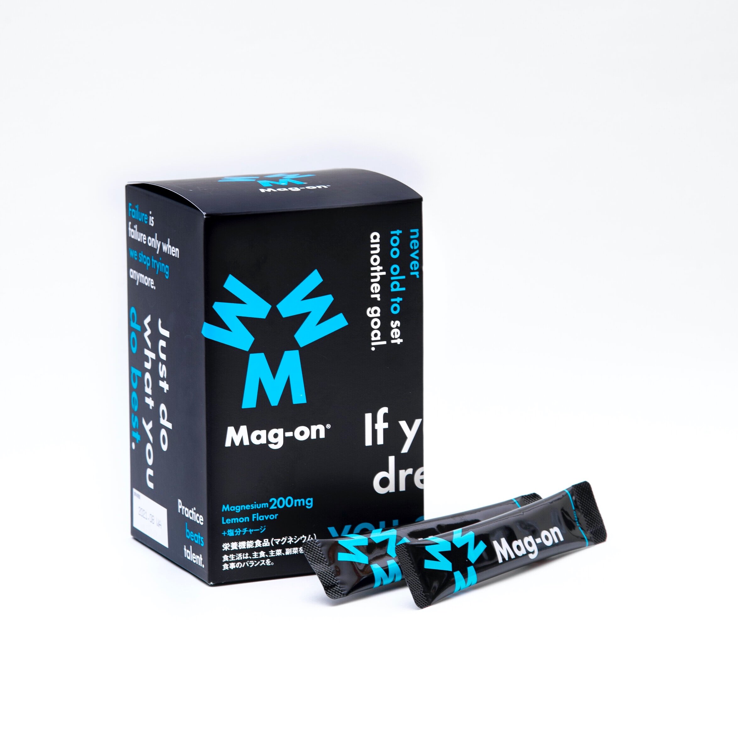
Mag-on brings functional benefits of magnesium for athletes to light. For easier and better consumption with satisfaction, Mag-on separates itself from most supplemental products which tastes dry and flavorless.
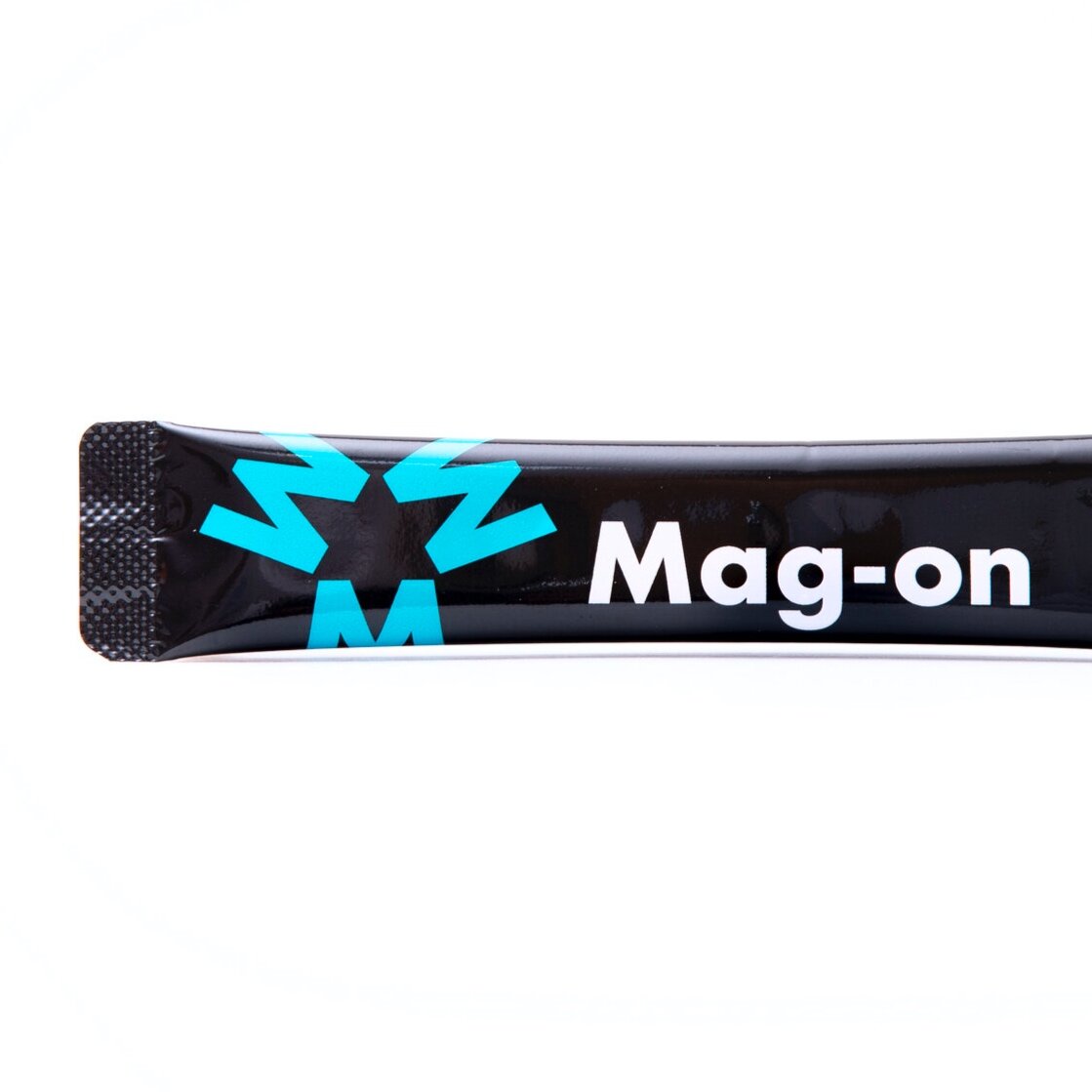
The design concept of Mag-on is: use it and you will become a star. Using the letter M of Mag-on, the logo is created in such a way that the empty space resembles a star. We nicknamed our logo “M Star” as we believe every sports player is a star. And because our product is about increasing endurance, we used turquoise blue to give it a sport image and for it to fit in seamlessly with any physical situation. The packaging design was a collaboration with the client’ creative director; we selected the English inspirational quotes to give the extra boost and motivation.
Digital Communication services, including website design, search engine optimization, social media, and content creation for nonprofit organizations, consultants, and creative entrepreneurs.