OKUYAMATO BEER


OKUYAMATO BEER
Client: OKUYAMATO BEER
Design Company: OFFICE CAMP llc
Design: Coji Katsuyama
Country: Japan
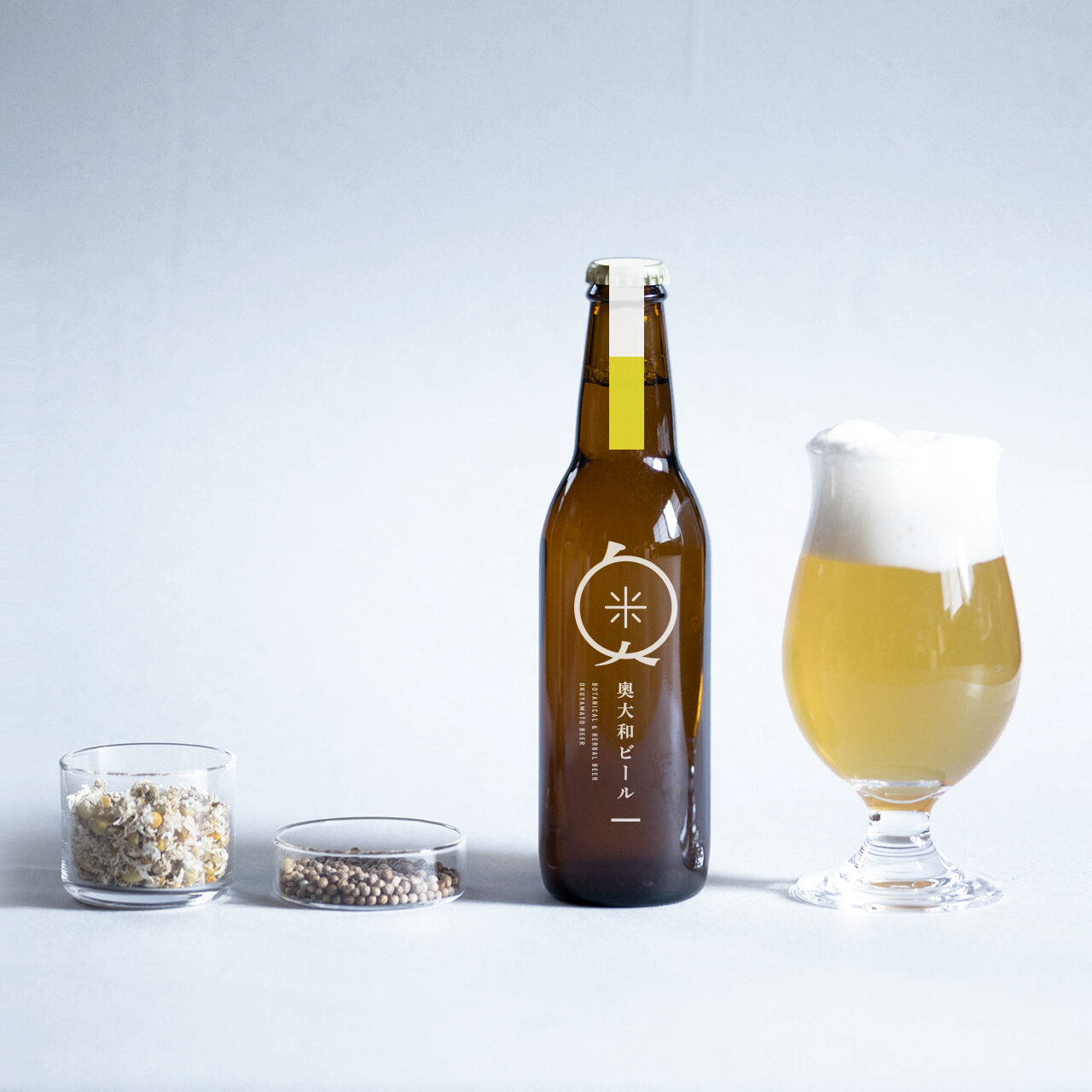
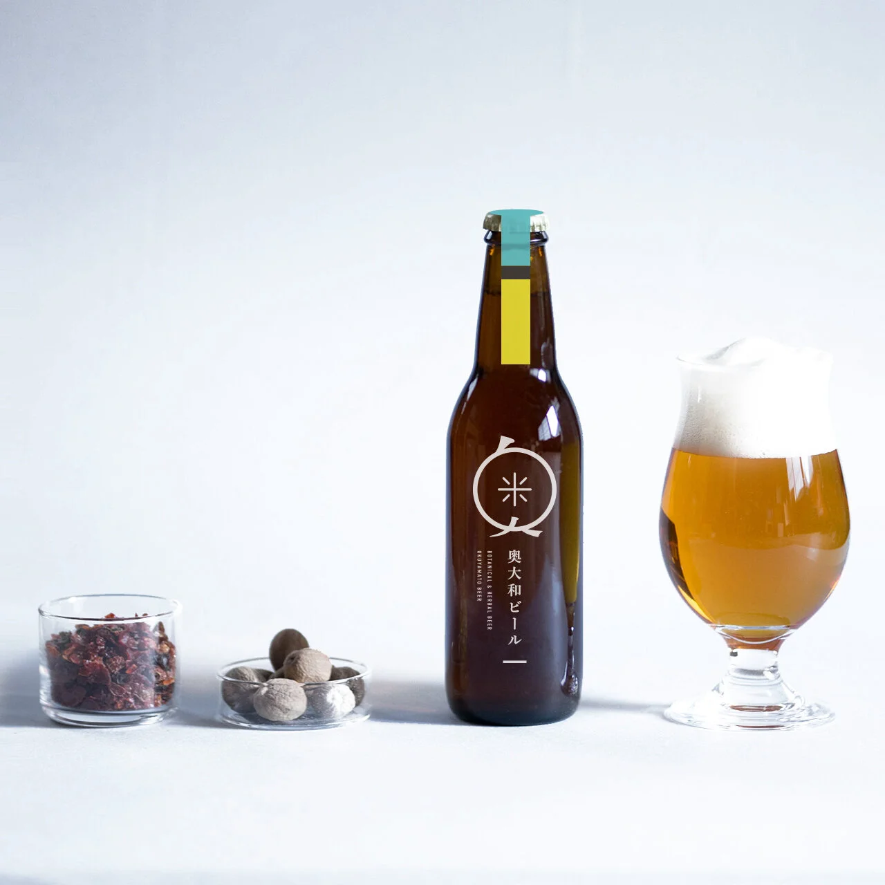
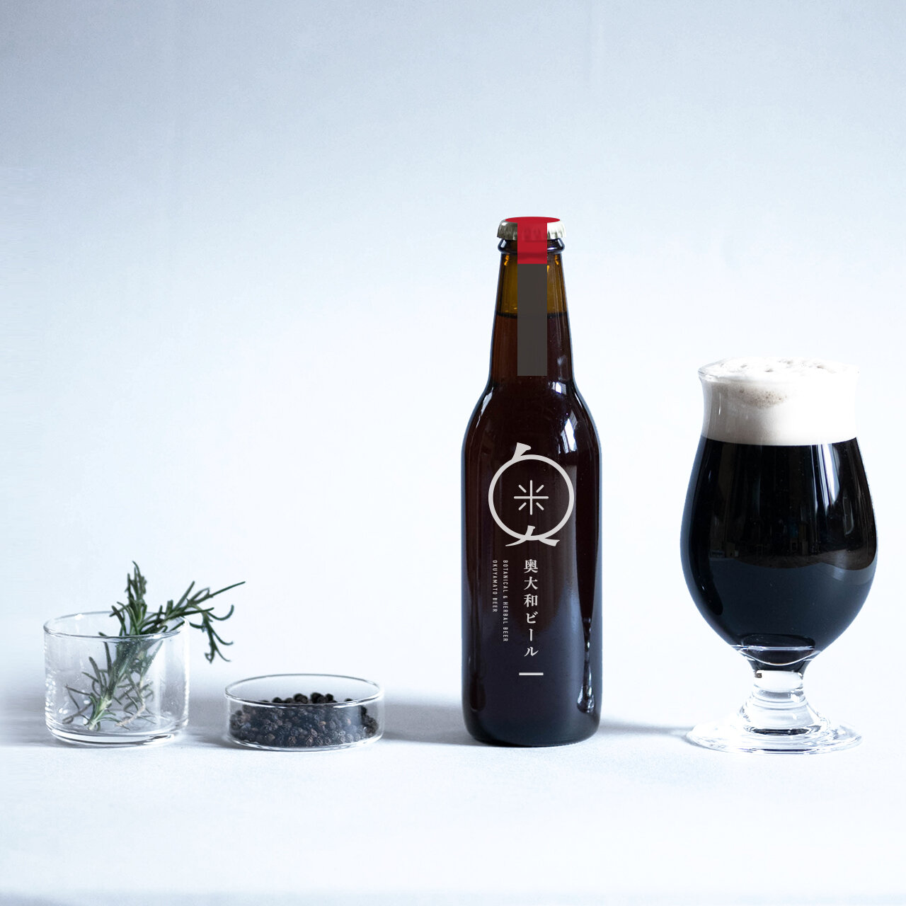
Craft beer is always a series of experiments: working with breweries and using seasonal ingredients. We decided to go without a physical label; instead, printed our label onto the bottle in white in order to elevate the packaging. The distinction of taste and flavor are indicated by color bands. Each color band, inspired by the seasonal ingredients or characteristics of each beer, seals the crown (lid) of the bottle.
Our brand logo is a character logo, commonly called or known as Oku-chan. We wanted to break the notion that beer is a man’s drink, and wanted more women to be interested. The logo uses the brand’s initial kanji “奥” and the brewer’s initial kanji “米” as its motif. And with respect for the brewer’s insatiable inquisitive mind, who continues to challenge the status quo, we added a samurai chonmage (Japanese topknot) on Oku-chan.
Digital Communication services, including website design, search engine optimization, social media, and content creation for nonprofit organizations, consultants, and creative entrepreneurs.