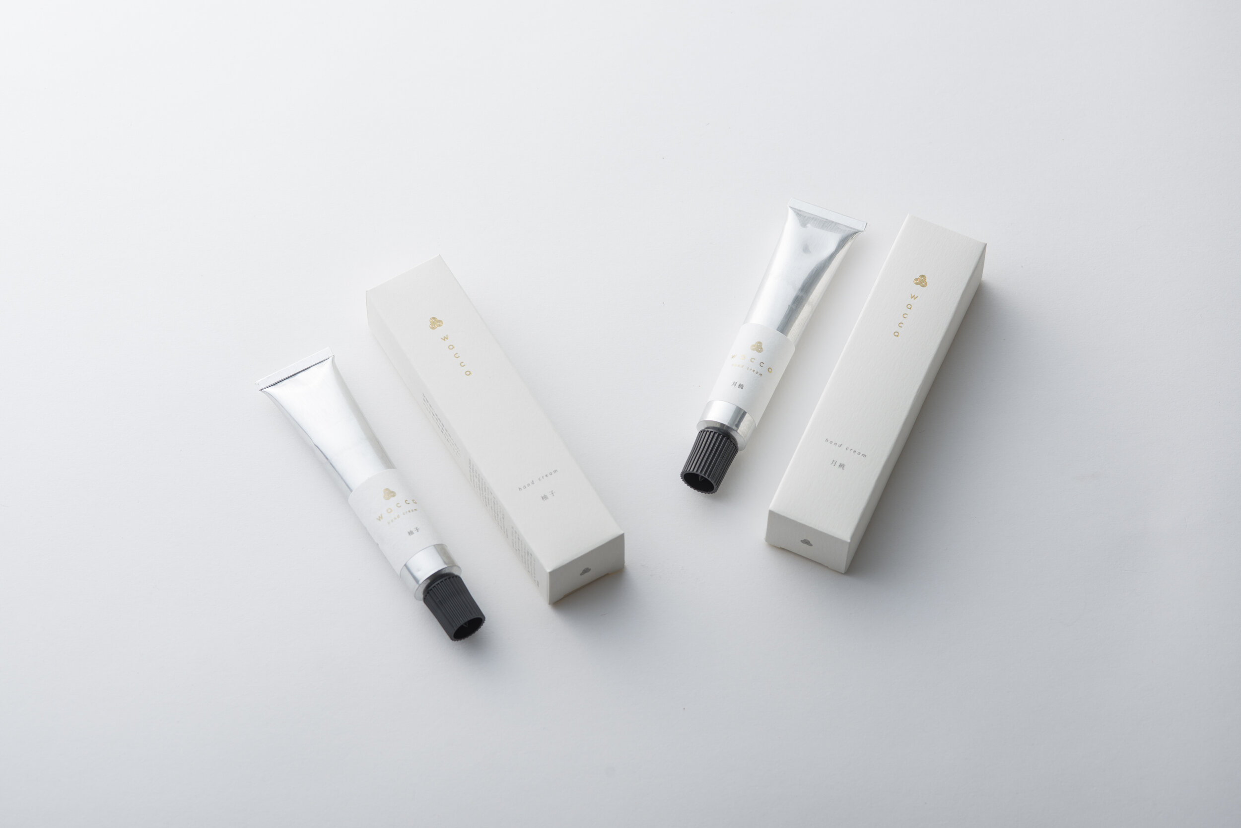
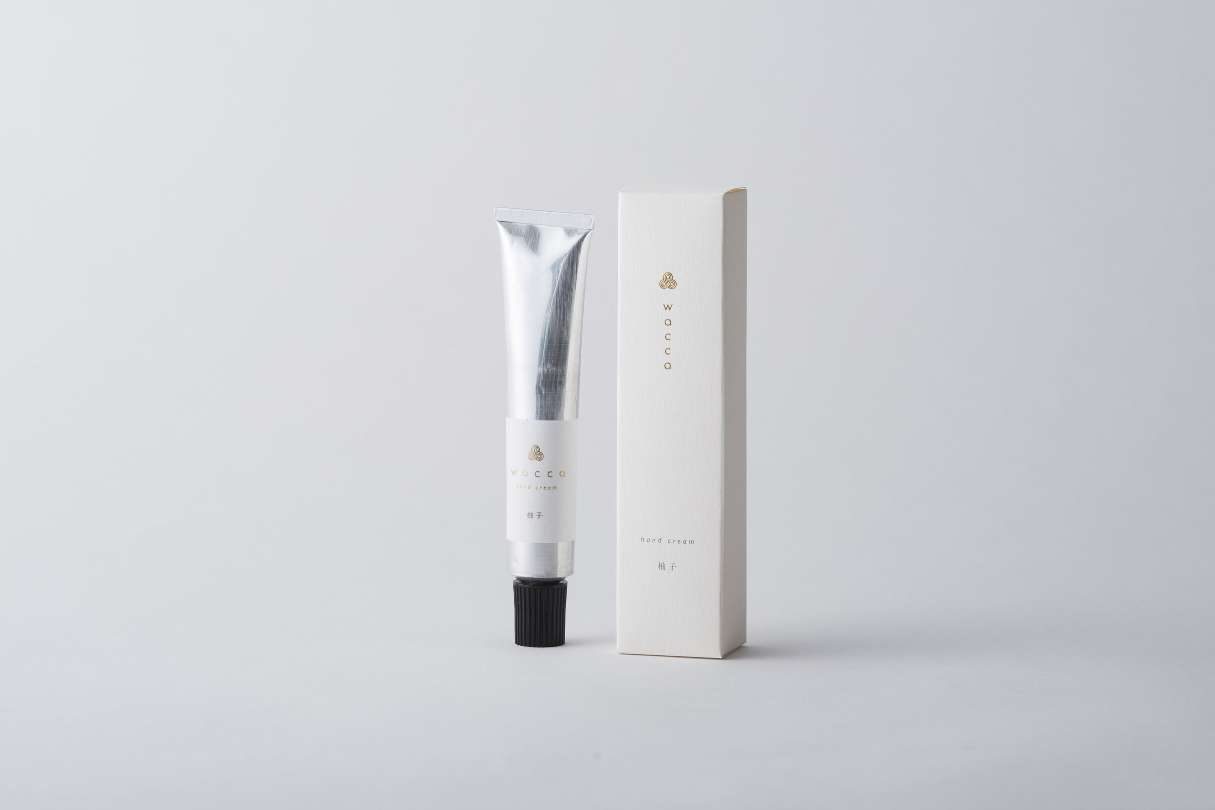
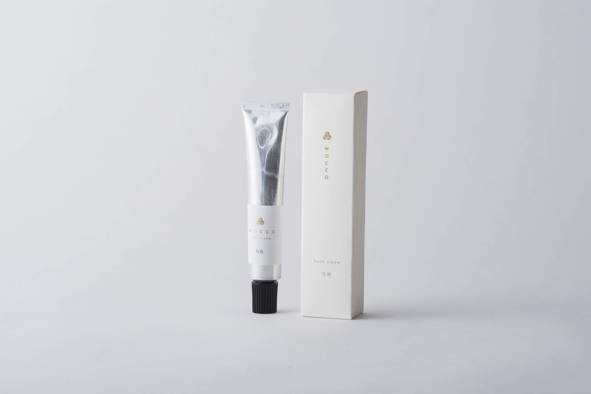
wacca handcream

Client: NAKAMURA Co., Ltd.
Designer: Taro Misako
Country: Japan
"wacca" is a "Japanese essential oil" brand. We use ingredients that are carefully made at a small scale and use scents that are representative of Japan; such as "cypress" and "yuzu" and have a selection of ten essential oils.
The logo is in the form of a circle. From the motif of "mizuhiki", ribbons that have been used for celebrations since the olden times, it is combined with the brand name "wacca (hoop)". The letters are similarly designed with the "hoop"; the letters "a" and "c" in circular forms.
As for the labels and paper used for the packaging, Japanese washi paper and other papers with similar textures are used, with the logo stamped in gold foil. The green for the aroma oil bottle imagines plants, and the silver used for the hand creams imagines the cleanliness that can be felt from the insecticidal ingredients in the essential oil. These elements are arranged on the packaging with reference to the practice of "minimalism" in the spaces and tools used at Japanese shrines, and completed a package that visually and tactually communicates the scents, charm, and effectiveness of Japan to the user."
Digital Communication services, including website design, search engine optimization, social media, and content creation for nonprofit organizations, consultants, and creative entrepreneurs.