
YOKANGO

YOKANGO
Client: TSURUYA
Design Company: I&S BBDO
Executive Creative Direction: Tatsuo Ueno
Plan: Tatsuro Kumaki, Takeru Nagasaki
Art Direction: Yoshimi Kimura (LIGHT PUBLICITY)
Design: Masao Kosaka
Produced by: Toshiharu Takahashi
Country: Japan
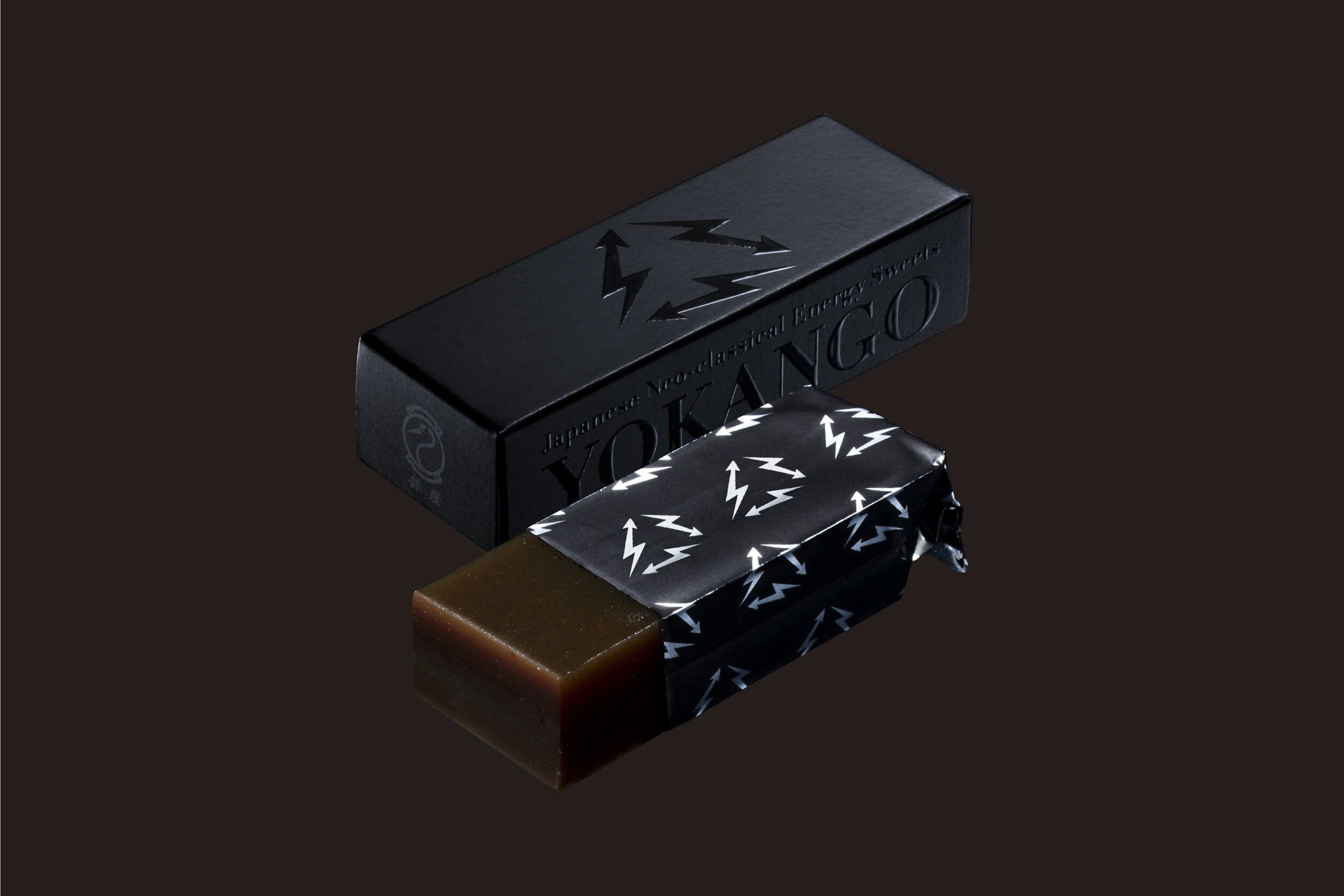
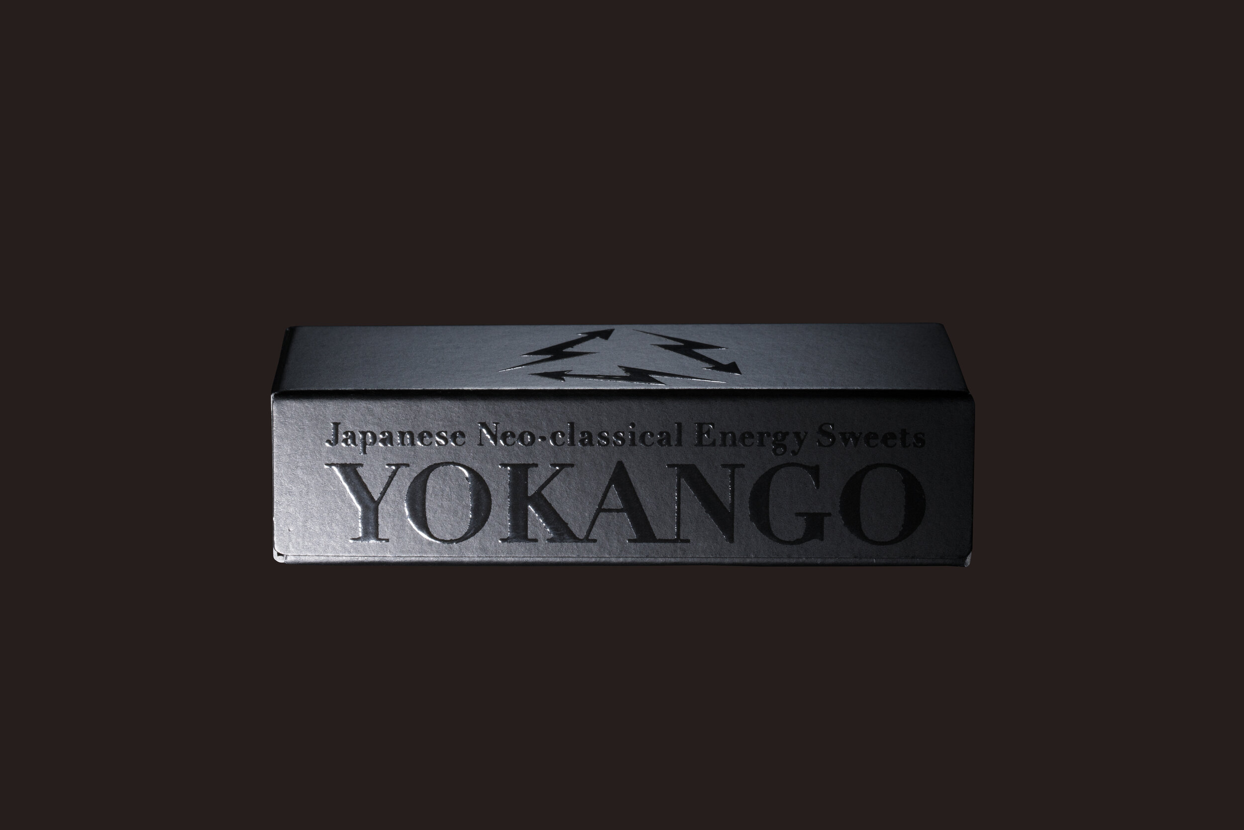
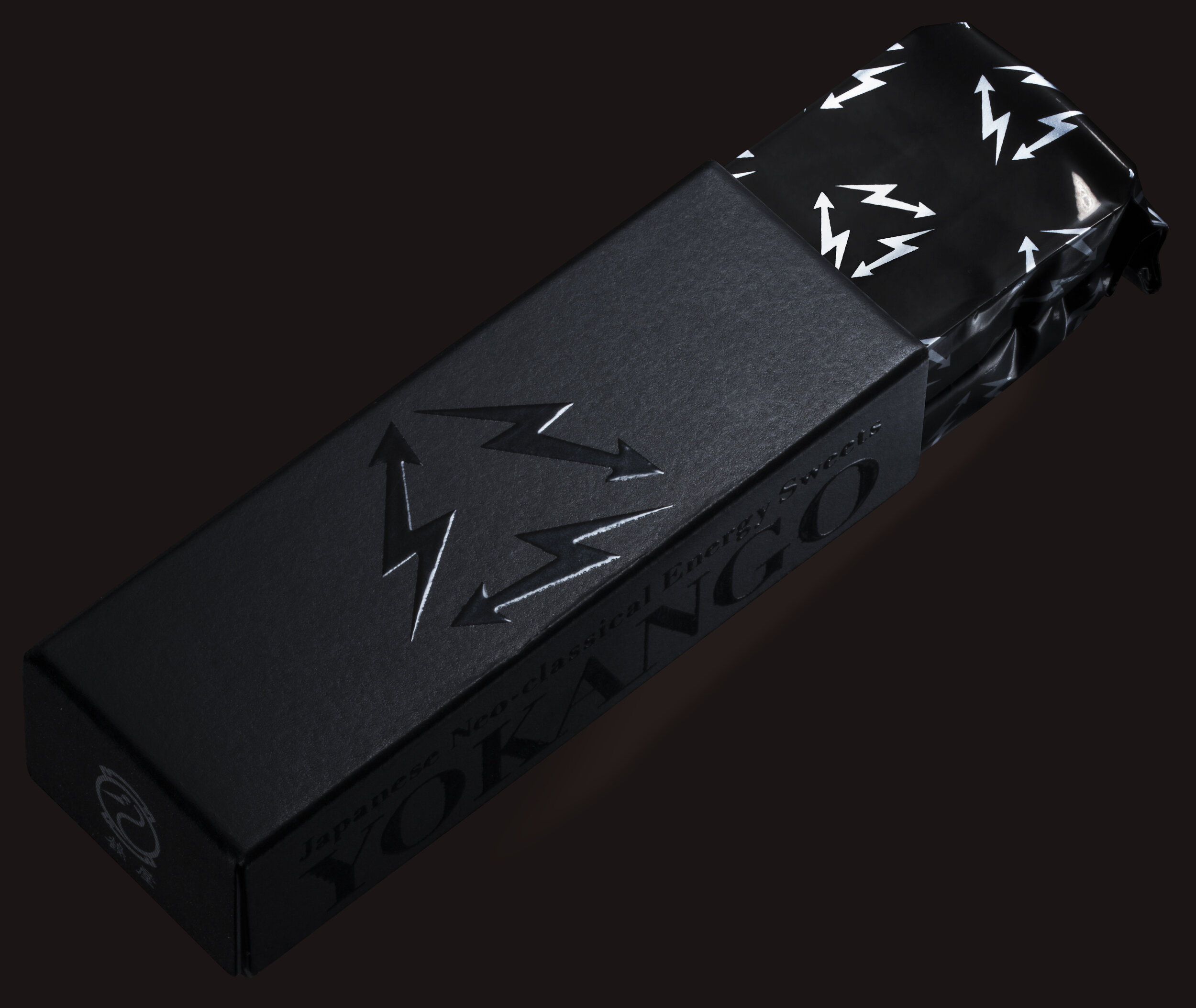
We focused on the fact that energy foods and drinks are popular among young people. In fact, yokan was considered as an original energy food eaten by the Saga Domain during the Edo Period. By branding yokan as an energy sweet, we want you people who do not eat Japanese sweets to be interested. The concept is Japanese Neo-classical Energy Sweets.
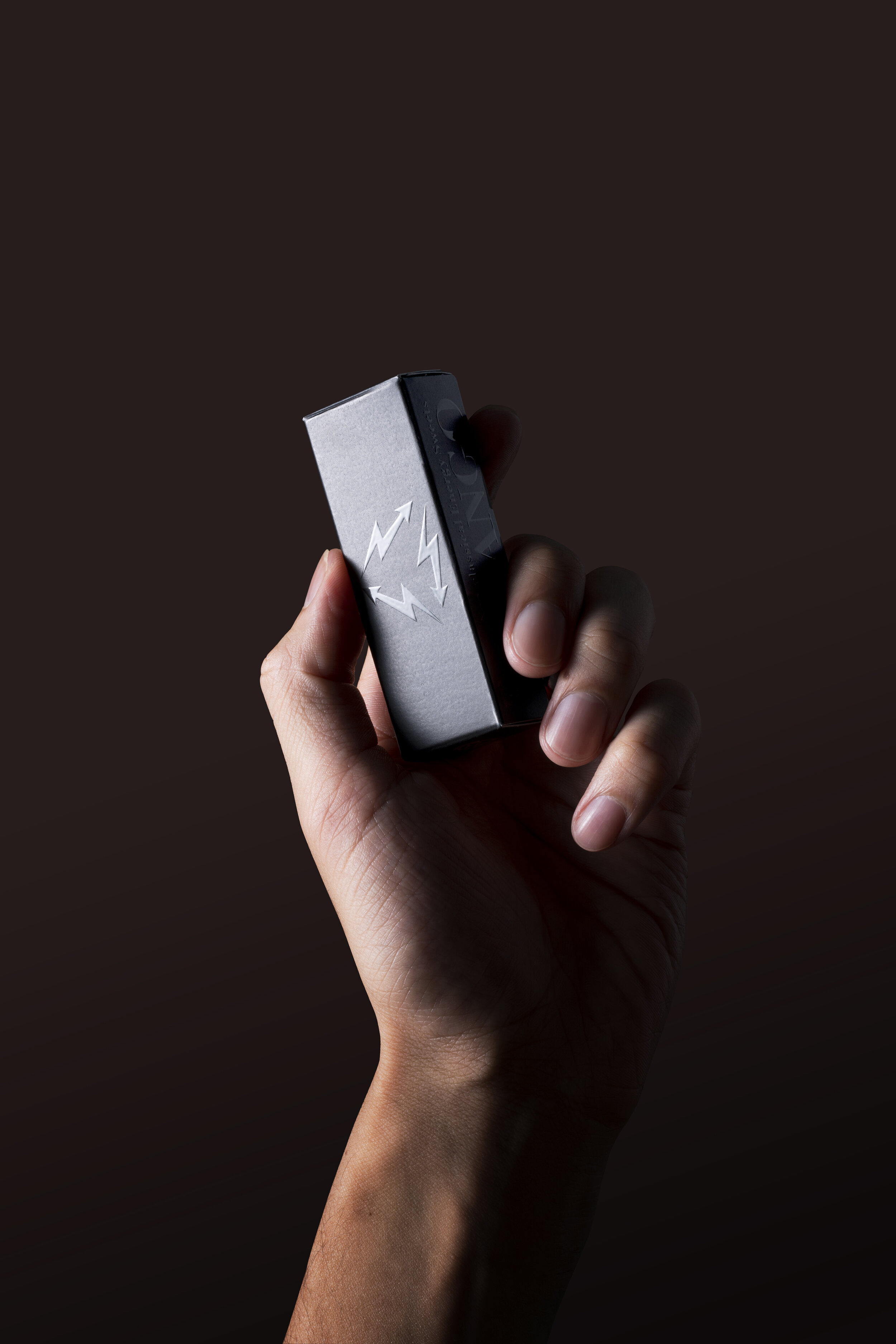
The packaging conveys energy charge and recharge. It was designed for young people for easy consumption at any time and easy pick up. We considered colorful packaging to attract attention on Instagram, but we decided to value the product and chose a design that was simple.
Digital Communication services, including website design, search engine optimization, social media, and content creation for nonprofit organizations, consultants, and creative entrepreneurs.


