Calorie Mate


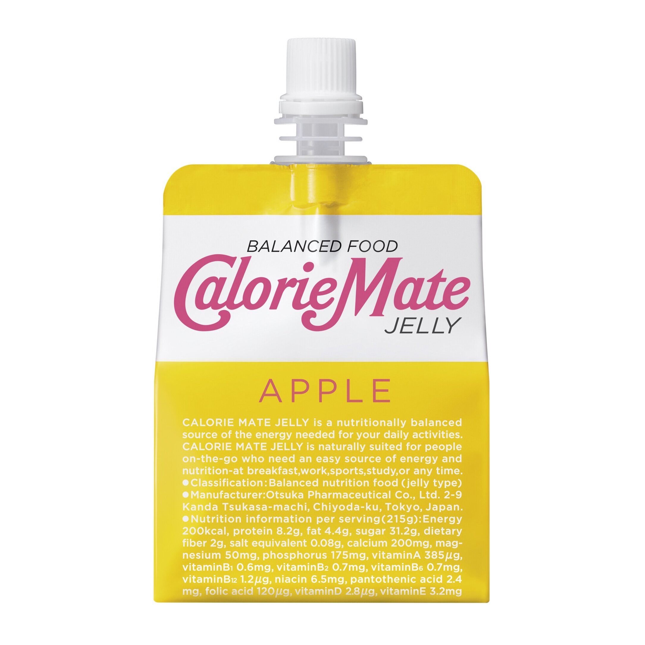


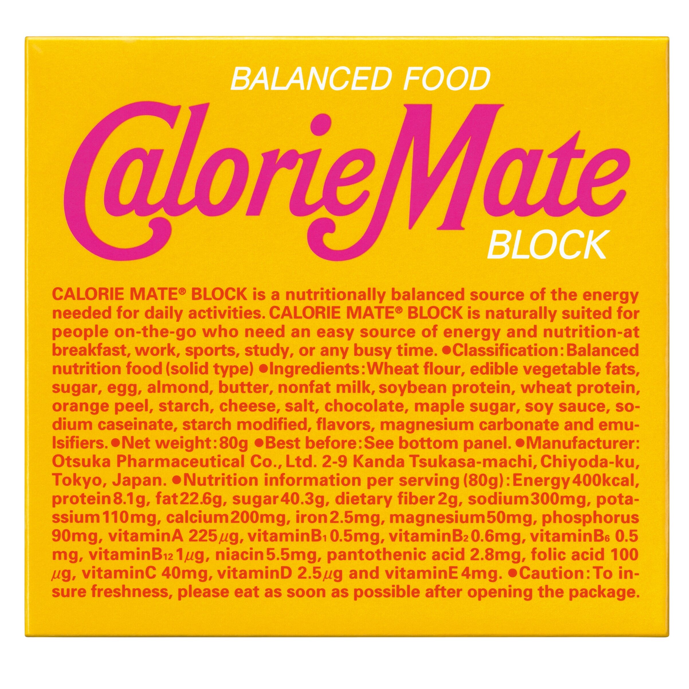

Calorie Mate
Client: Otsuka Pharmaceutical Co.,Ltd.
Design Company: LIGHT PUBLICITY CO.,LTD.
Art Director / Designer: Gan Hosoya
Typographer: Tadasu Fukano
Product development:
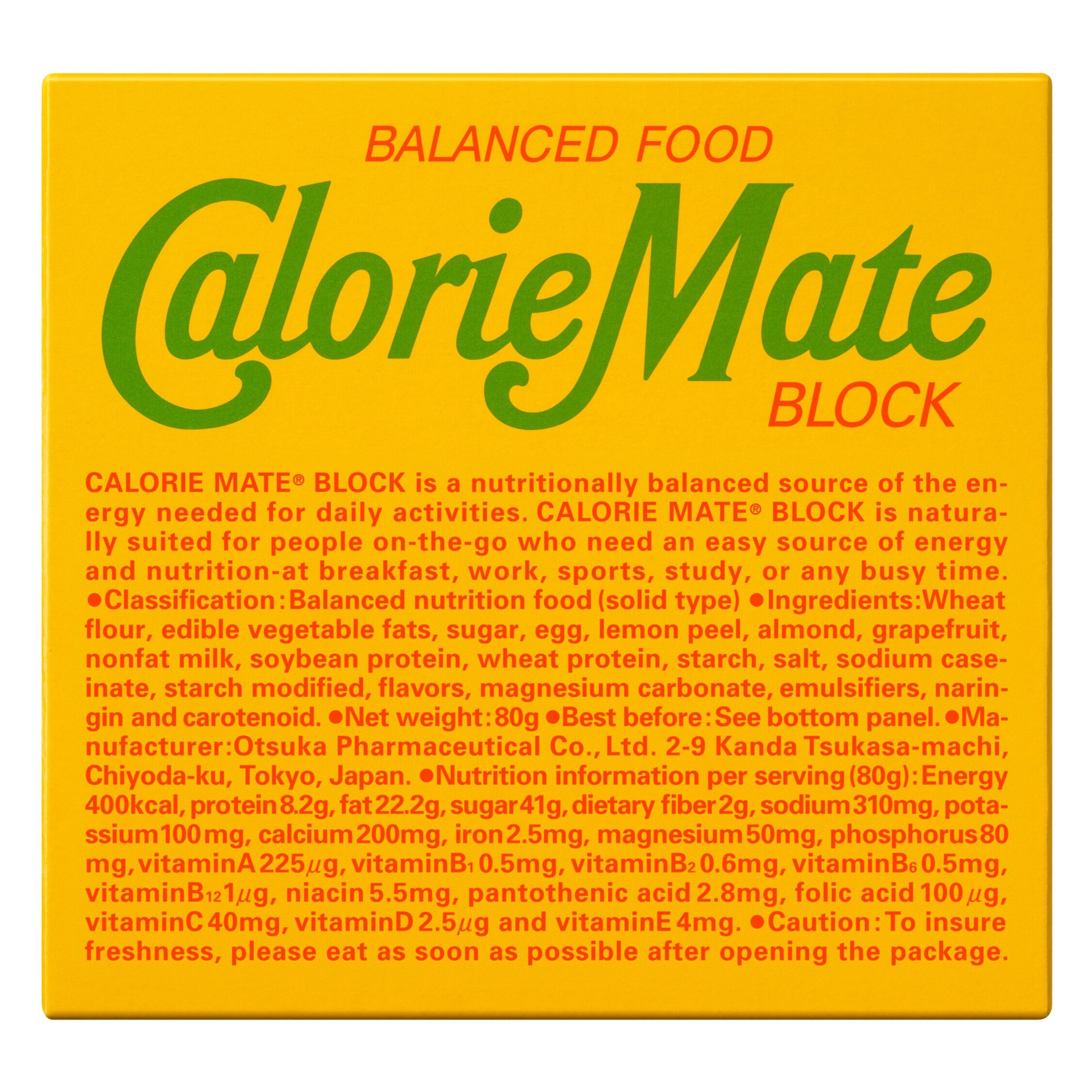
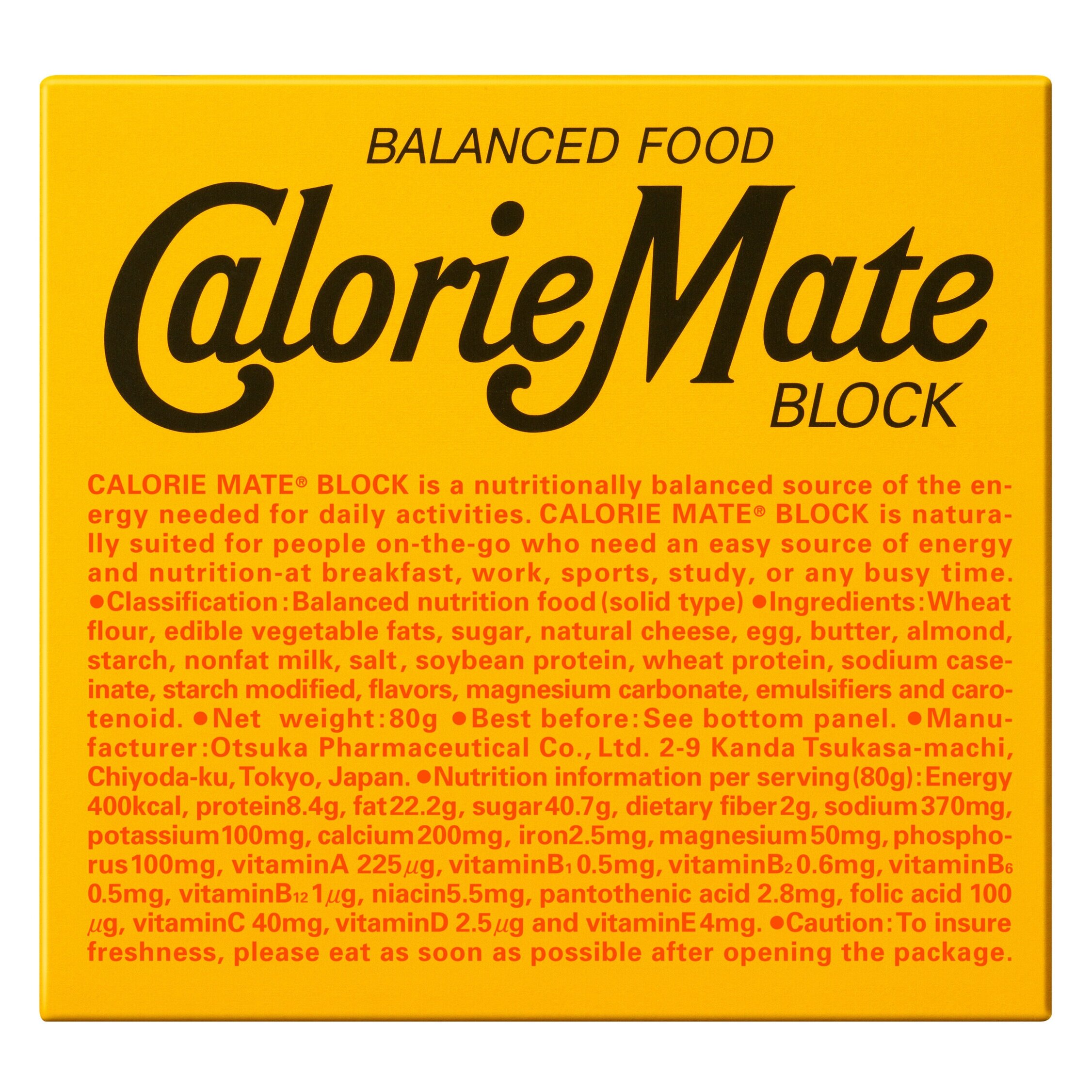
Calorie Mate was release in 1983 as a new genre of nutritional supplements; a product which the five major nutrients can be easily consumed. The drink version consists of concentrated liquid food used at medical institutions, and is produced in a form to aid the nutritional support of the general population. Meanwhile, the block version took into consideration the increasing problem of skipping breakfast at the time, and aimed to make nutritious food that could be consumed quickly. The two forms differ in form and development; yet, they share the common concept of "balanced nutritious food". In 2002, a refreshing jelly version was added to the line, and through these three different forms we are continuously growing into a brand that can respond to a wide range of needs.
Design concept:
We thought that an unexpected creative idea was crucial for a product with a completely new idea, thus aimed for a beautiful package using just typography.
By daringly using classic characters, there's a sense of surprise and originality. As for its colouring, an attention grabbing construction coloured yellow is used. To convey the product concept as "nutritious and well balanced", the nutrient and ingredient facts are placed in blocks of roman letters, and we pursued for a sense of balance in how the large and small characters are grouped. The jelly was renewed in recent years, its yellow base made lighter to convey its refreshing flavour and to create an impression of lightness.
Digital Communication services, including website design, search engine optimization, social media, and content creation for nonprofit organizations, consultants, and creative entrepreneurs.