Theobroma Caviar

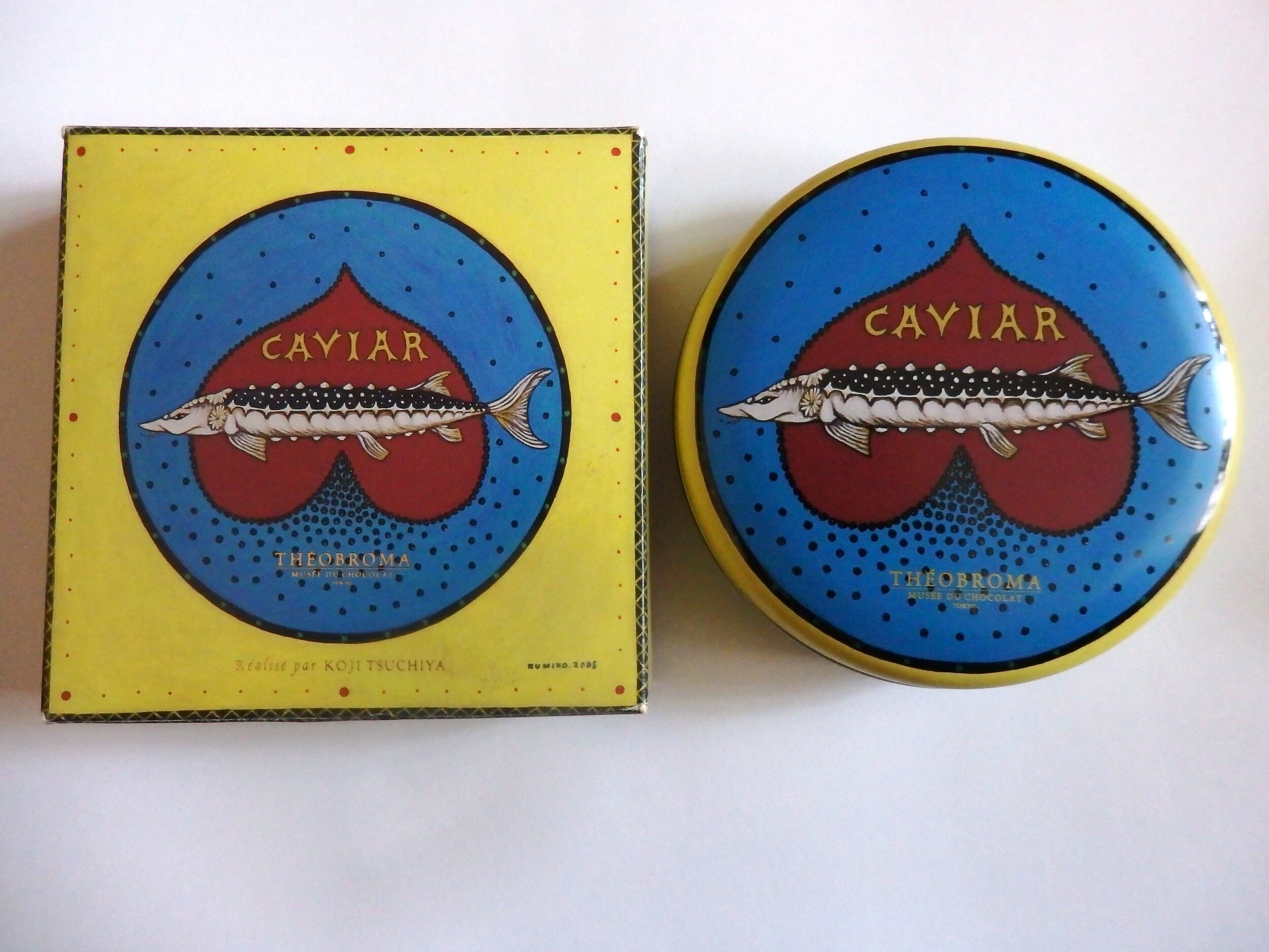
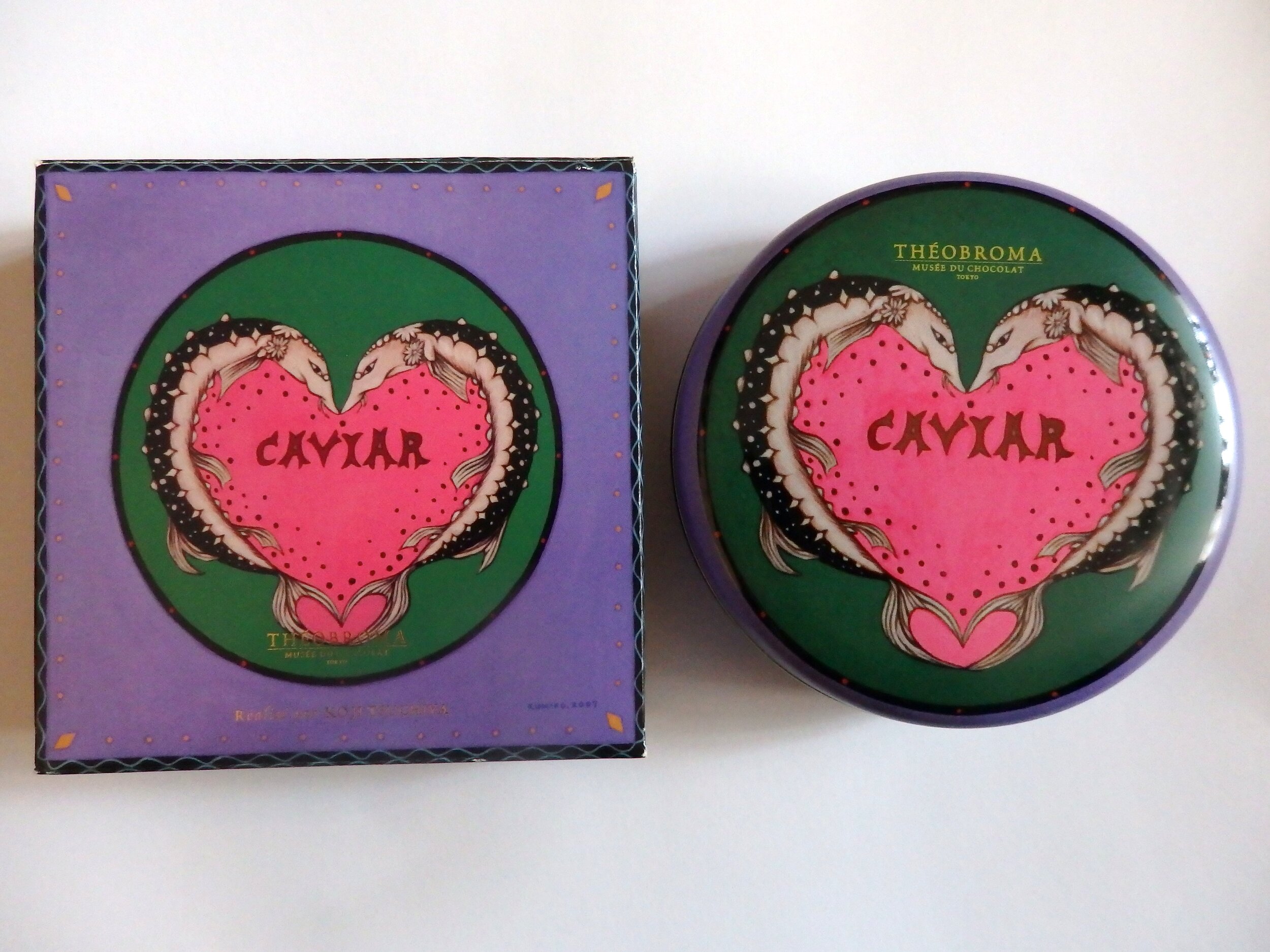
Theobroma Caviar
Company: THEOBROMA
Direction: Koji Tsuchiya (THEOBROMA)
Illustration: Kumiko Higami
Box Design: Hisamitsu Noriyuki (Sunlight Paperworks Co., Ltd.)
Can Design: Kinpodo Matsumoto Industry Co., Ltd.
Country: Japan
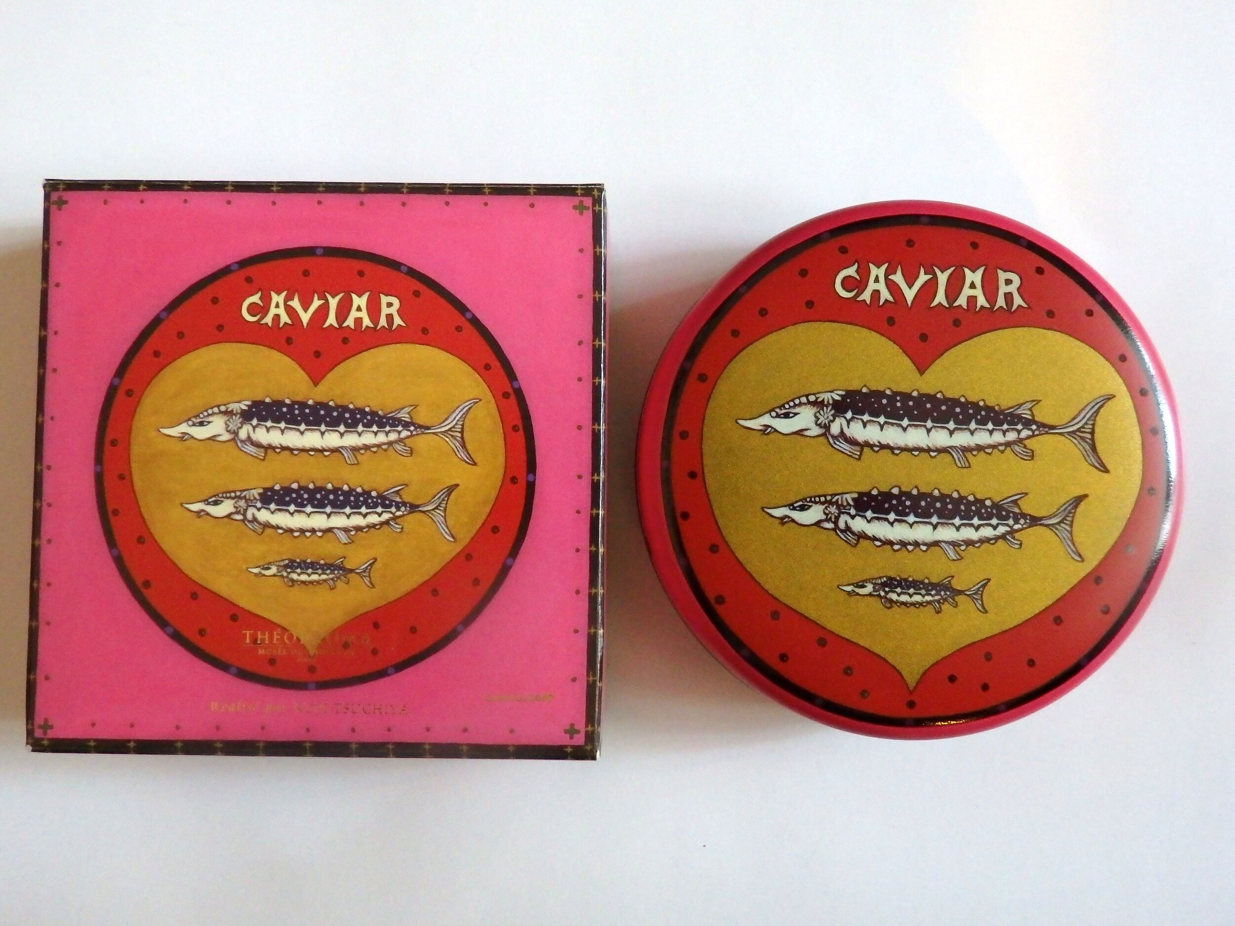
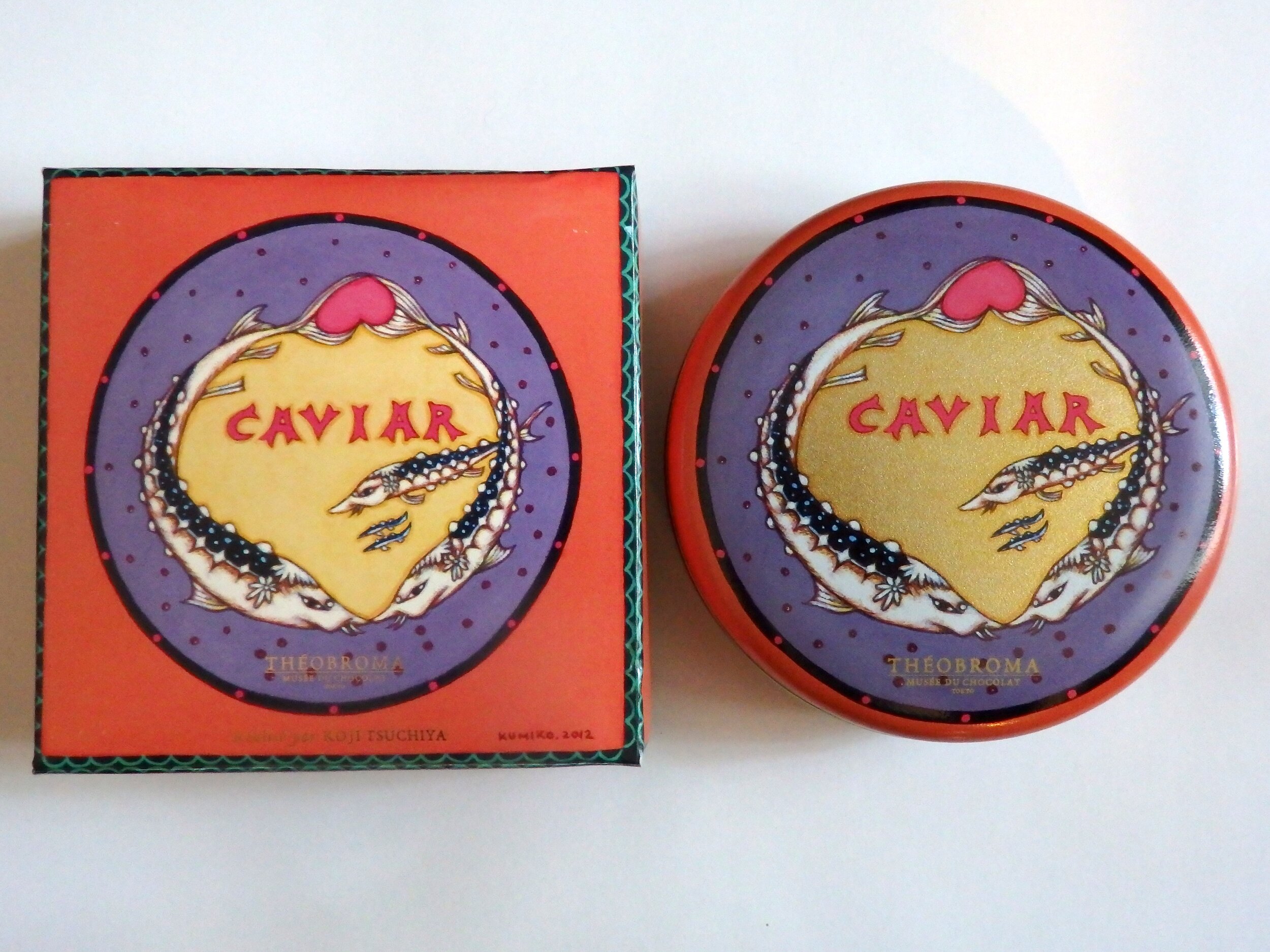
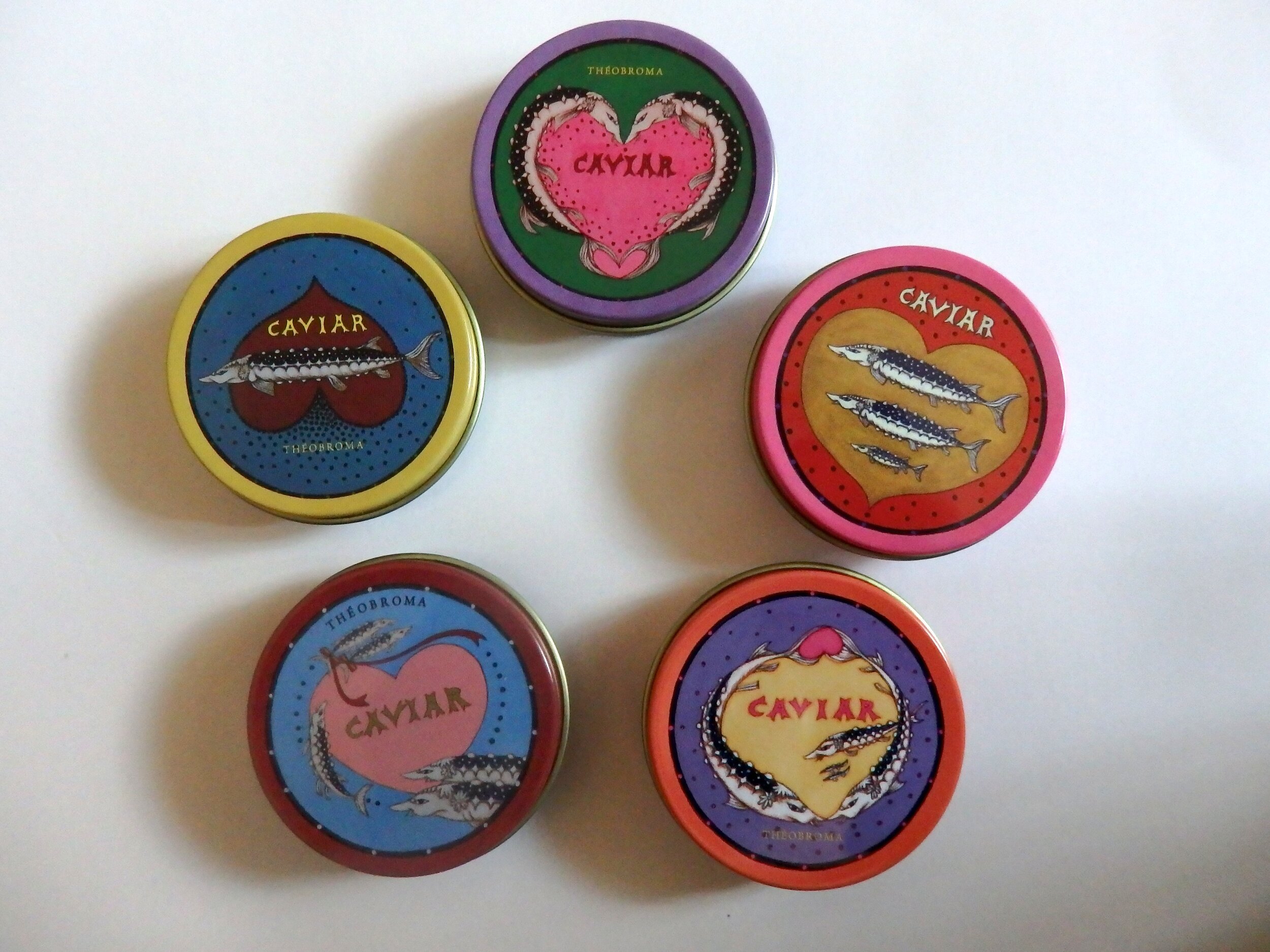
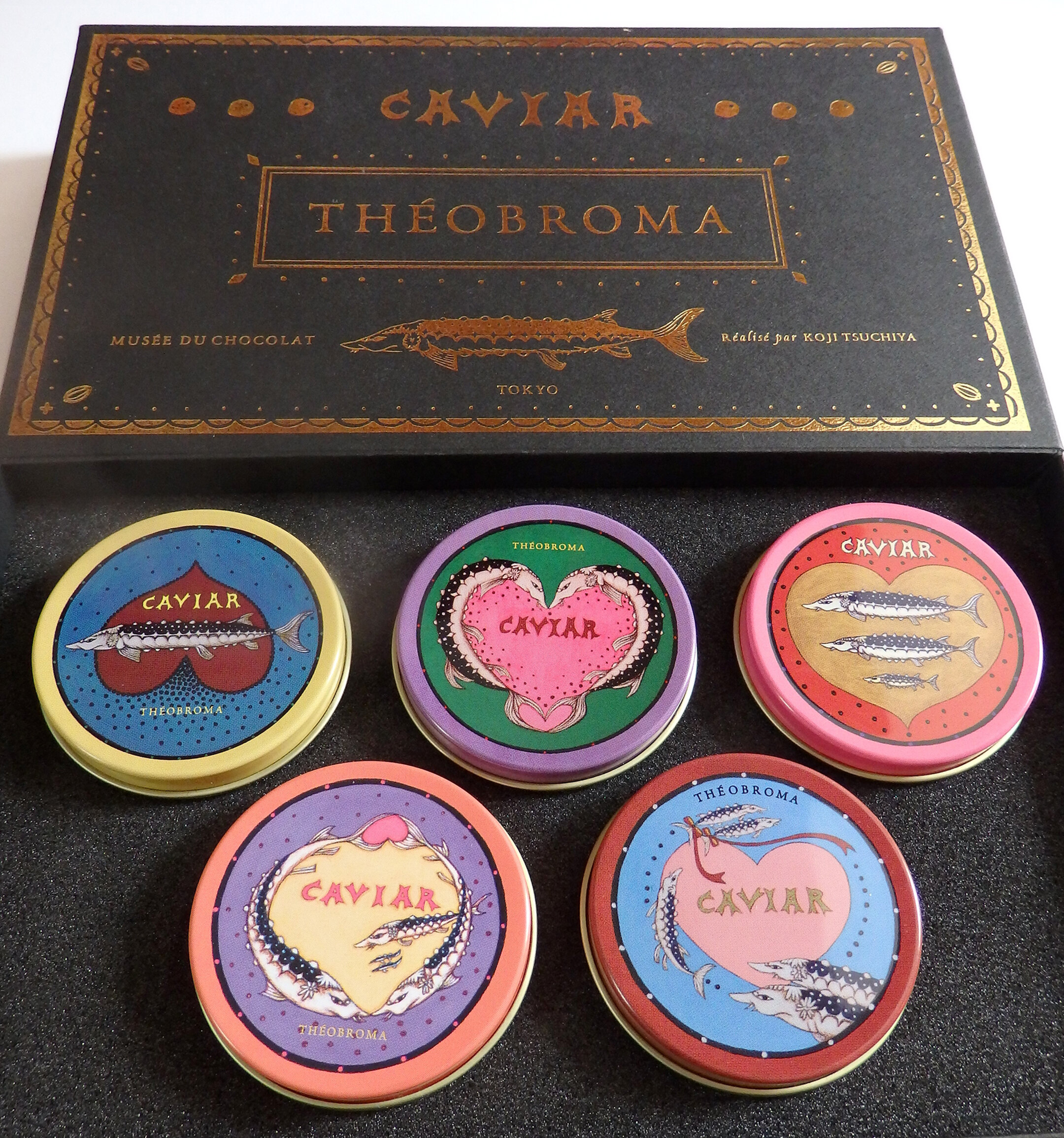
It was a request from Chef Tsuchiya when he was considering a new product where chocolates looked like caviar. He said to draw anything, whether they were patterns from lines or a girl — to design freely. I was pleased that he gave me this control, and as there were no restrictions, I was able to draw openly. At the beginning I didn't know how to draw the design of a box, and drew out the development view of the box. Based on that original drawing, Chef Tsuchiya went through multiple trials with the can packaging company as well as the box company to complete the package. In 2006 I thought it would be just one can, but in 2008 I was asked to designed a second, and to make the process enjoyable for myself I designed it with a narrative in mind. The sturgeon that used to be on its own in the first can was drawn as a couple in the second. On the third package (2010), a child is born, baby twins on the fourth (2013), and in the fifth (2015) the brother has gotten bigger, and the younger twins drawn with a ribbon. Thanks to Chef Tsuchiya who gave me the freedom to draw as I wished, I was able to create a story, and draw enjoyably. I had never thought that it would continue on this far, but the launch of the mini can set reflects an even stronger narrative, which I feel very happy about.
Digital Communication services, including website design, search engine optimization, social media, and content creation for nonprofit organizations, consultants, and creative entrepreneurs.