Kabajirushi Popsicle

Kabajirushi Popsicle
Client: Kabashima Hyouka
Design Company: WILLOW
Creative Direction: Yuichi Asaba
Art Direction & Design: Yachiyo
Country: Japan
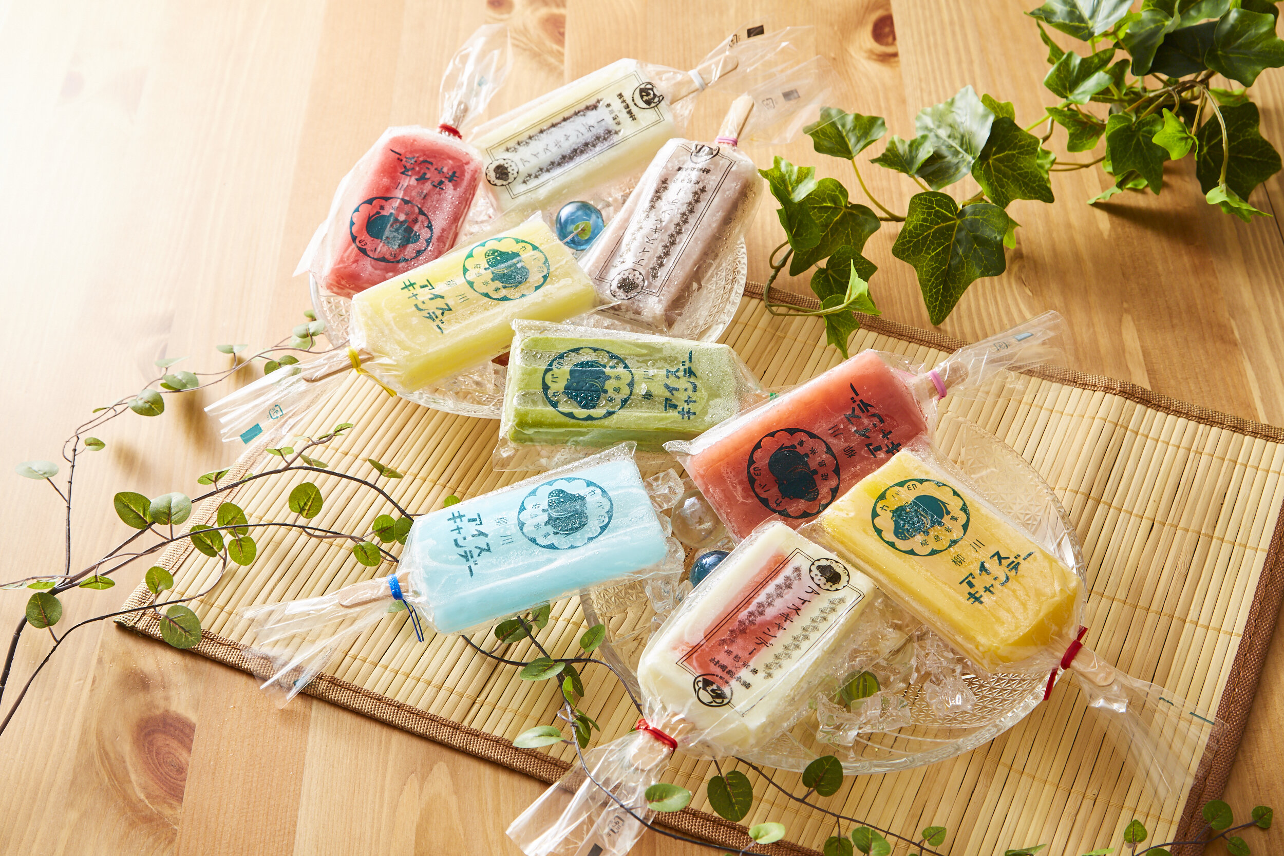
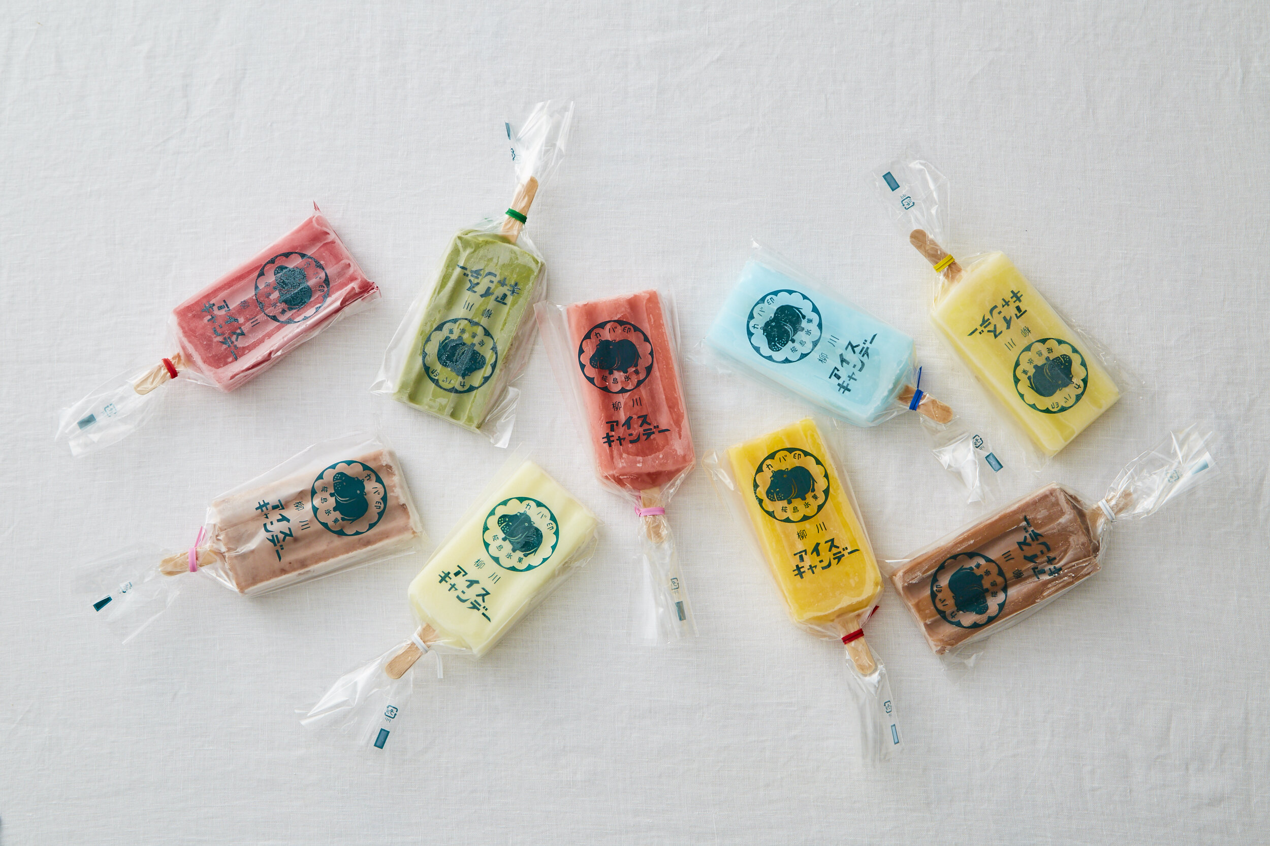
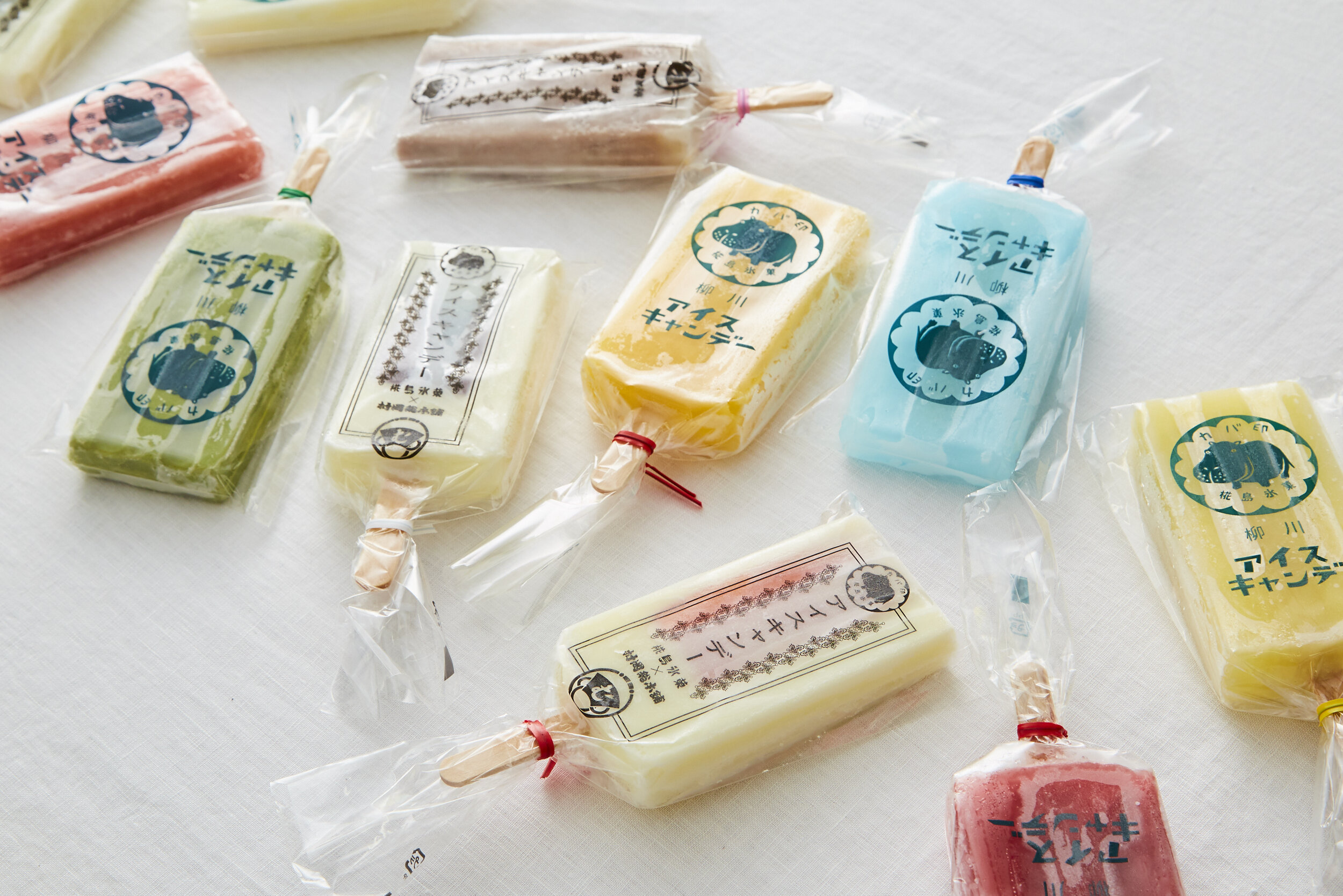
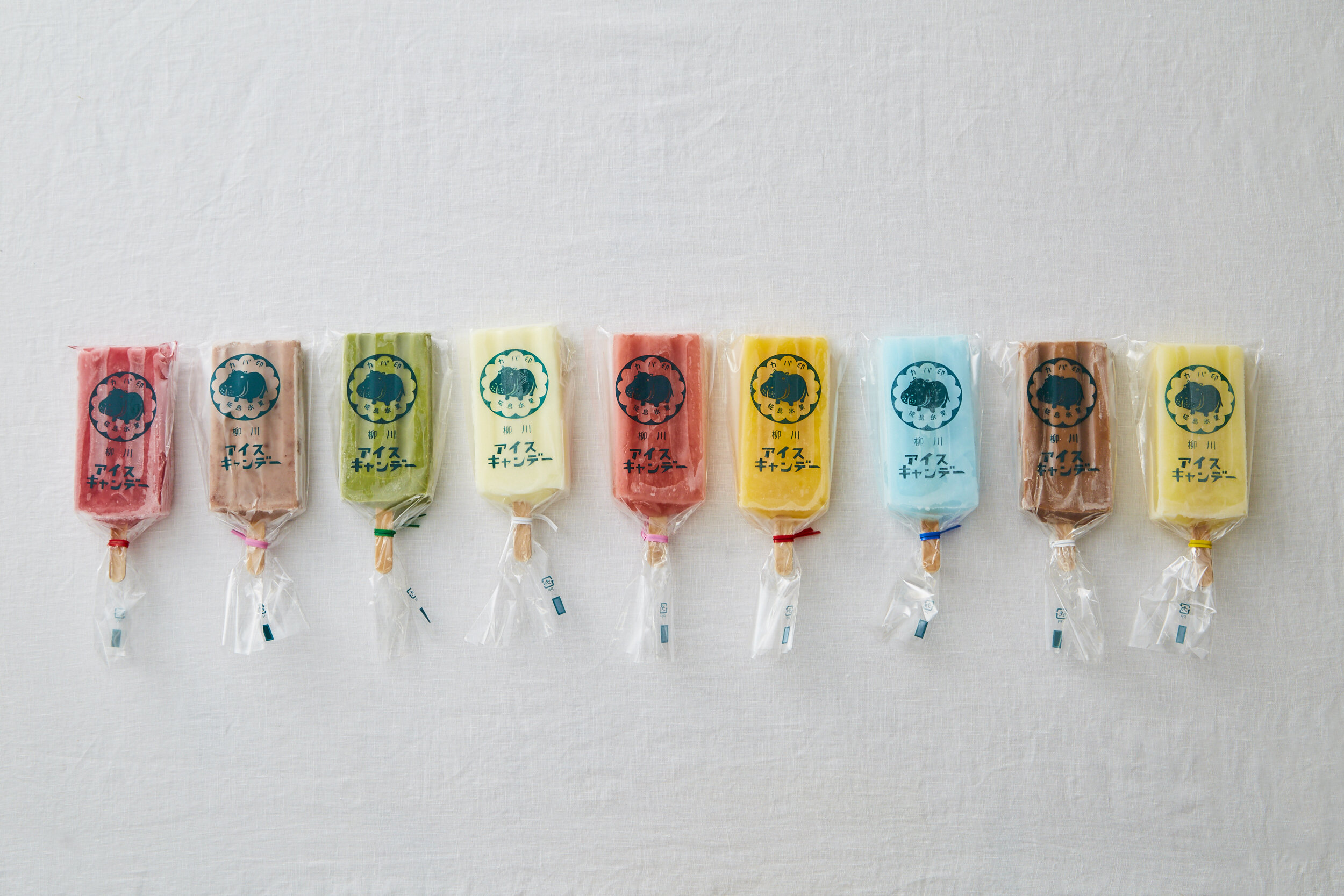
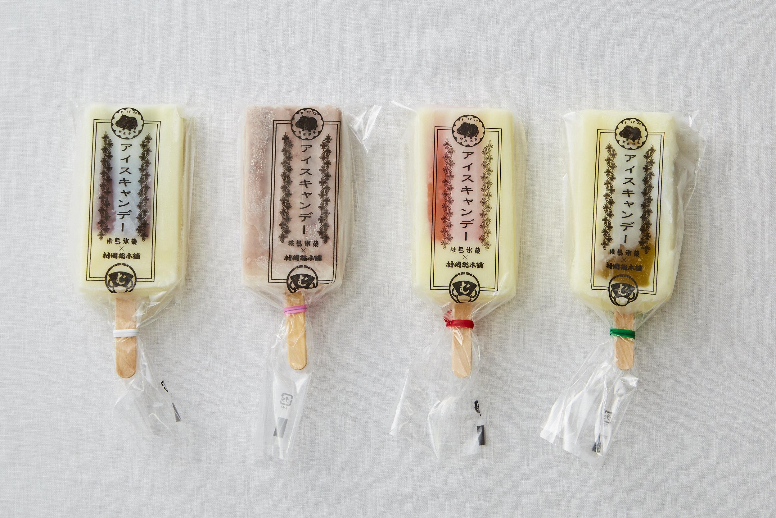
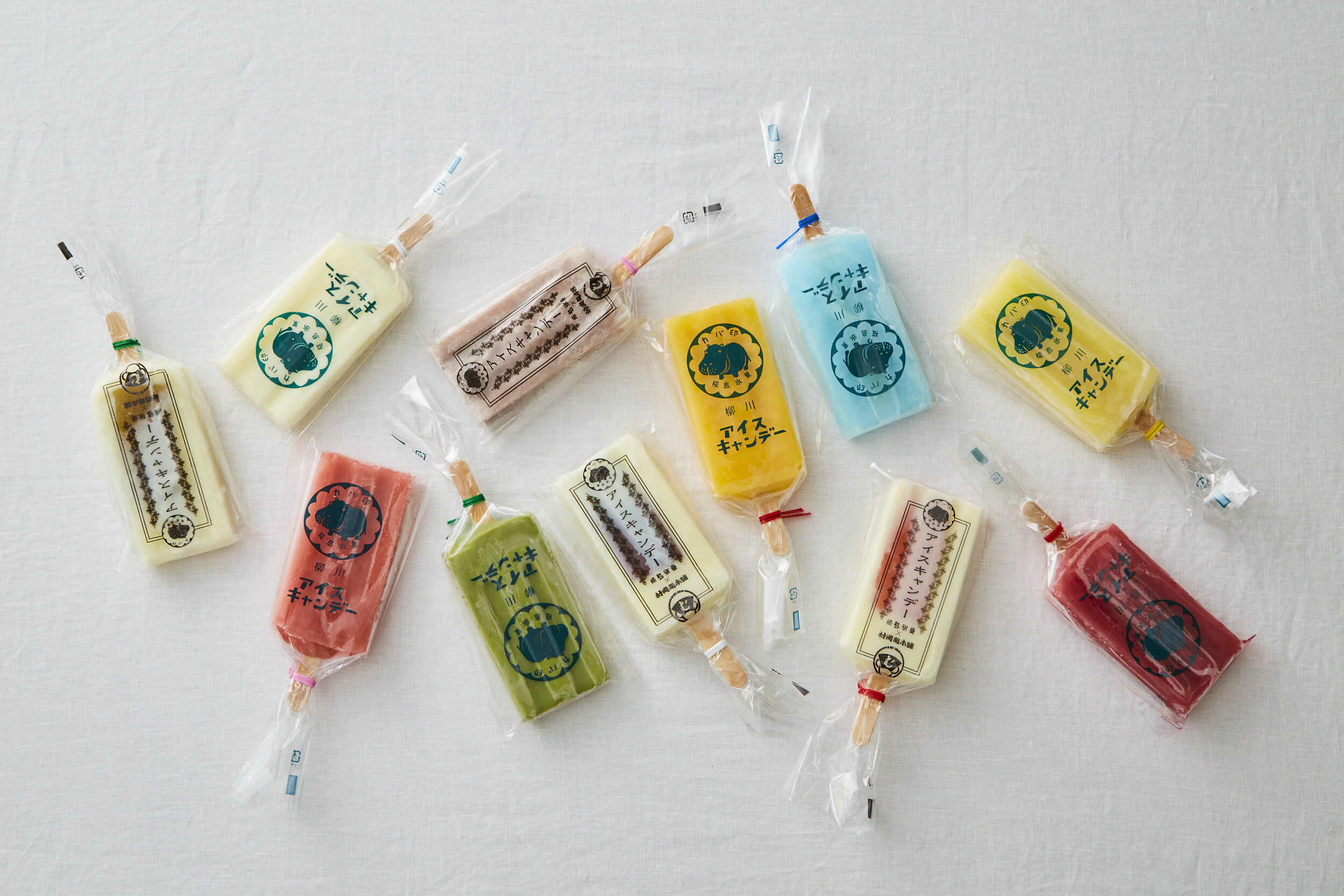
The owner couple of Anri Farm in Yanagawa City, Fukuoka Prefecture, originally manufactured ice cream cups with their house grown mangos. In 2011, the couple wanted to make something that was easy for children to eat and buy. With this thought, this popsicle brand was born.
I was asked to think of a brand name that was relatable and easy to remember. In Japanese, “Kaba”, taken from the owners name, “Kabashima”, sounds exactly the same as “hippopotamus”. Because of this, we use the hippopotamus as the brand name and logo: Kabashima Hyouka and Kabajirushi.
The colorful and vivid ice candies use various fruit from each season. The packaging uses simple and mono-color trademark of the hippopotamus logo. By not over decorating the packaging, the product gives a nostalgic and retro feel from the Showa period.
Digital Communication services, including website design, search engine optimization, social media, and content creation for nonprofit organizations, consultants, and creative entrepreneurs.